A plate of filters over a table or a list: checkboxes, a range, dates and a segmented choice, each group in a section that folds away, the filters that are on set out as chips with a remove key and Clear all, the number of matches in a readout, and Apply where there is room.
One form, the kit’s own groups in collapsible sections, and a chip row built from the chip group’s tray: every control, chip, key and sheet is drawn by the part it comes from, so every finish and the Quiet volume follow with nothing new coloured. The script reads the groups marked data-filter, turns each value that stands away from the markup’s own into a chip, and keys the event by the controls’ names. Nothing is copied and no section is given a height: the collapsible’s grid row does the folding, and the sheet is the drawer’s own plate.
Variants
Wide · two filters on
Wide · nothing on
Applied filters · remove keys and Clear all
Narrow · the Filters key
Narrow · the same form in the bottom sheet
States
Nothing on
Two on
Key, narrow
In the sheet
Props and options
Name
Kind
Description
label
attribute
The panel’s name: the sheet’s title and the words on the key that opens it, with the number applied in its accessible name.
count
attribute · property
What the readout says, exactly. Hidden while empty. The page sets it after filtering; the panel never counts.
input[name] · label
element
A checked checkbox is a filter; a radio is one only when it stands away from the markup’s checked one. The label’s words, without any small count, are the chip’s value.
[data-filter-applied]
attribute
Where the chip row and its Clear all key go. Leave it out and the script puts them in, before the first section.
[data-filter-clear]
attribute
The Clear all key. It resets every control to the markup’s own state and applies at once, on both widths.
filters
event
Fired after Apply, Clear all and a chip let go, and after every change on a narrow screen, with detail = the values by name.
values · apply()
property · method
values is the filters as they stand, by name; apply() does what the Apply key does. Read values on load to set the page up from the filters the markup starts with.
Apply
key
Applies on a wide screen.
Usage notes
Tick Pending and choose Online, then press Apply: the list narrows, the chips say what is on, and the readout counts the rows. Press a chip to let that filter go, or Clear all.
Accessibility
Keyboard: Tab moves through the Filters key, the applied chips, each section’s head and its controls, then Apply; Space ticks a checkbox and Enter or Space opens a section; a radio group takes the arrow keys; a range cap the arrows, Page Up and Page Down, Home and End; a date segment its digits, Backspace and Delete; Escape closes the sheet, whose grip takes Up and Down.
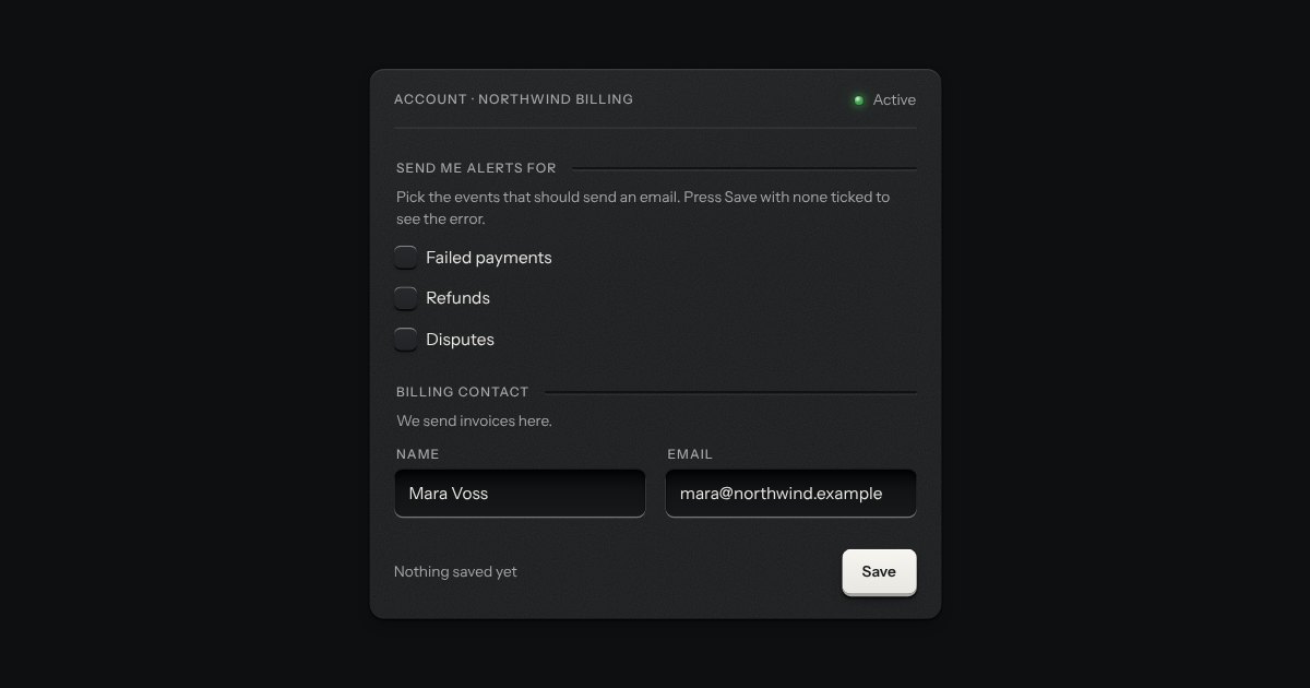
The form is one plate of fieldsets with legends, and every control is the kit’s own: a native checkbox or radio, a range with two sliders named Least and Most, a date field with three named segments.
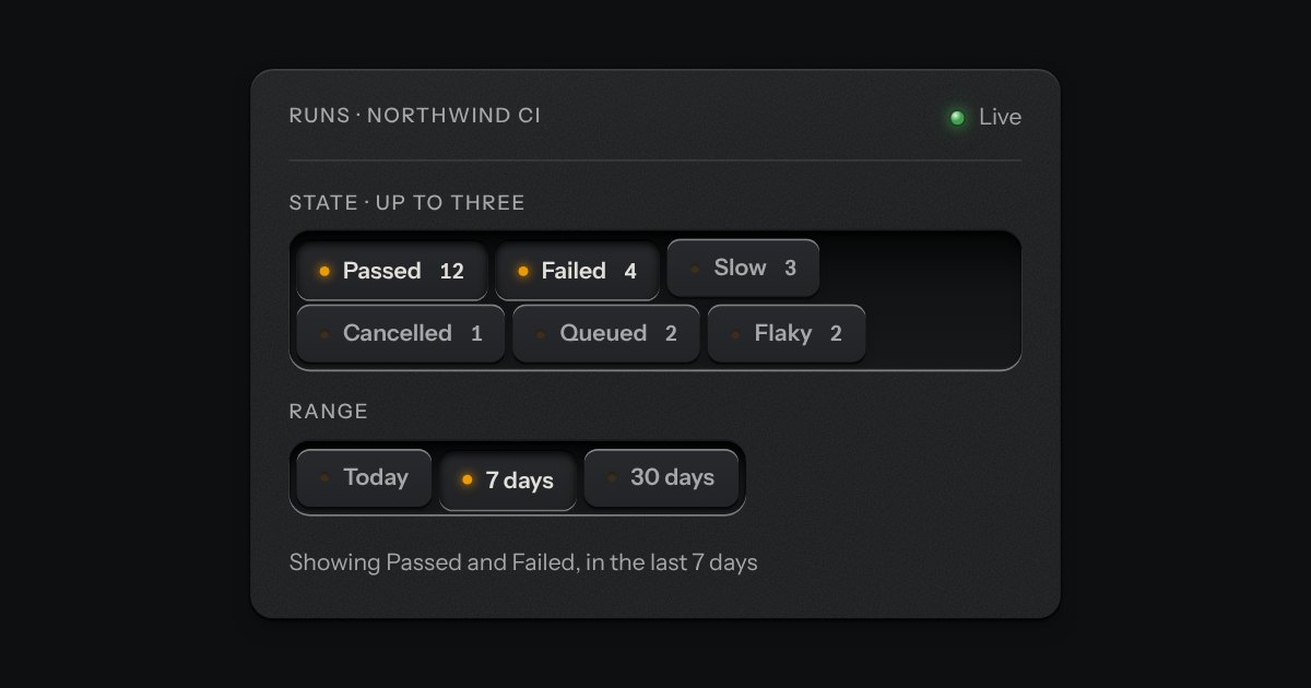
An applied filter is a checkbox that is down, so its chip sits pressed with its lamp lit and pressing it lets the filter go. The row says nothing while it is empty, and Clear all is a real key after it.
The readout is a polite live region, so a new number is read once; the display’s ink is its own, so the count is never a colour signal.
Without the script the form stays in the page, Apply posts the fields, and every group, chip and field is still a native control in the kit’s drawing.
Related fields under one engraved legend, with one hint and one error line for the group. It is the browser’s own fieldset and legend, so the group has a name for a screen reader and a disabled fieldset disables every field inside. The legend runs on into a groove cut in the plate; the error waits at the foot, not drawn, until it has something to say.
Small plates you press on and off, laid in a tray that wraps: the filters over a table, the topics on a form, the sizes on a product. Each chip is a native checkbox, or a radio when only one may be down, drawn as a small cap that sinks below the tray with its lamp lit. A limit may be set on how many go down at once.
A panel that rises from the bottom edge of the window, on the native dialog, for a short task that should not leave the page: add an expense, set some filters, pick an action. It stops at two heights, half and full. A grip in its top edge drags it, or steps it between the heights from the keyboard; dragged down from half it goes away. The key that saves stays in sight at half, and the content scrolls only when the sheet is full. On a phone it is the whole width; on a wide screen it is a card, centred, standing on the bottom edge.
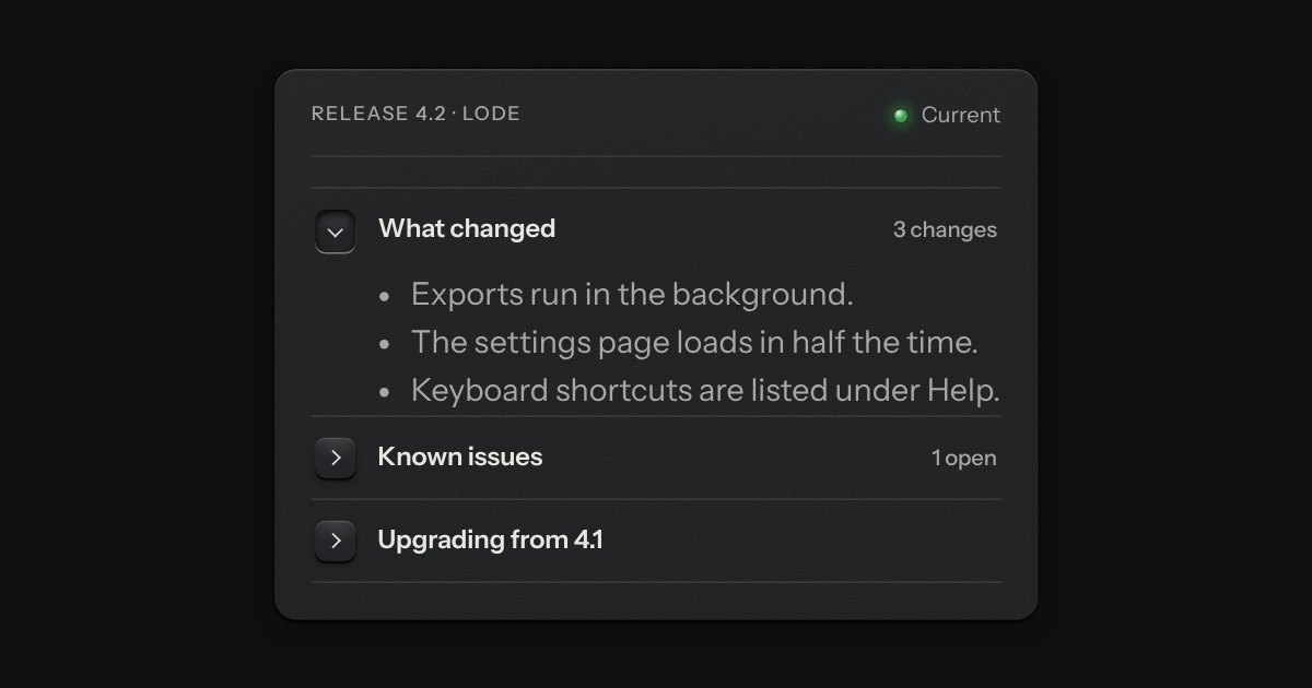
One section that opens in place. A square key sits at the start of its head with a printed chevron; opening latches the key below the plate and turns the chevron down, and the text slides out under the head on a grid row that grows from nothing, so it is never given a height of its own. It is a native details element, so it works with no script.
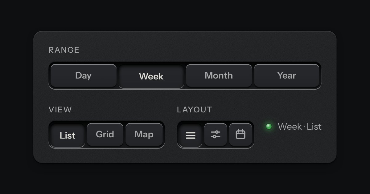
A row of keys in a tray with one pressed down: pick a view, a range or a mode and it applies at once. It is the kit’s selector without the lamps, with sizes, a full-width row and icon segments.
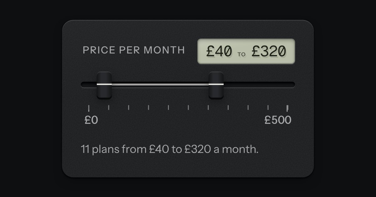
Two fader caps in one slot, for a span between a low value and a high one: a price band, quiet hours, a frequency band. The span between the caps is printed on the slot’s floor and both values read on a small LCD. The caps meet but never pass each other. Underneath are two native range inputs, which post with the form and are what shows without the script.