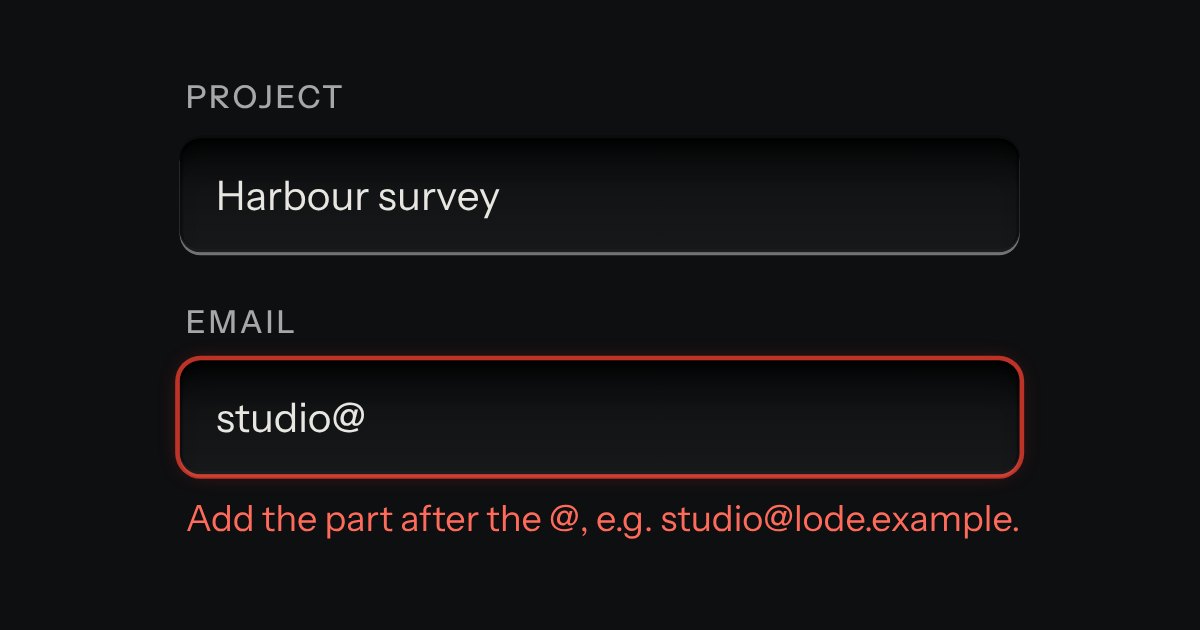
Field
Text entry in a recess, the label printed above it, and a hint that says how to fix an error.
Kit parts
A time of day in the field’s well: hours, minutes and, on a 12 hour clock, AM or PM, each a segment you can type into or step with the arrow keys. A key at the right opens a plain list of times, every few minutes between the earliest and the latest you allow, with the current one in the middle. It posts “HH:MM” on the 24 hour clock whichever clock it shows, says what is wrong in words (empty, half typed, too early, too late, off the step), and works in a native form, with a label, help text, an error, a disabled state and a reset.
Seats open in 11 days. Want one email that morning?
The kit’s well with three plain inputs set in it as figures, the kit’s key at the right and a native popover for the list, so the browser keeps the top layer, light dismiss and Escape. It is a form-associated element: the value, the validity and the reset go through ElementInternals, so a native form, a fieldset and FormData see it as an ordinary field. The list is built the first time it is opened, not before, and only then.
| Name | Kind | Description |
|---|---|---|
| value | attribute · property | The time, on the 24 hour clock. As an attribute it is the default a form reset goes back to; as a property it is the current time, or "" while a segment is empty. The form posts it as "HH:MM". |
| min · max | attribute | The earliest and latest time. They bound the list and the validity: below min and above max are errors with words. |
| step | attribute | |
| hour-cycle | attribute | Which clock to show. Without it the clock is the locale’s. A 12 hour field adds the AM or PM segment; the value is 24 hour either way. |
| locale | attribute | The language of AM and PM and the default clock. Without it the page’s lang, then the browser’s. |
| required · disabled · readonly | attribute | Required is checked with words. Disabled also follows a disabled fieldset. Read only keeps the segments readable and focusable and turns off every way of changing them. |
| error | attribute | Your own error, such as a server’s. It is shown with a red lamp, the well is ringed red, and it clears when the time is edited. |
| data-no-list | attribute | Leaves out the key and the list. |
| input · change | event | input as the value changes. change when it is committed: a step key, a finished segment, a pick from the list, or the focus leaving. |
| showList() · hideList() · focus() | method | Open or close the list, or put the focus on the hours. |
| timeParse() · timeFormat() · timeMinutes() · minutesToTime() | function | What was typed (9. |
| timeHourCycle() · timePeriods() · timeTo12() · timeTo24() · timeParts() · timeFromParts() · timeMissing() | function | |
| timeStep() · timeType() · timeSpinText() | function | One key on one segment, a digit typed into one (and whether it is full), and the words a screen reader hears for it. |
| timeOptions() · timeListStep() · timeNearest() · timeTypeahead() | function | The list of times, its step, the row nearest a value and the row a typed query reaches. |
| timeValidity() · timeIncomplete() · timeStepWords() | function | The flag and the words for what is wrong with a time: empty, half typed, too early, too late or off the step. |
On the 12 hour field press A or P. Press the clock key (or Alt and Down) for the list, then type a time, use the arrow keys and press Enter. Escape puts you back on the key.
Text entry in a recess, the label printed above it, and a hint that says how to fix an error.
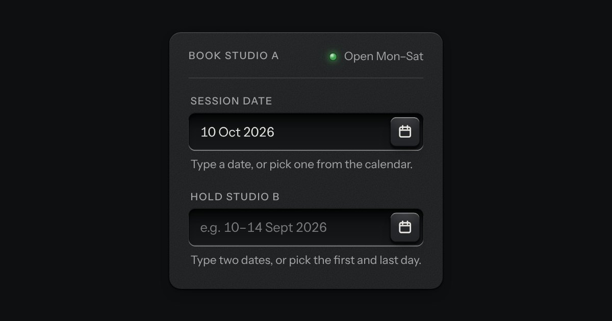
A date field with its calendar card in a slot underneath: type a date in any common form for your locale, or press the key and the card slides out. Single dates and ranges; shown the Intl way, posted as ISO.
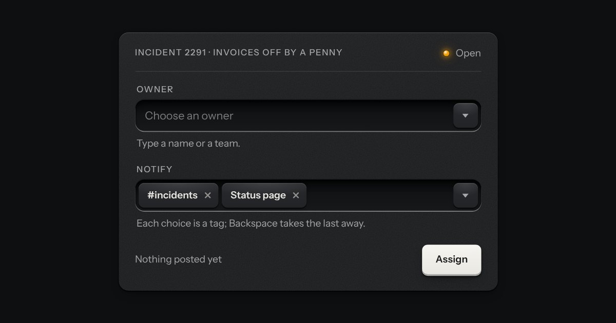
A field that filters a long list as you type. It starts as a plain select, so it posts with the form and works without a script; then the options card slides out of a slot under the well, the letters that match print heavier and the chosen option’s lamp is lit. Several choices sit in the well as tags.
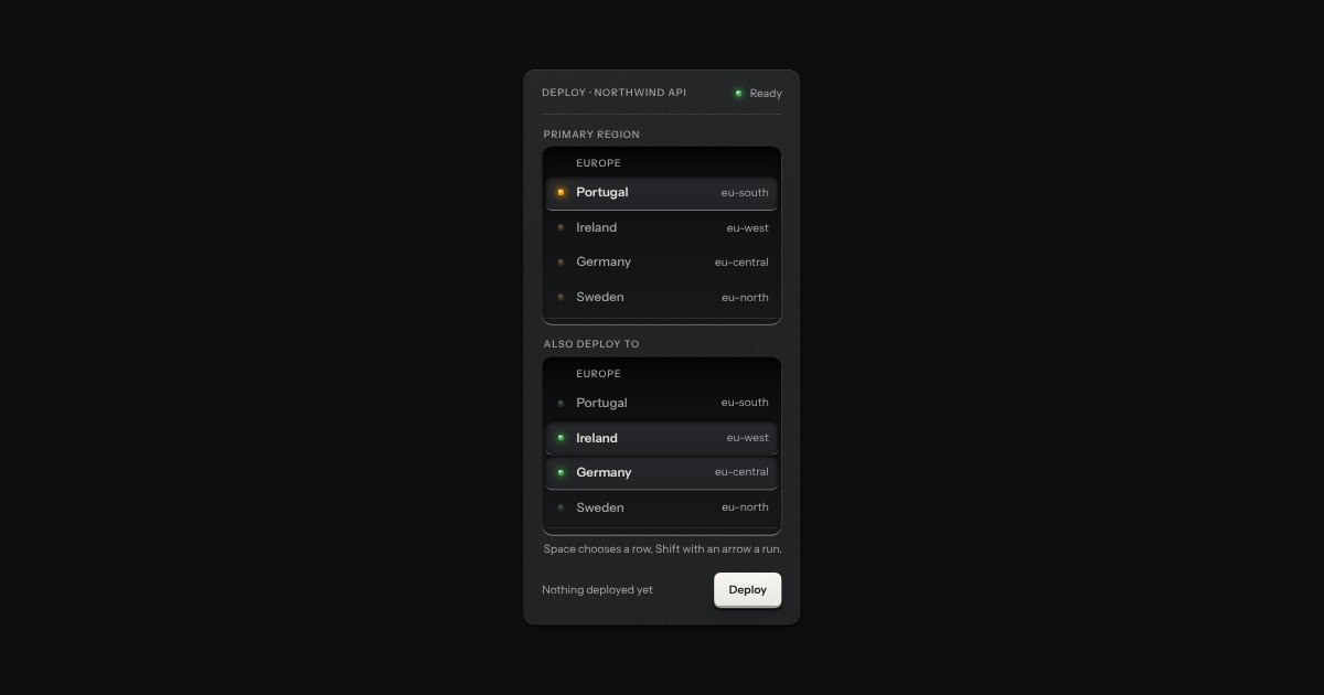
An always-open list let into the plate as a recess. The rows are printed on its floor and a chosen row is a cap let down into it with its lamp lit. One row may be chosen, or several; typing a few letters finds the next row that starts with them. It starts as a native select with a size, so it posts with the form and works without a script.