Radio
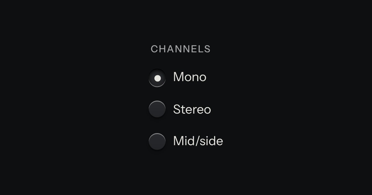
One choice from a short list in a form: small round keys in a fieldset, the chosen one pressed with a printed dot.
Kit parts
One mode of two to five: latching keys in a tray, one down at a time, each with a lamp that lights when chosen.
Seats open in 11 days. Want one email that morning?
The tray is the kit’s recess. No script.
| Name | Kind | Description |
|---|---|---|
| aria-label | attribute | Names the group, since there is no legend. |
| input[type=radio] + span | markup | The radio is visually hidden but real; the span is the key. |
| checked | attribute | The chosen key is latched below the plate and its amber lamp lights. |
| change | event | Native, on the radio that became checked. |
| Arrows | keyboard | Native radio behaviour: arrows move the choice and the focus together. |
Click a band, or Tab in and use the arrow keys. One key stays down.
One choice from a short list in a form: small round keys in a fieldset, the chosen one pressed with a printed dot.
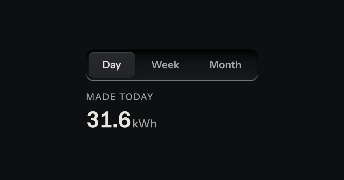
Views of the same thing, switched in place: keys in a tray, the chosen view a raised cap.
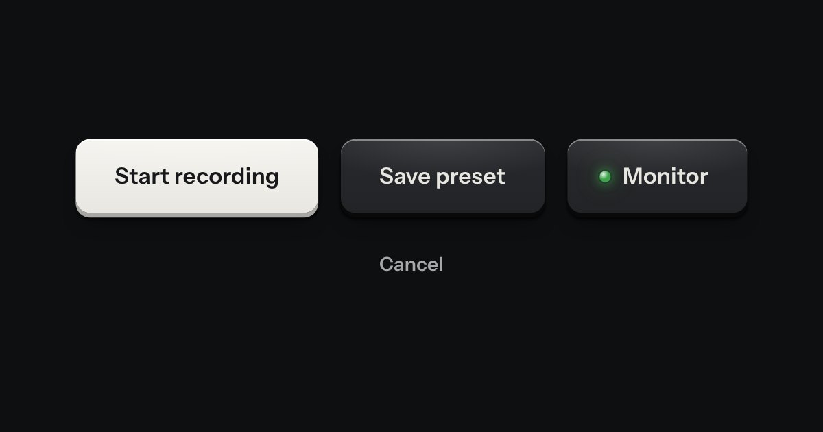
Every button, and every link that acts like one: a cap on a skirt that drops below the plate when pressed.