Menu
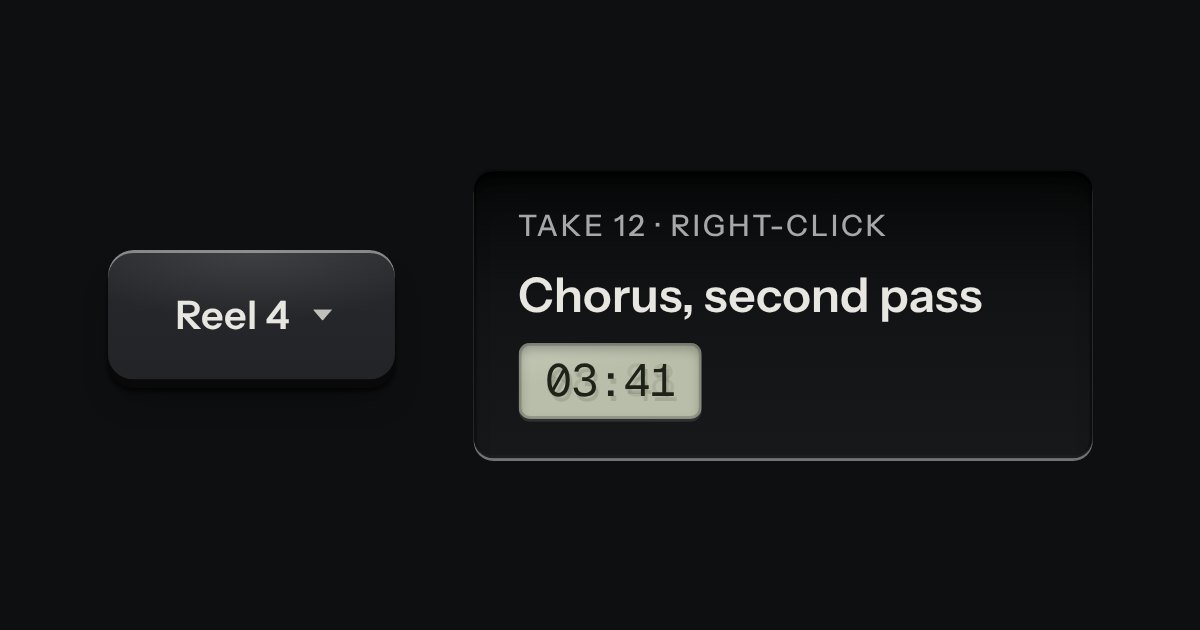
A card of actions and options that slides out from under its key. The key stays down while the card is out; an option that is on lights its lamp.
Kit parts
A card hung from the key that opened it, with a printed leader running back to the key. Not modal: the page stays live around it.
Seats open in 11 days. Want one email that morning?
Opening and closing are the browser’s. The arithmetic is a pure function with its own tests.
| Name | Kind | Description |
|---|---|---|
| popover | attribute | Top layer, light dismiss, Escape. Leave it off for a card that sits in the page. |
| popovertarget | attribute | Native: the key opens and closes the card; the browser links them for assistive tech. |
| data-side | attribute | Where the card prefers to hang. It flips to the opposite side when there is no room. |
| data-align | attribute | Where along that side. |
| aria-labelledby | attribute | For a card with keys or fields in it. |
| data-placed | attribute | The side it was placed on; the leader and the slide follow it. |
| placePopover(card, anchor, options) | function | Place any fixed card beside an element or a point; the menu and the notification centre use it. |
| Enter · Space · Escape · Tab | keyboard | Open and close from the key; Escape closes and returns focus; Tab walks into the card after the key. |
Open either card with a click, Enter or Space. Tab goes into it; Escape or a click outside puts it away and focus returns to the key.
A card of actions and options that slides out from under its key. The key stays down while the card is out; an option that is on lights its lamp.
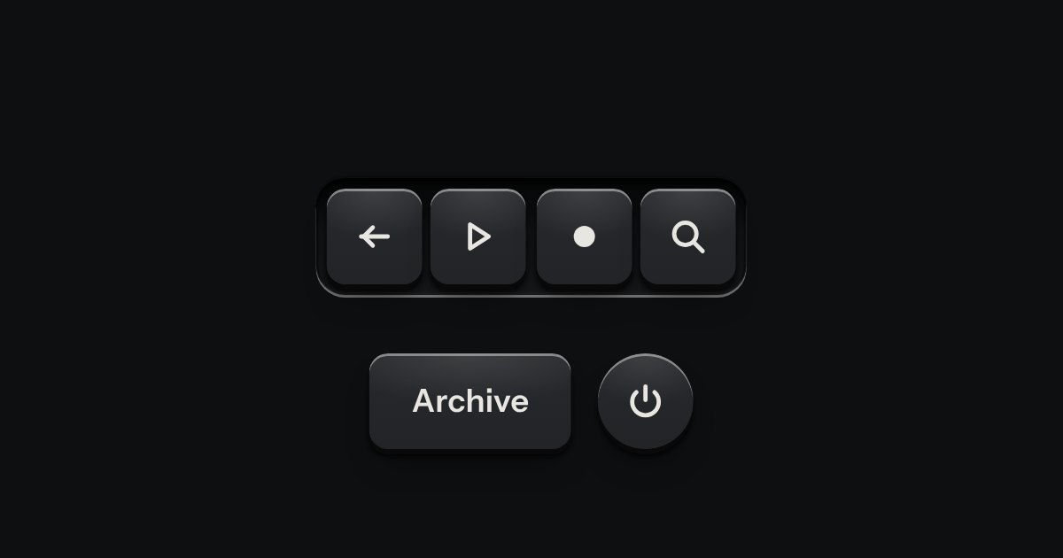
A few words on a small label plate, the kind riveted beside a control on a rack: printed in the contrast colours with a rule just inside its edge and a short tab aimed at its key. It comes up when a pointer rests on the key or the keyboard reaches it, is read by a screen reader, and goes on Escape.
A decision that must be made now: a native dialog with a question, one sentence of consequence, a way back and the act.