Tray
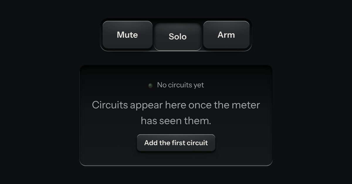
A recess cut into the plate that holds other parts: keys, a selector, an empty state waiting for its first thing.
Kit part · Cards & panels
A face plate that groups what belongs together: a head, a rule, then the parts. Screws only on device-like panels.
Seats open in 11 days. Want one email that morning?
A face plate. 20px in, 12px corners.
Receiver
24px in, four slotted screws.
Both finishes, side by side. Hover, pressed and focus are forced with .is-hover, .is-down and .is-focus; checked and disabled are real.
Aluminium
| Part | Face | Head | Screws |
|---|---|---|---|
| Surface | Head |
Graphite
| Part | Face | Head | Screws |
|---|---|---|---|
| Surface | Head |
| Name | Kind | Values | What it does |
|---|---|---|---|
| .tui-panel | class | A face plate: --tui-face, 20px padding, 12px radius, the raised light and the bead-blast grain. | |
| .tui-panel--screws | class | Four slotted screws in the corners and 24px padding. For device-like panels only. | |
| .tui-panel__head | class | A row: label on the left (it grows), a status or one small key on the right, a hairline rule under it. | |
| .tui-rule | class | <hr> | A printed hairline between groups on one plate. |
| --tui-grain | CSS property | 0.5 · 0.35 | Opacity of the bead-blast texture. Set by the finish; do not remove it to “clean up”. |
| --tui-noise, --tui-screw | CSS property | SVG data URI | The grain and the screw, as images the panel draws. Read-only. |
<div class="tui-panel">
  <div class="tui-panel__head">
    <span class="tui-label">Output stage</span>
    <span class="tui-status"><span class="tui-lamp" data-on></span>Running</span>
  </div>
  <div class="tui-tray">
    <button class="tui-key">Mute</button>
    <button class="tui-key">Solo</button>
  </div>
</div>
Needs kit.css only, no script. How to install the kit.
role="region" and an aria-label.tui-label class.The face is --tui-face with a ::before carrying an SVG fractal-noise texture at --tui-grain opacity (the bead-blast) and the shared raised light: a one-pixel catch light on the top edge and two soft shadows falling down. The screws are one inline SVG, repeated four times in an ::after, every slot turned the same way. No bitmaps; the noise and the screw are SVG data URIs.
One level of panels: a panel holds trays and parts, never another panel.
4 rules in this file, with the foundations they rest on and the anti-patterns that break them. Full rules ship in the brain with the Pass.
A recess cut into the plate that holds other parts: keys, a selector, an empty state waiting for its first thing.
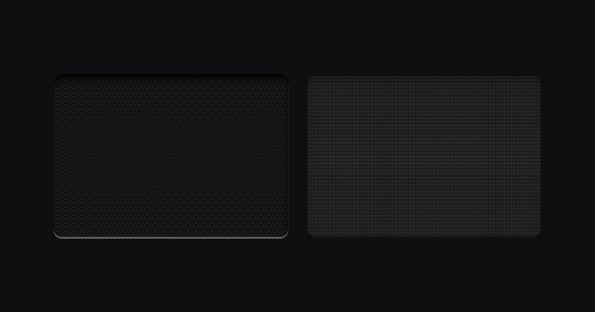
Perforated metal and speaker cloth, for the place where a real device would breathe or sound.
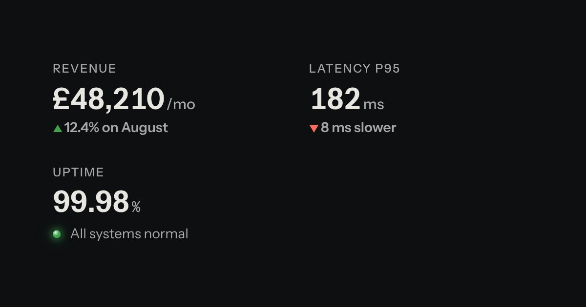
A printed label over a value: key figures, with the unit small and the change in words.