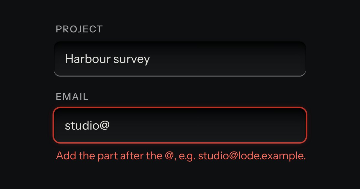
Field
Text entry in a recess, the label printed above it, and a hint that says how to fix an error.
Kit parts
A form field for choosing a colour. A plane sets saturation across and brightness up, a strip sets hue and, if you ask for it, a second strip sets opacity. Under them are a hex field that takes #rgb, #rrggbb and #rrggbbaa with or without the #, red, green and blue number fields, a row of swatches and a preview of the colour you have. The plane and the strips are drawn with gradients and only their thumbs move. The colour being chosen shows in the plane, the strips, the swatches and the preview and nowhere else: the thumbs, the fields and the rings are the kit’s own. It posts a lowercase hex under its name, resets with its form, fails validation when it is required and empty, and works inline in a form or inside a native popover opened by a swatch key.
Seats open in 11 days. Want one email that morning?
The kit’s well for the plane, the strips and the fields, with gradients for the colours: the plane is a pure hue under a white fade from the left and a black fade from below, the hue strip is the hue wheel unrolled, and the opacity strip fades the colour over squares made from two token tones. Only the thumbs move, by transform, placed with container query units, so nothing is measured or reflowed while you drag. The thumb is a hollow ring in two tones so it reads on any colour. The element is form-associated: it sets its own form value, validity, reset and disabled state, and the inputs inside have no names, so only the colour is posted. It uses no canvas, no animation and no storage.
| Name | Kind | Description |
|---|---|---|
| alpha | attribute | The value is then always eight digits. |
| swatches | attribute | The colours on offer. Entries that are not colours are left out. |
| required | attribute | An empty value fails validation (“Choose a colour, or type a hex value.”). Empty the hex field to clear the colour. |
| readonly · disabled | attribute | Read-only shows and reads but changes nothing and still posts. Disabled does not post; a disabled fieldset around it disables it too. |
| error | attribute | An error from outside, such as a server’s. It marks the hex field invalid and prints the message, and clears when the colour is changed. |
| contrast | attribute | |
| eyedropper | attribute | Adds an Eyedropper key that picks a colour from the screen, only where the browser has window.EyeDropper. Otherwise it is left out. |
| Enter | keyboard | Takes the typed colour now, without leaving the field. A bad value is marked and the colour is kept. |
| Enter · Space | keyboard | Picks the colour. Arrows, Home and End move between swatches. |
| value · rgb · hsv | property | The colour. Setting value takes any hex colour, or an empty string to clear it. |
| input · change | event | input with every change; change when one is committed: a key press, the end of a drag, a field left or Enter, a swatch. The events of the fields inside are not passed on. |
| colorParseHex() · colorFormatHex() · colorHsvToRgb() · colorRgbToHsv() · colorClamp() | function | Read and write a hex colour, convert between hue, saturation, brightness and red, green, blue, and hold a number between two others. |
| colorContrast() · colorContrastText() · colorPlaneText() · colorHueText() · colorAlphaText() | function | The contrast ratio of two colours, the readout sentence, and the value text each control speaks. |
Move the hue strip. Type a colour in the hex field and press Enter or leave the field: a bad value is marked and the colour is kept. Press a swatch, then Tab back to the form and press Save zone to see what it posts. Press the Outline key to open the same picker in a popover.
Text entry in a recess, the label printed above it, and a hint that says how to fix an error.
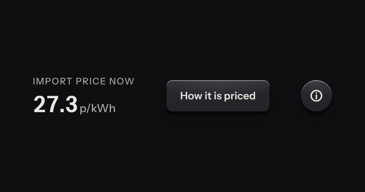
A card hung from the key that opened it, with a printed leader running back to the key. Not modal: the page stays live around it.
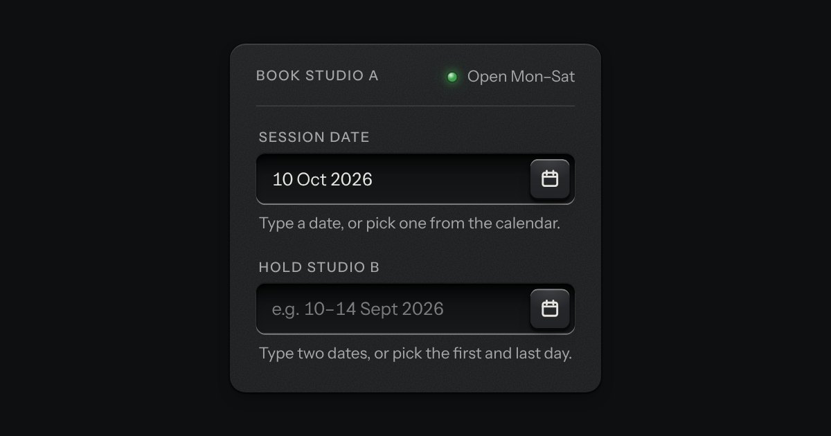
A date field with its calendar card in a slot underneath: type a date in any common form for your locale, or press the key and the card slides out. Single dates and ranges; shown the Intl way, posted as ISO.
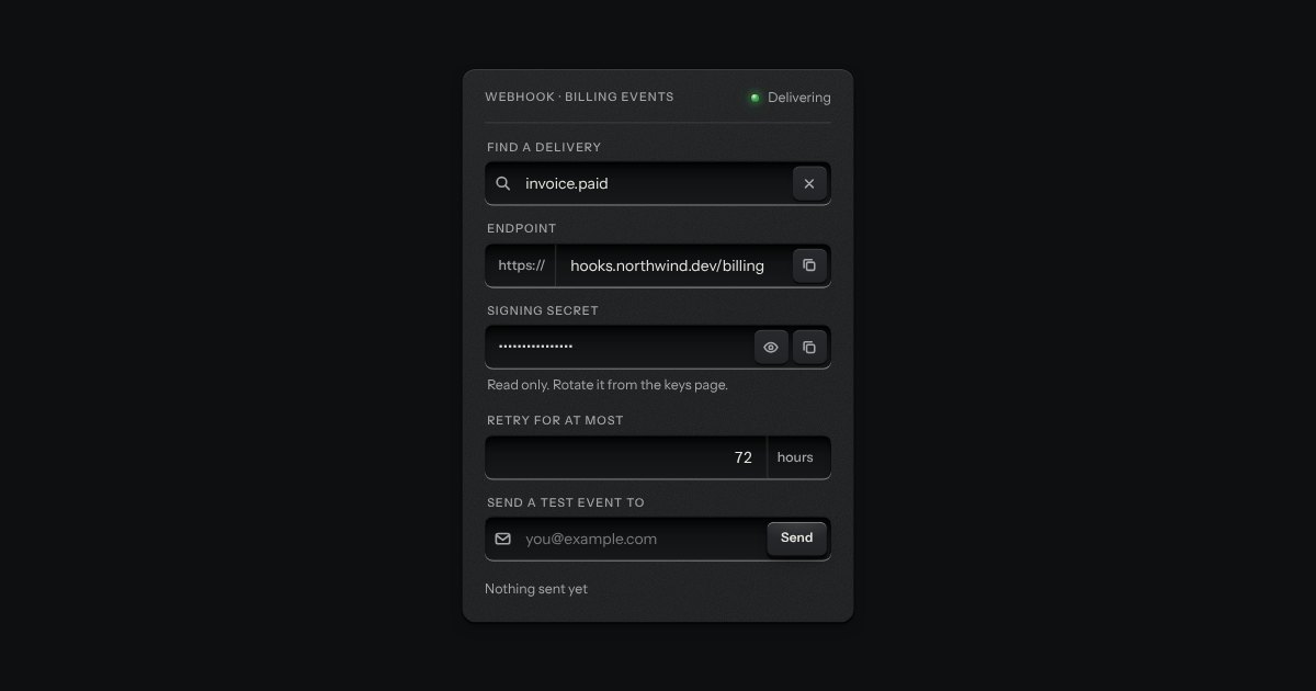
One recess that holds a field and everything that belongs to it. Words that are part of the value but are not typed, such as https:// or a currency, are printed on the floor of the well behind an engraved line; a glyph sits at the start; small keys sit at the end to clear the text, copy it, or show a password.