Check
An option in a form: a small square key that presses below the plate when chosen, with a tick printed on it.
Kit part · Radio groups
One choice from a short list in a form: small round keys in a fieldset, the chosen one pressed with a printed dot.
Seats open in 11 days. Want one email that morning?
Both finishes, side by side. Hover, pressed and focus are forced with .is-hover, .is-down and .is-focus; checked and disabled are real.
Aluminium
| Part | Off | On | Focus |
|---|---|---|---|
| Radio |
Graphite
| Part | Off | On | Focus |
|---|---|---|---|
| Radio |
| Name | Kind | Values | What it does |
|---|---|---|---|
| .tui-radio | class | on <input type="radio"> | An 18px round key. Checked: pressed, with a printed dot. |
| .tui-choice | class | on <label> | The key and its words, 8px apart. |
| name · value · checked | attribute | Native: one name per group; the form posts the checked value. | |
| <fieldset> · <legend> | element | Groups the radios and names the group. | |
| change | event | Native, on the radio that became checked. | |
| Arrows | keyboard | Move the choice within the group. |
<fieldset>
  <legend class="tui-label">Channels</legend>
  <label class="tui-choice"><input type="radio" class="tui-radio" name="ch" value="mono" checked> Mono</label>
  <label class="tui-choice"><input type="radio" class="tui-radio" name="ch" value="stereo"> Stereo</label>
</fieldset>
Needs kit.css only, no script. How to install the kit.
<fieldset> with a <legend>; screen readers then read “Channels, Mono, radio, 1 of 3”.A native radio with appearance: none: the same small skirted key as the check, with a round cap. Chosen, it drops 1.5px under the pressed light and prints a dot, an ::after circle in --tui-ink.
Radios sit under a legend that names the group; past five choices, a select reads better.
3 rules in this file, with the foundations they rest on and the anti-patterns that break them. Full rules ship in the brain with the Pass.
An option in a form: a small square key that presses below the plate when chosen, with a tick printed on it.
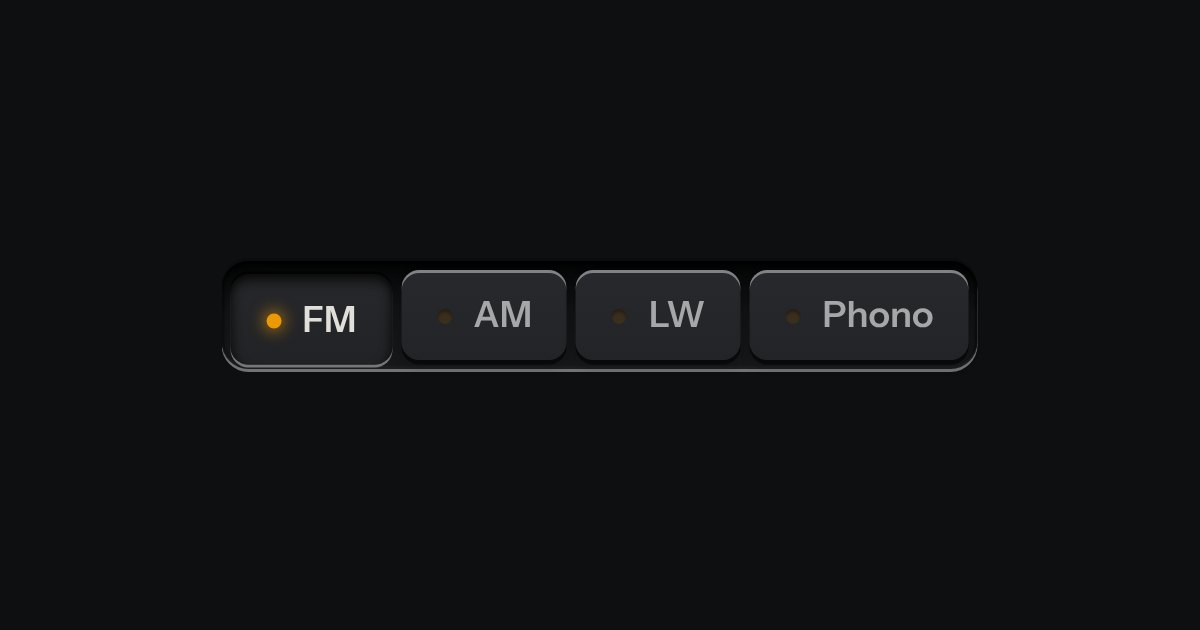
One mode of two to five: latching keys in a tray, one down at a time, each with a lamp that lights when chosen.
A choice from a longer list, in the same recess as a field, with a printed chevron. The browser’s own menu opens it.