Switch
On or off, applied the moment it moves. A native checkbox with a ridged thumb in a slot that lights green when on.
What a settings page is made of: a label, one sentence under it and the control at the end, ruled like the list with a hairline between rows and nothing else drawn. A row with a switch or a check is one label, so pressing anywhere on it turns the control; a row with a key, a select or a value is a plain box, so a press means what the key says.
Seats open in 11 days. Want one email that morning?
Both finishes, side by side. Hover, pressed and focus are forced with .is-hover, .is-down and .is-focus; checked and disabled are real.
Aluminium
| Part | Rest | Hover | Focus | On | Disabled |
|---|---|---|---|---|---|
| Row |
Graphite
| Part | Rest | Hover | Focus | On | Disabled |
|---|---|---|---|---|---|
| Row |
| Name | Kind | Values | What it does |
|---|---|---|---|
| .tui-settings | class | role="group", with an aria-label | The page or the section: rows ruled like a list. Put a .tui-settings__head heading first to print a section name. |
| label.tui-settings__row | element | holds .tui-settings__text and a switch or check | A row that is one control. Pressing anywhere on it turns the switch. Name the input with aria-labelledby on the title and describe it with the sentence. |
| div.tui-settings__row | element | holds .tui-settings__text and a key, select or value | A row that holds a control which does something when pressed. Only the control is pressable. |
| .tui-settings__text > .tui-settings__title + .tui-settings__desc | class | two lines | The label and the one sentence under it. Keep the sentence to what changes when the control is turned. |
| .tui-settings__end · .tui-settings__value | class | at the end of a row | A printed value beside its key: “£12 a seat” and Change. |
| .tui-settings__row--danger | modifier | on the row | The title reads in the error ink, and the key says what it destroys. |
| role="switch" | attribute | on .tui-switch | Makes the checkbox a switch to a screen reader: “Email receipts, switch, on”. |
<div class="tui-settings" role="group" aria-label="Notifications">
  <h3 class="tui-settings__head">Notifications</h3>

  <!-- A switch or a check: the whole row is the label -->
  <label class="tui-settings__row">
    <span class="tui-settings__text">
      <span class="tui-settings__title" id="s1-t">Email receipts</span>
      <span class="tui-settings__desc" id="s1-d">Send a receipt after every payment.</span>
    </span>
    <input class="tui-switch" type="checkbox" role="switch" aria-labelledby="s1-t" aria-describedby="s1-d" checked>
  </label>

  <!-- A key, a select or a value: a plain box -->
  <div class="tui-settings__row">
    <span class="tui-settings__text">
      <span class="tui-settings__title">Two-step sign-in</span>
      <span class="tui-settings__desc">Ask for a code from your phone.</span>
    </span>
    <button class="tui-key tui-key--sm" type="button">Set up</button>
  </div>
</div>
Needs kit.css only, no script. How to install the kit.
<label>, so the whole row is the target and the pointer, a finger and a switch-access device all reach it; on a phone the row is at least 64px tall.aria-labelledby and described by the sentence with aria-describedby, so it reads “Email receipts, switch, on, Send a receipt after every payment” and not the title and sentence run together as a name.The list already knows how to be a rack of rows with hairlines between them, so the settings row borrows its rule exactly: a one-pixel line, inset to the words, that vanishes under the row the pointer is on. The controls are the kit’s own, a switch, a check, a key and a select, set in the row’s end with auto margin. The row is a flex box that wraps, so on a narrow screen a wide control drops under its words instead of squeezing them.
Lay out a settings page as rows that say what each setting does in a sentence, with the control where the eye ends up, and a whole row to press.
6 rules in this file, with the foundations they rest on and the anti-patterns that break them. Full rules ship in the brain with the Pass.
On or off, applied the moment it moves. A native checkbox with a ridged thumb in a slot that lights green when on.
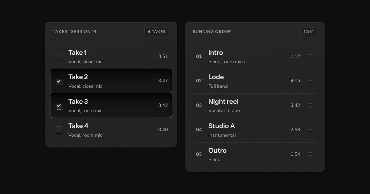
Rows in a rack: a mark, a title, a second line and a fact or a key at the end. Chosen rows sink into a recess with their check key latched; in a running order, a row lifts out of the rack on its skirt and slides past the others, from the keyboard or by its grip.
An option in a form: a small square key that presses below the plate when chosen, with a tick printed on it.
Text entry in a recess, the label printed above it, and a hint that says how to fix an error.