The bar that slides up when rows are checked. It says how many are chosen, offers the actions that apply to all of them (Archive, Assign, Delete) and a Clear key, and goes away again when none are. It follows a data table through the table’s own selection event, so the two share nothing but an id. The slide is a transform and nothing else, and under reduced motion the bar simply appears.
Seats open in 11 days. Want one email that morning?
Anatomy
The data table’s own plate, lifted off the table: the same face, the same lit lamp for “something is chosen”, the kit’s small keys. It rides at the foot of the table (sticky) and moves by transform alone.
Variants
Open · three chosen
Open · one chosen
Narrow · the count takes its own line
States
Shut
Open
Key in focus
Delete
Props and options
Name
Kind
Description
button[data-bulk]
element
An action.
button[data-bulk-clear]
element
Let every row go (the table’s clear()), shut the bar and put the focus back in the table. Escape inside the bar does the same.
setBulkBar(bar, n)
function
Open the bar for n rows or shut it for none, for a table that is not a data table. The count is said a moment after it settles.
bulkBarHTML() · bulkText() · bulkSays()
function
The markup, “3 bookings selected”, and the sentence said when the count settles.
Usage notes
Check one or more rows: the bar slides up from the foot of the table and says how many are chosen. Tab from the table into the bar, press an action, or press Clear (or Escape) to let the rows go and return to the table.
Accessibility
The bar is a named region that follows the table in the tab order, so a keyboard user checks rows, presses Tab and arrives at the actions.
The count is text (“3 bookings selected”) with a lamp beside it, and is said once, politely, a moment after it stops changing, with the actions that are available: “3 bookings selected. Actions: Archive, Assign, Delete.” Clearing says “Selection cleared.”
Delete is a key like the others, set apart by its red-lit text and its word, not by position or a colour alone. The action keys name what they do; nothing here acts on a press of a row.
Escape inside the bar and Clear both let the rows go and return the focus to the table, so the focus never lands on something that has just gone away.
The slide is a movement of the bar up from below its place, nothing else; under reduced motion it appears and goes at once.
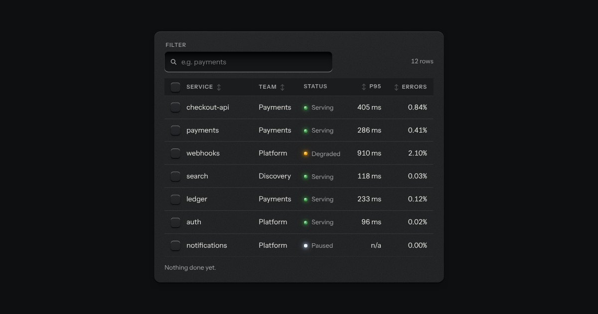
The kit’s table with the tools a working one needs: headers that sort, a filter well, a check key on every row with one in the header that selects them all and sinks half way when only some are chosen, and a header that stays at the top while the rows scroll under it. While rows are chosen a plate slides out of a slot under the tools, its lamp lit, carrying what can be done to them. Without the script it is the plain table.
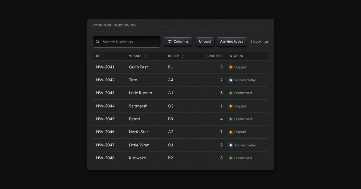
The strip over a table: a search well, filter keys that latch, a menu to choose which columns show, and the count of rows in view (“8 of 8 bookings”). It drives a data table or a data grid through the methods and events they share, so the table and its toolbar stay two parts. It tells the page about every change too, for a table that asks a server.
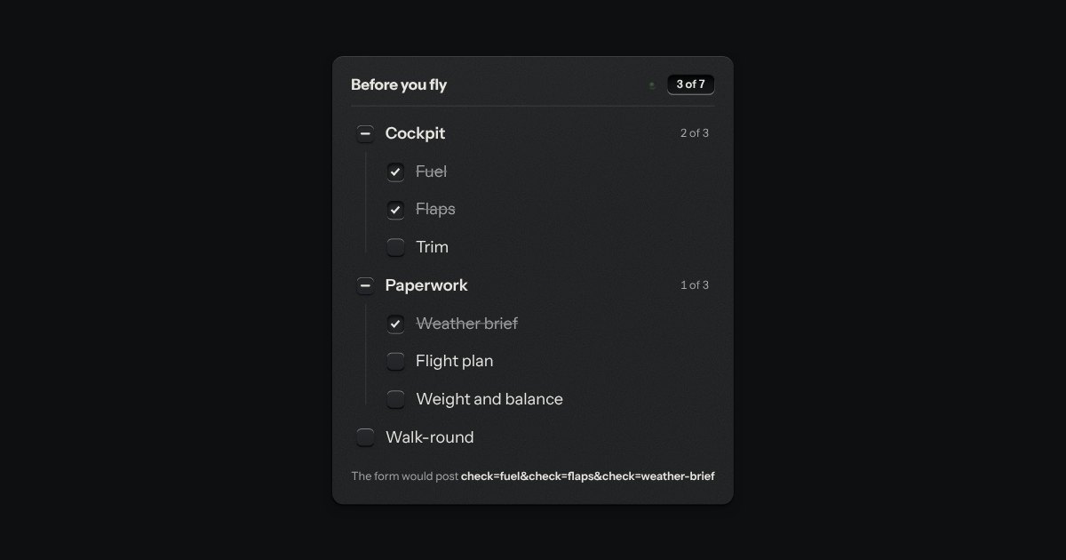
The kit’s check keys in nested groups. A group’s key is the sum of its items: all done, none, or some, and some is a key sunk halfway with a bar across it. The head counts the items, “3 of 7”, and its lamp lights when they are all done.