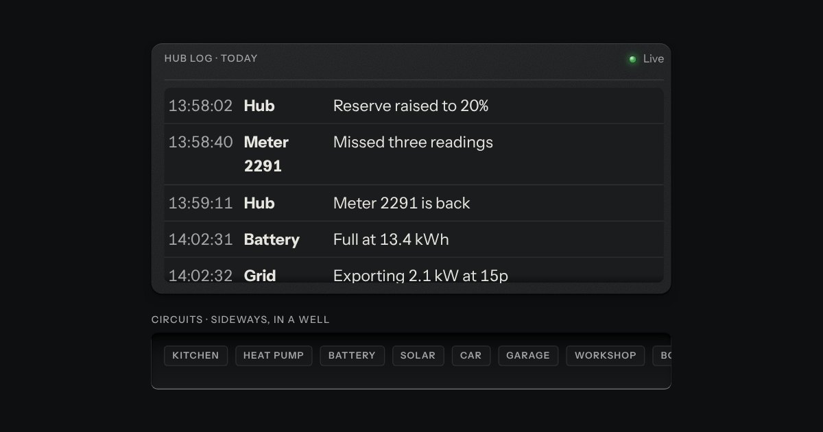
Scroll area
A region that scrolls, with its scrollbar made as a machined rail: a groove cut into the plate and a thumb like a fader cap riding in it. Scrolling itself is the browser’s own.
Kit parts
Two panes and a groove cut across the plate between them, with a knurled grip set in the groove. Drag the grip with a mouse, a pen or a finger, or give it focus and use the keys; Enter folds the first pane away and brings it back. Side by side or one over the other, each pane keeps the least room you give it.
Seats open in 11 days. Want one email that morning?
The box is a grid of three tracks. The groove is a pseudo-element cut in with the well tokens; the grip is a small cap with its ridges drawn as a repeating gradient, lit on its top and left edges and shadowed down and right; held, it sinks under the plate. Pointer capture keeps a drag on the divider wherever the pointer goes, and while it is held the panes take no pointer events, so a frame inside one cannot catch the drag.
| Name | Kind | Description |
|---|---|---|
| label | attribute | What the panes are, for the divider’s name: “Files and preview” is read as “Resize files and preview”. |
| value | attribute | The first pane’s share of the box to start with. |
| min · max | attribute | The least and the most the first pane may take. |
| min-start · min-end | attribute | The least room each pane keeps however small the box. These win over min and max when they cannot all hold. |
| orientation | attribute | Side by side, the default, or one over the other. |
| step | attribute | How far one arrow press moves it; Shift moves four steps. |
| collapse | attribute | Which pane Enter folds away: the first, by default, or the second. |
| splitClamp · splitKey · splitToggle | function | The rules, pure: a share every limit allows, what a key does, and folding and unfolding. |
Drag the grip, or press Tab to reach it and use the arrows; Shift moves four times as far. Home and End go to the least and the most each pane allows. Enter folds the file list away and brings it back, and so does a double click.
A region that scrolls, with its scrollbar made as a machined rail: a groove cut into the plate and a thumb like a fader cap riding in it. Scrolling itself is the browser’s own.
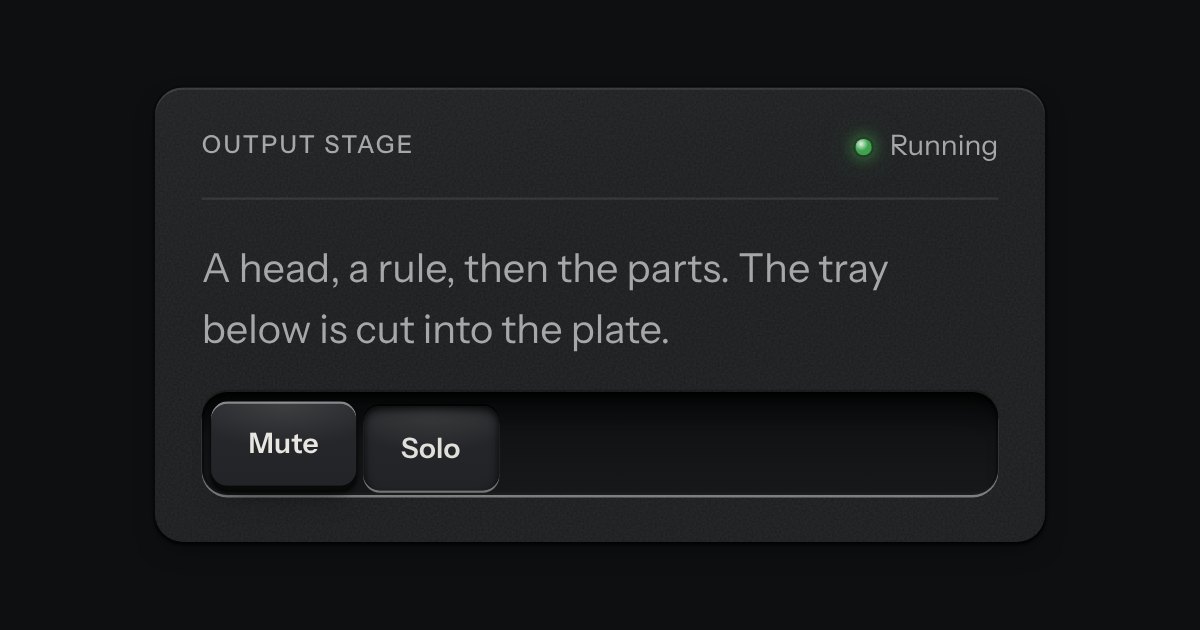
A face plate that groups what belongs together: a head, a rule, then the parts. Screws only on device-like panels.
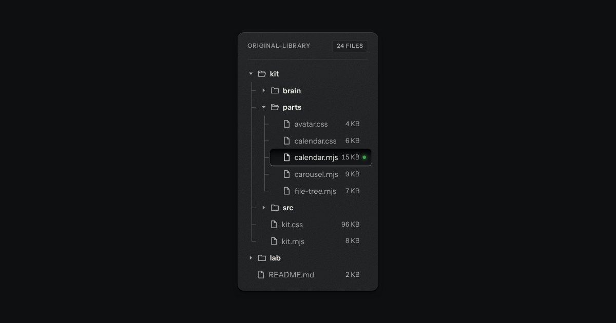
Folders and files as a real tree, printed like a wiring diagram: traces with an elbow into every item, chevrons that turn, and the chosen file set in a recess with its lamp lit. Written as a plain nested list.