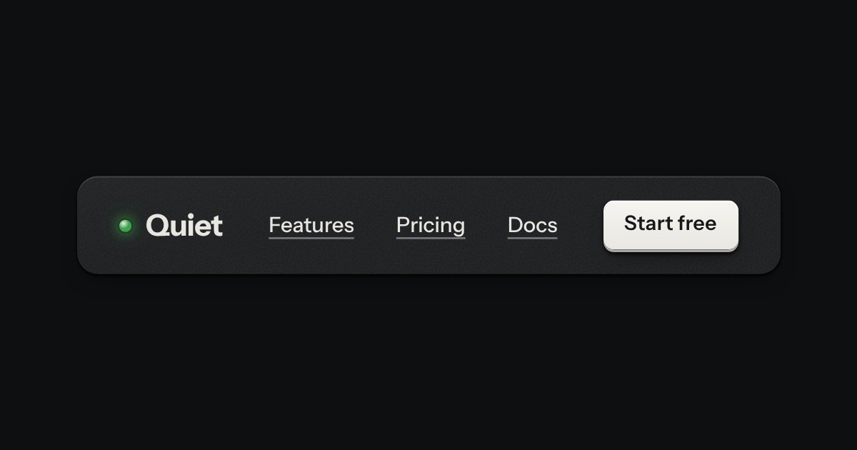
Bar
The top of a page: a wordmark with a lamp, printed links, and one contrast key at most.
Templates
A personal budgeting app for an everyday screen, on a Quiet page: left to spend this month and a day, a meter for each category that turns amber near its limit and red past it, in words as well as colour, a searchable list of transactions grouped by day with a side panel to change a category, three accounts with when they were last read, and a few settings. On a phone it becomes a tab bar and bottom sheets. Loading, empty, error and bank-paused states included.
The top of a page: a wordmark with a lamp, printed links, and one contrast key at most.
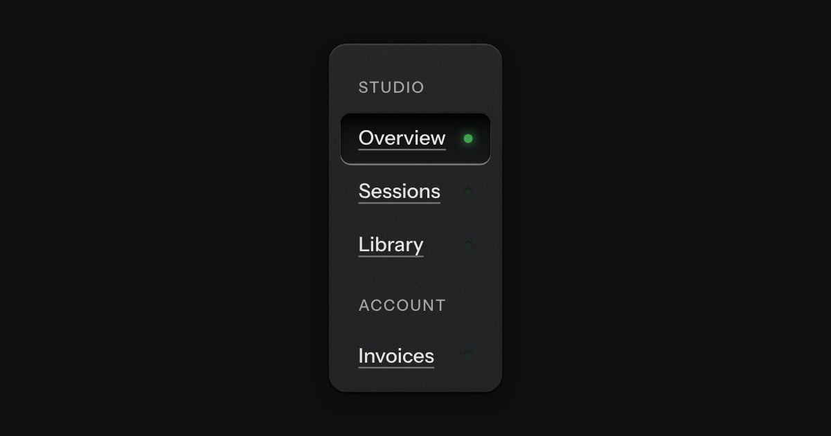
App navigation in a panel: the current page is a recess with its lamp lit, links grouped under printed labels.
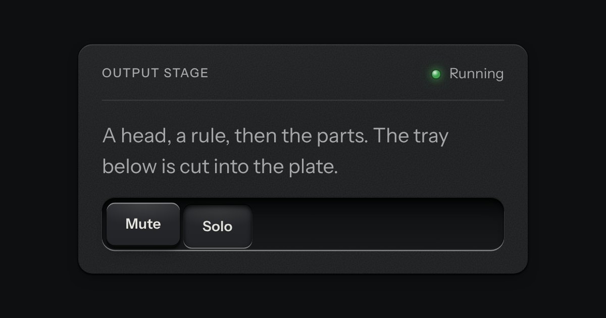
A face plate that groups what belongs together: a head, a rule, then the parts. Screws only on device-like panels.
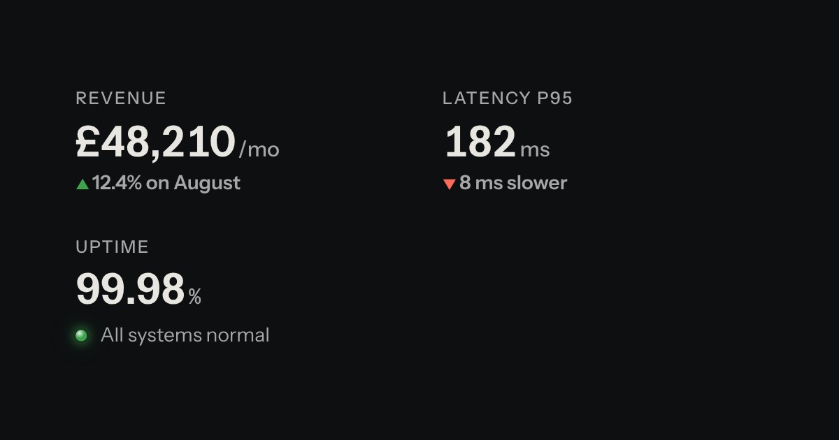
A printed label over a value: key figures, with the unit small and the change in words.
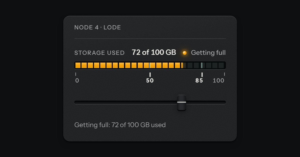
A value inside a known range, read off an LED strip. The strip is a native meter element, so low, high and optimum are the browser’s own: the whole lit length takes the colour of where the value stands (green in the good region, amber next to it, red beyond), not the colour of the segment it has reached. The marks under the strip print where the regions begin, and cut lines across it show the same two places. Words say the state too.
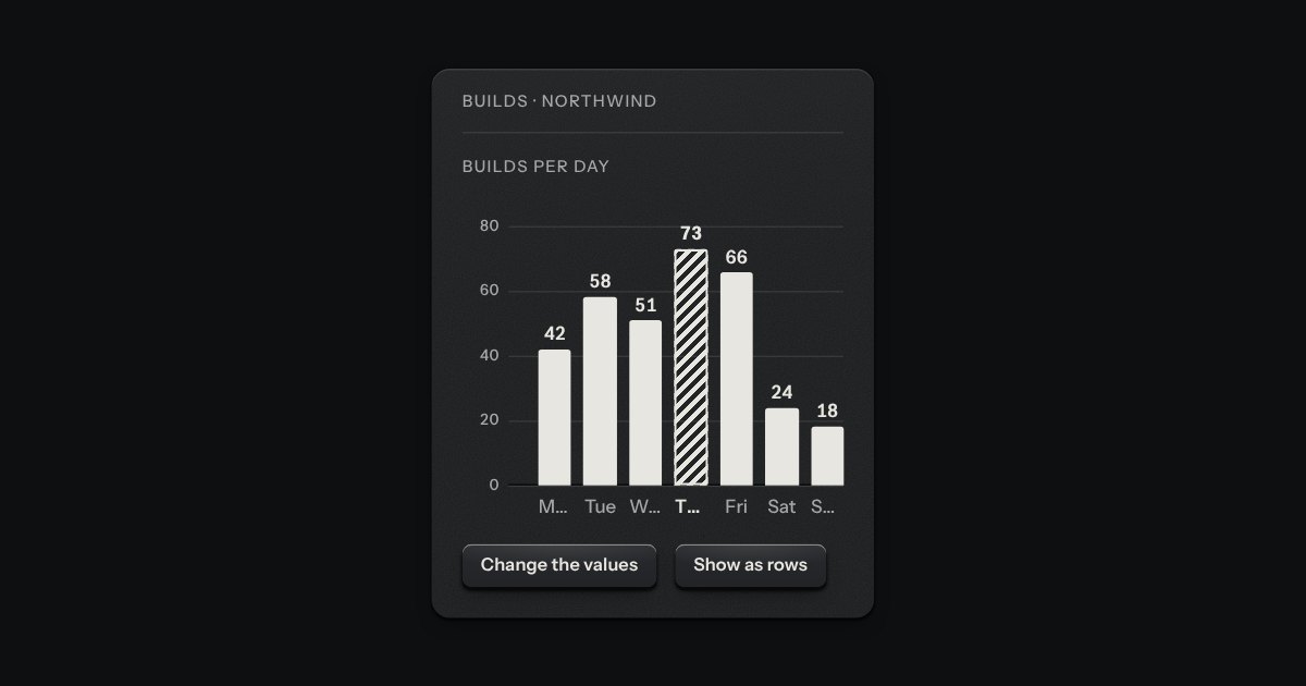
Printed bars on the panel, one value each. The bars are ink laid flat on the plate, never a colour and never glass; the axis is engraved into it, a groove along the zero line with the light on its lower lip and a faint rule at each tick. Columns by default, rows when the labels are long, and on display glass the ink is the display’s light.
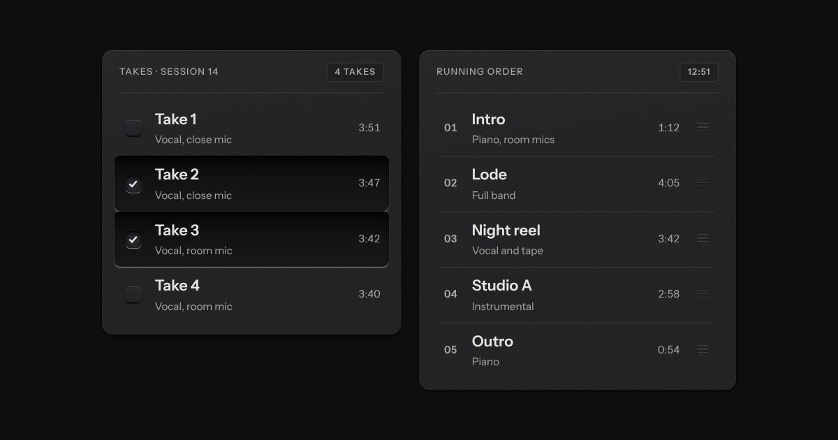
Rows in a rack: a mark, a title, a second line and a fact or a key at the end. Chosen rows sink into a recess with their check key latched; in a running order, a row lifts out of the rack on its skirt and slides past the others, from the keyboard or by its grip.
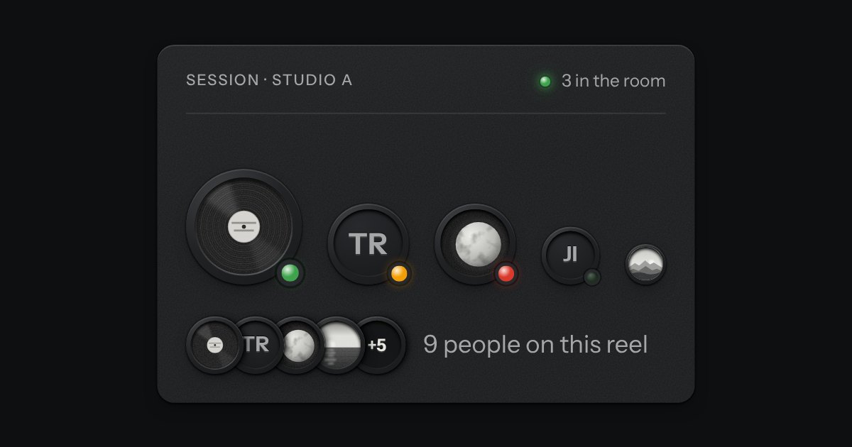
A person’s mark, struck like a coin: initials stamped into the field, or a photo set under the rim, with a status lamp mounted at five o’clock. Stacks into a group with a count.
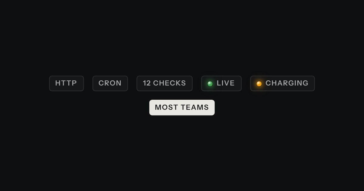
A small printed plate: a type, a count, a badge. Solid for the one tag that must stand out.
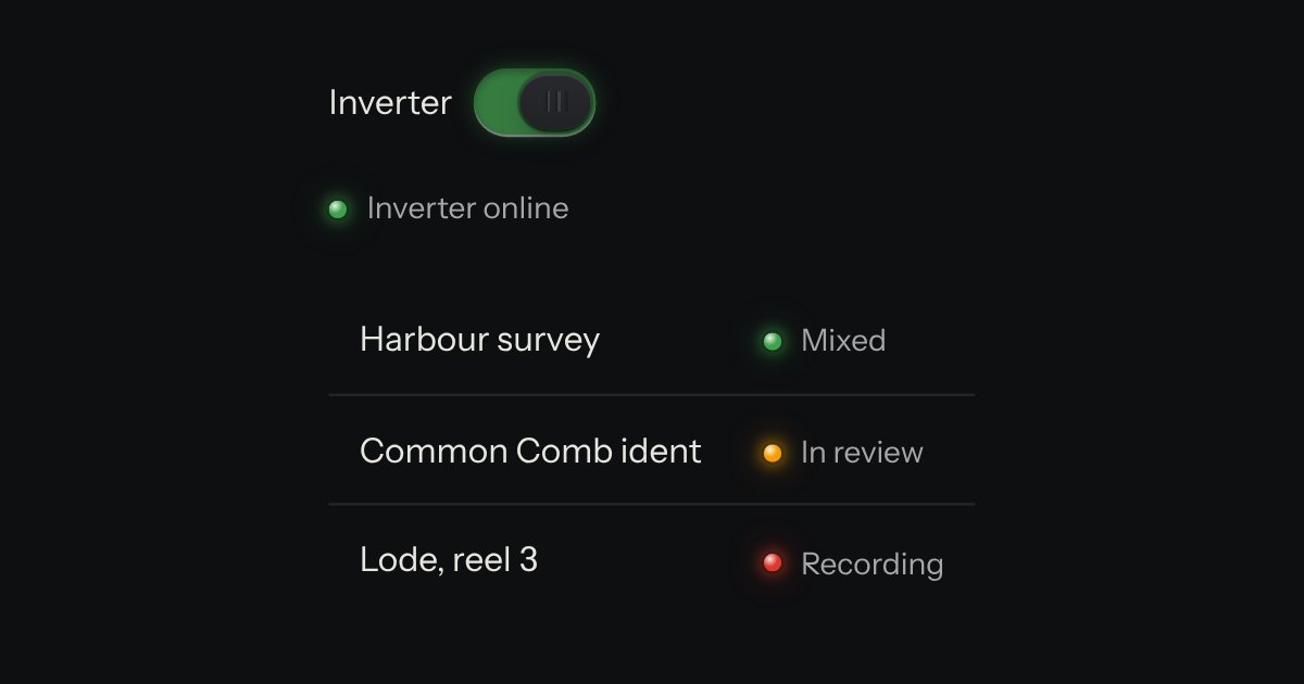
A lamp with words: the state line in tables, panel heads and lists. The words carry the meaning; the lamp is the glance.
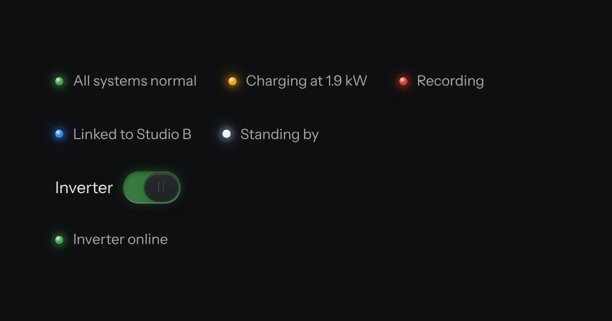
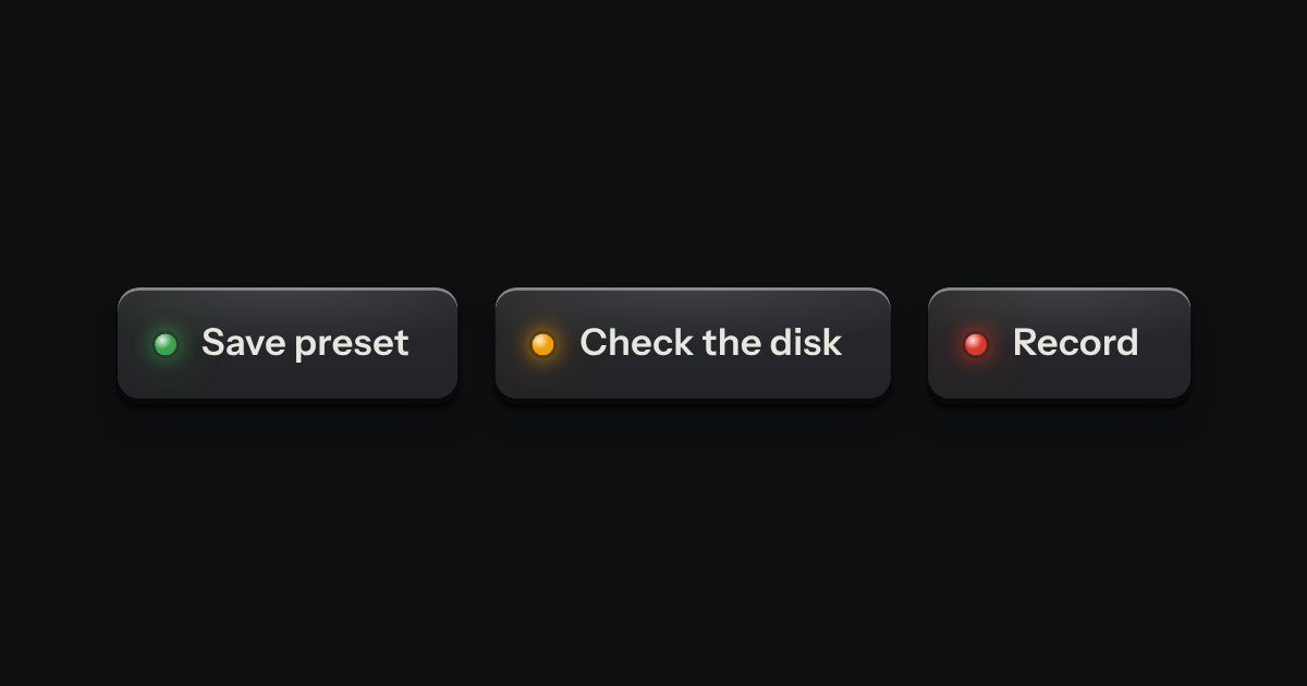
The only colour in the kit: a lamp that is on. Green is on, amber is waiting, red is recording or failing, blue is linked, white is standing by. Always next to words.
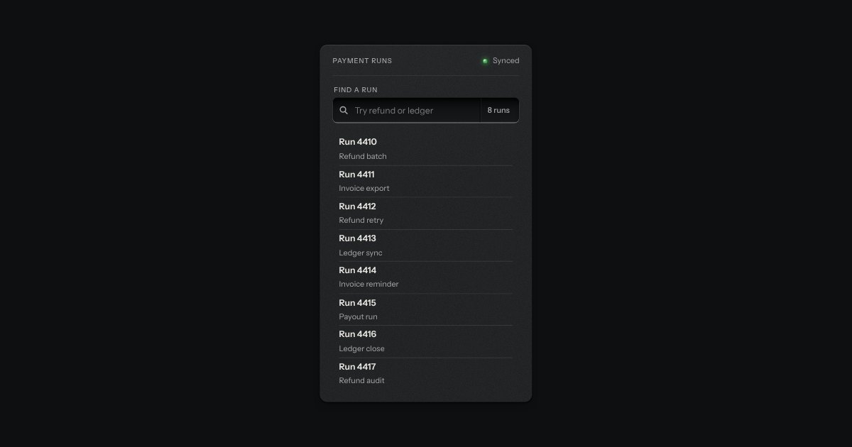
A recess for a question. A glass is printed on its floor at the start, the words run on, an optional count is printed behind an engraved line, and a clear key sits in the far corner while there is something to clear. Escape empties it.
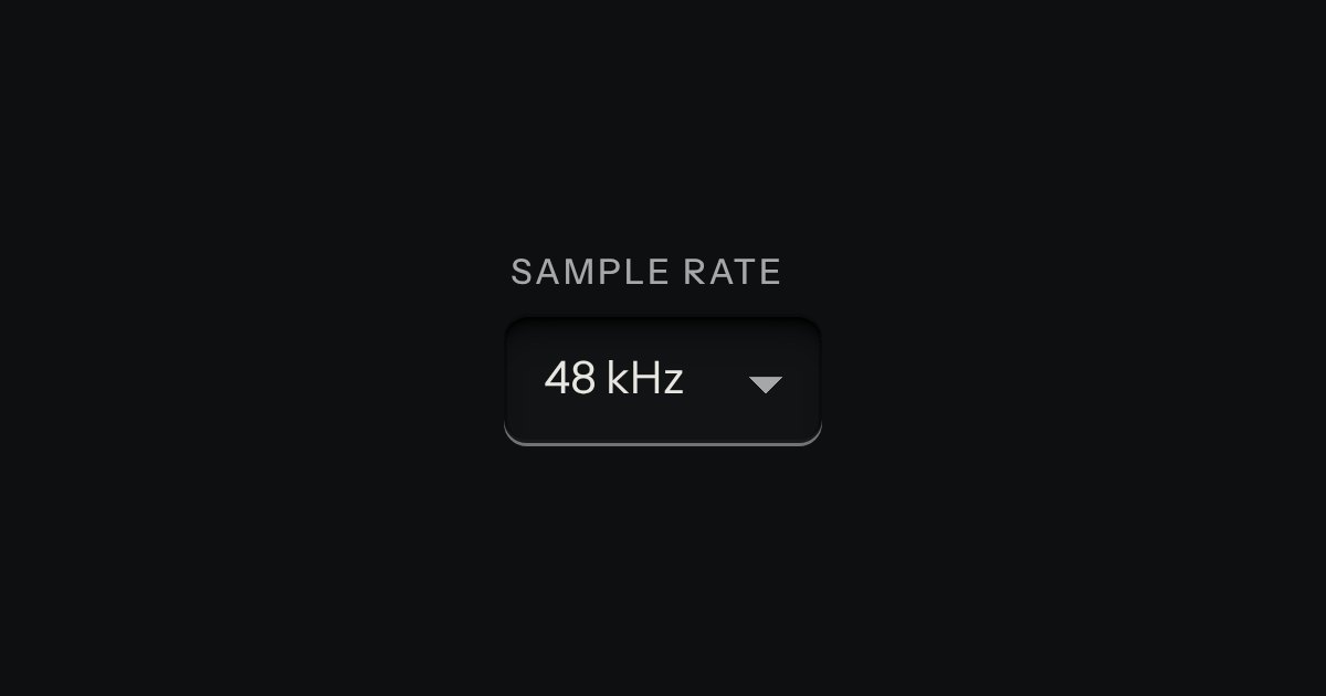
A choice from a longer list, in the same recess as a field, with a printed chevron. The browser’s own menu opens it.
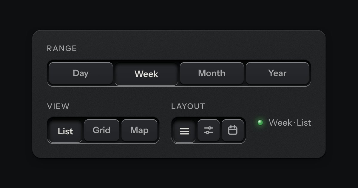
A row of keys in a tray with one pressed down: pick a view, a range or a mode and it applies at once. It is the kit’s selector without the lamps, with sizes, a full-width row and icon segments.
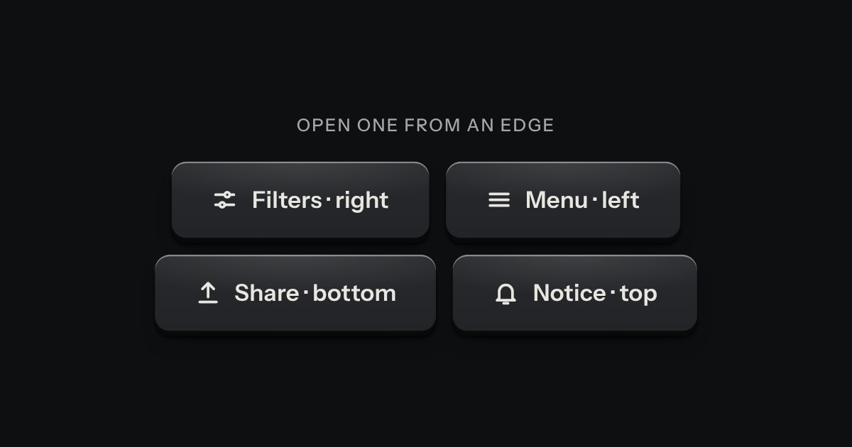
A panel that slides in from any edge of the window, on the native dialog. A face plate bolted to the frame, with a machined grip let into its inner edge to pull it shut by.
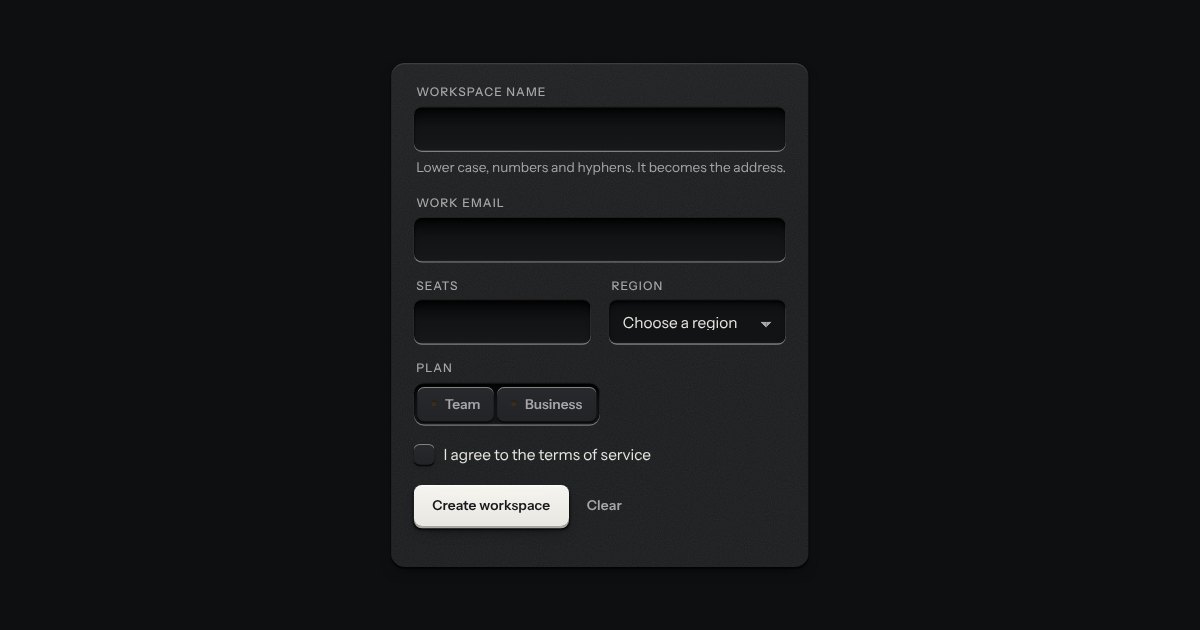
A form that says what is wrong, on the browser’s own checks. Press submit with something missing and each field in error gets a line under it with a red lamp lit and words that say how to put it right, its well ringed red; at the top of the form an annunciator lights over a count and a list that links to each field, and takes the focus. From then on each field is checked again as it changes.
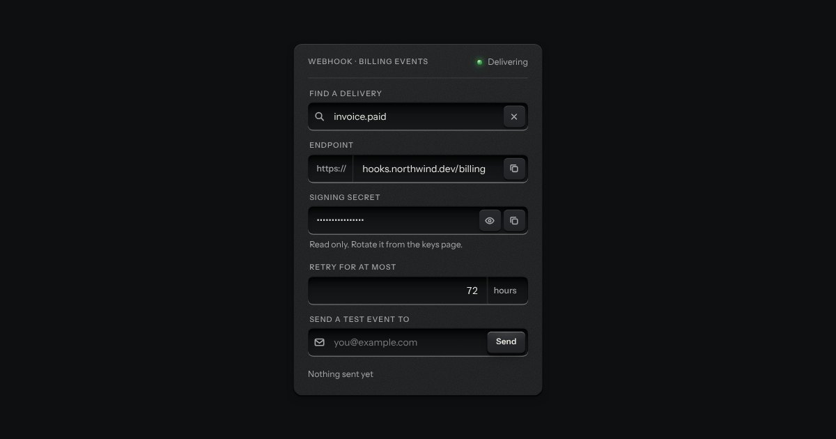
One recess that holds a field and everything that belongs to it. Words that are part of the value but are not typed, such as https:// or a currency, are printed on the floor of the well behind an engraved line; a glyph sits at the start; small keys sit at the end to clear the text, copy it, or show a password.
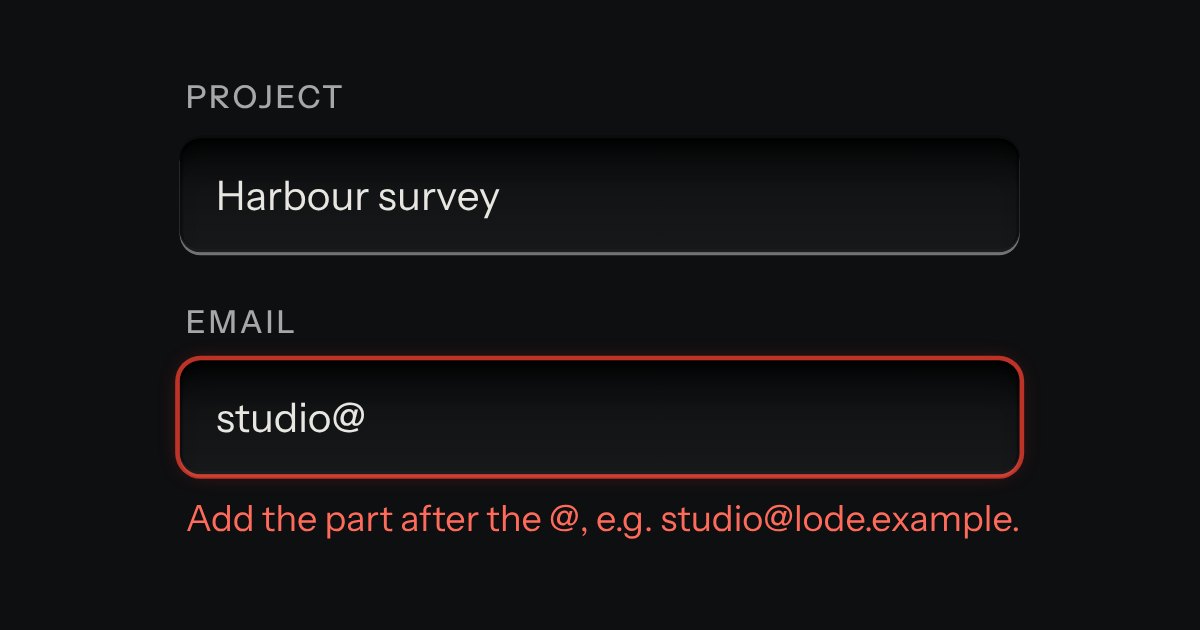
Text entry in a recess, the label printed above it, and a hint that says how to fix an error.
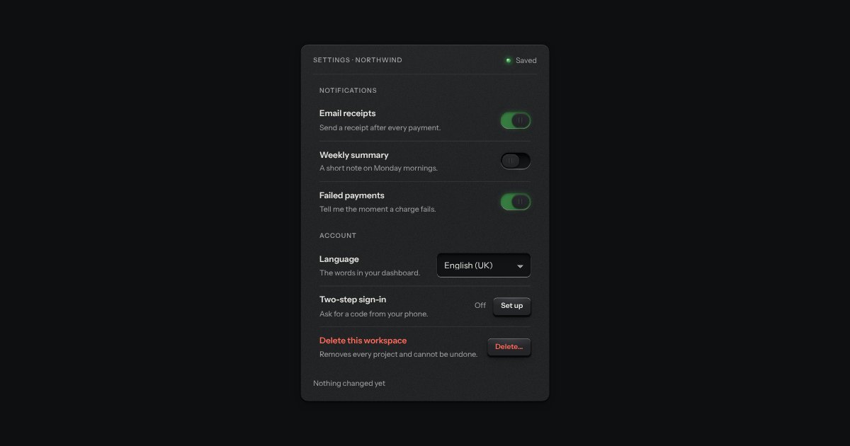
What a settings page is made of: a label, one sentence under it and the control at the end, ruled like the list with a hairline between rows and nothing else drawn. A row with a switch or a check is one label, so pressing anywhere on it turns the control; a row with a key, a select or a value is a plain box, so a press means what the key says.
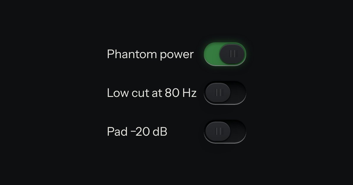
On or off, applied the moment it moves. A native checkbox with a ridged thumb in a slot that lights green when on.
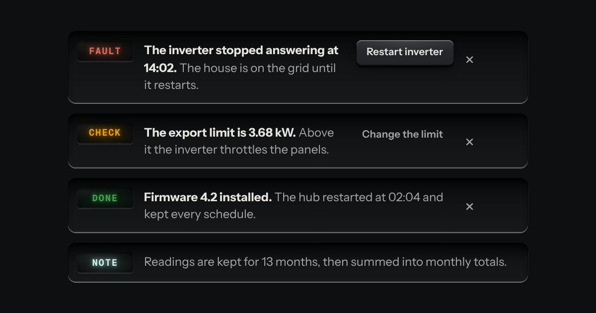
A message let into the surface, with an annunciator: a small lit legend (Note, Done, Check, Fault) beside the words that say what happened.
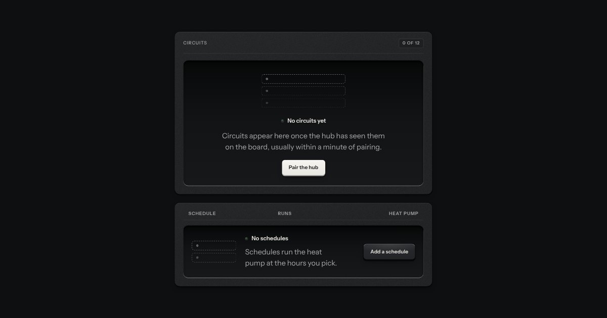
What a view shows before it has anything: an empty tray with the outline of what goes in it printed on its floor, one sentence and one key.
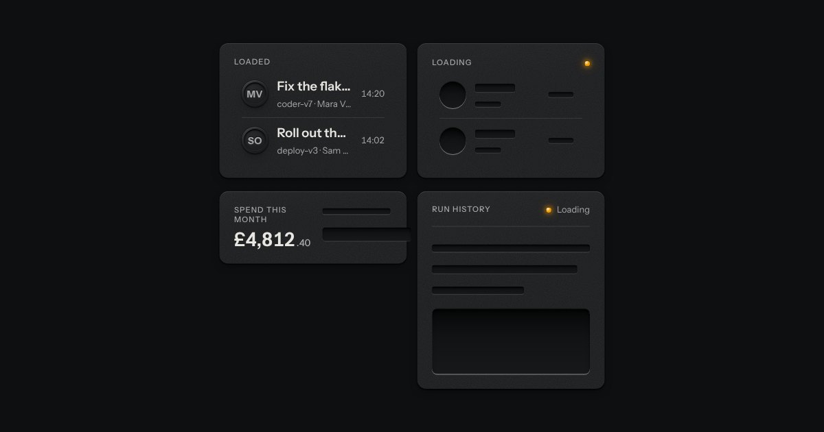
The shape of a page before its data arrives, drawn as the unprinted plate: blank engraved bars where the words will print. Nothing on it moves. One amber lamp beside “Loading” is the only sign of work.
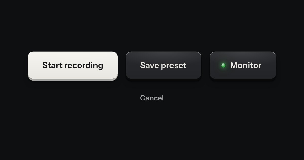
Every button, and every link that acts like one: a cap on a skirt that drops below the plate when pressed.
A confirmation after an action.
Bar with a sync status and one contrast key (Add expense) · a side rail, or a tab bar on a phone · a head with the screen name and the budget month · Overview: left to spend as a readout with a budget meter and its pace, the total across accounts, bars for each week, bills due in seven days, the latest activity · Budgets: a meter for each category, with a state word and the amount left · Transactions: a search field, two selects and a selector over a list grouped by day; a row opens a drawer to change its category · Accounts: a panel each with its balance and when it was last read · Settings: rows for currency, the day the month starts, notices, volume and finish · an Add expense drawer on the validation part · a key at the foot that shows the other states (?state=).