Lamp
The only colour in the kit: a lamp that is on. Green is on, amber is waiting, red is recording or failing, blue is linked, white is standing by. Always next to words.
Kit part · Loaders
A ring of eight lamps lit in turn, a chase round a dial: each lamp is a dim cap with its light laid over it, and the light fades as the chase passes on, leaving a short tail. Only the light’s opacity moves. Amber, the lamp for work in hand. Under reduced motion it holds still on one lit lamp at the top, and the words still say it is busy.
Seats open in 11 days. Want one email that morning?
Both finishes, side by side. Hover, pressed and focus are forced with .is-hover, .is-down and .is-focus; checked and disabled are real.
Aluminium
| Part | Small | Default | Large | Labelled | Green |
|---|---|---|---|---|---|
| Spinner | Loading | Loading | Loading | Loading | Done soon |
Graphite
| Part | Small | Default | Large | Labelled | Green |
|---|---|---|---|---|---|
| Spinner | Loading | Loading | Loading | Loading | Done soon |
| Name | Kind | Values | What it does |
|---|---|---|---|
| span.tui-spinner[role="status"] | element | with a label | The spinner. A status region, so its label is said when it appears. Add data-lamp to light the ring green, red, blue or white (amber is the default). |
| .tui-spinner__ring[aria-hidden="true"] | element | eight <i> | The drawing: eight empty i elements, one lamp each. Hidden from a screen reader. |
| .tui-spinner__label | element | the words | What is going on. Always in the page for a screen reader; drawn on screen with --labelled. |
| --sm · --lg · --labelled | modifier | 16px · 40px · words shown | The ring’s size, and whether the label is drawn beside it. Set --sp for any other size. |
| spinnerHTML({ label, size, lamp, labelled, status }) | function | pure | The markup of one. Pass status: false inside a region that is already a status. |
| data-paused | attribute | set by kit.mjs | Holds the chase while the spinner is off screen. Set it yourself in a hidden pane. |
<span class="tui-spinner tui-spinner--labelled" role="status">
  <span class="tui-spinner__ring" aria-hidden="true">
    <i></i><i></i><i></i><i></i><i></i><i></i><i></i><i></i>
  </span>
  <span class="tui-spinner__label">Importing 3 of 14 files</span>
</span>

<!-- Without the words on screen, they are still said: drop --labelled -->
import { spinnerHTML } from '/kit/kit.mjs';
// The markup of one, so a script does not have to type eight <i>.
el.innerHTML = spinnerHTML({ label: 'Importing', size: 'lg', labelled: true });
spinnerHTML({ label: 'Saving', status: false }); // inside a region that already says itNeeds kit.css and kit.mjs. How to install the kit.
role="status" with its words in .tui-spinner__label, so a screen reader says “Importing 3 of 14 files” politely when it appears; the eight lamps are aria-hidden.Eight lamps on a circle, each a dim cap with a lit layer on top of it. Every lit layer runs the same short fade, 960 milliseconds long, started a step later than its neighbour, so the lit one appears to travel and the lamps just behind it are still dying away. The lamps are placed with a direction and a radius rather than rotated, so each one’s shine stays on its upper left. In the finishes that draw their lamps as square pixels or printed rings, the spinner’s lamps are drawn the same way.
Show that something is working when no one can say how long it will take: a ring of lamps chased in turn, with a line of words that is the real message.
6 rules in this file, with the foundations they rest on and the anti-patterns that break them. Full rules ship in the brain with the Pass.
The only colour in the kit: a lamp that is on. Green is on, amber is waiting, red is recording or failing, blue is linked, white is standing by. Always next to words.
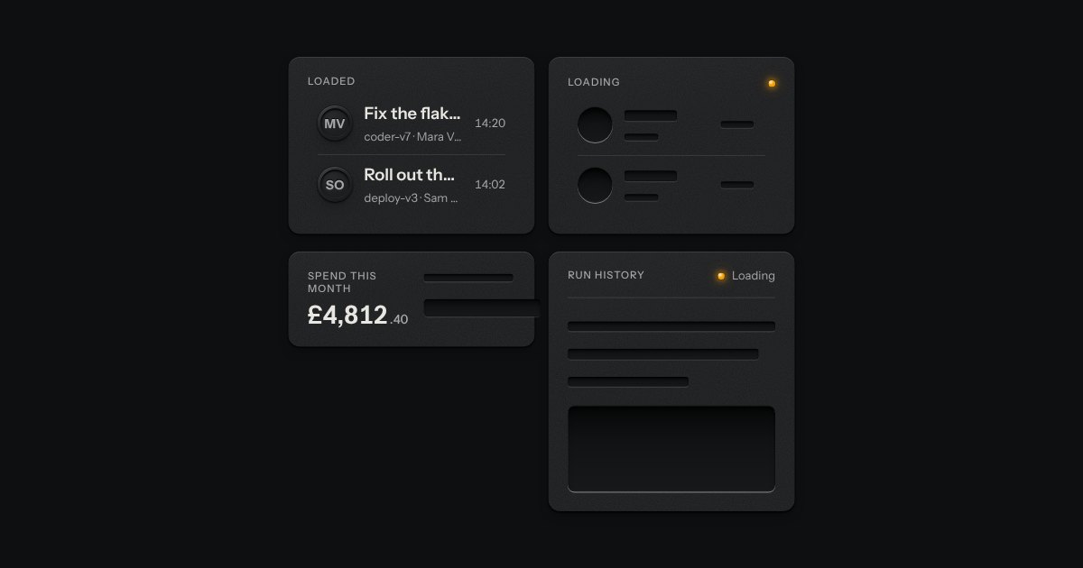
The shape of a page before its data arrives, drawn as the unprinted plate: blank engraved bars where the words will print. Nothing on it moves. One amber lamp beside “Loading” is the only sign of work.
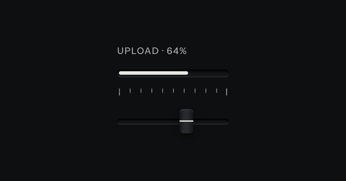
Progress through a task: ink filling a groove, never a coloured bar.
A pane of smoked glass laid over a panel while it works. The panel underneath keeps every pixel of its place, dimmed and a little out of focus, with one plate in the middle carrying a spinner and a line of words. Set aria-busy on the panel to lower the glass; what is underneath goes inert, so nothing in it can be pressed or tabbed to until the glass lifts.