Radio
One choice from a short list in a form: small round keys in a fieldset, the chosen one pressed with a printed dot.
Kit part · Cards & panels · Checkboxes · Radio groups
A radio or a check set as a large plate carrying a name, a sentence and a price. The plate is a big key on a skirt with a small check key in its corner; the chosen one goes down below the panel and its corner key latches. Under it is the real radio or checkbox, so a group is a native radio group and posts with the form.
Seats open in 11 days. Want one email that morning?
Both finishes, side by side. Hover, pressed and focus are forced with .is-hover, .is-down and .is-focus; checked and disabled are real.
Aluminium
| Part | Up | Hover | Pressing | Chosen | Focus | Disabled |
|---|---|---|---|---|---|---|
| Plate |
Graphite
| Part | Up | Hover | Pressing | Chosen | Focus | Disabled |
|---|---|---|---|---|---|---|
| Plate |
| Name | Kind | Values | What it does |
|---|---|---|---|
| <fieldset class="tui-choice-cards"> | element | with a legend | The group and its name, around a .tui-choice-cards__set grid that fits as many plates as the width holds. Add --stack to the fieldset for a single column. |
| label.tui-choice-card | element | holds the input and its words | One plate. The label is the plate, so a press anywhere on it is a press on the input. |
| input.tui-choice-card__input | element | radio or checkbox | The real control, laid over the whole plate and invisible. Give radios one name; set checked and disabled on it as on any input. |
| .tui-choice-card__name · __desc · __price | class | in the label | The name, the sentence and the price. Put the unit in a small inside the price: “£12 a seat, monthly”. |
| .tui-choice-card__mark | class | aria-hidden | The small check key in the corner: round for a radio, square with a tick for a check. It is drawn from the input’s state. |
| aria-disabled | attribute | on a disabled plate’s label | Optional beside the input’s disabled; it lets the reader’s tools treat the plate as dimmed on purpose. |
| ← → ↑ ↓ · Space | key | on the input | The browser’s own: arrows move and choose in a radio group, Space chooses a card or turns a check. |
<fieldset class="tui-choice-cards">
  <legend class="tui-label">Plan</legend>
  <div class="tui-choice-cards__set">
    <label class="tui-choice-card">
      <input class="tui-choice-card__input" type="radio" name="plan" value="team" checked>
      <span class="tui-choice-card__name">Team</span>
      <span class="tui-choice-card__mark" aria-hidden="true"></span>
      <span class="tui-choice-card__desc">Shared projects for up to ten people.</span>
      <span class="tui-choice-card__price">£12 <small>a seat, monthly</small></span>
    </label>
    <label class="tui-choice-card"> … </label>
  </div>
</fieldset>

<!-- Any number: checkboxes. A column: tui-choice-cards--stack -->
<input class="tui-choice-card__input" type="checkbox" name="addon" value="support">
Needs kit.css only, no script. How to install the kit.
It is the kit’s key drawn large: the same cap, the same skirt (three pixels, as a large key has) and the same pressed shadow, so the plate goes down below the panel exactly as a key does and follows every finish and both volumes. The corner key is the check key drawn small, driven by the input’s own state with ~ instead of a script. The input is stretched over the plate with zero opacity, which is why a press, a label, a focus and the arrow keys all stay the browser’s.
Let people pick a plan, a size or an add-on by pressing a whole plate that says what it is and what it costs, with no script.
6 rules in this file, with the foundations they rest on and the anti-patterns that break them. Full rules ship in the brain with the Pass.
One choice from a short list in a form: small round keys in a fieldset, the chosen one pressed with a printed dot.
An option in a form: a small square key that presses below the plate when chosen, with a tick printed on it.
Every button, and every link that acts like one: a cap on a skirt that drops below the plate when pressed.
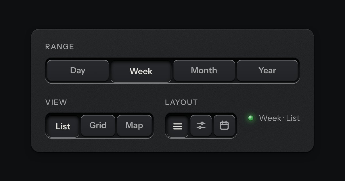
A row of keys in a tray with one pressed down: pick a view, a range or a mode and it applies at once. It is the kit’s selector without the lamps, with sizes, a full-width row and icon segments.