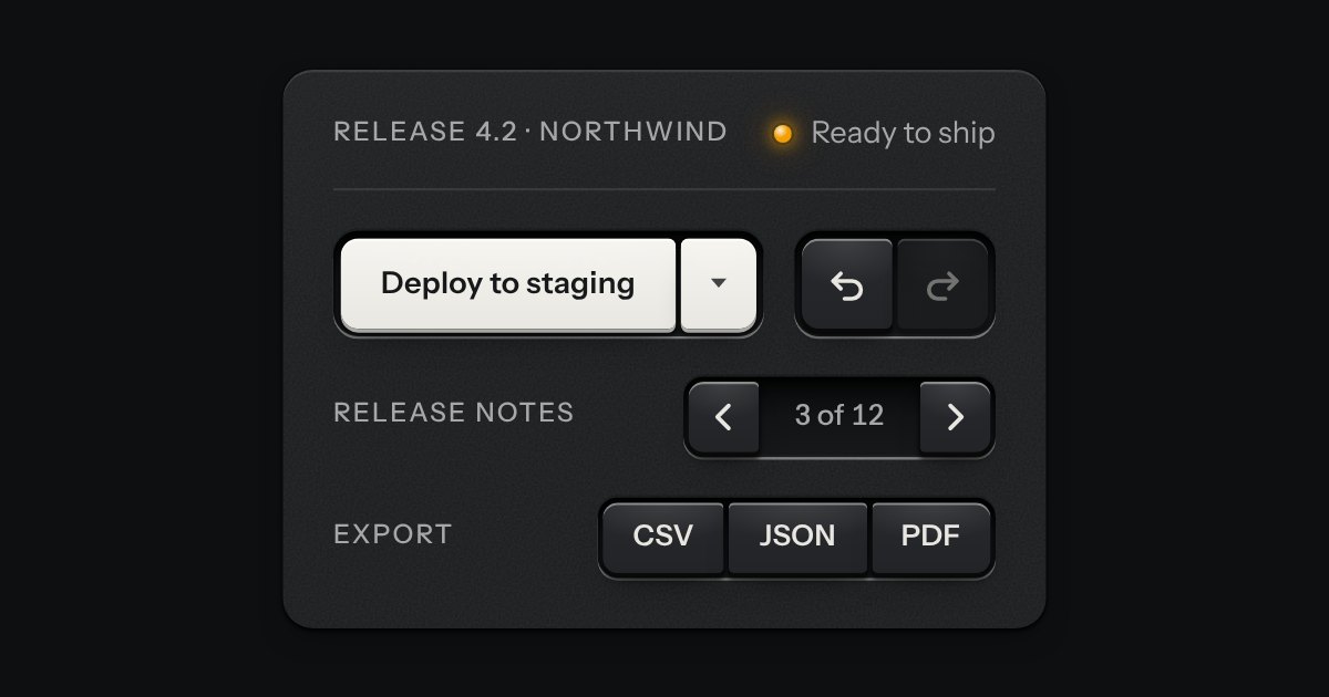
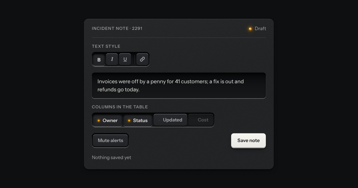
A rack of keys in one slot cut into the plate, under one tab stop. Keys, toggle keys, a copy key and a menu key sit side by side, parted into clusters by engraved lines, and the arrow keys move along it so a keyboard user passes the whole rack with one Tab.
Element
<tui-toolbar>
Needs
kit.css + kit.mjs
Rules
toolbar.rules.md · 6
Finishes
Aluminium · Graphite · Oak · Walnut · Porcelain · Black · Daylight · Night · Paper · Phosphor · E-paper · AMOLED
Seats open in 11 days. Want one email that morning?
Variants
A rack, clusters parted
Words, a copy key, a menu key
Small keys, words
A column · aria-orientation
Wraps when narrow
Every state, at once
Both finishes, side by side. Hover, pressed and focus are forced with .is-hover, .is-down and .is-focus; checked and disabled are real.
Aluminium
Part
Rest
Hover
Latched
Focus
Disabled
Toolbar
Graphite
Part
Rest
Hover
Latched
Focus
Disabled
Toolbar
API
Name
Kind
Values
What it does
<tui-toolbar>
element
with .tui-toolbar, role="toolbar", aria-label
The rack. Makes the keys one tab stop with arrow keys; without the script each key is in the tab order.
role="toolbar" · aria-label
attribute
on the element
Required, and not guessed: the name says what the keys act on.
aria-orientation="vertical"
attribute
on the element
Lays the keys in a column; the arrows go up and down instead.
.tui-toolbar__rule
class
between keys
A parting line between clusters of keys, cut in the floor of the slot.
.tui-key · .tui-toggle-key · .tui-copy-key
class
inside the rack
Any key of the kit. Buttons, links and checkboxes take part in the arrows; anything inside a popover keeps its own.
items
property
HTMLElement[]
The keys the arrows move between, in order, without hidden ones or a menu’s items.
rovingNext(index, key, count, options)
function
{ orientation, loop, skip }
Where a key press moves the focus, or -1. The toggle group’s, shared.
← → · ↑ ↓ · Home · End · Tab
key
in the rack
Move along it (wrapping); first and last; leave it. Tab comes back to the key it left.
Markup
<tui-toolbar class="tui-toolbar" role="toolbar" aria-label="Text formatting">
  <button class="tui-key tui-key--icon tui-toggle-key" type="button" data-toggle-key aria-pressed="false" aria-label="Bold"><b>B</b></button>
  <button class="tui-key tui-key--icon tui-toggle-key" type="button" data-toggle-key aria-pressed="false" aria-label="Italic"><i>I</i></button>
  <i class="tui-toolbar__rule" aria-hidden="true"></i>
  <button class="tui-key tui-key--icon" type="button" aria-label="Link"><svg class="tui-icon" …></svg></button>
  <button class="tui-key" type="button">Clear</button>
</tui-toolbar>

<!-- A column: the arrows go up and down -->
<tui-toolbar class="tui-toolbar" role="toolbar" aria-label="Tools" aria-orientation="vertical">…</tui-toolbar>
import { rovingNext } from '/kit/kit.mjs';   // the same one the toggle group moves by

const bar = document.querySelector('tui-toolbar');
bar.items;                                      // the keys the arrows move between, in order
rovingNext(0, 'ArrowRight', bar.items.length);  // 1
The element is role="toolbar" with a name, and each key is a button, so a screen reader says “Text formatting, toolbar” and then the key.
With the script the rack is one tab stop and the arrow keys do the rest: they wrap, Home and End go to the ends, disabled keys are passed over, and the focus returns to the key it left.
A toggle key inside it keeps its own aria-pressed; the toolbar does not touch it.
Parting lines are hidden from a screen reader; they are only for the eye.
A narrow screen wraps the rack onto a second row rather than scrolling it, and on a phone each cap is 44px square or taller.
Nothing moves but the 70ms press of a key, which reduced motion turns off.
How it’s built
It is the button group’s slot with the same three pixels of floor round the keys, so a key’s corner is the slot’s corner less that gap, and the clusters are parted by the toggle group’s engraved cut. What is new is the single tab stop: the toggle group’s rovingNext works out where each arrow goes, and the element keeps exactly one key at tabindex 0, the last one that had the focus. The keys themselves stay the kit’s keys, so every finish and both volumes draw them.
Rules
toolbar.rules.mdIn the brain
Put the actions on one thing in one rack: a single tab stop, arrows and Home and End along it, clusters parted by a cut in the floor.
6 rules in this file, with the foundations they rest on and the anti-patterns that break them. Full rules ship in the brain with the Pass.
Keys that belong together set side by side in one slot, like the transport keys of a deck. Each is still its own cap and goes down on its own; only the corners facing a neighbour are tightened, so the row reads as one bank. A split key is one action with the menu of its other ways, two caps in one slot, and a readout can be printed between keys.
The segmented control’s keys, each latching on its own, so any number can be down at once: bold and italic, the columns a table shows, the filters on a log. Every key is a checkbox and posts with the form. A lone toggle is a group of one, and a parting line splits clusters of keys in one slot.
One key that latches below the plate and stays there. It is the kit’s own key with one state to keep, down or up, so it is the way to say mute, pin, bold or armed without the weight of a switch. A lamp in the cap may light while it is down.