Menu
A card of actions and options that slides out from under its key. The key stays down while the card is out; an option that is on lights its lamp.
Kit parts
The links at the top of a site. A row that is flat on the page: plain links, and keys that open a panel of links beneath the bar. Each panel link has a name and one line on where it goes, and a panel may lead with a featured link. The key that is open is pressed into the bar, and the page you are on is pressed in too, with a lit lamp as in the side rail. Rest on a key and its panel opens; move to the next key and the panel changes at once.
Seats open in 11 days. Want one email that morning?
A flat row of keys on the page, a card for the panel and the kit’s lamp for the current page. The pressed look is the field’s recess, the card is the menu’s, and the links in it are pressed in under the finger as the menu’s lines are. The fold is a container query on the bar’s own width, so it folds in a narrow column of a wide page as well as on a phone. The script is the hover waits, the arrow keys and the panel’s place; the links themselves are plain anchors that work without it.
| Name | Kind | Description |
|---|---|---|
| setNavmenuCurrent(nav, link) | function | Move the current page for a router that does not reload: aria-current, the lamp and the mark on the key move to the link. |
| navmenuStep() · navmenuEntryStep() · navmenuPanelLeft() · NAVMENU_DELAY | function | Where a key takes the focus along the bar and inside a panel, the panel’s left edge, and the waits before it opens and closes. |
Rest the pointer on Berths: its panel opens after a moment. Move along the bar and the panel changes at once; move away and it closes. Click a key to keep its panel open. With the keyboard, Tab to the bar, use Left and Right to move along it, and press Down to open a panel and go to its first link; Up from the first link is back to the key, and Escape closes the panel. Choose a link and the lamp moves to it. Make the window narrower than a phone and the bar folds to one Menu key.
A card of actions and options that slides out from under its key. The key stays down while the card is out; an option that is on lights its lamp.
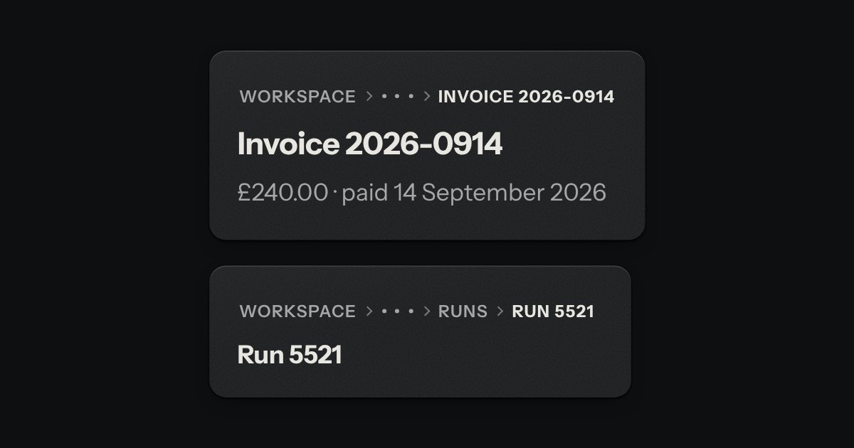
The trail of levels above this page, printed across the top like the path an instrument shows over its menu screen: SETTINGS › BILLING › INVOICES. The levels above are in the second ink, the one you are on in full ink, with small engraved chevrons between. When the line is too short, the middle folds into a … key that opens a menu.
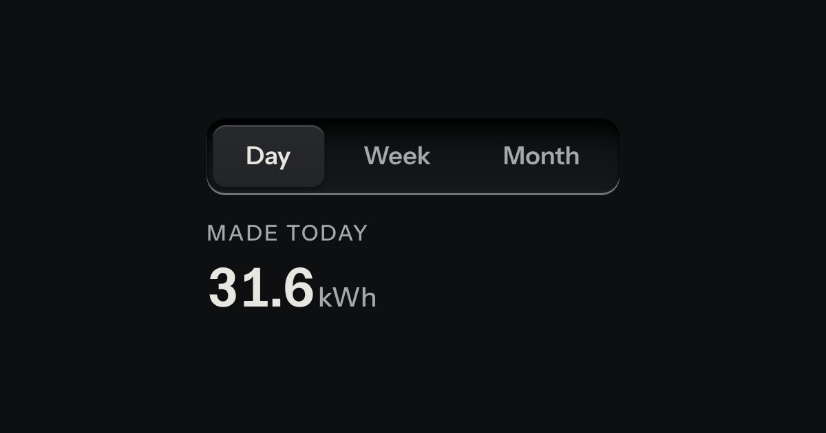
Views of the same thing, switched in place: keys in a tray, the chosen view a raised cap.
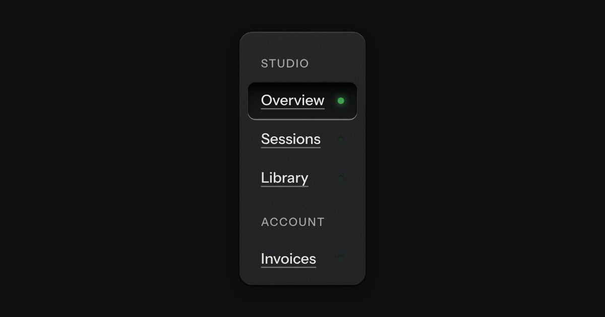
App navigation in a panel: the current page is a recess with its lamp lit, links grouped under printed labels.