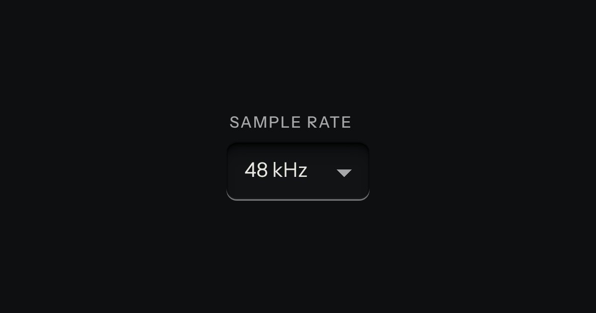
Select
A choice from a longer list, in the same recess as a field, with a printed chevron. The browser’s own menu opens it.
Kit parts
A select whose list is a tree, for a folder, a category or a team that sits inside others. Folders open and close with a turning chevron; a pick is one leaf, or in multiple mode any number of them, with a box on every row. A folder’s box picks all it holds and sinks half way, with a bar across it and a count (“2 of 3”), when only some of it is picked. Typing jumps to the next name that starts with the letters, opening folders on the way. In the closed field the picks sit as tokens, and a folder with everything picked is one token, not many. It is a proper ARIA combobox with a tree in its popup.
Seats open in 11 days. Want one email that morning?
The field is the combobox’s well, key, card and tokens (the tag input’s). The rows are the file tree’s: its printed traces, turning chevron, folder mark, and the single pick set in a recess with its lamp lit. The boxes are the kit’s check keys, sunk half way with a bar for some, as the checklist’s group key is. The matching of typed letters is the file tree’s. No colour is added; the only lamp is the kit’s.
| Name | Kind | Description |
|---|---|---|
| li (with a ul inside) | child | A folder. It groups the leaves in it, opens and closes, and has no value of its own. |
| li[data-value] | child | A leaf: the thing that is picked. data-value is what the form submits; data-selected picks it to begin with, and its folders start open. |
| multiple | attribute | Several picks, with a box on every row. A folder’s box picks every leaf in it. Without it, one leaf is the pick and picking closes the tree. |
| name · required · disabled · placeholder | attribute | The element is form-associated: name submits each value. Required is invalid with nothing picked. Placeholder shows while nothing is. |
| data-label | attribute | What the field and its tree are called to a screen reader when no label names them. |
| value · values | property | The first pick and every pick, in tree order. Setting values drops any value that is in no leaf. |
| open · input | property | Whether the tree is out, and the text field inside. |
| change · input | event | When the picks change, by key, pointer, token or code. Not fired by setting values from code. |
| treeModel() · treeCheck() | function | A nested list to the flat nodes and the picks it starts with; the state of a node (“true”, “false” or “mixed”) from the picked values. |
| treeCover() · treeToggle() · treeSays() | function | The nodes that show as tokens; the picks after a leaf or a folder’s box is pressed; the words for the count. |
| treeHTML() · treeSelectHTML() | function | The tree’s rows and the element as markup, for a server or a specimen. Text is escaped. |
Open the Filed under field and press the Down arrow: the tree opens with Harbour office already out. Press Right on Safety to open it, then Space on Drills to pick it; Safety’s box sinks half way and says 1 of 3. Press Space on Safety to take all three, and the three tokens in the field become one. Type the letters “inc” to jump to Incident log. Press Backspace in the field to take the last token away.
A choice from a longer list, in the same recess as a field, with a printed chevron. The browser’s own menu opens it.
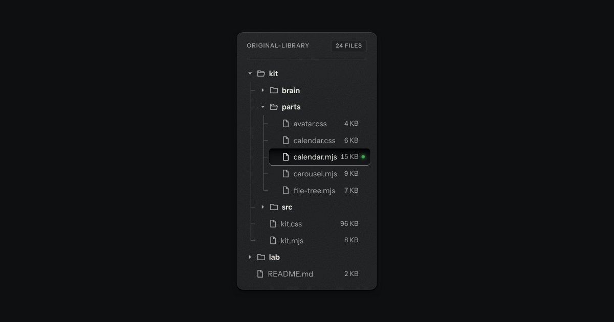
Folders and files as a real tree, printed like a wiring diagram: traces with an elbow into every item, chevrons that turn, and the chosen file set in a recess with its lamp lit. Written as a plain nested list.
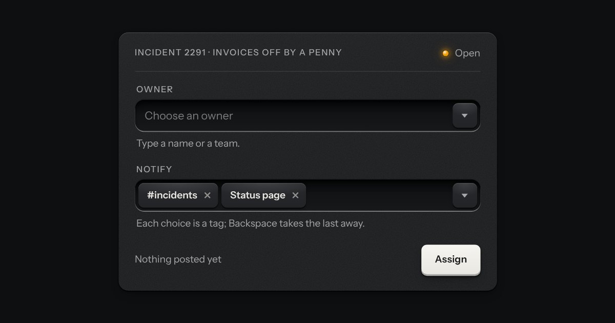
A field that filters a long list as you type. It starts as a plain select, so it posts with the form and works without a script; then the options card slides out of a slot under the well, the letters that match print heavier and the chosen option’s lamp is lit. Several choices sit in the well as tags.
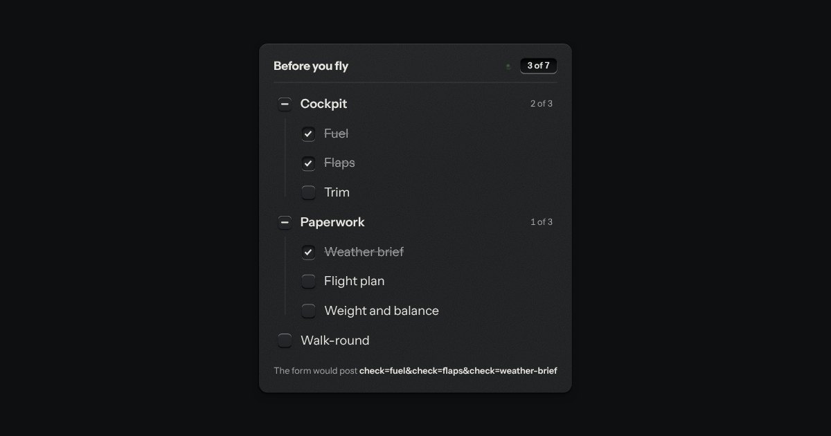
The kit’s check keys in nested groups. A group’s key is the sum of its items: all done, none, or some, and some is a key sunk halfway with a bar across it. The head counts the items, “3 of 7”, and its lamp lights when they are all done.