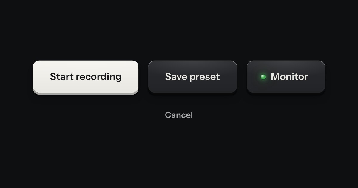
Key
Every button, and every link that acts like one: a cap on a skirt that drops below the plate when pressed.
Kit parts
Keys that belong together set side by side in one slot, like the transport keys of a deck. Each is still its own cap and goes down on its own; only the corners facing a neighbour are tightened, so the row reads as one bank. A split key is one action with the menu of its other ways, two caps in one slot, and a readout can be printed between keys.
Seats open in 11 days. Want one email that morning?
There is no script. The skirt is a little shorter than a loose key’s, as the slot holds the caps lower. The split key’s arrow is a narrow cap of the same key (the contrast cap stays the contrast cap), drawn with the combobox’s arrow, and it is the menu part’s trigger, so its card, its keys and its return of focus are the menu’s own. In Quiet the keys are the flat Quiet caps in a hairline slot.
| Name | Kind | Description |
|---|---|---|
| keyGroupHTML(options) | function | The same markup from data, on a server or in a test. A group without a label is refused. |
| Tab · Enter · Space | key | Each key is its own tab stop and is pressed as any key is. The split’s narrow key also opens with ↓ (the menu part). |
Each key goes down on its own. Open the narrow key beside Deploy for its other ways: the arrow keys move through them and Escape hands the focus back. Page through the releases with the keys either side of the readout.
Every button, and every link that acts like one: a cap on a skirt that drops below the plate when pressed.
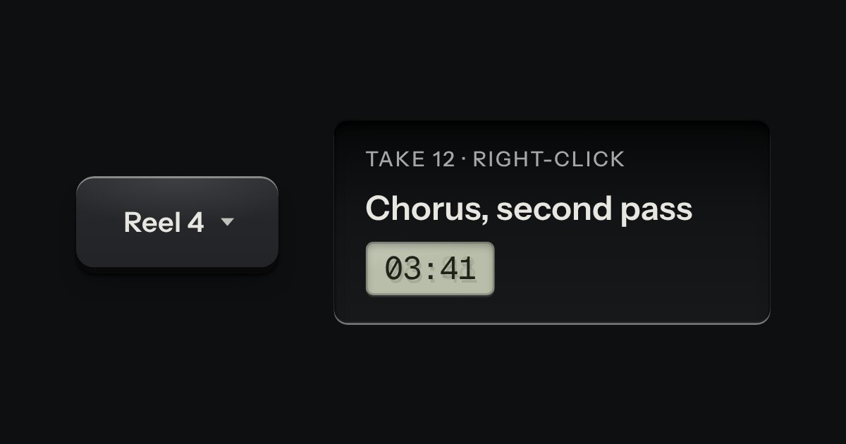
A card of actions and options that slides out from under its key. The key stays down while the card is out; an option that is on lights its lamp.
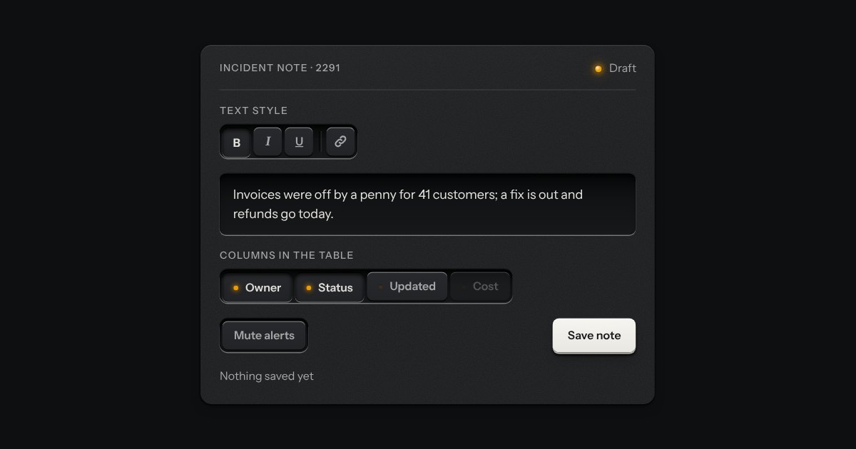
The segmented control’s keys, each latching on its own, so any number can be down at once: bold and italic, the columns a table shows, the filters on a log. Every key is a checkbox and posts with the form. A lone toggle is a group of one, and a parting line splits clusters of keys in one slot.
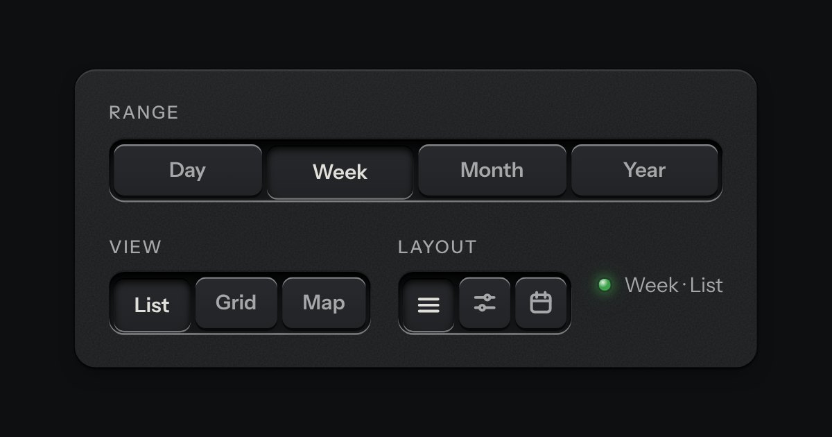
A row of keys in a tray with one pressed down: pick a view, a range or a mode and it applies at once. It is the kit’s selector without the lamps, with sizes, a full-width row and icon segments.