Field
Text entry in a recess, the label printed above it, and a hint that says how to fix an error.
The field’s well with a louvred shutter drawn across its characters and a peek key at the end. Press the key and the shutter slides off to the right, the characters stand open, and the key stays down; press it again and the shutter closes. The key says Show or Hide, and the caret never leaves where it was.
Seats open in 11 days. Want one email that morning?
Both finishes, side by side. Hover, pressed and focus are forced with .is-hover, .is-down and .is-focus; checked and disabled are real.
Aluminium
| Part | Hidden | Key hover | Key pressed | Shown |
|---|---|---|---|---|
| Field | ||||
| In focus |
Graphite
| Part | Hidden | Key hover | Key pressed | Shown |
|---|---|---|---|---|
| Field | ||||
| In focus |
| Name | Kind | Values | What it does |
|---|---|---|---|
| <tui-password-field> | element | around the input and its key | The well. Adds the shutter, names the key and moves the input between password and text; without the script it is a plain password field in its well. |
| input.tui-password-field__input | element | type="password" | The real field. It posts, validates and autofills as ever; give it the right autocomplete (current-password or new-password). |
| button[data-peek] | attribute | empty button after the input | The peek key. The script gives it its eye, its words and its name. |
| data-what | attribute | on the key | What is being shown, if it is not a password: “API key” makes the key say Show API key. |
| shown | property | boolean | Whether the characters are showing. Setting it opens or closes the shutter without an event. |
| tui-peek | event | detail { shown } | Bubbles from the element when the key is pressed. |
| peekKeyState(shown, what) | function | { type, legend, label, say } | What the key shows and says for a state. Pure. |
| Space · Enter · Tab | key | on the key | Press it; it is the next stop after the field. The field keeps its caret. |
<div class="tui-field">
  <label class="tui-label" for="pw">Password</label>
  <tui-password-field>
    <input class="tui-password-field__input" id="pw" name="password" type="password"
           autocomplete="current-password" minlength="12" required>
    <button class="tui-password-field__key" type="button" data-peek></button>
  </tui-password-field>
  <span class="tui-hint">At least 12 characters.</span>
</div>

<!-- Another secret: say which, and the key says Show API key -->
<tui-password-field>
  <input class="tui-password-field__input" id="key" name="key" type="password" readonly value="sk_live_4f2a91c0d7">
  <button class="tui-password-field__key" type="button" data-peek data-what="API key"></button>
</tui-password-field>
import { peekKeyState } from '/kit/kit.mjs';
const field = document.querySelector('tui-password-field');
field.addEventListener('tui-peek', (e) => track(e.detail.shown));
field.shown = true; // open the shutter from code (quietly: no event, no announcement)
field.input.type; // 'text'
peekKeyState(true, 'API key'); // { type: 'text', legend: 'Hide', label: 'Hide API key', say: 'API key shown' }Needs kit.css and kit.mjs. How to install the kit.
<input>, so password managers, autofill, validation and a form post all work as before.aria-pressed, because its name already changes with the state.The shutter is only drawing: a row of thin slats, each a dark cut and a lit lip, laid over the characters and let through between. The state it shows is the input’s type, which the script flips between password and text, so there is no second copy of the secret and nothing for a screen reader to read twice. The caret is saved before the flip and restored after it, and the key swallows the pointer’s focus change when the field has the focus. The well is the field’s, 38px high, with the key inset three pixels so its corner is the well’s less that gap.
Let someone check what they typed: a peek key that says what it does, a shutter that shows the state, and a caret that stays put.
6 rules in this file, with the foundations they rest on and the anti-patterns that break them. Full rules ship in the brain with the Pass.
Text entry in a recess, the label printed above it, and a hint that says how to fix an error.
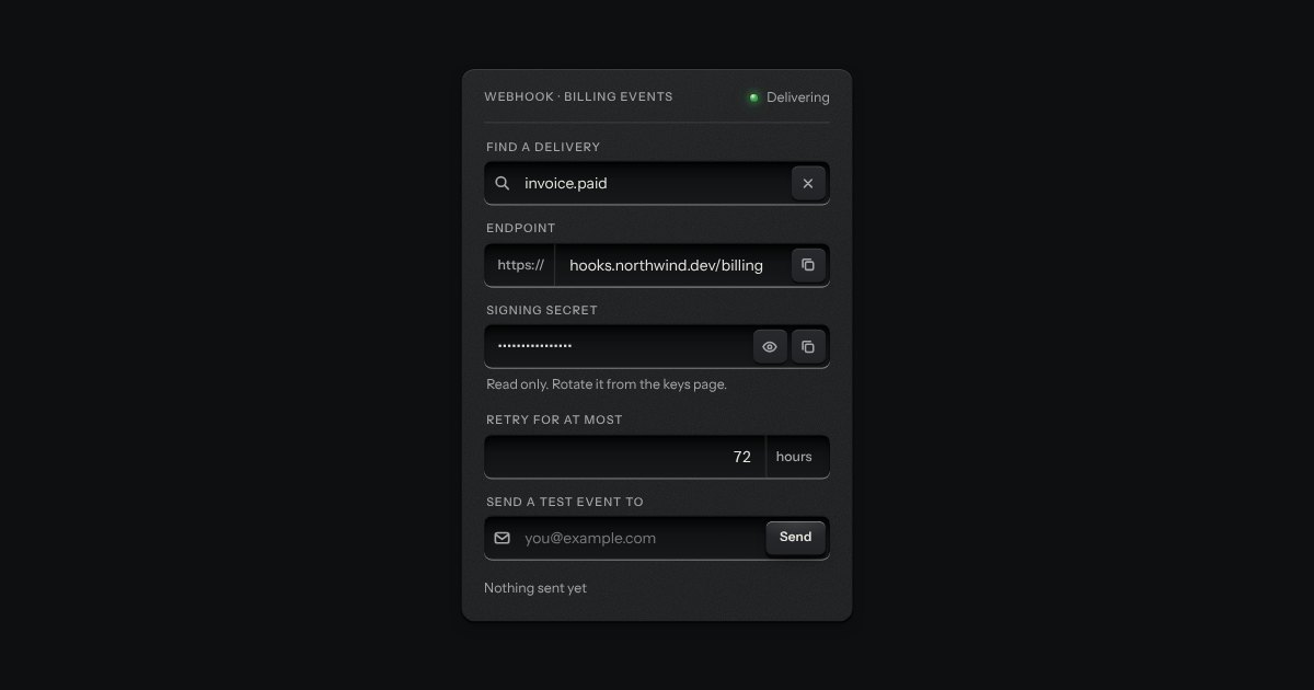
One recess that holds a field and everything that belongs to it. Words that are part of the value but are not typed, such as https:// or a currency, are printed on the floor of the well behind an engraved line; a glyph sits at the start; small keys sit at the end to clear the text, copy it, or show a password.
A recess for a question. A glass is printed on its floor at the start, the words run on, an optional count is printed behind an engraved line, and a clear key sits in the far corner while there is something to clear. Escape empties it.
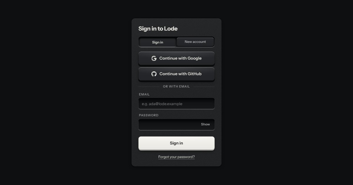
Sign in and sign up on one plate: Google and GitHub keys with their marks stamped in monochrome, an email route underneath, a two-way selector that re-prints the plate, and errors that say how to fix them.