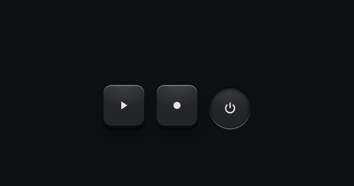
Icon key
A key with an icon and no words, square or round: transport, power, the small tools. Its aria-label names it; a tip shows the name.
Kit part · Buttons
Every button, and every link that acts like one: a cap on a skirt that drops below the plate when pressed.
Seats open in 11 days. Want one email that morning?
Both finishes, side by side. Hover, pressed and focus are forced with .is-hover, .is-down and .is-focus; checked and disabled are real.
Aluminium
| Part | Rest | Hover | Pressed | Latched | Focus | Disabled |
|---|---|---|---|---|---|---|
| Key | ||||||
| Contrast | ||||||
| Flat | None |
Graphite
| Part | Rest | Hover | Pressed | Latched | Focus | Disabled |
|---|---|---|---|---|---|---|
| Key | ||||||
| Contrast | ||||||
| Flat | None |
| Name | Kind | Values | What it does |
|---|---|---|---|
| .tui-key | class | A plain key: a raised cap on a 2px skirt, 36px tall. | |
| .tui-key--primary | class | The contrast cap: the one action on a surface that matters most. | |
| .tui-key--flat | class | No cap at all: printed text that acts. For backing out. | |
| .tui-key--danger | class | Red printing on a plain cap, for destructive actions. | |
| .tui-key--sm · --lg | class | 28px · 46px | Small in tables and panel heads; large in heroes. Skirts scale with the cap: 1.5px, 3px. |
| .tui-key--icon · --round | class | Keys with an icon and no words: see the icon key. | |
| aria-pressed | attribute | "true" · "false" | A latching key. “true” holds it down below the plate. |
| disabled · aria-disabled | attribute | 45% opacity and no travel. Use aria-disabled="true" on links. | |
| data-tip | attribute | text | A one-line name shown on hover and focus. Required on icon keys, with an aria-label. |
| data-material | attribute | aluminium · graphite · porcelain · black-anodised · titanium · bakelite · anodised-blue · anodised-green | What the cap, its skirt and its printing are made of, apart from the page’s finish; the contrast key takes the material’s own. On the key or on the device around it. Anodised blue and green go on a whole device only. |
| --h · --skirt | CSS property | 36px · 2px | Cap height and skirt depth. The size modifiers set both. |
| .is-hover · .is-down · .is-focus | class | Forced states, for documentation and specimens only. | |
| Enter · Space | keyboard | Native button behaviour. The key presses on :active, so it drops under a finger, a mouse or a key. |
<button class="tui-key tui-key--primary">Start recording</button>
<button class="tui-key">Save preset</button>
<button class="tui-key" aria-pressed="false">
  <span class="tui-lamp" data-on></span>Monitor
</button>
<button class="tui-key tui-key--flat">Cancel</button>
Needs kit.css only, no script. How to install the kit.
<button>, or an <a> for navigation. Both are reached with Tab and keep the 2px focus ring, 3px away.aria-label; with kit.mjs the data-tip becomes a real tooltip, read after the name, so keep the two close in meaning.aria-pressed. The lamp in its cap is a second signal, never the only one.Two backgrounds and a stack of box-shadows, no images. The cap is a linear gradient of --tui-face-hi under a radial highlight from above; the skirt is a hard 2px shadow in --tui-skirt, with a contact shadow and a soft one below it. Pressing moves the cap down by exactly the skirt and swaps the shadows for --tui-pressed: the plate’s edge now shades the cap’s top and sides. 70ms, one easing curve.
One contrast key per surface. The label says what happens: “Erase reel”, not “Submit”.
7 rules in this file, with the foundations they rest on and the anti-patterns that break them. Full rules ship in the brain with the Pass.
A key with an icon and no words, square or round: transport, power, the small tools. Its aria-label names it; a tip shows the name.
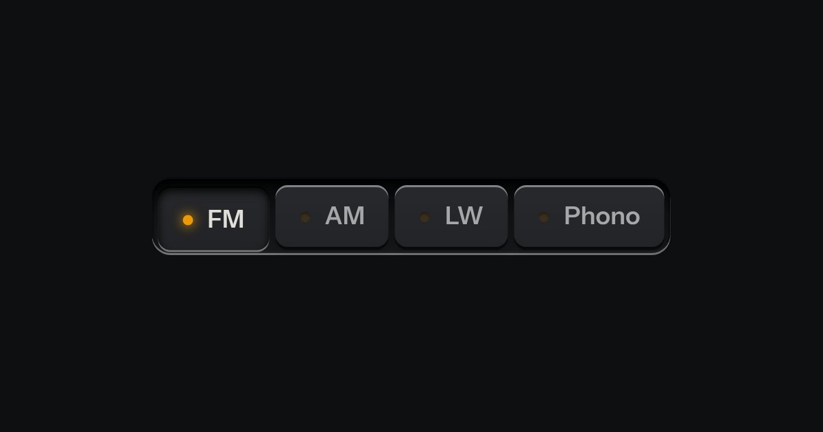
One mode of two to five: latching keys in a tray, one down at a time, each with a lamp that lights when chosen.
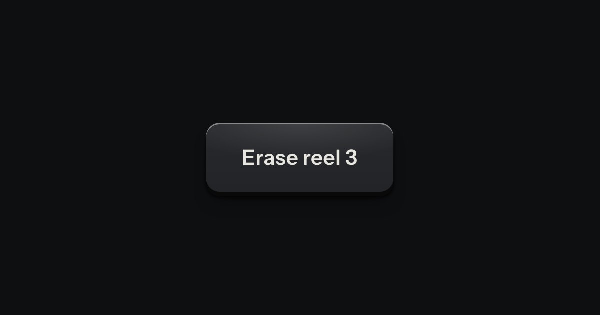
A decision that must be made now: a native dialog with a question, one sentence of consequence, a way back and the act.