Lamp
The only colour in the kit: a lamp that is on. Green is on, amber is waiting, red is recording or failing, blue is linked, white is standing by. Always next to words.
Kit part · Badges & tags
A small printed plate: a type, a count, a badge. Solid for the one tag that must stand out.
Seats open in 11 days. Want one email that morning?
Both finishes, side by side. Hover, pressed and focus are forced with .is-hover, .is-down and .is-focus; checked and disabled are real.
Aluminium
| Part | Plain | Solid | Live | Waiting |
|---|---|---|---|---|
| Tag | Cron | New | Live | Queued |
Graphite
| Part | Plain | Solid | Live | Waiting |
|---|---|---|---|---|
| Tag | Cron | New | Live | Queued |
| Name | Kind | Values | What it does |
|---|---|---|---|
| .tui-tag | class | on <span> | 22px, 10px upper-case tracked type, a hairline border. |
| .tui-tag--solid | class | Printed in the contrast colours. One per view. | |
| .tui-lamp inside | element | For live states. |
<span class="tui-tag">HTTP</span>
<span class="tui-tag tui-tag--solid">Most teams</span>
<span class="tui-tag"><span class="tui-lamp" data-on></span>Live</span>
Needs kit.css only, no script. How to install the kit.
A hairline border in --tui-rule, a faint face and upper-case tracked type. The solid version borrows the contrast cap’s colours. Level with the plate: no light, no shadow.
Solid for the one tag that must stand out, like “Most teams”.
3 rules in this file, with the foundations they rest on and the anti-patterns that break them. Full rules ship in the brain with the Pass.
The only colour in the kit: a lamp that is on. Green is on, amber is waiting, red is recording or failing, blue is linked, white is standing by. Always next to words.
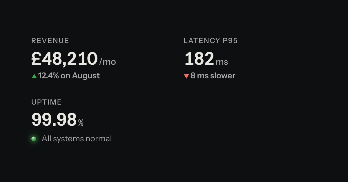
A printed label over a value: key figures, with the unit small and the change in words.
| Reel 3 | 42:10 |
| Mixed | 0:30 |
Rows of data with printed column labels, figures right-aligned in columns, and status in lamps with words.