Radio
One choice from a short list in a form: small round keys in a fieldset, the chosen one pressed with a printed dot.
Kit part · Radio groups
A row of indicator lamps, each in its own round recess, lit up to your score. It is a native radio group underneath, so arrows, Space, the label and the form all work with no script; a number is printed under each lamp, so the score is never told by colour alone. A read-only row shows a score someone else gave.
Seats open in 11 days. Want one email that morning?
Both finishes, side by side. Hover, pressed and focus are forced with .is-hover, .is-down and .is-focus; checked and disabled are real.
Aluminium
| Part | None | Hover | Focus | Chosen | Disabled | Read-only |
|---|---|---|---|---|---|---|
| Rating | Read-only |
Graphite
| Part | None | Hover | Focus | Chosen | Disabled | Read-only |
|---|---|---|---|---|---|---|
| Rating | Read-only |
| Name | Kind | Values | What it does |
|---|---|---|---|
| <fieldset class="tui-rating"> | element | with a legend | The group and its name. Add --sm or --lg for the lamp’s size, and data-lamp="green" | "red" | "blue" | "white" to light a lamp of another colour (amber is the default). |
| label > input[type=radio] + .tui-rating__lamp + .tui-rating__n | element | one to a lamp | The radio is the real control and posts with the form; the lamp is its recess; the number is printed under it. Give the radios one name and the values 1 to the top score. |
| .tui-rating__out | element | optional, aria-hidden | The score in words beside the lamps, filled by the script: “4 of 5”. A screen reader already hears the radios, so it is hidden from one. |
| .tui-rating--readonly | class | on a div with role="img" | The same row as a picture of a score. Put data-on on each lamp that is lit and the score in aria-label. |
| tui-rating-change | event | detail { value, max } | Bubbles from the fieldset when a lamp is chosen. The radio’s own change fires as ever. |
| ratingText(value, max) · ratingLabel(value, max) | function | pure | The printed words (“4 of 5”, “Not rated”) and the name of a read-only row (“Rated 4 out of 5”). |
| ← → ↑ ↓ | key | in the row | The browser’s own radio keys: move to the next lamp and choose it. Tab leaves the row. |
<fieldset class="tui-rating" data-lamp="amber">
  <legend class="tui-label">Rate this release</legend>
  <div class="tui-rating__row">
    <div class="tui-rating__lamps">
      <label><input type="radio" name="score" value="1"><span class="tui-rating__lamp"></span><span class="tui-rating__n">1</span></label>
      <label><input type="radio" name="score" value="2"><span class="tui-rating__lamp"></span><span class="tui-rating__n">2</span></label>
      <!-- … to 5 -->
    </div>
    <span class="tui-rating__out" aria-hidden="true">Not rated</span>
  </div>
</fieldset>

<!-- Read-only: an image with the score in its name -->
<div class="tui-rating tui-rating--readonly" role="img" aria-label="Rated 4 out of 5">
  <span class="tui-rating__lamps">
    <span class="tui-rating__lamp" data-on></span> … <span class="tui-rating__lamp"></span>
  </span>
</div>
import { ratingText, ratingLabel } from '/kit/kit.mjs';
document.querySelector('.tui-rating').addEventListener('tui-rating-change', (e) => {
save(e.detail.value, e.detail.max); // 4, 5
});
ratingText(4, 5); // '4 of 5'
ratingLabel(4, 5); // 'Rated 4 out of 5'Needs kit.css and kit.mjs. How to install the kit.
<fieldset> with a <legend>, which every screen reader says as “Rate this release, group, 4, radio button, 4 of 5”, with no script and no ARIA.role="img" named “Rated 4 out of 5”, so it is one thing to a screen reader, not five lamps. The lamps past the score carry a dash in the recess, so even a printout shows the score.The radio is the browser’s, kept whole and laid over its own lamp, so a press, a label, the form and the arrow keys are native. The lamp is the kit’s indicator lamp set in a round recess, and the lit lamps are found with CSS alone: a lamp is lit if its own radio is checked or if a later radio is, which is the selector :has(~ label input:checked). The hover preview is the same rule keyed on the pointer. The script only prints the words.
Ask for a score on a row of lamps: set by a press or the arrow keys, read as “4 of 5” by everyone, and shown read-only where the score is not yours to change.
6 rules in this file, with the foundations they rest on and the anti-patterns that break them. Full rules ship in the brain with the Pass.
One choice from a short list in a form: small round keys in a fieldset, the chosen one pressed with a printed dot.
The only colour in the kit: a lamp that is on. Green is on, amber is waiting, red is recording or failing, blue is linked, white is standing by. Always next to words.
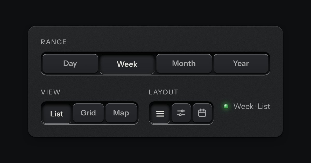
A row of keys in a tray with one pressed down: pick a view, a range or a mode and it applies at once. It is the kit’s selector without the lamps, with sizes, a full-width row and icon segments.
Text entry in a recess, the label printed above it, and a hint that says how to fix an error.