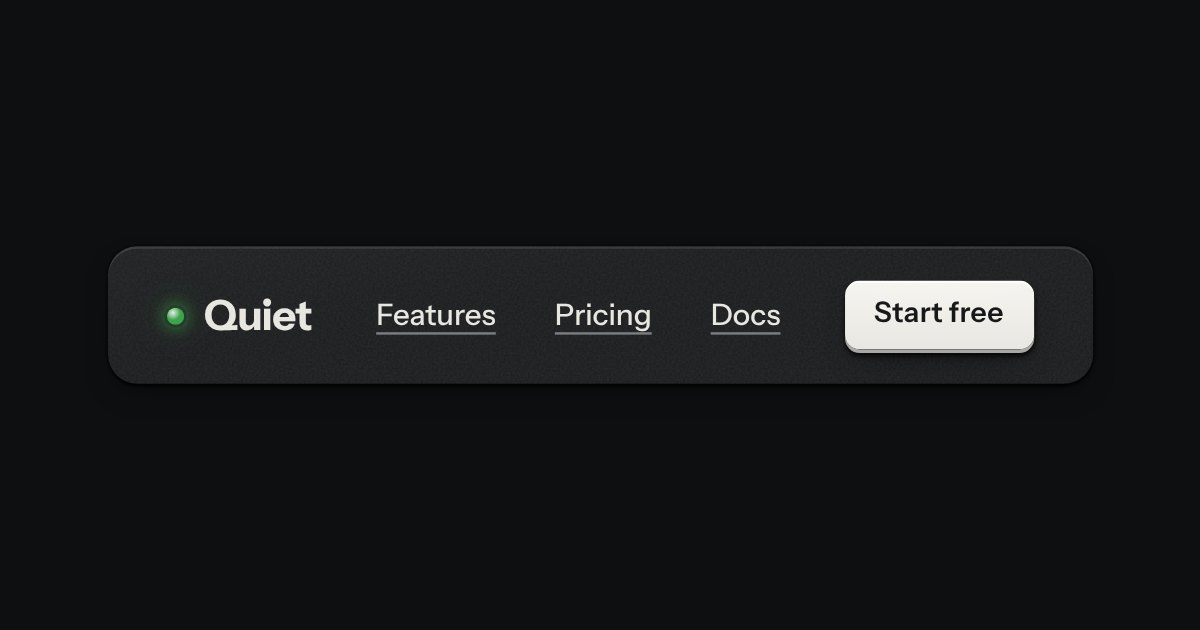
Bar
The top of a page: a wordmark with a lamp, printed links, and one contrast key at most.
Templates
An AI chat app for an everyday screen, on a Quiet page: a list of conversations you can search and fold away, a thread of plain readable messages with real headings, lists, tables and code blocks that have their own copy key, a reply that streams in with a Stop key, and a box that grows as you write, with a model picker and a token count. Replies can be copied, retried and rated; a settings sheet holds the default model, the Quiet and Tactile volume, the finish and a confirmed clear of the history. On a phone the list and the settings are bottom sheets. Loading, empty, error and offline states included.
The top of a page: a wordmark with a lamp, printed links, and one contrast key at most.
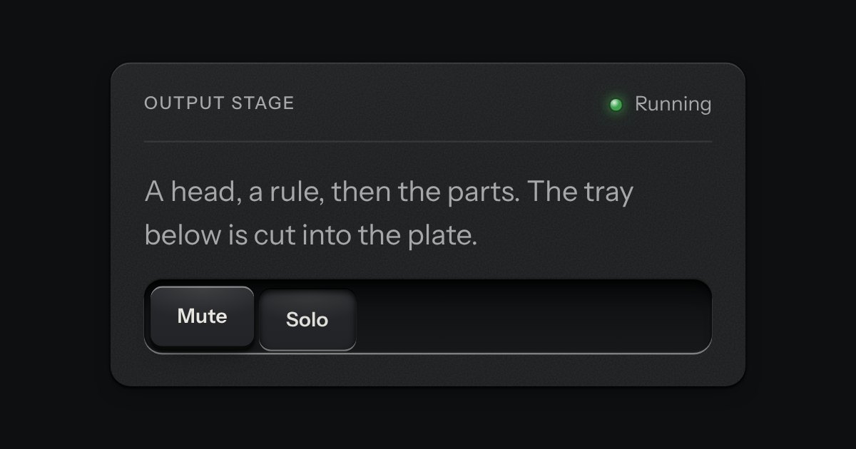
A face plate that groups what belongs together: a head, a rule, then the parts. Screws only on device-like panels.
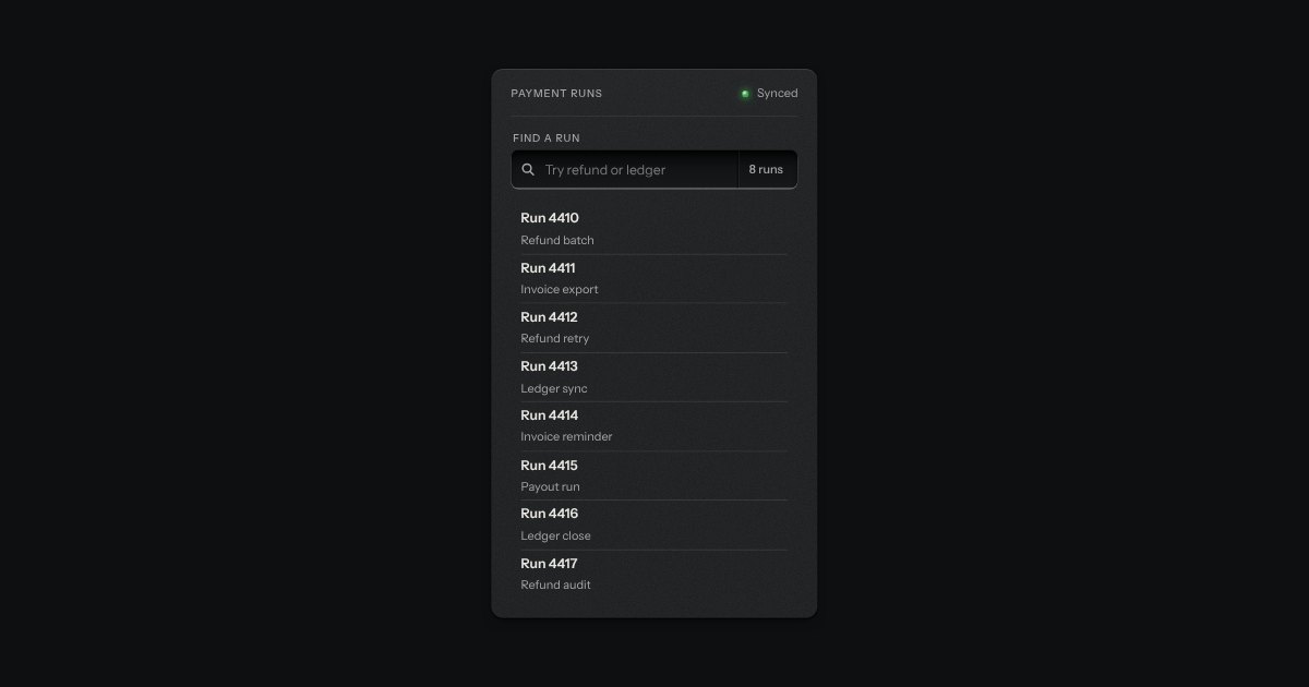
A recess for a question. A glass is printed on its floor at the start, the words run on, an optional count is printed behind an engraved line, and a clear key sits in the far corner while there is something to clear. Escape empties it.
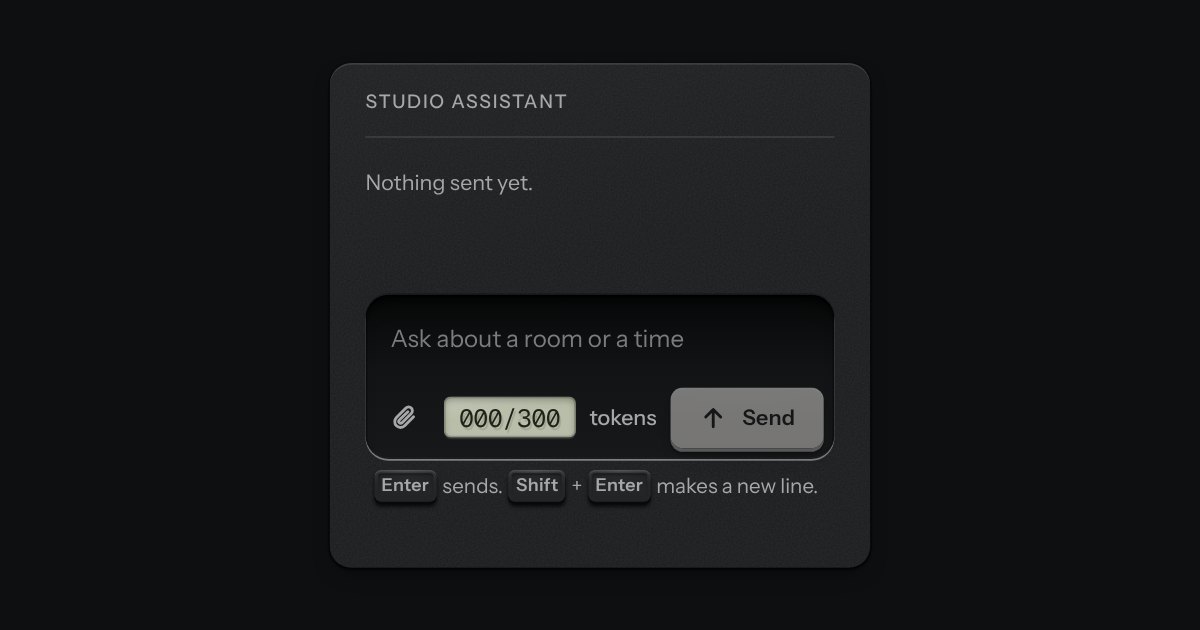
The prompt box. One deep recess holds the text and the keys sit on its floor: attach at one end; at the other a small LCD that counts tokens, amber near the limit and red over it, and the send key, which becomes a stop key while a reply runs. It is a real form with a labelled text area. Enter sends and Shift and Enter make a new line, and the send key is disabled while there is nothing to send. The text grows as you type, up to a height, then scrolls.
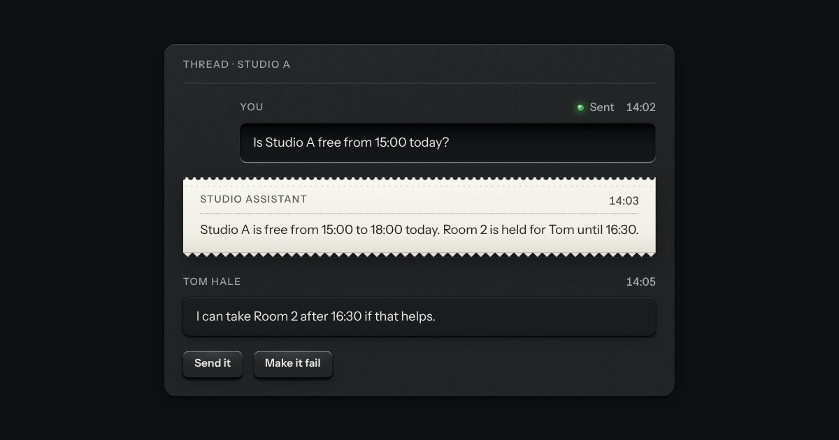
One chat message as a plate, with no chat around it, and made the way the chat is made. What you wrote is typed into a recess and sits to the right; what the assistant said is printed on a slip of paper torn along a perforation; what someone else wrote is a small raised plate. Along the top run the sender, printed as a legend, and the time; a lamp and a word say what has become of your message (sending, sent or not sent). A message that did not go grows a Retry key. Use it in a thread you build yourself, in a notification or in a log of what was said.
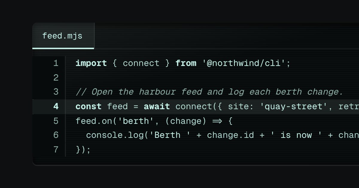
Code on display glass. A bar along the top holds the file name on a tab, with a lit edge under it, and the copy key at the far end. Under it the lines run, each with its number engraved in a gutter that stays where it is when a long line scrolls sideways. The numbers are drawn by the stylesheet, so they are never selected, never copied and never read aloud. Highlighting is optional and small: a few strengths of the display’s own light, told apart by weight and italic, never a colour of its own.
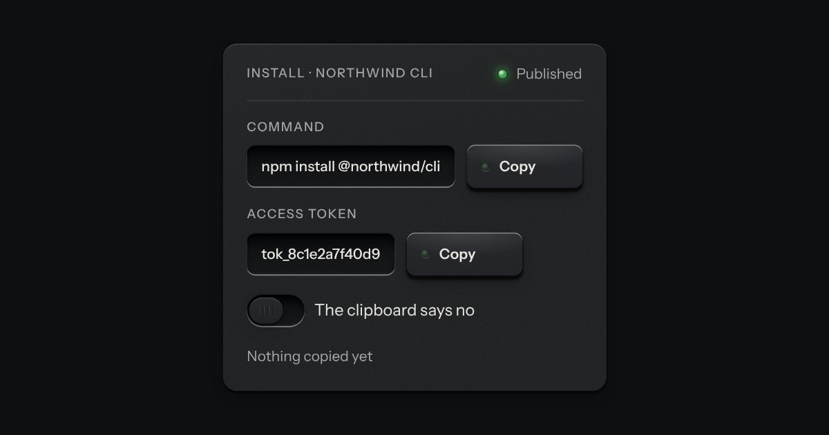
A key that copies a value and says so. Its lamp sits dark in the cap; when the text is on the clipboard the lamp lights, winks once, and the legend says Copied before it goes back to Copy. If the browser refuses the clipboard, the text is selected for the keyboard and the lamp lights amber.
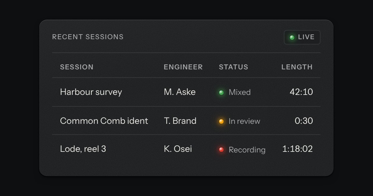
Rows of data with printed column labels, figures right-aligned in columns, and status in lamps with words.
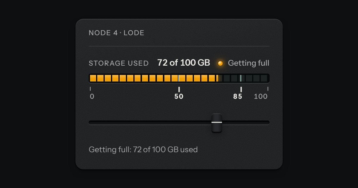
A value inside a known range, read off an LED strip. The strip is a native meter element, so low, high and optimum are the browser’s own: the whole lit length takes the colour of where the value stands (green in the good region, amber next to it, red beyond), not the colour of the segment it has reached. The marks under the strip print where the regions begin, and cut lines across it show the same two places. Words say the state too.
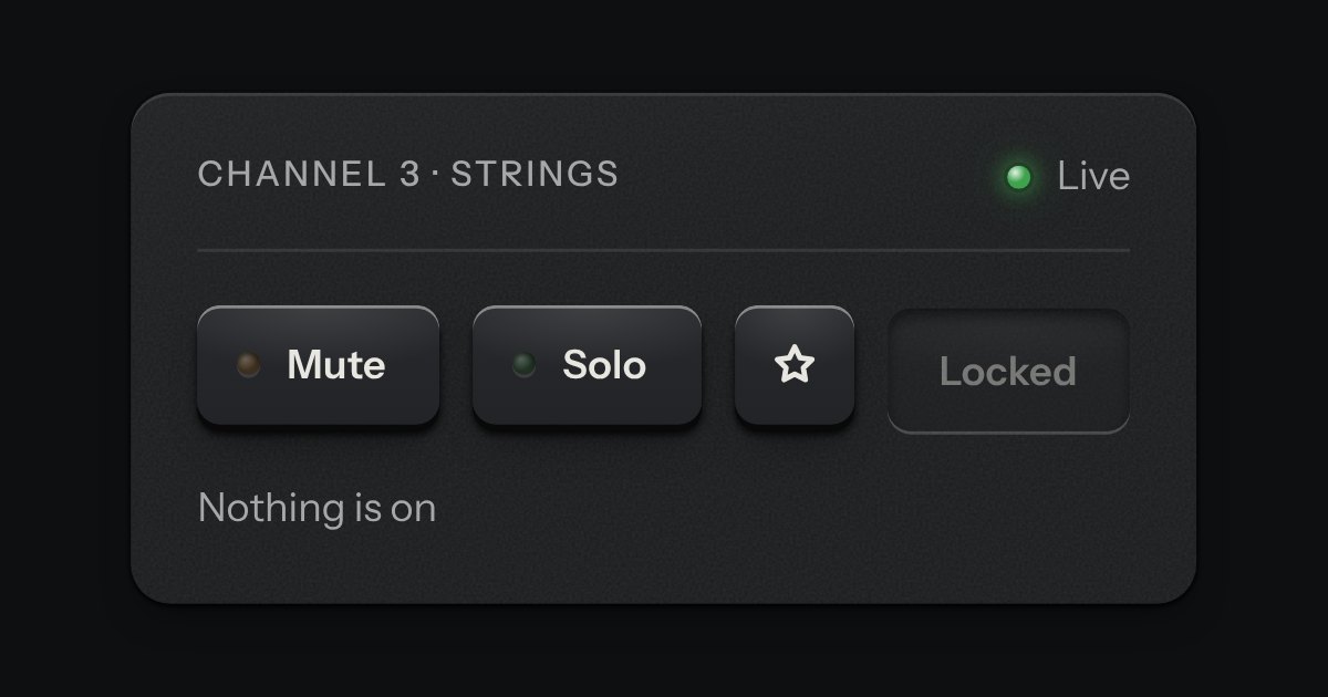
One key that latches below the plate and stays there. It is the kit’s own key with one state to keep, down or up, so it is the way to say mute, pin, bold or armed without the weight of a switch. A lamp in the cap may light while it is down.
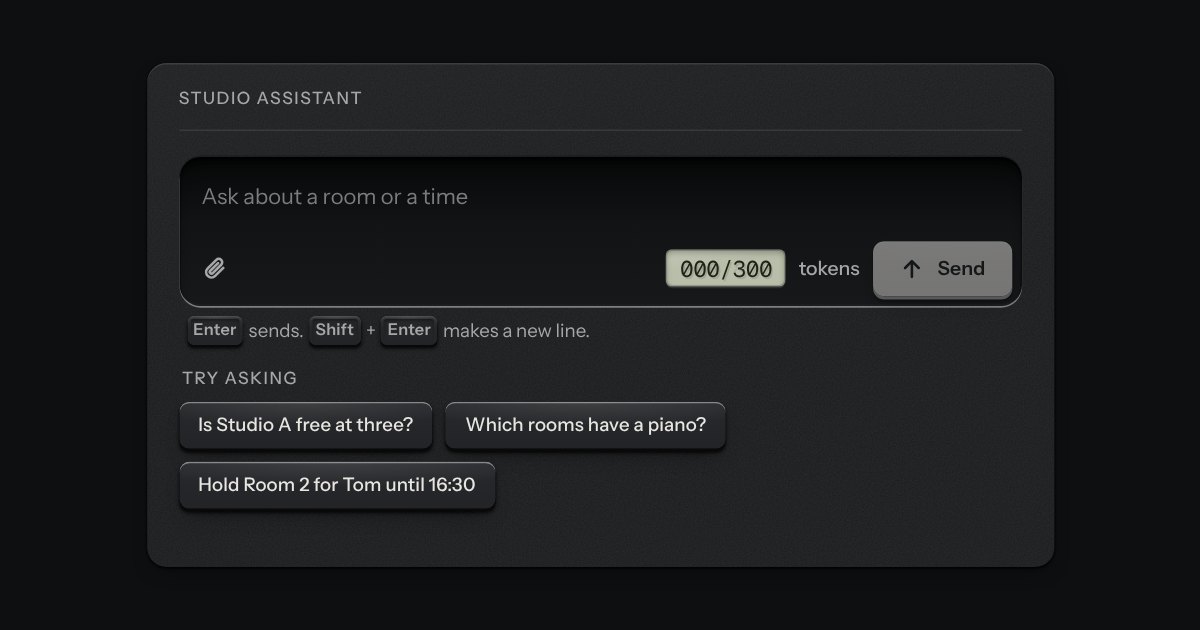
Starter prompts as small plates set out under the composer. Each is a real key (the kit’s cap on its skirt) that is allowed to be a line or two of words, left-aligned like a printed legend. Press one and its words are written into the prompt box, with the caret at the end, and the sending is left to you. It fills the composer next to it, or any text area you point it at, and it works on its own as plain buttons with an event when there is no box to fill.
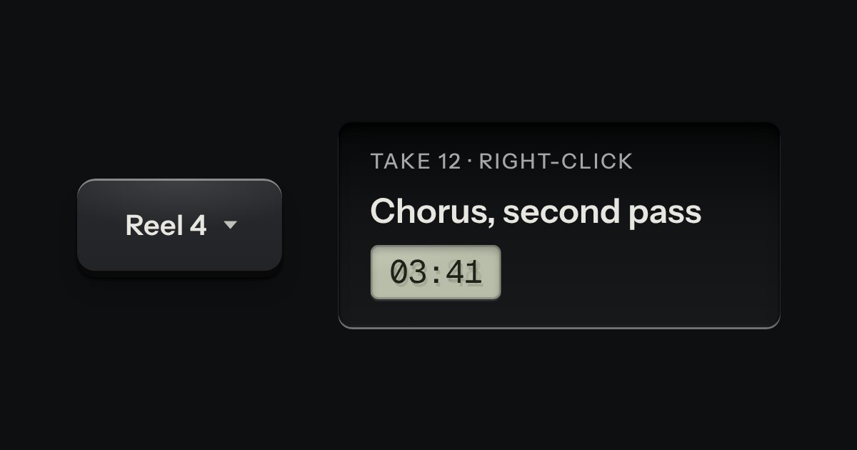
A card of actions and options that slides out from under its key. The key stays down while the card is out; an option that is on lights its lamp.
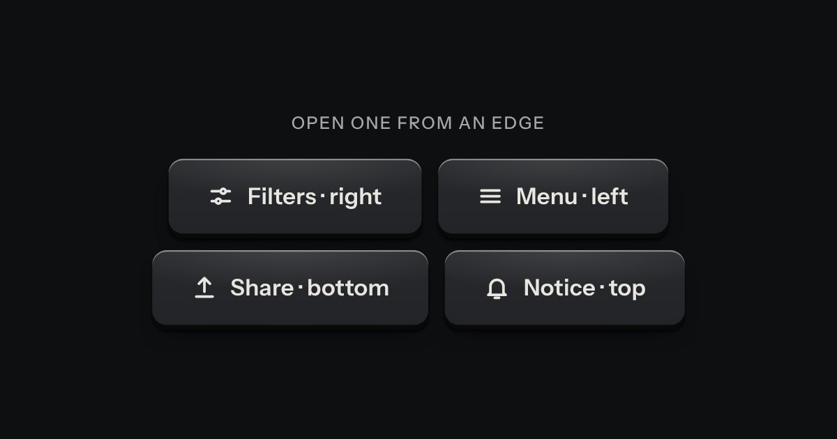
A panel that slides in from any edge of the window, on the native dialog. A face plate bolted to the frame, with a machined grip let into its inner edge to pull it shut by.
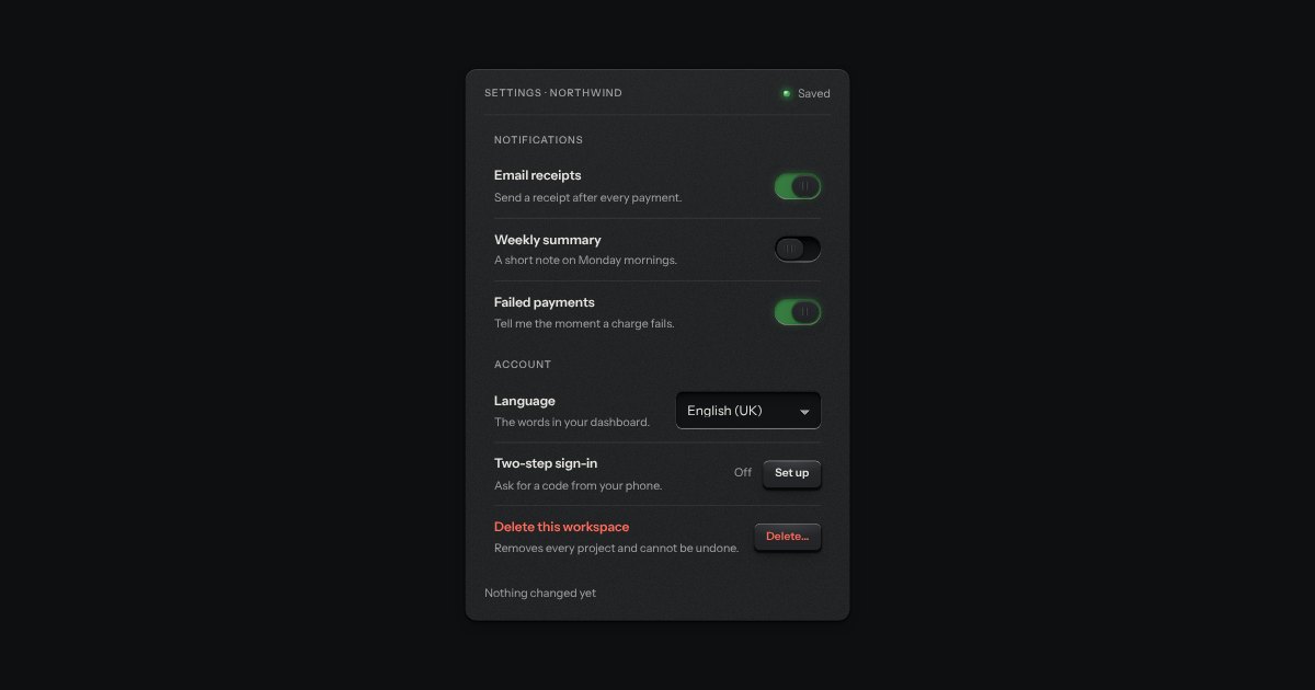
What a settings page is made of: a label, one sentence under it and the control at the end, ruled like the list with a hairline between rows and nothing else drawn. A row with a switch or a check is one label, so pressing anywhere on it turns the control; a row with a key, a select or a value is a plain box, so a press means what the key says.
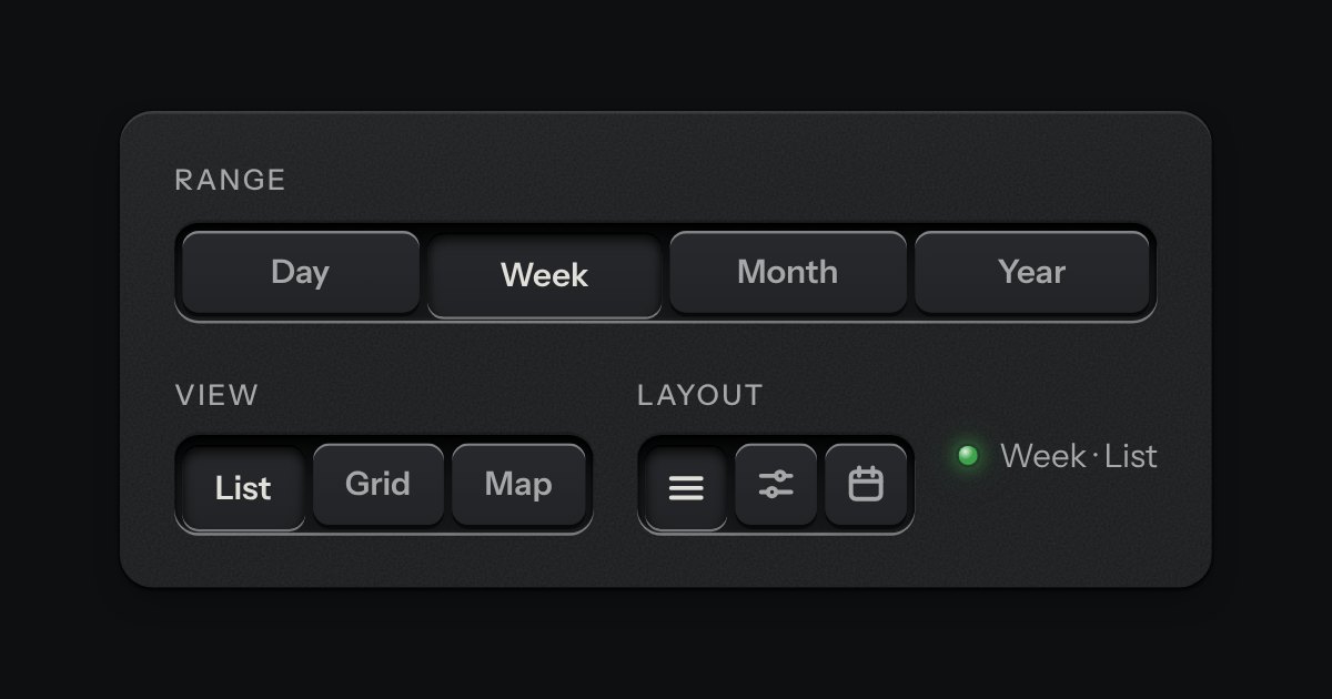
A row of keys in a tray with one pressed down: pick a view, a range or a mode and it applies at once. It is the kit’s selector without the lamps, with sizes, a full-width row and icon segments.
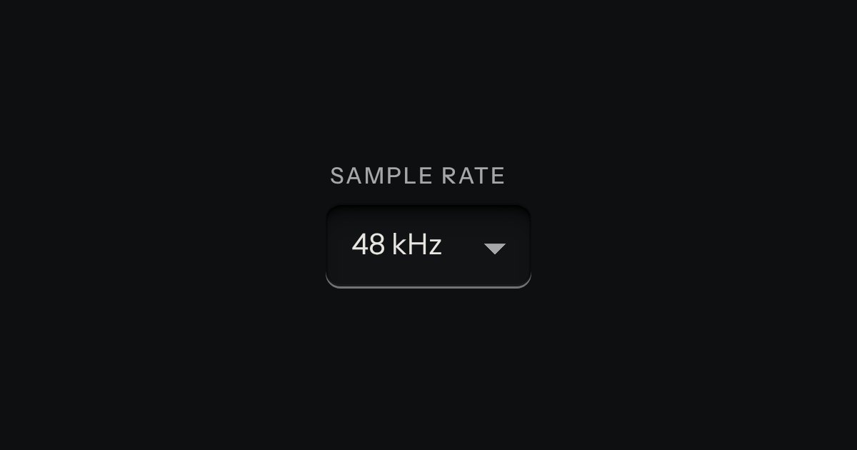
A choice from a longer list, in the same recess as a field, with a printed chevron. The browser’s own menu opens it.
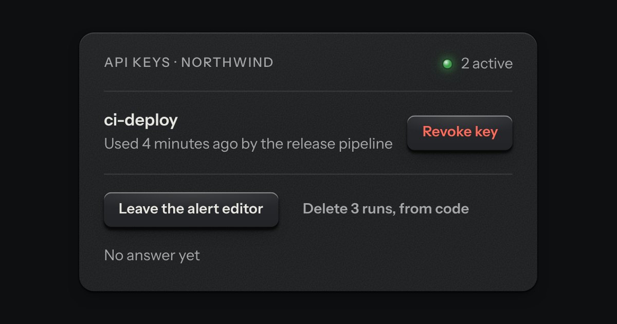
The dialog plate for a question that must be answered before an act that matters. A caution strip is set across its head with one lamp in it, red when the act cannot be undone and amber when it can. The question is the title, one sentence says what will happen, and a grave act can ask for its name to be typed first.
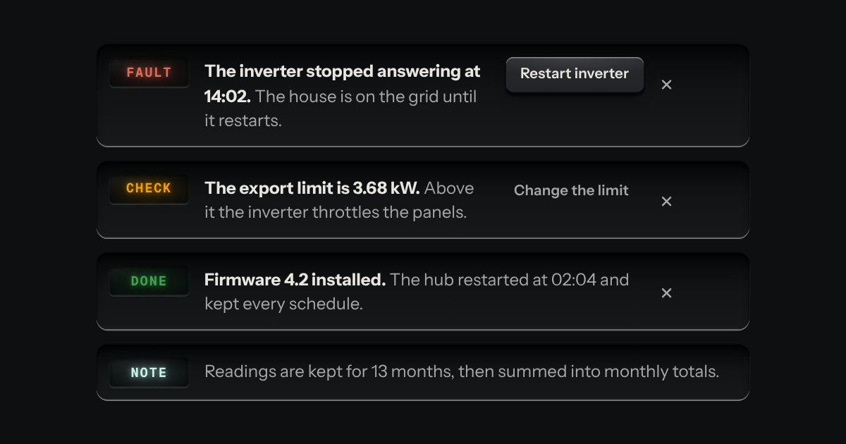
A message let into the surface, with an annunciator: a small lit legend (Note, Done, Check, Fault) beside the words that say what happened.
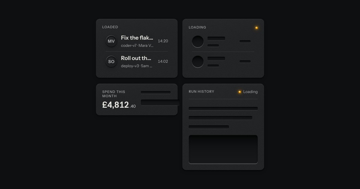
The shape of a page before its data arrives, drawn as the unprinted plate: blank engraved bars where the words will print. Nothing on it moves. One amber lamp beside “Loading” is the only sign of work.
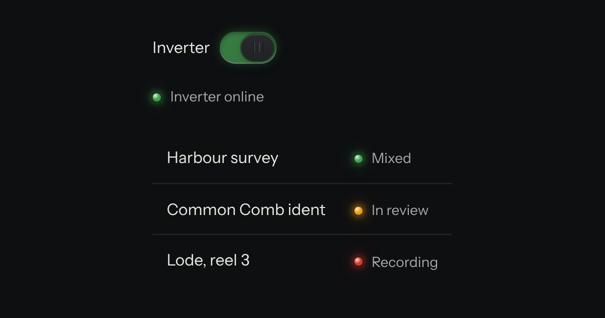
A lamp with words: the state line in tables, panel heads and lists. The words carry the meaning; the lamp is the glance.
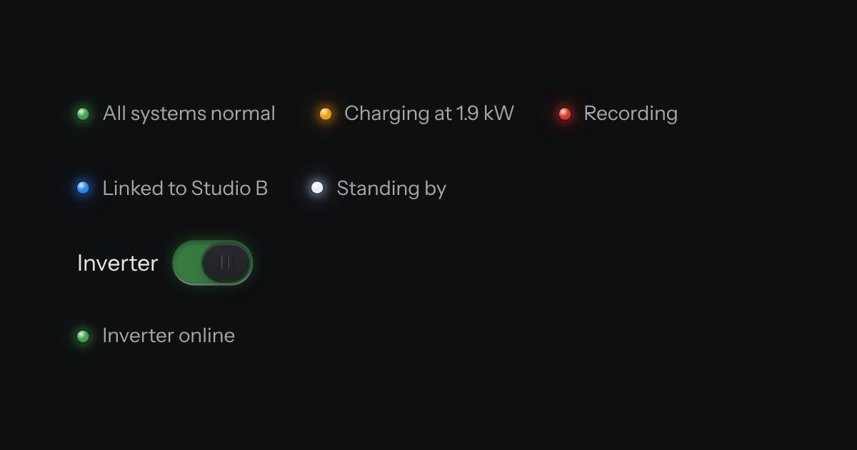
The only colour in the kit: a lamp that is on. Green is on, amber is waiting, red is recording or failing, blue is linked, white is standing by. Always next to words.
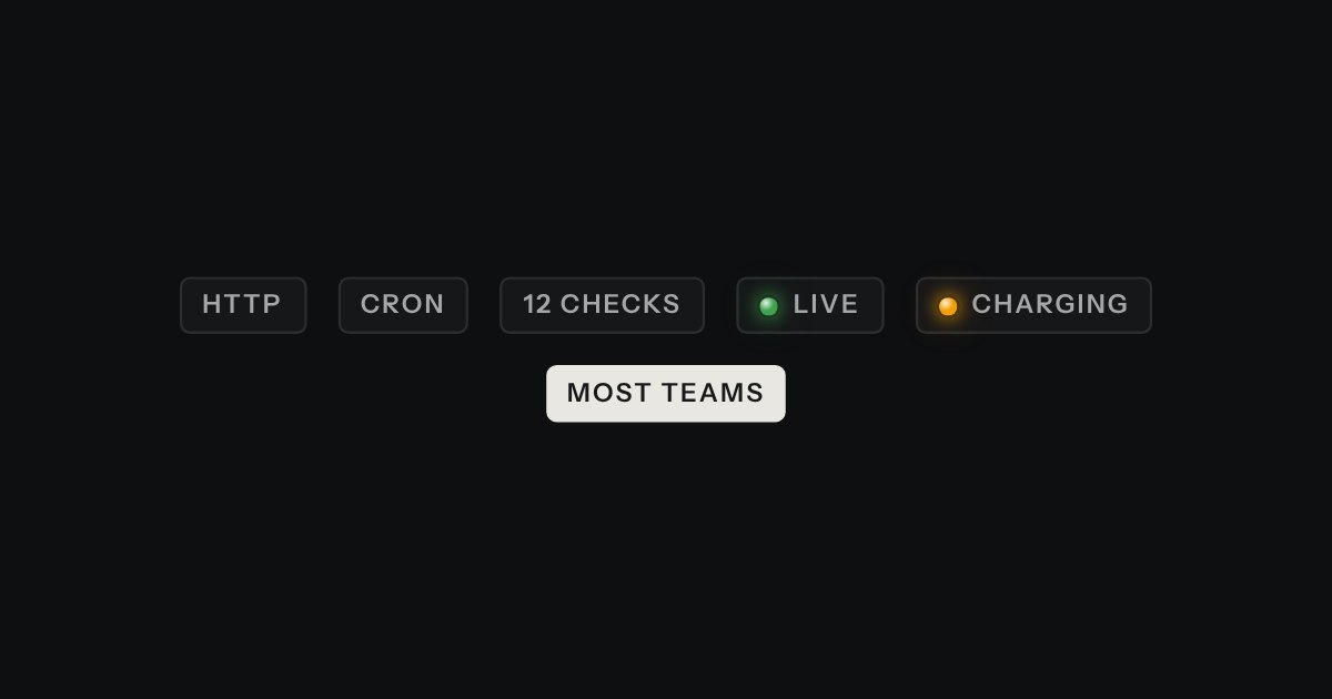
A small printed plate: a type, a count, a badge. Solid for the one tag that must stand out.
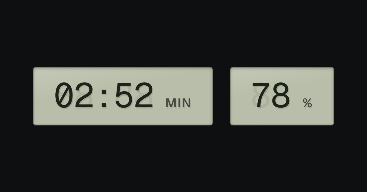
A value that changes, on grey-green liquid crystal, with a ghost of the unlit segments behind it: clocks, battery, counters.
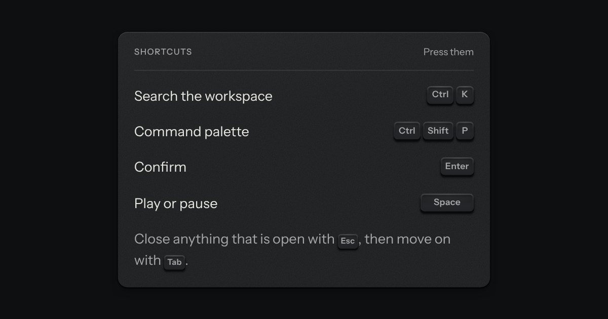
The key to press, drawn as the key: a small cap on a skirt with a dish worked into its top. Shortcuts come as combos and follow the platform, so ⌘ K on a Mac is Ctrl K elsewhere.
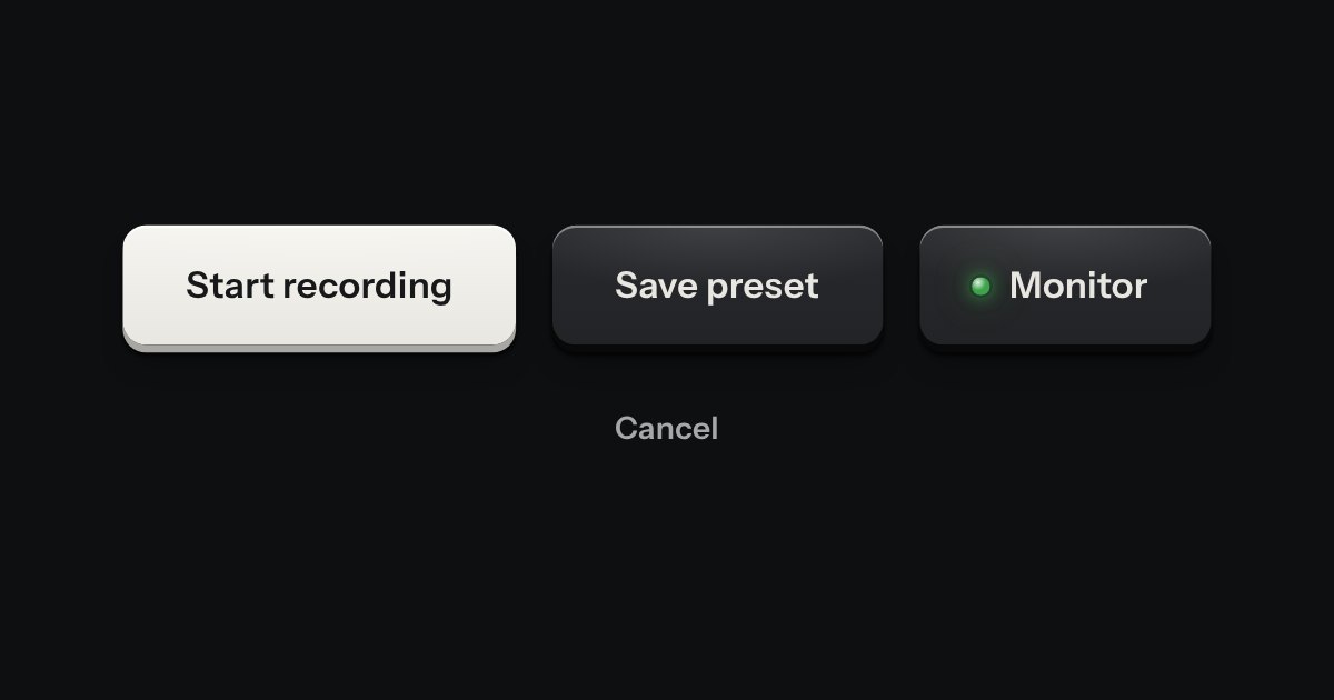
Every button, and every link that acts like one: a cap on a skirt that drops below the plate when pressed.
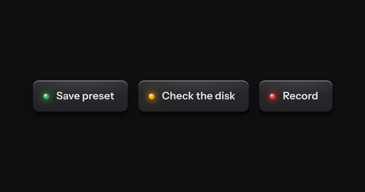
A confirmation after an action.
Bar with a status, a New chat key and Settings · a list of conversations in a panel (a search field with a count, then Pinned, Today and Earlier), folded away with one key, or a sheet on a phone · a head with the chat name, its model and a meter of how much context is used · the thread, a log: your messages in the message well, replies as plain text in a reading column with headings, lists, a table and code on glass with a copy key; copy, retry and rate shown on hover and focus and always on touch · the composer: a growing recess with attach, a model select, a token count on an LCD, Send and Stop, and one line of help · first run: three example prompts as suggestion chips · a settings sheet: default model, volume, finish, and Clear chats behind an alert dialog · a key at the foot that shows the other states (?state=).