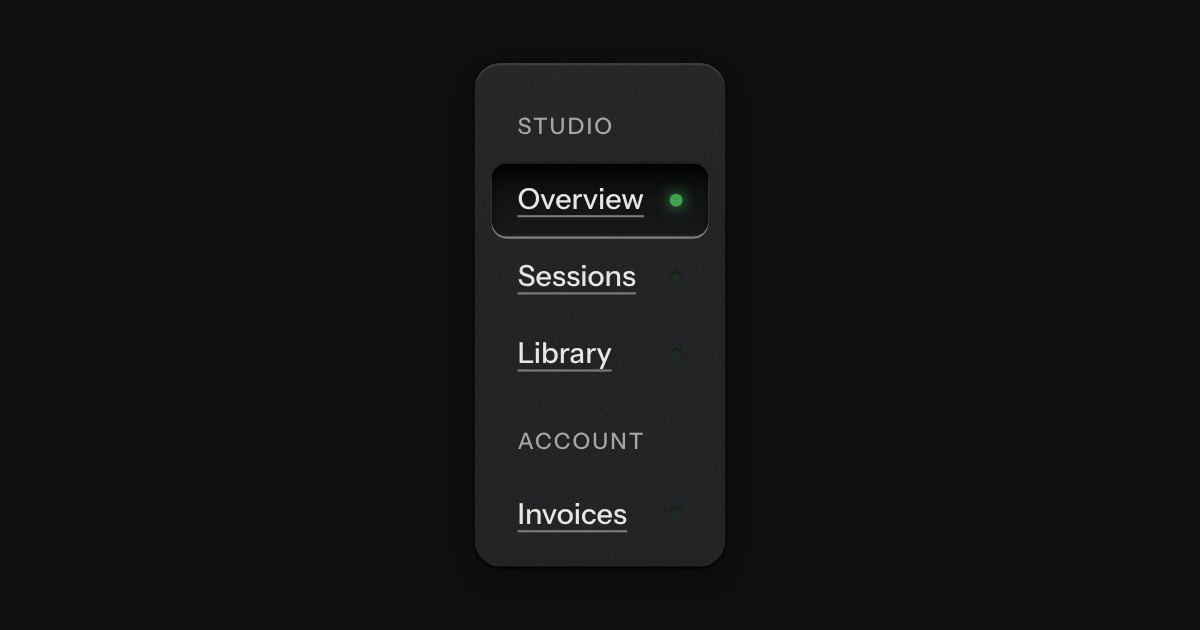
Side rail
App navigation in a panel: the current page is a recess with its lamp lit, links grouped under printed labels.
Kit parts
The top of a page: a wordmark with a lamp, printed links, and one contrast key at most.
Seats open in 11 days. Want one email that morning?
A flex row and type, nothing else. The lamp is the kit’s lamp; the key is the kit’s key.
The current page is printed in full ink; the rest in the second ink.
App navigation in a panel: the current page is a recess with its lamp lit, links grouped under printed labels.
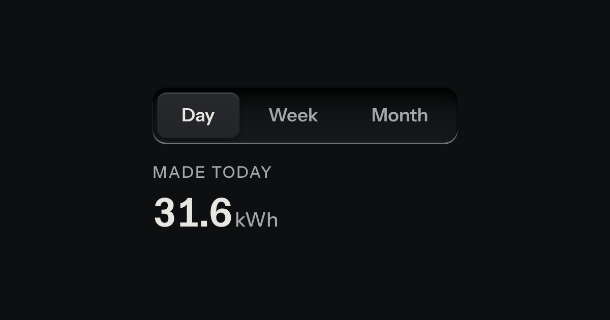
Views of the same thing, switched in place: keys in a tray, the chosen view a raised cap.
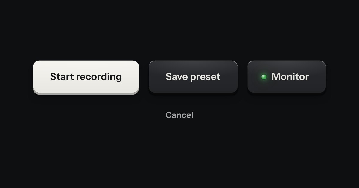
Every button, and every link that acts like one: a cap on a skirt that drops below the plate when pressed.