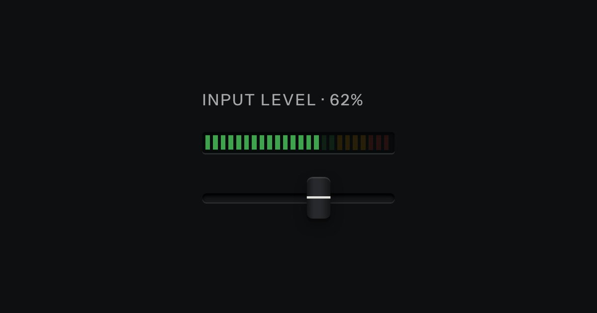
Ladder
An LED ladder for levels and load: green, then amber, then red, the way a recording level has always been read.
Kit part · Progress
A value inside a known range, read off an LED strip. The strip is a native meter element, so low, high and optimum are the browser’s own: the whole lit length takes the colour of where the value stands (green in the good region, amber next to it, red beyond), not the colour of the segment it has reached. The marks under the strip print where the regions begin, and cut lines across it show the same two places. Words say the state too.
Seats open in 11 days. Want one email that morning?
Both finishes, side by side. Hover, pressed and focus are forced with .is-hover, .is-down and .is-focus; checked and disabled are real.
Aluminium
| Part | Good | Fair | Poor |
|---|---|---|---|
| Storage |
Graphite
| Part | Good | Fair | Poor |
|---|---|---|---|
| Storage |
| Name | Kind | Values | What it does |
|---|---|---|---|
| div.tui-meter | element | --lo and --hi | The meter and its label, value and state. Set --lo and --hi (0 to 1) to where the meter’s low and high fall, so the cut lines and marks agree with them. |
| .tui-meter__strip > meter | element | min max low high optimum value | The native meter, drawn as the strip. It gives the screen reader its value and range and the browser the colour of the lit length. |
| .tui-meter__head | element | label, value, state | A real label for the meter, the figure and the state in words, with a lamp that agrees (green, amber or red). |
| .tui-meter__marks > .tui-meter__mark | element | --at: 0 to 1 | A printed tick under the strip and its figure, at that fraction of the range. Add --cut for the two thresholds. The first and last lean away from the edge. |
| --n | CSS property | 24 | The number of segments. |
| --lg · --bare | modifier | tui-meter--lg, --bare | A taller strip; or the strip without its cut lines. |
| meterState(value, range) · meterRegion() · meterFraction() | function | pure | The browser’s rule in code: "good", "fair" or "poor", which third of the range, and where in 0 to 1. |
| setMeter(root, value) | function | needs kit.mjs | Sets the native value, the lamp, the words from data-good, data-fair and data-poor, and fires tui-meter-change. |
<div class="tui-meter" style="--lo:.5;--hi:.85"
     data-good="Plenty free" data-fair="Getting full" data-poor="Nearly full">
  <div class="tui-meter__head">
    <label class="tui-label" for="disk">Storage used</label>
    <span class="tui-meter__value">72 GB</span>
    <span class="tui-meter__state">
      <span class="tui-lamp" data-lamp="amber" data-on aria-hidden="true"></span>
      <span class="tui-meter__words">Getting full</span>
    </span>
  </div>
  <div class="tui-meter__strip">
    <meter id="disk" min="0" max="100" low="50" high="85" optimum="20" value="72">72 GB</meter>
  </div>
  <div class="tui-meter__marks" aria-hidden="true">
    <span class="tui-meter__mark" style="--at:0"><span>0</span></span>
    <span class="tui-meter__mark tui-meter__mark--cut" style="--at:.5"><span>50</span></span>
    <span class="tui-meter__mark tui-meter__mark--cut" style="--at:.85"><span>85</span></span>
    <span class="tui-meter__mark" style="--at:1"><span>100</span></span>
  </div>
</div>
import { setMeter, meterState } from '/kit/kit.mjs';
// Sets the native value, the lamp, the state's words and fires tui-meter-change.
setMeter(document.querySelector('.tui-meter'), 91);
meterState(91, { min: 0, max: 100, low: 50, high: 85, optimum: 20 }); // 'poor'
meterState(72, { min: 0, max: 100, low: 50, high: 85, optimum: 20 }); // 'fair'Needs kit.css only, no script. How to install the kit.
<meter> with a real <label>, so a screen reader says “Storage used, meter, 72 of 100”, with the range and the value, and no ARIA is needed.It is the ladder’s dark glass with the opposite idea in it. The ladder paints its segments by position, green then amber then red along its length, so it shows how far up a scale something is. The meter paints the whole lit length one colour, chosen by the native meter from low, high and optimum, so it shows whether the value is good: the same 40 on a strip whose good end is high is red and on one whose good end is low is green. The cut lines and printed marks are drawn from two custom properties, and the segment gaps are laid over the browser’s own bar.
Show where a value stands between a low and a high that matter: storage used, a score, a cabinet’s temperature, with the thresholds printed under the strip.
6 rules in this file, with the foundations they rest on and the anti-patterns that break them. Full rules ship in the brain with the Pass.
An LED ladder for levels and load: green, then amber, then red, the way a recording level has always been read.
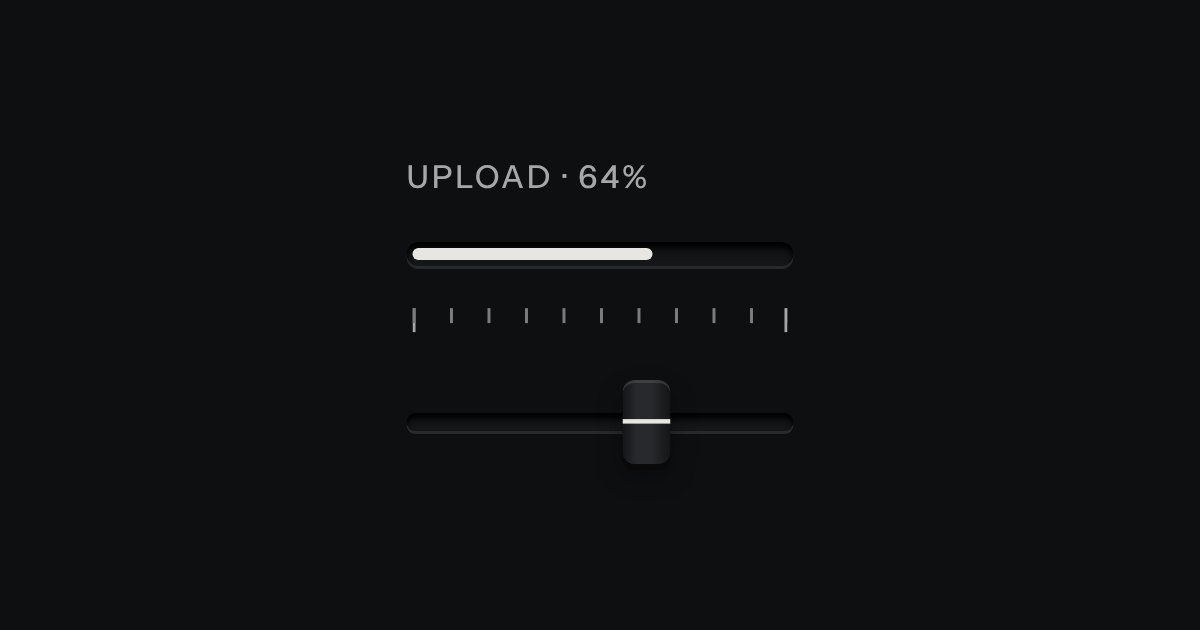
Progress through a task: ink filling a groove, never a coloured bar.
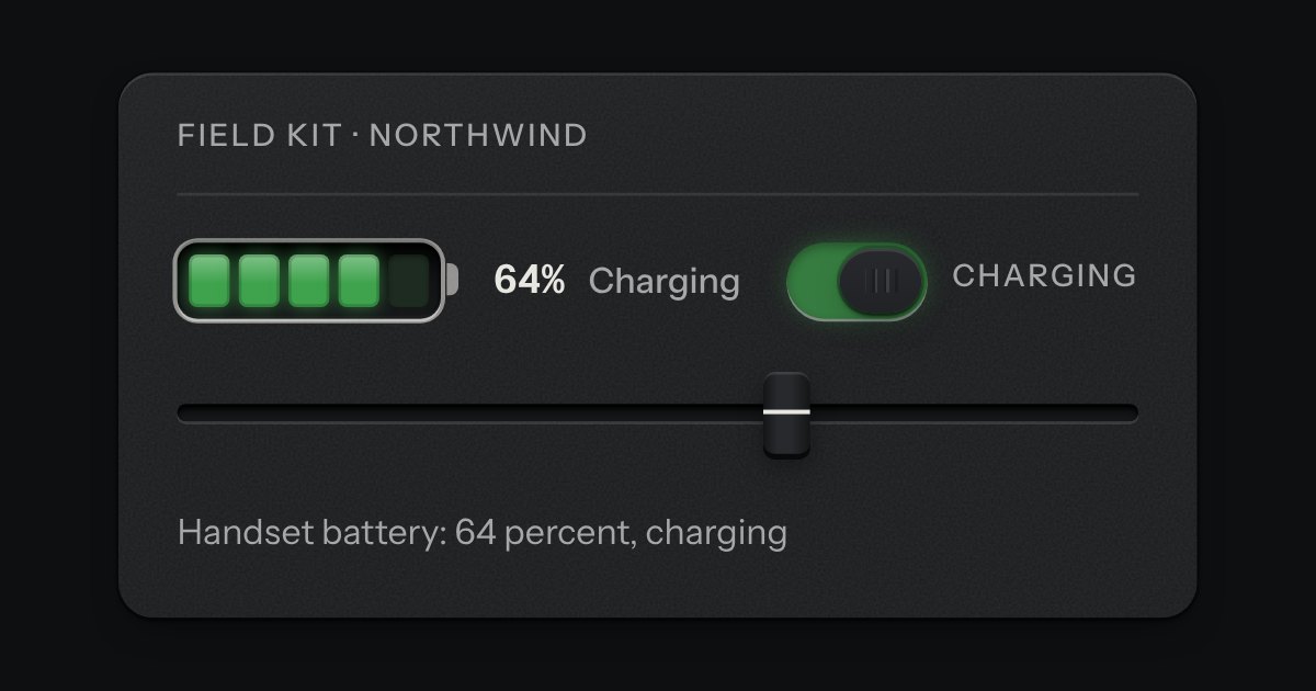
A cell outline with a terminal at one end, filled with lamp segments set into a recess, lit from the empty end. The lit segments are one lamp colour for the whole cell: green, amber below two fifths, red below a fifth. While it charges, the top lit segment breathes. The level is said in words too, so neither the colour nor the breathing is the only sign.
The only colour in the kit: a lamp that is on. Green is on, amber is waiting, red is recording or failing, blue is linked, white is standing by. Always next to words.