Field
Text entry in a recess, the label printed above it, and a hint that says how to fix an error.
Kit part · Selects
A choice from a longer list, in the same recess as a field, with a printed chevron. The browser’s own menu opens it.
Seats open in 11 days. Want one email that morning?
Both finishes, side by side. Hover, pressed and focus are forced with .is-hover, .is-down and .is-focus; checked and disabled are real.
Aluminium
| Part | Rest | Focus | Chosen | Error |
|---|---|---|---|---|
| Select |
Graphite
| Part | Rest | Focus | Chosen | Error |
|---|---|---|---|---|
| Select |
| Name | Kind | Values | What it does |
|---|---|---|---|
| .tui-select | class | on <select> | The field recess, with a printed chevron and 34px kept clear on the right. |
| .tui-field | class | on <label> | The printed label above, the hint below. |
| data-error | attribute | on .tui-field | Red hairline and red hint. |
| change | event | Native. | |
| Arrows · Space · type-ahead | keyboard | Native select behaviour. |
<label class="tui-field">
  <span class="tui-label">Sample rate</span>
  <select class="tui-select">
    <option>44.1 kHz</option>
    <option selected>48 kHz</option>
    <option>96 kHz</option>
  </select>
</label>
Needs kit.css only, no script. How to install the kit.
A native <select> with appearance: none in the field’s recess. The chevron is two 5px triangles drawn by linear gradients in --tui-ink-2. The open menu is not restyled: it stays the platform’s.
The label is printed above; an error carries a hint that says what to do.
5 rules in this file, with the foundations they rest on and the anti-patterns that break them. Full rules ship in the brain with the Pass.
Text entry in a recess, the label printed above it, and a hint that says how to fix an error.
One choice from a short list in a form: small round keys in a fieldset, the chosen one pressed with a printed dot.
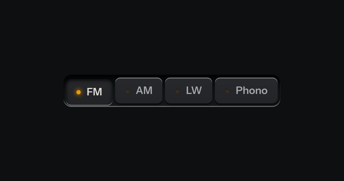
One mode of two to five: latching keys in a tray, one down at a time, each with a lamp that lights when chosen.