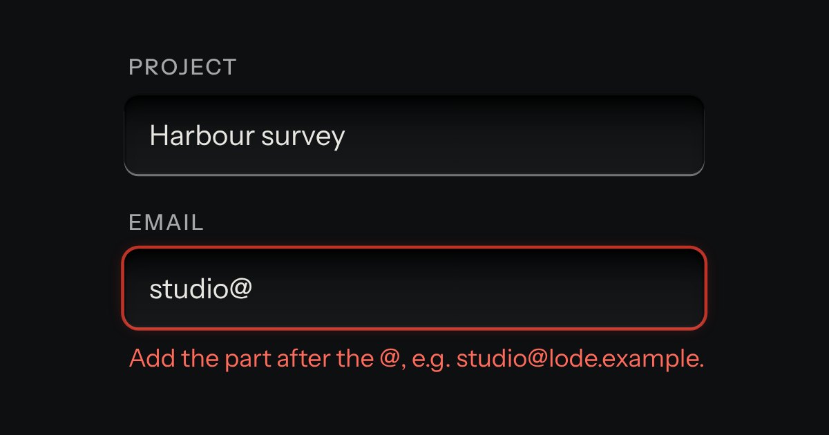
Field
Text entry in a recess, the label printed above it, and a hint that says how to fix an error.
Kit parts
A form that says what is wrong, on the browser’s own checks. Press submit with something missing and each field in error gets a line under it with a red lamp lit and words that say how to put it right, its well ringed red; at the top of the form an annunciator lights over a count and a list that links to each field, and takes the focus. From then on each field is checked again as it changes.
Seats open in 11 days. Want one email that morning?
A group of radios or checks in a fieldset is one entry.
| Name | Kind | Description |
|---|---|---|
| required · type · pattern · min · max · minlength · maxlength · step | attribute | The rules, the browser’s own. Nothing is checked that the browser does not check. |
| data-error-required · -type · -pattern · -min · -max · -minlength · -maxlength · -step | attribute | The words for each way a field can fail, saying how to put it right. data-error for any; the browser’s message when there is none. |
| fieldset | element | A group with one name is one entry, named by its legend and linked to its first option. Put its words on the fieldset. |
| validateMessage · validateLabel · validateSummary | function | The rules, pure: the words for a failure, a label without its “*”, and the summary’s heading and lines. |
Press Create workspace with the form empty: the summary takes the focus, and each line takes you to its field. Fix one and watch it leave the list. Try “Lode Ops” as the name, “ana@” as the email, or 0 seats.
Text entry in a recess, the label printed above it, and a hint that says how to fix an error.
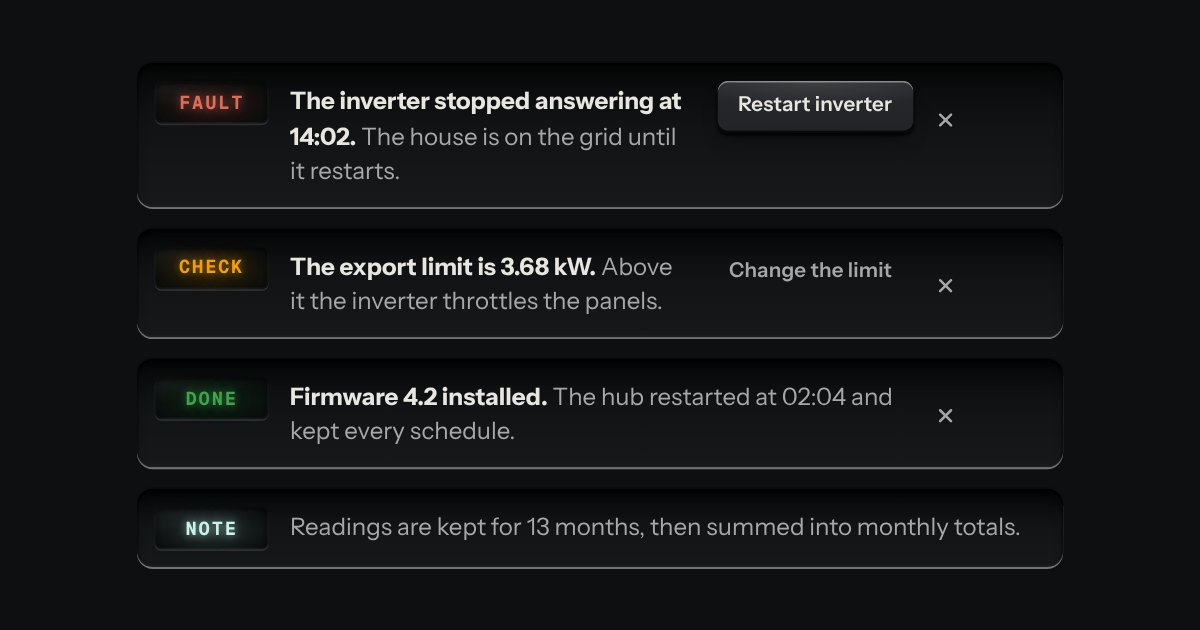
A message let into the surface, with an annunciator: a small lit legend (Note, Done, Check, Fault) beside the words that say what happened.
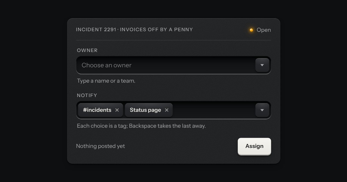
A field that filters a long list as you type. It starts as a plain select, so it posts with the form and works without a script; then the options card slides out of a slot under the well, the letters that match print heavier and the chosen option’s lamp is lit. Several choices sit in the well as tags.