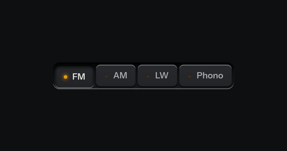
Selector
One mode of two to five: latching keys in a tray, one down at a time, each with a lamp that lights when chosen.
Kit part · Code & devtools
One command, four package managers. A row of selector keys (npm, pnpm, yarn and bun) sits over a line of display glass with the command on it and the copy key at the end. Press another key and the command is rewritten; the choice is remembered, and every other install snippet on the page follows it, so someone who uses pnpm reads pnpm all the way down the guide. It is the kit’s selector and copy key with one small script between them.
Seats open in 11 days. Want one email that morning?
npm install @northwind/clinpm install -D @northwind/lintnpm install -g @northwind/clinpx @northwind/cli initnpm install @northwind/harbour-schedules-and-tides-clientBoth finishes, side by side. Hover, pressed and focus are forced with .is-hover, .is-down and .is-focus; checked and disabled are real.
Aluminium
| Part | npm | pnpm | yarn | bun |
|---|---|---|---|---|
| Chosen | npm install @northwind/cli | pnpm add @northwind/cli | yarn add @northwind/cli | bun add @northwind/cli |
| Key focused | npm install @northwind/cli | pnpm add @northwind/cli | yarn add @northwind/cli | bun add @northwind/cli |
Graphite
| Part | npm | pnpm | yarn | bun |
|---|---|---|---|---|
| Chosen | npm install @northwind/cli | pnpm add @northwind/cli | yarn add @northwind/cli | bun add @northwind/cli |
| Key focused | npm install @northwind/cli | pnpm add @northwind/cli | yarn add @northwind/cli | bun add @northwind/cli |
| Name | Kind | Values | What it does |
|---|---|---|---|
| .tui-install[data-install][data-pkg] | element | the package | The snippet. data-pkg is the package, or the package and its arguments for exec. Use a name of your own. |
| [data-mode] | attribute | add · dev · global · exec | What the command does. Add is the default; exec runs the package once without installing it. |
| .tui-seg[role="radiogroup"] > label > input[type="radio"] | element | npm · pnpm · yarn · bun | The selector. Each radio’s value is the manager, and each group needs a name of its own: two groups with one name are one group to the browser. |
| code.tui-install__cmd | element | the command | On glass, with the prompt drawn in the margin by the stylesheet, so it is never copied. The script rewrites its text. |
| button.tui-copy-key[data-copy-from] | element | points at the command’s id | The kit’s copy key: it copies whatever the command says now. |
| [data-install-fixed] | attribute | on the snippet | Keeps a snippet on its own choice, for a demonstration. It still rewrites itself when pressed. |
| tui-install-manager | event | bubbles | Fired on the snippet that was changed, with detail { manager }. |
| installCommand(manager, pkg, mode) | function | pure | The command for a manager, a package and a mode. An unknown manager or mode falls back to npm and add. |
| setInstallManager(manager) · installRemembered() | function | needs kit.mjs | Set every snippet and remember it as tui-pm; read the remembered choice back, or an empty string. |
<!-- A native radio group of keys, a line of glass, the copy key. Each snippet's radios need a name of their own. -->
<div class="tui-install" data-install data-pkg="@northwind/cli">
  <div class="tui-seg tui-seg--sm" role="radiogroup" aria-label="Package manager">
    <label><input type="radio" name="pm-1" value="npm" checked><span>npm</span></label>
    <label><input type="radio" name="pm-1" value="pnpm"><span>pnpm</span></label>
    <label><input type="radio" name="pm-1" value="yarn"><span>yarn</span></label>
    <label><input type="radio" name="pm-1" value="bun"><span>bun</span></label>
  </div>
  <div class="tui-glass tui-install__glass">
    <code class="tui-install__cmd" id="pm-1-cmd">npm install @northwind/cli</code>
    <button class="tui-key tui-key--flat tui-key--sm tui-copy-key" type="button" data-copy-from="#pm-1-cmd" aria-label="Copy install command"></button>
  </div>
</div>

<!-- data-mode: dev, global or exec (run once, no install). data-install-fixed: stays on its own choice. -->
import { setInstallManager, installCommand } from '/kit/kit.mjs';
installCommand('pnpm', '@northwind/cli', 'dev'); // "pnpm add -D @northwind/cli"
setInstallManager('bun'); // every snippet, remembered as tui-pm
document.addEventListener('tui-install-manager', (e) => track(e.detail.manager));Needs kit.css and kit.mjs. How to install the kit.
The kit’s selector and the kit’s copy key, on a line of .tui-glass. The script is about forty lines: it builds the command from a table of four words per manager, delegates the radios’ change, and remembers the answer. The glass and the keys draw themselves in every finish and volume as they do elsewhere.
Print the install command once and let the reader choose their package manager: the keys rewrite it, the copy key takes it, and the whole page remembers the choice.
6 rules in this file, with the foundations they rest on and the anti-patterns that break them. Full rules ship in the brain with the Pass.
One mode of two to five: latching keys in a tray, one down at a time, each with a lamp that lights when chosen.
A key that copies a value and says so. Its lamp sits dark in the cap; when the text is on the clipboard the lamp lights, winks once, and the legend says Copied before it goes back to Copy. If the browser refuses the clipboard, the text is selected for the keyboard and the lamp lights amber.
const berth = 'A1';
const open = true;
return { berth, open };
Code on display glass. A bar along the top holds the file name on a tab, with a lit edge under it, and the copy key at the far end. Under it the lines run, each with its number engraved in a gutter that stays where it is when a long line scrolls sideways. The numbers are drawn by the stylesheet, so they are never selected, never copied and never read aloud. Highlighting is optional and small: a few strengths of the display’s own light, told apart by weight and italic, never a colour of its own.