Key
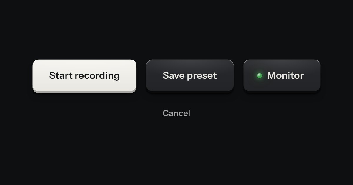
Every button, and every link that acts like one: a cap on a skirt that drops below the plate when pressed.
Kit parts
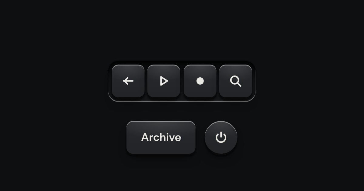
A key with an icon and no words, square or round: transport, power, the small tools. Its aria-label names it; a tip shows the name.
Seats open in 11 days. Want one email that morning?
How it is built, line by line, comes with its code and styling.
| Name | Kind | Description |
|---|---|---|
| aria-label | attribute | The key’s name. Screen readers read this, not the icon. |
| data-tip | attribute | The name, printed above on hover and focus. |
| aria-pressed | attribute | For latching keys, like power. |
| svg | element | Any icon drawn in currentColor, marked aria-hidden. |
Hover or Tab to a key to see its name. Power latches.
Every button, and every link that acts like one: a cap on a skirt that drops below the plate when pressed.
A few words on a small label plate, the kind riveted beside a control on a rack: printed in the contrast colours with a rule just inside its edge and a short tab aimed at its key. It comes up when a pointer rests on the key or the keyboard reaches it, is read by a screen reader, and goes on Escape.
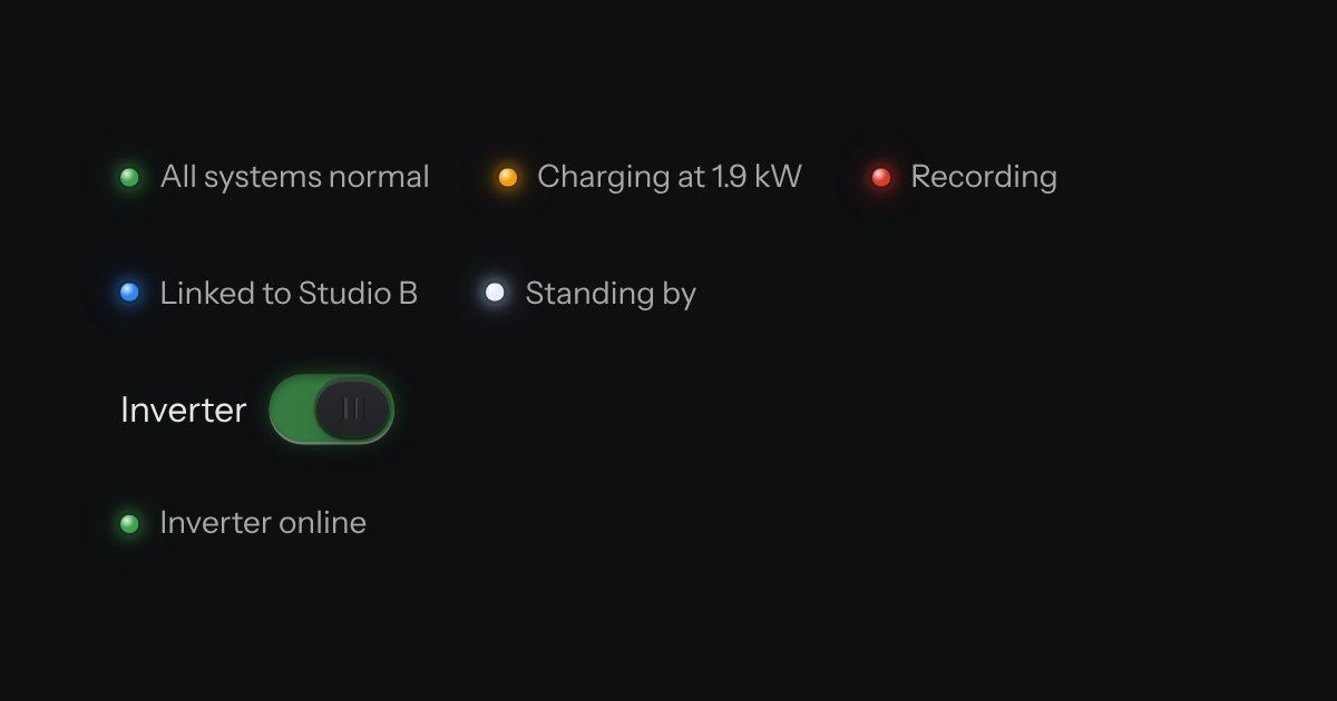
The only colour in the kit: a lamp that is on. Green is on, amber is waiting, red is recording or failing, blue is linked, white is standing by. Always next to words.