Selector
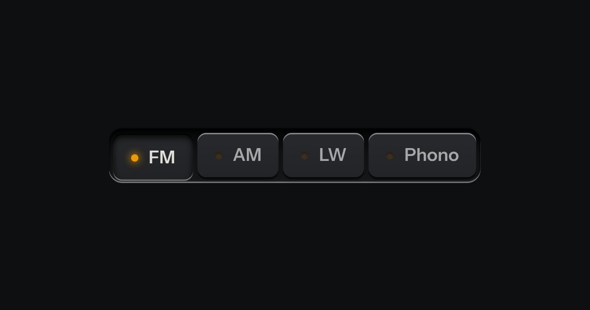
One mode of two to five: latching keys in a tray, one down at a time, each with a lamp that lights when chosen.
Kit parts
A row of keys in a tray with one pressed down: pick a view, a range or a mode and it applies at once. It is the kit’s selector without the lamps, with sizes, a full-width row and icon segments.
Seats open in 11 days. Want one email that morning?
The tray and the key are the kit’s recess and cap, already in the selector; this part is the selector with its lamps off and three more things. A pressed key drops the height of its skirt into the tray and takes the pressed light, so the plate’s edge shades its top. Sizes change the key and the tray together, and each keeps the corners concentric. The radios are ordinary inputs, absolutely positioned and invisible, with the printed key as the span that follows each; there is no script at all.
| Name | Kind | Description |
|---|---|---|
| aria-label | attribute | Names the group. Or make the tray a and give it a , which is not drawn. |
| disabled | attribute | |
| change | event | As any radio: fires on the one that became checked. |
| ← → · ↑ ↓ | keyboard | Move to the neighbour and choose it, wrapping at the ends; Tab enters and leaves the group as one stop. |
Press a key, or Tab in and use the arrow keys: the pressed one is the choice. The readout follows.
One mode of two to five: latching keys in a tray, one down at a time, each with a lamp that lights when chosen.
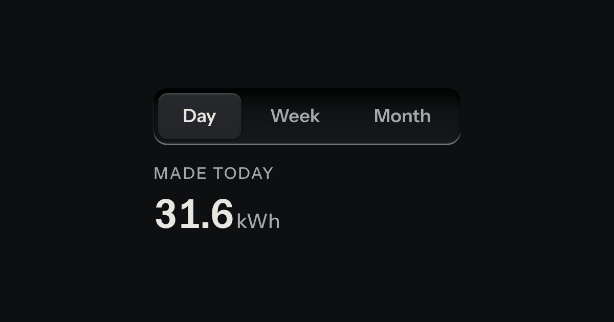
Views of the same thing, switched in place: keys in a tray, the chosen view a raised cap.

One choice from a short list in a form: small round keys in a fieldset, the chosen one pressed with a printed dot.