Popover
A card hung from the key that opened it, with a printed leader running back to the key. Not modal: the page stays live around it.
Kit parts
A small card that asks before a click does its work, hung from the key that opened it. It is the popover, placed by the popover’s own rules and tied to its key by the same printed leader, holding a short question, an optional second line, and Cancel and Confirm keys. Escape and a click outside both cancel it, and the focus goes back to the key. For a destructive act it takes the danger tone: the kit’s red lamp before the question and a danger Confirm key, with no new colour. It is the guard on a delete in a table row, where a dialog is too heavy.
Seats open in 11 days. Want one email that morning?
The popover, whole: its card, its printed leader and dot, its placement and its top-layer behaviour are reused as they are. The keys are the kit’s keys, the danger one in its red ink, and the lamp is the kit’s red. The element only names the answers and says which way the card closed.
| Name | Kind | Description |
|---|---|---|
| data-tone | attribute | Danger puts the red lamp before the question, makes Confirm a danger key and puts the focus on Cancel. Without it Confirm is the contrast key and takes the focus. |
| data-side · data-align | attribute on the card | Where the card hangs, as the popover’s. It turns to the other side if there is no room. |
| data-popconfirm | attribute on a key | Marks the two answers. |
| open | property | Whether the card is out. Setting it shows or hides it. |
| opener | property | The key the card hangs from. |
| show() · hide(reason) | method | Open or close the card from code; hide takes the reason the cancel event reports. |
| popconfirmHTML() | function | The element and its card as markup. static draws only the card, in place, for a specimen. |
Press Delete on invoice 412: the card hangs from it with Cancel under the focus. Press Escape, click outside, or press Cancel, and the card goes and the focus comes back to Delete. Press the card’s Delete and the invoice is struck off. Archive is the same card without the red.
A card hung from the key that opened it, with a printed leader running back to the key. Not modal: the page stays live around it.
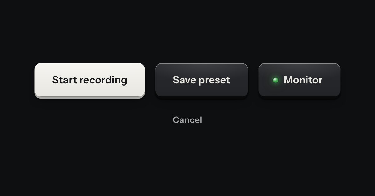
Every button, and every link that acts like one: a cap on a skirt that drops below the plate when pressed.
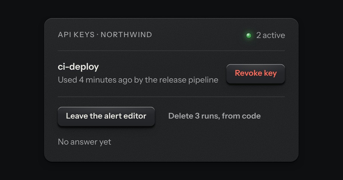
The dialog plate for a question that must be answered before an act that matters. A caution strip is set across its head with one lamp in it, red when the act cannot be undone and amber when it can. The question is the title, one sentence says what will happen, and a grave act can ask for its name to be typed first.
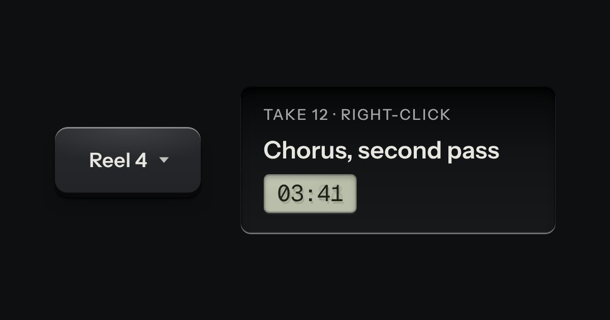
A card of actions and options that slides out from under its key. The key stays down while the card is out; an option that is on lights its lamp.