Key
Every button, and every link that acts like one: a cap on a skirt that drops below the plate when pressed.
Kit part · Buttons · Toggles & switches
One key that latches below the plate and stays there. It is the kit’s own key with one state to keep, down or up, so it is the way to say mute, pin, bold or armed without the weight of a switch. A lamp in the cap may light while it is down.
Seats open in 11 days. Want one email that morning?
Both finishes, side by side. Hover, pressed and focus are forced with .is-hover, .is-down and .is-focus; checked and disabled are real.
Aluminium
| Part | Up | Hover | Pressing | Latched | Focus | Disabled |
|---|---|---|---|---|---|---|
| Key | ||||||
| With lamp |
Graphite
| Part | Up | Hover | Pressing | Latched | Focus | Disabled |
|---|---|---|---|---|---|---|
| Key | ||||||
| With lamp |
| Name | Kind | Values | What it does |
|---|---|---|---|
| <button class="tui-key tui-toggle-key"> | element | with aria-pressed="true" or "false" | The key. Down is aria-pressed="true": the cap sinks below the plate and its lamp lights. |
| data-toggle-key | attribute | on the key | The script flips aria-pressed on press. Leave it off to set aria-pressed from your own state. |
| aria-pressed | attribute | "true" | "false" | The state, for the page and for a screen reader. Start every toggle key with one or the other. |
| aria-label | attribute | on a key with no words | Names a key that shows only a glyph. Keep the name the same whether it is up or down. |
| .tui-lamp | class | inside the key, with data-lamp | The key’s own lamp: green, amber, red or blue. It is dark while the key is up and lit while it is down. |
| --sm · --icon | modifier | on the key | The key’s sizes; --icon makes a square cap for a glyph. |
| tui-toggle-key-change | event | detail { pressed } | Bubbles from the key after it latches or lets go. |
| toggleKey(key, force?) | function | a key, and true or false | Latches, releases or flips a key from code, fires the event and returns the new state. |
| Space · Enter | key | on the key | Latch it or let it go; it is a button, so both work. |
<!-- Words, with a lamp that lights while the key is down -->
<button class="tui-key tui-toggle-key" type="button" data-toggle-key aria-pressed="false">
  <span class="tui-lamp" data-lamp="amber" aria-hidden="true"></span>Mute
</button>

<!-- A glyph alone: the name is the same up or down, aria-pressed says which -->
<button class="tui-key tui-key--icon tui-toggle-key" type="button" data-toggle-key aria-pressed="true" aria-label="Favourite">
  <svg class="tui-icon" …></svg>
</button>

<!-- Without data-toggle-key you keep aria-pressed yourself, as a framework would -->
<button class="tui-key tui-toggle-key" type="button" aria-pressed="true">Pinned</button>
import { toggleKey } from '/kit/kit.mjs';
const mute = document.querySelector('#mute');
mute.addEventListener('tui-toggle-key-change', (e) => {
channel.muted = e.detail.pressed; // true while the key is down
});
toggleKey(mute, true); // latch it from code
toggleKey(mute); // flip itNeeds kit.css and kit.mjs. How to install the kit.
<button> with aria-pressed, read as “Mute, toggle button, pressed”, and it works with Space and Enter.aria-pressed, so colour is never the only sign of it.aria-label, and its glyph is hidden from a screen reader.There is almost nothing new under it. The kit’s key already sinks below the plate when it is pressed, and a pressed button is drawn the same way; this part only gives that latched look a meaning, one state kept. The lamp is the kit’s lamp, left unlit in the cap and lit by the key’s own pressed state, so it follows every finish and both volumes with no rule of its own. The script is one listener on the page that flips aria-pressed for any key that asks for it, so keys added later work without being wired.
A single key that stays down: pressed and latched states a screen reader can read, a lamp that lights with it, and no switch where a key will do.
5 rules in this file, with the foundations they rest on and the anti-patterns that break them. Full rules ship in the brain with the Pass.
Every button, and every link that acts like one: a cap on a skirt that drops below the plate when pressed.
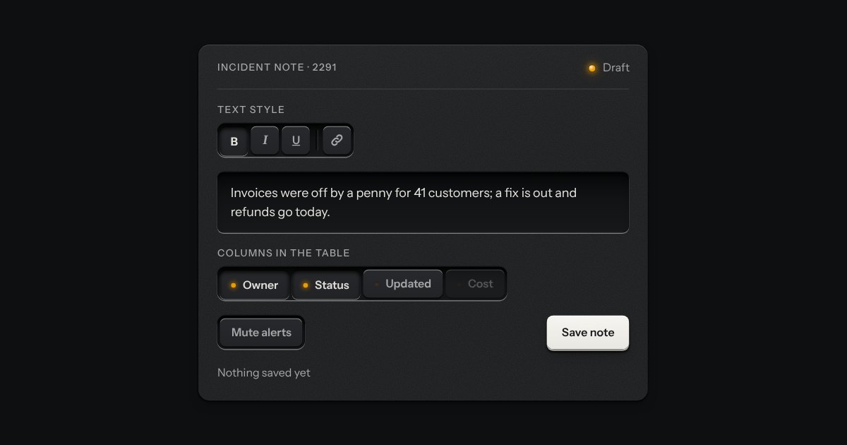
The segmented control’s keys, each latching on its own, so any number can be down at once: bold and italic, the columns a table shows, the filters on a log. Every key is a checkbox and posts with the form. A lone toggle is a group of one, and a parting line splits clusters of keys in one slot.
On or off, applied the moment it moves. A native checkbox with a ridged thumb in a slot that lights green when on.
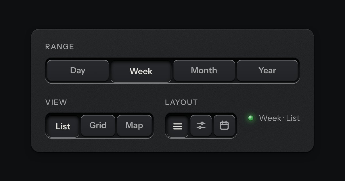
A row of keys in a tray with one pressed down: pick a view, a range or a mode and it applies at once. It is the kit’s selector without the lamps, with sizes, a full-width row and icon segments.