Check
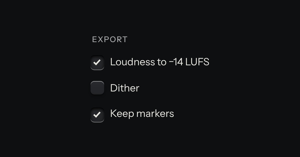
An option in a form: a small square key that presses below the plate when chosen, with a tick printed on it.
Kit parts
The kit’s check keys in nested groups. A group’s key is the sum of its items: all done, none, or some, and some is a key sunk halfway with a bar across it. The head counts the items, “3 of 7”, and its lamp lights when they are all done.
Seats open in 11 days. Want one email that morning?
The check is the kit’s own. This part adds two things to it. A pressed group writes its state down to everything under it. The roving Tab stop is the element’s too; the boxes are still native inputs, so a form, a label and a screen reader all behave as they do for a checkbox anywhere else.
| Name | Kind | Description |
|---|---|---|
| indeterminate | state | A group with some items done: the key is sunk halfway with a bar across it. aria-checked mirrors it on every group. |
| data-complete | attribute | On the element while every item is done. |
| values | property | The values of the ticked items. |
| checklistState · checklistPress · checklistCount | function | The rules, pure: a group’s state from its items’, what pressing a group does, and the words for the count. |
| ↑ ↓ · Home · End | keyboard | Move between the keys. The list is one Tab stop. |
| → · ← | keyboard | Right goes into a group; left goes back up to it. |
| Space | keyboard | Presses it. |
Press a group: everything under it follows. Press an item and the groups above it change. Arrow keys move; Space presses.
An option in a form: a small square key that presses below the plate when chosen, with a tick printed on it.
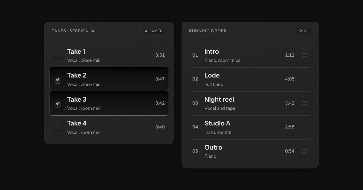
Rows in a rack: a mark, a title, a second line and a fact or a key at the end. Chosen rows sink into a recess with their check key latched; in a running order, a row lifts out of the rack on its skirt and slides past the others, from the keyboard or by its grip.
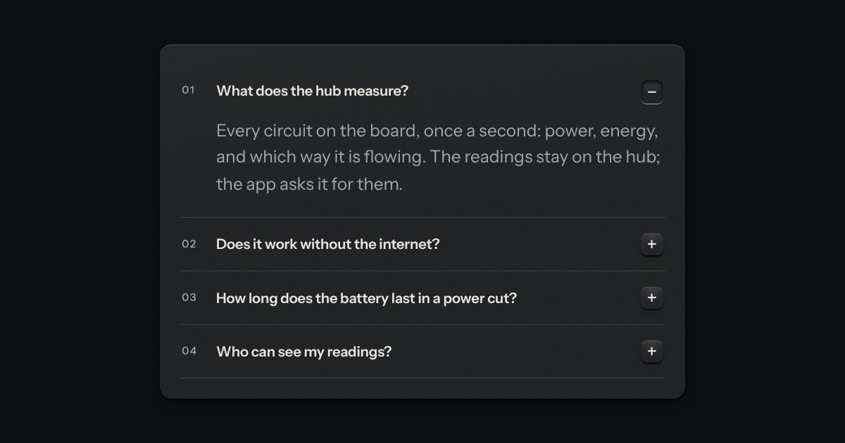
Printed sections that open in place. Each head ends in a small square key printed +; open, the key latches below the plate and reads −.