Switch
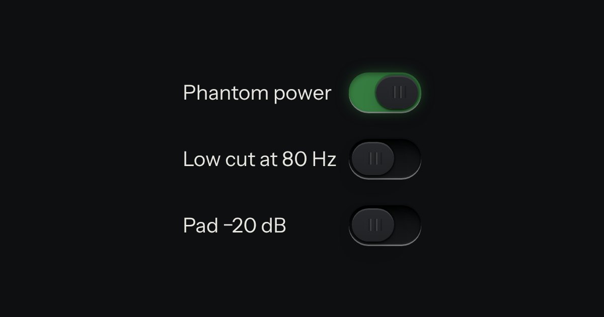
On or off, applied the moment it moves. A native checkbox with a ridged thumb in a slot that lights green when on.
Kit parts
A heavier on/off for power, mains and arming: a cap that pivots in a black bezel, printed | and O.
Seats open in 11 days. Want one email that morning?
Its background is six layers: the two marks, two shadow gradients over the pressed half, a one-pixel highlight on the raised half’s top edge, and a horizontal gradient that models the pivot (end wall, lit face, falling shade, the seam, and the sunk half). Checking swaps the layers to the other side. No images and no script; the bezel is a dark gradient with an inset shadow.
| Name | Kind | Description |
|---|---|---|
| checked | attribute | On: the | half is pressed. |
| data-material | attribute | What the lever and its printing are made of, apart from the page’s finish; the bezel keeps the finish. Anodised blue and green go on a whole device only. |
| change | event | Native. |
| Space | keyboard | Toggles. |
Press it: the | half sinks into the bezel and the O half rises toward the lamp.
On or off, applied the moment it moves. A native checkbox with a ridged thumb in a slot that lights green when on.
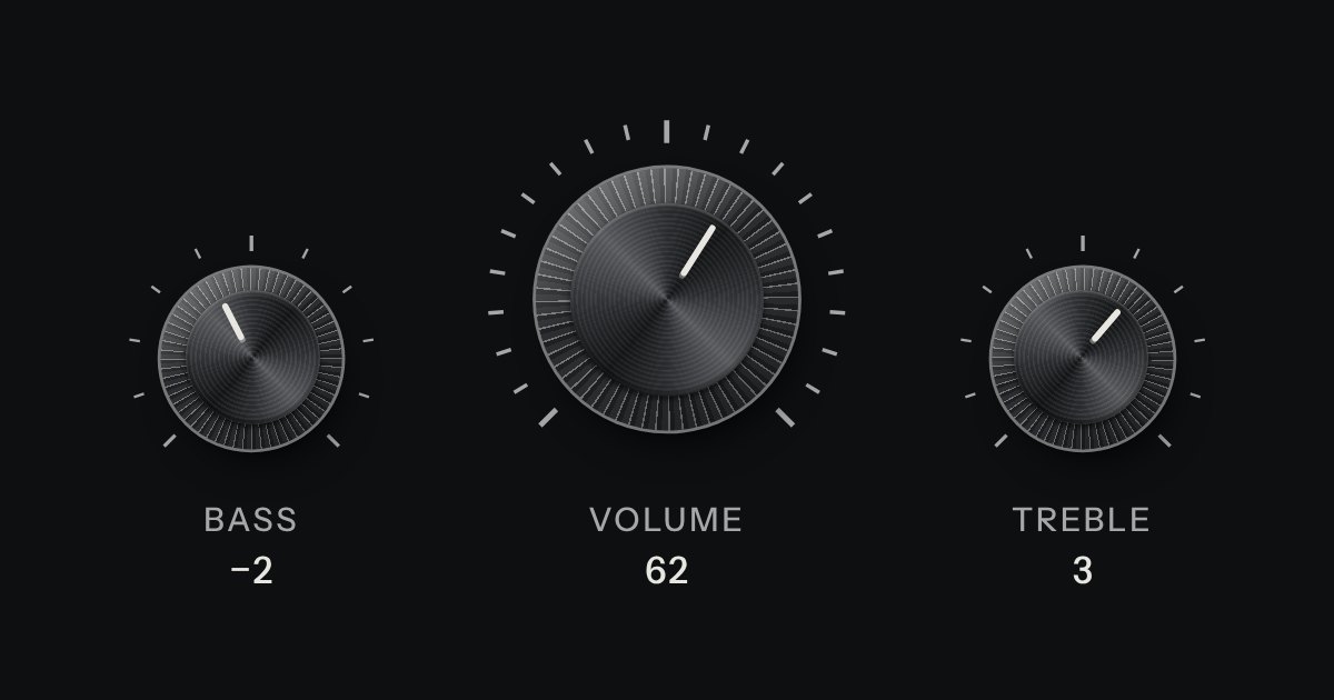
A rotary control for continuous or stepped values where space is square. Its knurl and pointer turn; its light does not.
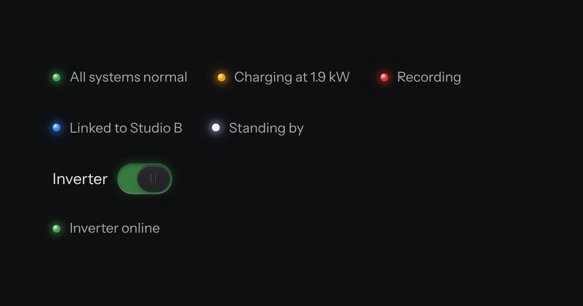
The only colour in the kit: a lamp that is on. Green is on, amber is waiting, red is recording or failing, blue is linked, white is standing by. Always next to words.