Small plates you press on and off, laid in a tray that wraps: the filters over a table, the topics on a form, the sizes on a product. Each chip is a native checkbox, or a radio when only one may be down, drawn as a small cap that sinks below the tray with its lamp lit. A limit may be set on how many go down at once.
Element
<tui-chip-group class="tui-seg tui-chip-group">
Needs
kit.css + kit.mjs
Rules
chip-group.rules.md · 6
Finishes
Aluminium · Graphite · Oak · Walnut · Porcelain · Black · Daylight · Night · Paper · Phosphor · E-paper · AMOLED
Seats open in 11 days. Want one email that morning?
Variants
Any number · checkboxes
One of several · radios
No lamps · .tui-seg--plain
Small · .tui-chip-group--sm
Many chips wrap
At the limit of three
Disabled
Every state, at once
Both finishes, side by side. Hover, pressed and focus are forced with .is-hover, .is-down and .is-focus; checked and disabled are real.
Aluminium
Part
Up
Hover
Pressing
Down
Focus
At the limit
Disabled
Chip
Graphite
Part
Up
Hover
Pressing
Down
Focus
At the limit
Disabled
Chip
API
Name
Kind
Values
What it does
<tui-chip-group class="tui-seg tui-chip-group">
element
role="group" and an aria-label
The tray, around labels that each hold a checkbox and a span. For one of several, use a div with role="radiogroup" and radios of one name.
label > input + span
element
checkbox or radio
One chip. The input is the real control and posts with the form; the span is the cap. Put a count in a small after the words.
max
attribute
on the group, a number
How many may be down at once. At the limit the rest are marked aria-disabled and a press changes nothing; a chip that is down can always be let go.
--plain · --sm
modifier
tui-seg--plain, tui-chip-group--sm
No lamp on the chips; a smaller tray of smaller chips.
value
property
string[]
The values that are down, in order.
tui-toggle-change
event
detail { value, values }
Bubbles from the group after a chip changes. The checkbox’s own change fires as ever.
chipSays({ count, max, refused })
function
pure
The words the status line says: “2 of 3 chosen”, or why a press did nothing.
← → · Home · End
key
with checkboxes
Move along the chips with one tab stop; Space latches the chip in focus.
Markup
<!-- Any number down, up to a limit: checkboxes. They post with the form. -->
<tui-chip-group class="tui-seg tui-chip-group" role="group" aria-label="Filter runs by state" max="3">
  <label><input type="checkbox" name="state" value="failed" checked><span>Failed <small>4</small></span></label>
  <label><input type="checkbox" name="state" value="slow"><span>Slow <small>3</small></span></label>
  <label><input type="checkbox" name="state" value="queued"><span>Queued <small>2</small></span></label>
</tui-chip-group>

<!-- One of several: radios with one name. The arrows are the browser's own. -->
<div class="tui-seg tui-chip-group" role="radiogroup" aria-label="Range">
  <label><input type="radio" name="range" value="day"><span>Today</span></label>
  <label><input type="radio" name="range" value="week" checked><span>7 days</span></label>
</div>
import { chipSays } from '/kit/kit.mjs';

const group = document.querySelector('tui-chip-group');
group.addEventListener('tui-toggle-change', (e) => {
  list.filter(e.detail.values);              // the values that are down, in order
});

group.value;                                  // ['failed', 'slow']
chipSays({ count: 2, max: 3 });               // '2 of 3 chosen'
Each chip is a native checkbox or radio, so a screen reader says “Failed, checkbox, not checked” with the group’s name, and a group of radios gets the browser’s own arrow keys and “1 of 3”.
A chip that is down is also a chip that sits lower, with its lamp lit, so colour is never the only sign. A count is part of the chip’s name: “Failed 4”.
With a limit, the chips that cannot go down are aria-disabled, still reachable by arrow, and a press says why in a polite line: “The limit is 3. Let one go to choose another.”
Checkbox chips are one tab stop (a roving tabindex) with arrows, Home and End, and the chip the focus left is where it comes back to. Without the script every chip is a tab stop of its own.
On a phone each chip is 44px tall and at least 44px wide, the tray wraps instead of scrolling sideways, and the press is not slowed by reduced motion.
How it’s built
The segmented control already draws a cap that sinks below its tray and lights a lamp, in every finish and both volumes, so the chip is that cap: only the tray changes, which now wraps, leaves a little air between the chips and carries a count. The toggle group’s script supplies the single tab stop and the arrows, and the chip group adds one thing to it, a limit. Everything else is the input the browser already gave you.
Rules
chip-group.rules.mdIn the brain
Filter or pick a few things with chips that latch: real checkboxes that post with a form, a limit if you want one, and one tab stop with arrows.
6 rules in this file, with the foundations they rest on and the anti-patterns that break them. Full rules ship in the brain with the Pass.
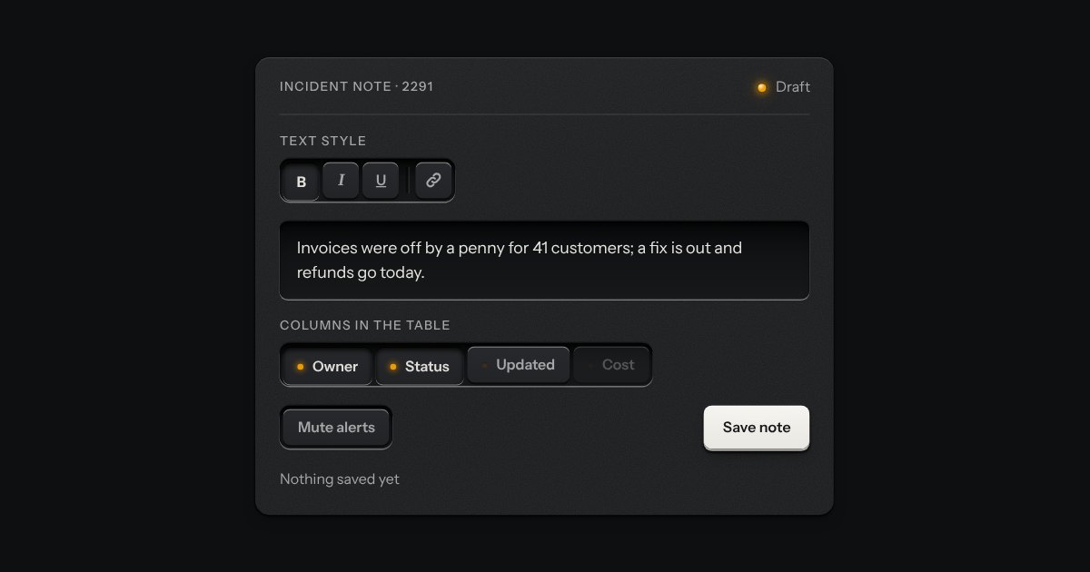
The segmented control’s keys, each latching on its own, so any number can be down at once: bold and italic, the columns a table shows, the filters on a log. Every key is a checkbox and posts with the form. A lone toggle is a group of one, and a parting line splits clusters of keys in one slot.
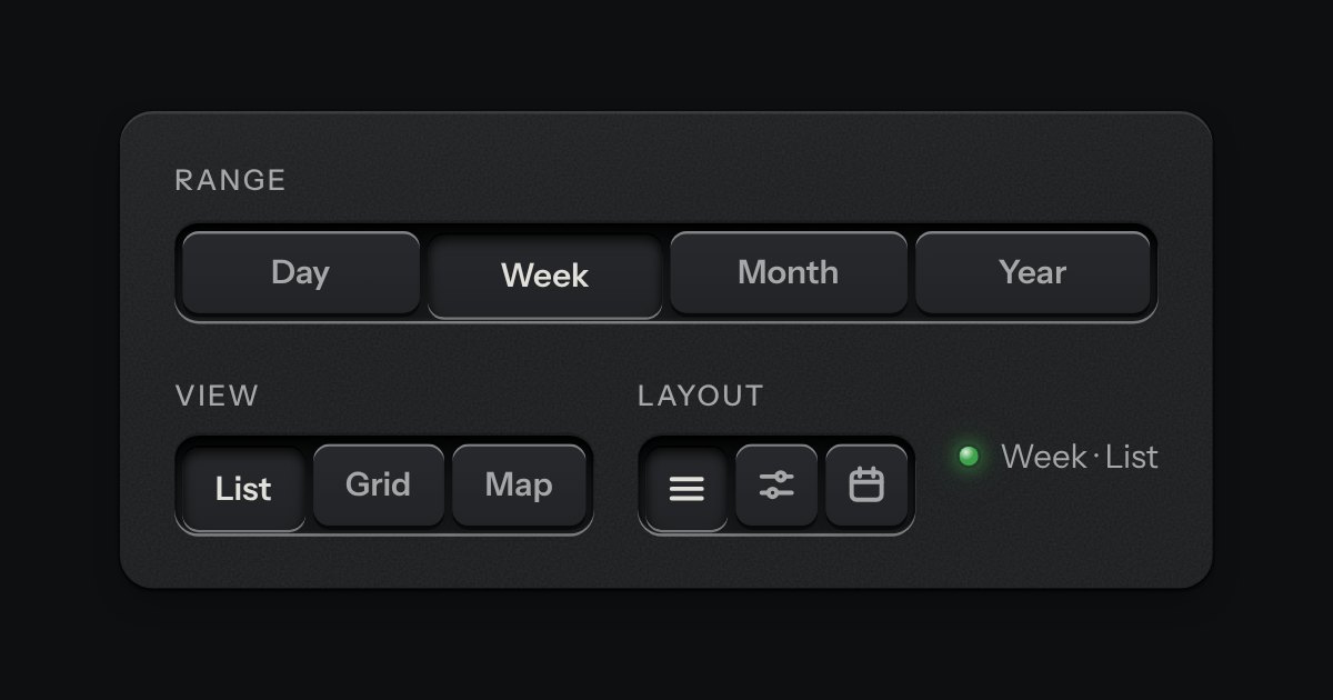
A row of keys in a tray with one pressed down: pick a view, a range or a mode and it applies at once. It is the kit’s selector without the lamps, with sizes, a full-width row and icon segments.