The control bar for an audio or video element. It plays nothing itself: it drives a real media element, so that element’s own events, buffering and errors stay the truth. A primary play key that swaps to pause, the time elapsed and the length on two small LCDs in the mono figures, a scrubber that is the kit’s fader with the loaded length printed as a rule on its floor and the played length filled in, a mute key with a volume fader and an optional speed key. The keys are Space, the arrows and M. For a screen reader the position is a sentence on the scrubber, and a polite status says what happened, no more than once a second.
Seats open in 11 days. Want one email that morning?
Anatomy
The scrubber and the volume are the kit’s fader, with the loaded and played lengths drawn on its slot. The play key is the kit’s primary key and the others are flat keys; the play icon is the icon set’s and pause and the speaker are drawn the same way. The times are on the kit’s LCD in the mono figures. The plate is the panel’s face. No colour is added.
Variants
Audio with speed · speed
A voice note on a phone · no-volume
Chosen rates
Without volume or speed
States
Ready
Playing, part loaded
Muted
Over an hour
Cannot play
Props and options
Name
Kind
Description
for
attribute
The id of the audio or video element. The bar looks for it again if it comes later in the page. A media element inside the bar is used first, and shown above it.
media
property
The element the bar drives; set it from code when there is no id. Setting it to anything else lets go.
label
attribute
What is playing. It names the group a screen reader finds the bar in.
speed · speeds
attribute
It reads and sets the element’s playback rate.
skip
attribute
How far an arrow key moves the playhead.
no-volume
attribute
Leave out mute and volume, for a phone whose volume is the system’s, and stop the up and down arrows changing it.
announce
attribute
How often the position is spoken while it plays. 0 for never; what happened (playing, paused, a place, muted, buffering) is always spoken.
playing · speed
property
Whether the media is playing, and its playback rate (settable).
toggle() · seek(seconds)
method
Play or pause (a refused play is told in the status), and go to a time. A time past the end goes to the end.
Where a key takes the playhead, the rates from a list, the next one, and the element with its bar written, for a server or a specimen.
Usage notes
Press Play on the episode: the key becomes Pause and the elapsed time runs on its LCD while the scrubber fills. Drag the scrubber, or press the right arrow on it for five seconds on. Press M to mute and the volume fader empties. Press a chapter and the episode goes there.
Accessibility
Every key and slider is named. The LCDs are hidden from assistive technology.
On any other key ↑ and ↓ change the volume, and on the volume slider the arrows are the slider’s. M mutes. Tab walks play, mute, volume, speed and the scrubber in the order they sit.
The status is a polite live region.
The played length is a filled bar and the loaded length a thin rule under it, so neither relies on colour. A media element that fails shows “This recording cannot be played.” in words and disables the keys; a stream with no length is Live and cannot be scrubbed.
Under reduced motion the bar has no animation; the scrubber still follows the playhead, which is the point of it.
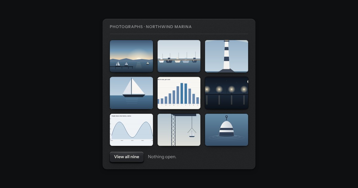
A grid of thumbnails that opens one picture large. Each thumbnail is a plate with the picture set in it, and a real link to the full picture, so the grid works without any script. Press one and the page goes behind a near-black scrim. Left and Right turn the page, Home and End go to the first and the last, Escape puts it away, and on a touch screen a swipe does the same. It is dark in every finish, because a picture is looked at best in a dark room.
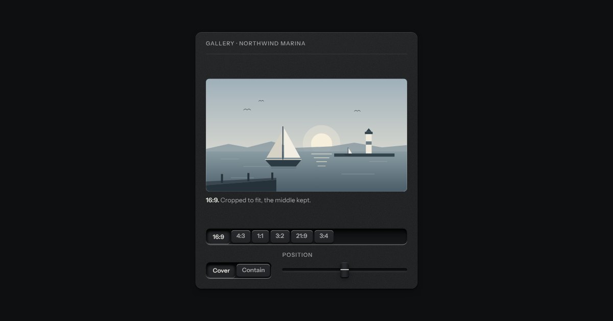
A frame that holds one shape, whatever is put in it. Say the shape (16:9, 4:3, 1:1, 3:2, 21:9, 3:4) and the frame takes its height from its width; a picture, a video or a map inside it is cropped to fit, keeping the middle unless you say which part to keep. Until a picture arrives the frame is a recess, so the page does not jump. An optional hairline round the edge keeps a pale picture from dissolving into a pale page. Plain CSS, with no script.
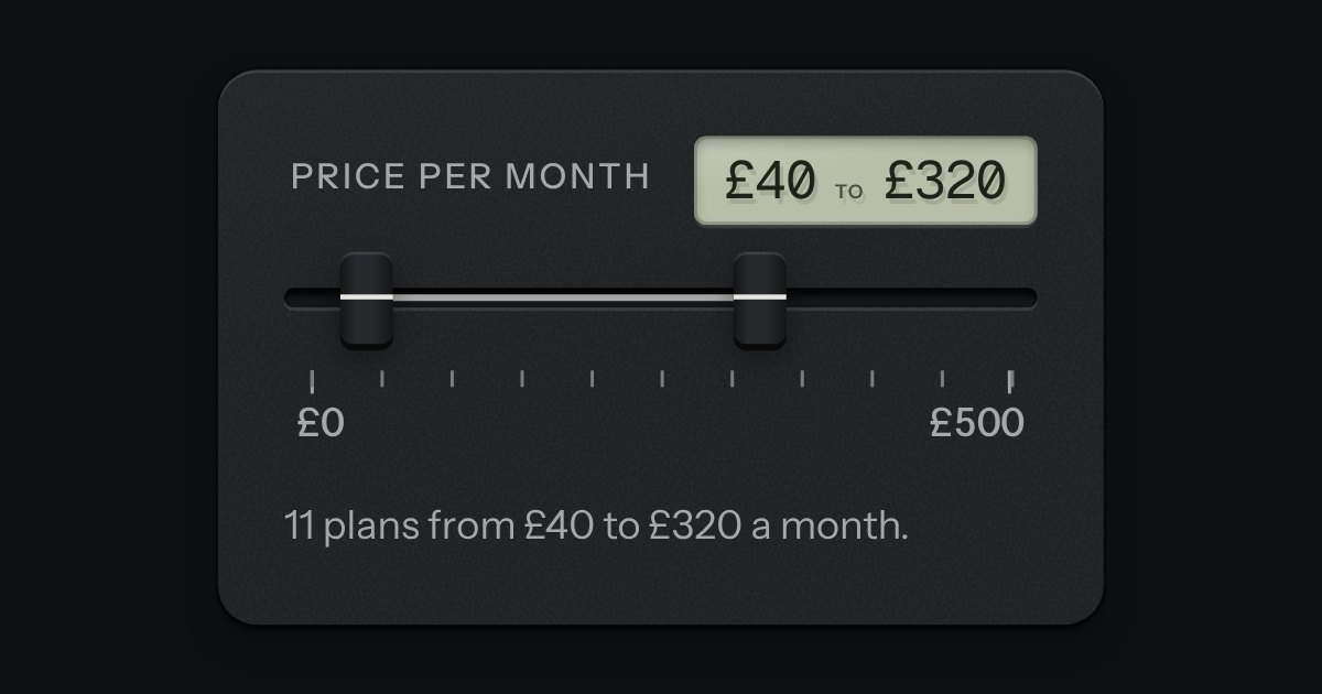
Two fader caps in one slot, for a span between a low value and a high one: a price band, quiet hours, a frequency band. The span between the caps is printed on the slot’s floor and both values read on a small LCD. The caps meet but never pass each other. Underneath are two native range inputs, which post with the form and are what shows without the script.
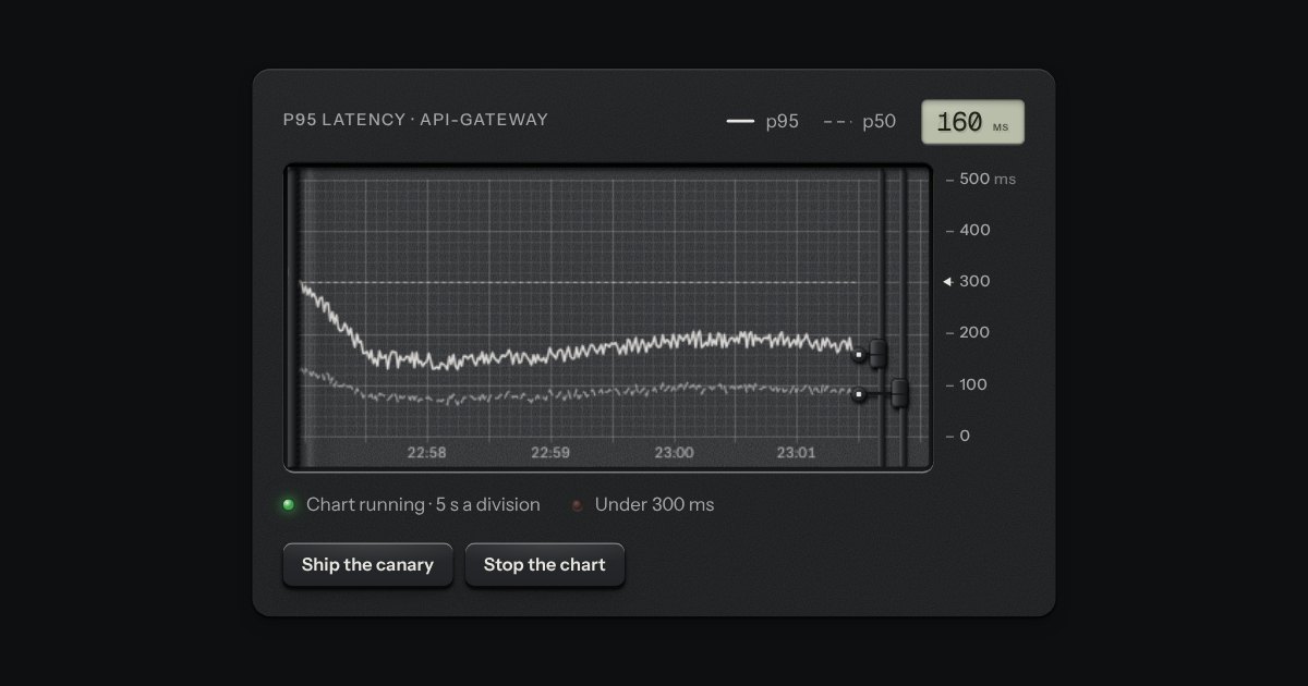
A strip-chart recorder: gridded paper advancing under a pen that rides a rail, drawing the live value as the paper moves and printing the time in the margin. For p95 latency, tokens per second, grid frequency, a cold room’s log.