Tariff
Three rates a day.
Reserve
Kept for a power cut.
Accordion
Printed sections that open in place. Each head ends in a small square key printed +; open, the key latches below the plate and reads −.
Docs · 190 pages
190 everyday parts in twelve finishes, filed under 50 categories. Every one runs on its page, and on this one.
Three rates a day.
Kept for a power cut.
Printed sections that open in place. Each head ends in a small square key printed +; open, the key latches below the plate and reads −.
Faster exports.
One section that opens in place. A square key sits at the start of its head with a printed chevron; opening latches the key below the plate and turns the chevron down, and the text slides out under the head on a grid row that grows from nothing, so it is never given a height of its own. It is a native details element, so it works with no script.
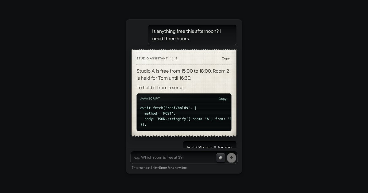
An AI chat as a teleprinter, with restraint: what you type sits in a recess; the answer prints on a perforated slip with an amber lamp at the print head; code comes up on display glass. Composer with attachments and a send key that becomes Stop.
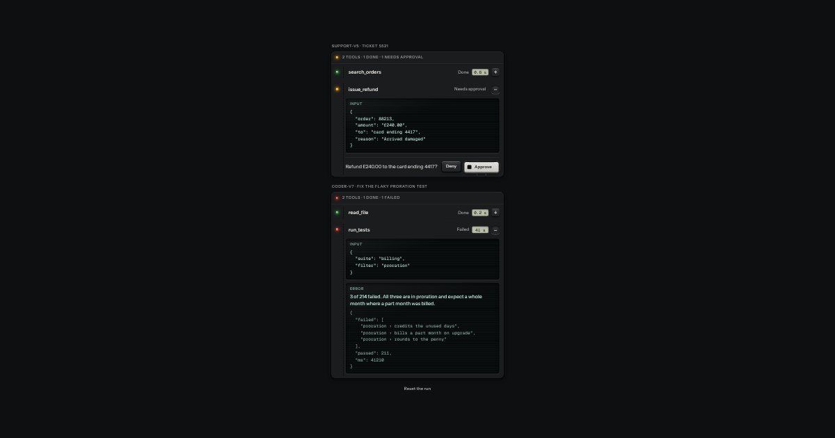
A job ticket for each tool an agent runs: the tool’s name printed as a legend, a lamp on the stub, the state in words and the time on a small LCD. Its input and output sit on display glass behind a hinge, and when the tool needs your say, Deny and Approve stand at its foot.
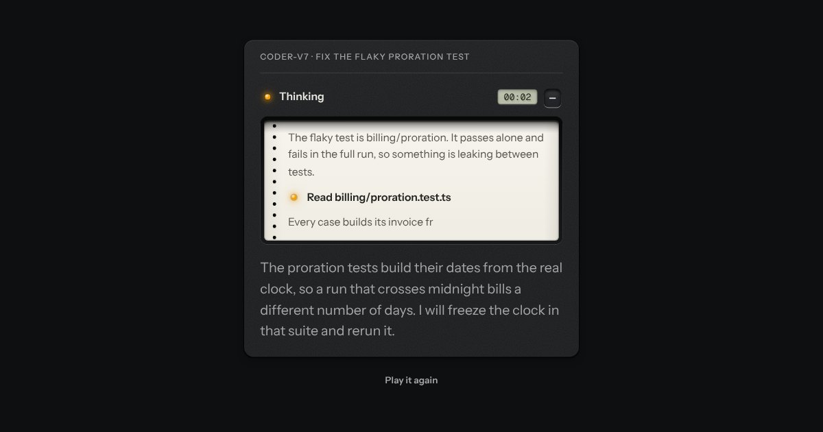
The model’s working, printed on a paper tape that feeds behind a smoked window. While it thinks, an amber lamp is lit beside “Thinking” and an LCD counts the seconds.
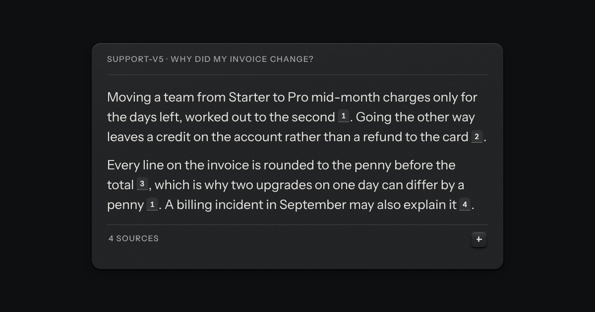
Where an answer got what it says, as a card index. A citation is a small numbered tab printed after the sentence it supports; resting on it hangs a card with the source’s title, its site and a quoted line. At the foot of the answer, the sources are a references plate that opens to a numbered list.
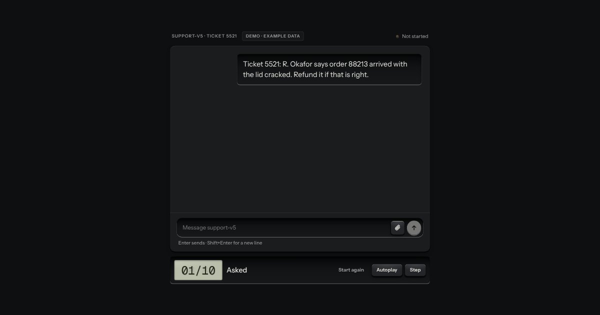
A whole approval flow for an agent console, made of the kit’s own parts: the chat, a tool call that waits for a person, the reasoning and the sources, with one status lamp and a walkthrough tray. It goes through every state: waiting for you, denied with a reason, approved and running, an error you can retry, the result, and the answer with its sources.
One chat message as a plate, with no chat around it, and made the way the chat is made. What you wrote is typed into a recess and sits to the right; what the assistant said is printed on a slip of paper torn along a perforation; what someone else wrote is a small raised plate. Along the top run the sender, printed as a legend, and the time; a lamp and a word say what has become of your message (sending, sent or not sent). A message that did not go grows a Retry key. Use it in a thread you build yourself, in a notification or in a log of what was said.
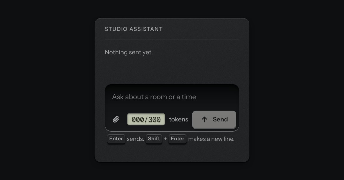
The prompt box. One deep recess holds the text and the keys sit on its floor: attach at one end; at the other a small LCD that counts tokens, amber near the limit and red over it, and the send key, which becomes a stop key while a reply runs. It is a real form with a labelled text area. Enter sends and Shift and Enter make a new line, and the send key is disabled while there is nothing to send. The text grows as you type, up to a height, then scrolls.
Try asking
Starter prompts as small plates set out under the composer. Each is a real key (the kit’s cap on its skirt) that is allowed to be a line or two of words, left-aligned like a printed legend. Press one and its words are written into the prompt box, with the caret at the end, and the sending is left to you. It fills the composer next to it, or any text area you point it at, and it works on its own as plain buttons with an event when there is no box to fill.
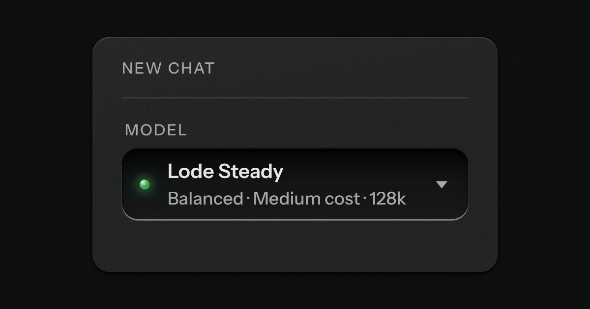
Choose a model. A well shows the one in use, and a card of rows opens from it; each row has the model’s name, a line about it, a legend for speed and one for cost (each a small ladder of three and a word), its context size, and a lamp lit on the one in use. It is a listbox with type-ahead, built on a native select that stays the form’s value. The names here are made up.
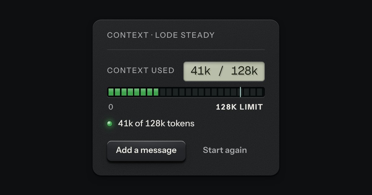
How much of a model’s context a conversation has used, as a segmented meter with the limit printed at its end. The strip is the meter’s: dark glass, the unlit segments just visible. It is green while there is room, amber from a cut line near the limit and red once the count is over it. A line of words says the same in a sentence (“41k of 128k tokens”), and a small display carries the figures, so colour is never the only sign.
The keys under a reply: Copy, Retry, and a pair to rate it up or down. They are the kit’s own keys in its toolbar, so they are one tab stop with the arrow keys between them. With a mouse they stay out of the way until the reply is hovered or anything in it has the focus; with a finger there is no hover, so they are always there. Copy is the copy key.
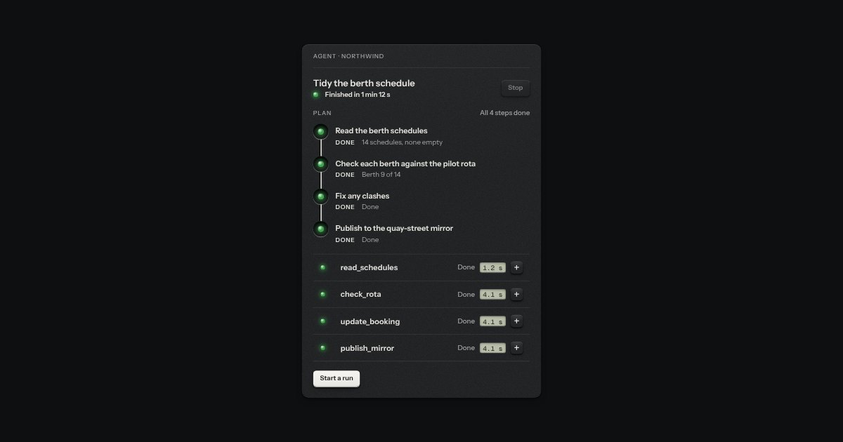
The panel for one run of an agent, laid out like any calm panel in an app: its name, a status line with a lamp, the state in words and the time it has been going, and a Stop key. Under it the plan as plan steps, and under that the tool calls as a plain list of the kit’s tool-call rows. Nothing is printed or torn off. The running lamp breathes by opacity alone and rests while the panel is off screen.
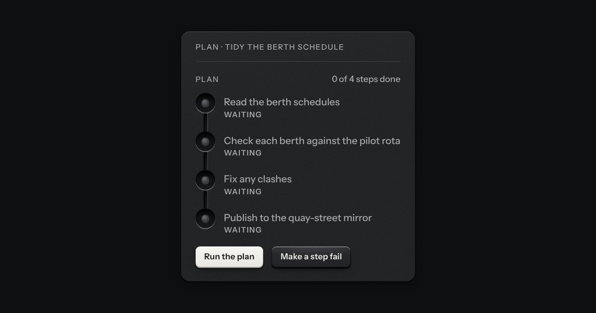
An agent’s plan as checked steps down a groove, with the pipeline’s stations stood on end. Each step is a socket with a lamp in it (green for done, amber and breathing for the one running, red for failed, an empty socket for waiting), the step in a sentence, its state in a printed word, and one line of what came of it. Ink runs down the groove as far as the plan has got. A step that was running when someone stopped the plan says Stopped.
Disk 82% full.
A message let into the surface, with an annunciator: a small lit legend (Note, Done, Check, Fault) beside the words that say what happened.
A strip the width of the page, above everything, for one announcement: a lamp, one line, an optional key that goes somewhere and a dismiss key. It is a raised plate, not a recess, so it reads as part of the frame and not as a message in the page. It is a labelled region, there on load, and says its thing once. When it goes it closes like a drawer, so the page glides up by its height instead of jumping.
Tip
Press ? anywhere to see every shortcut.
A note let into running text, for docs and articles: the Alert’s idea, made quiet. There is no window and no glass, only a narrow groove cut down the margin of the paragraph with one lamp seated at its head, a printed word that says what kind of note it is (Note, Tip or Caution) and the words in the text’s own ink. Quiet draws the groove as a hairline.
%22%2F%3E%3Cpath%20d%3D%22M32%2032%2058%2050a31%2031%200%200%201-16%2012z%22%20fill%3D%22%23fff%22%20opacity%3D%22.07%22%20filter%3D%22url(%23s)%22%2F%3E%3Ccircle%20cx%3D%2232%22%20cy%3D%2232%22%20r%3D%2210.5%22%20fill%3D%22%23d8d7d2%22%2F%3E%3Ccircle%20cx%3D%2232%22%20cy%3D%2232%22%20r%3D%2210.5%22%20fill%3D%22none%22%20stroke%3D%22%23000%22%20stroke-opacity%3D%22.25%22%2F%3E%3Cpath%20d%3D%22M24%2029.5h16M25.5%2034.5h13%22%20stroke%3D%22%23000%22%20stroke-opacity%3D%22.35%22%20stroke-width%3D%221.2%22%2F%3E%3Ccircle%20cx%3D%2232%22%20cy%3D%2232%22%20r%3D%221.3%22%20fill%3D%22%231a1a1b%22%2F%3E%3Crect%20width%3D%2264%22%20height%3D%2264%22%20filter%3D%22url(%23g)%22%2F%3E%3C%2Fsvg%3E) TRMH
TRMH%22%2F%3E%3Ccircle%20cx%3D%2235%22%20cy%3D%2233%22%20r%3D%2221%22%20fill%3D%22%23000%22%20opacity%3D%22.35%22%20filter%3D%22url(%23c)%22%2F%3E%3Ccircle%20cx%3D%2235%22%20cy%3D%2233%22%20r%3D%2223%22%20fill%3D%22none%22%20stroke%3D%22%23fff%22%20stroke-opacity%3D%22.08%22%20stroke-width%3D%223%22%20filter%3D%22url(%23s)%22%2F%3E%3Crect%20width%3D%2264%22%20height%3D%2264%22%20filter%3D%22url(%23g)%22%2F%3E%3C%2Fsvg%3E) +4
+4A person’s mark, struck like a coin: initials stamped into the field, or a photo set under the rim, with a status lamp mounted at five o’clock. Stacks into a group with a count.
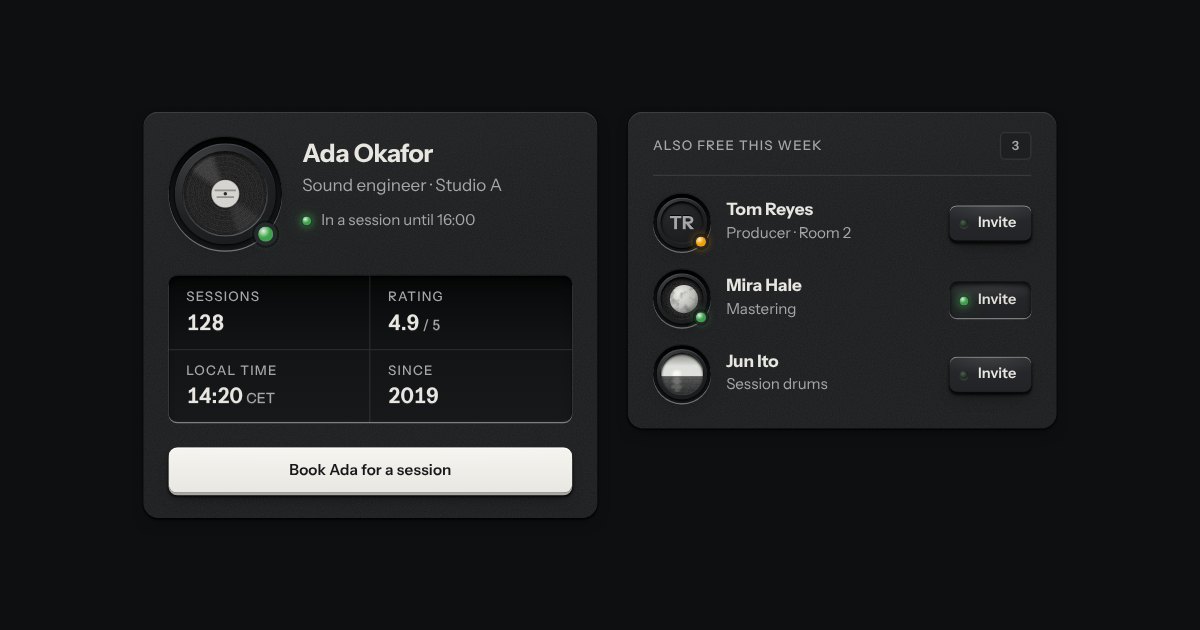
A person’s ID plate: their coin set in a countersunk socket, name and role, a rating plate of facts engraved in tabular figures, and one key to act. Compact for one line.
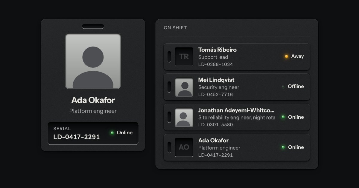
A staff badge for a person. An engraved metal plate with a clip slot cut through its top edge, a photo well and the name, role and serial engraved beneath. With no photo, the initials are debossed into the well. A lamp shows whether they are online, away or offline, and the word is always printed beside it. A compact plate does the same in one line, for lists.
A brushed metal surface under a raking light. The grain runs one way, as if drawn with a wire brush, and a soft sheen crosses it in bands. On a fine pointer the light turns slowly toward the pointer as it crosses the section and settles where you leave off; on touch it rests. Otherwise it is still, so it costs nothing at rest.
A warm pool of lamplight on a desk. The desk is the finish’s own, with a fine grain, and a lamp over one corner throws an oval of light that fades to the dim of the room. On a fine pointer the lamp drifts a little toward the pointer, eased. The warmth is the filament lamp’s colour and nothing else: it is not a new colour in the kit.
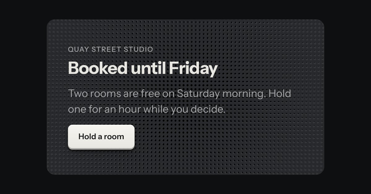
Two speaker grilles laid one over the other. Each is a plate drilled with a lattice of round holes; one turns a few degrees and back, and where its holes meet the other’s the dark behind shows through. Those dark spots gather and thin and drift across the surface, the way two real grilles beat against each other. Slow, and held still off screen.
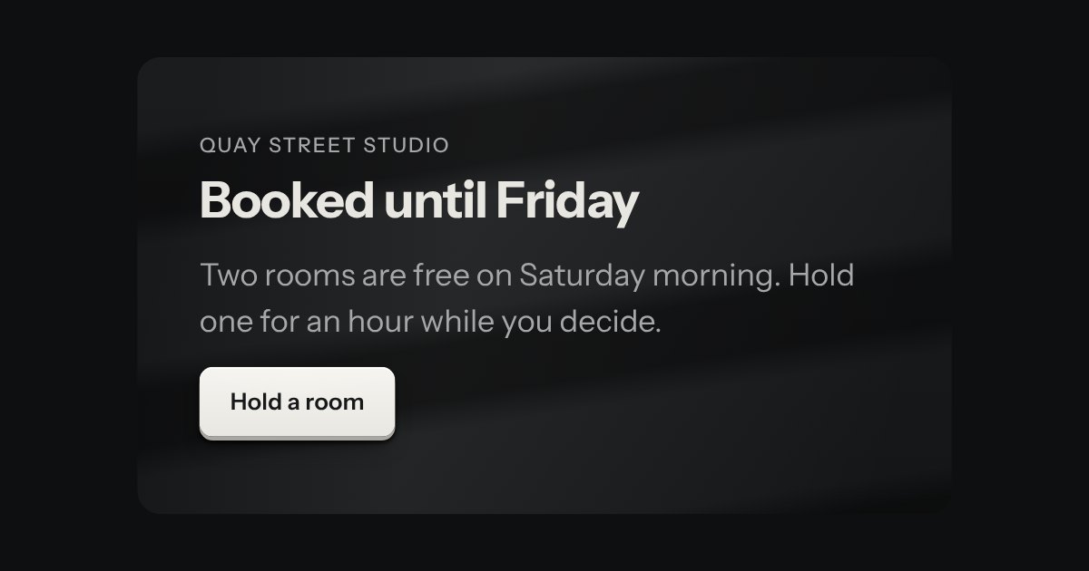
A wall lit from the side, with the shadows of slats across it, as when the sun comes through blinds. The wall and its light are fixed; the slat shadows drift sideways across it very slowly and come back. Their edges are soft, drawn into the gradient rather than blurred, and the whole thing holds still when it is off screen.
A small printed plate: a type, a count, a badge. Solid for the one tag that must stand out.
A lamp with words: the state line in tables, panel heads and lists. The words carry the meaning; the lamp is the glance.
The only colour in the kit: a lamp that is on. Green is on, amber is waiting, red is recording or failing, blue is linked, white is standing by. Always next to words.
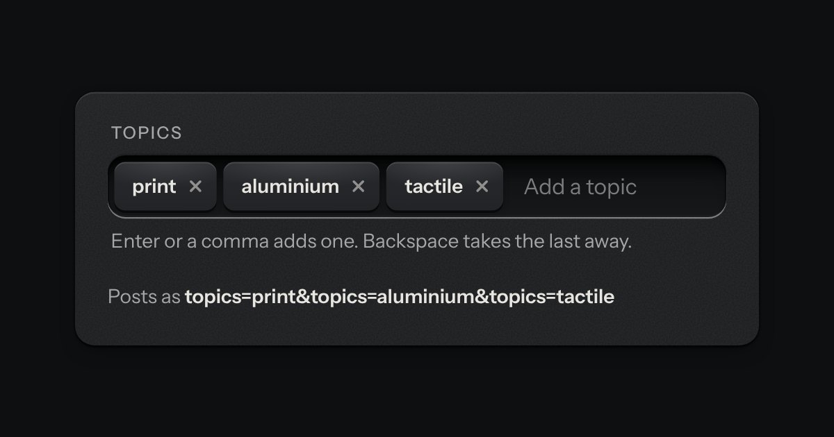
A text input that turns what you type into printed tags. Enter or a comma sets one down in the well; each tag is a key that takes itself away, and every change is spoken.
Small plates you press on and off, laid in a tray that wraps: the filters over a table, the topics on a form, the sizes on a product. Each chip is a native checkbox, or a radio when only one may be down, drawn as a small cap that sinks below the tray with its lamp lit. A limit may be set on how many go down at once.
A small legend that says whether your work is safe: Saving, Saved or Offline, with a lamp that matches (amber and blinking while it saves, green when it has, red when it cannot). The words are the state and the lamp only agrees with them. It is a polite status region, so changing its words is what a screen reader hears.
Every button, and every link that acts like one: a cap on a skirt that drops below the plate when pressed.
A key with an icon and no words, square or round: transport, power, the small tools. Its aria-label names it; a tip shows the name.
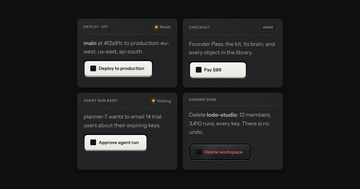
A key for work that takes time and must not run twice. It latches below the plate while the work runs, an LED matrix in its face scanning amber, and says how it ended.
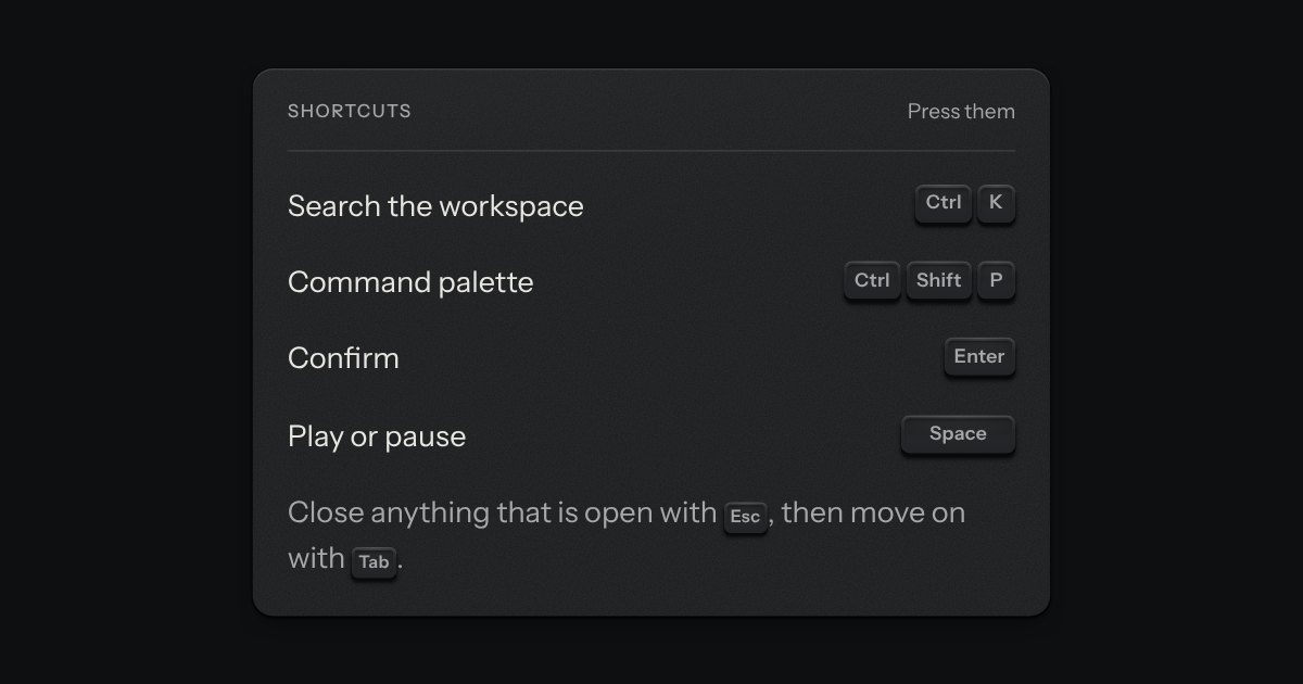
The key to press, drawn as the key: a small cap on a skirt with a dish worked into its top. Shortcuts come as combos and follow the platform, so ⌘ K on a Mac is Ctrl K elsewhere.
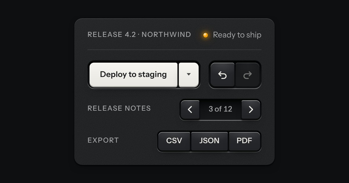
Keys that belong together set side by side in one slot, like the transport keys of a deck. Each is still its own cap and goes down on its own; only the corners facing a neighbour are tightened, so the row reads as one bank. A split key is one action with the menu of its other ways, two caps in one slot, and a readout can be printed between keys.
One key that latches below the plate and stays there. It is the kit’s own key with one state to keep, down or up, so it is the way to say mute, pin, bold or armed without the weight of a switch. A lamp in the cap may light while it is down.
A key that copies a value and says so. Its lamp sits dark in the cap; when the text is on the clipboard the lamp lights, winks once, and the legend says Copied before it goes back to Copy. If the browser refuses the clipboard, the text is selected for the keyboard and the lamp lights amber.
A rack of keys in one slot cut into the plate, under one tab stop. Keys, toggle keys, a copy key and a menu key sit side by side, parted into clusters by engraved lines, and the arrow keys move along it so a keyboard user passes the whole rack with one Tab.
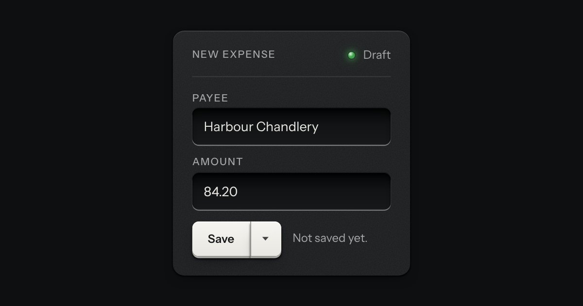
An action and the menu of its other ways, as two keys in one outline: Save, and a narrow key beside it for Save as draft or Save and close. The wide key is a real button that does what its words say. The narrow one opens a menu. They share the outer corners and one hairline between them, and each goes down on its own.
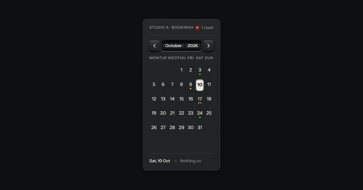
A month on a plate. The month and year sit on two drums behind a window and roll when you page; the chosen day is a latched cap, a range is a groove cut between two caps, and events are lamps named in the line below.
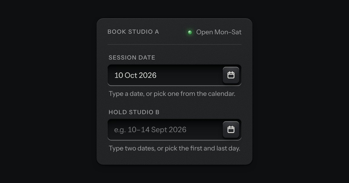
A date field with its calendar card in a slot underneath: type a date in any common form for your locale, or press the key and the card slides out. Single dates and ranges; shown the Intl way, posted as ISO.
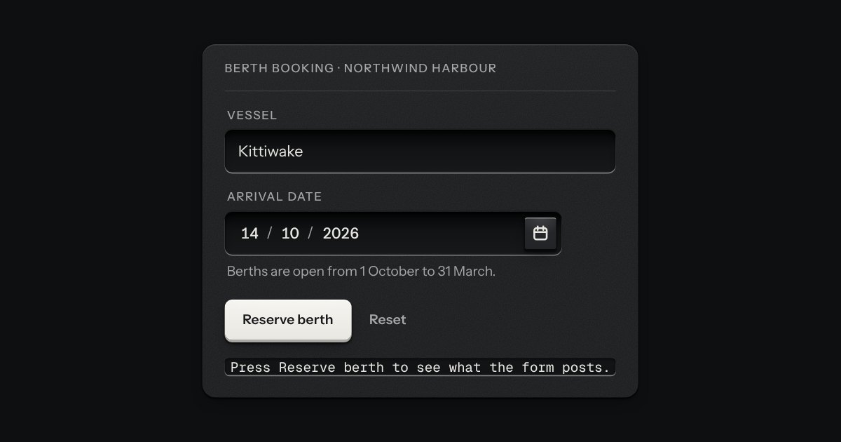
A date typed in three segments, day, month and year, in the field’s own well. Each segment is a small number you can step with the arrow keys or type over, and typing moves you on by itself once a number is complete. The order and the separator are the reader’s. A calendar key at the right of the well opens the kit’s calendar for anyone who would rather point. The form gets an ISO date, yyyy-mm-dd, or nothing while the date is not complete, and a wrong date says what is wrong in a sentence: February has 28 days in 2026.
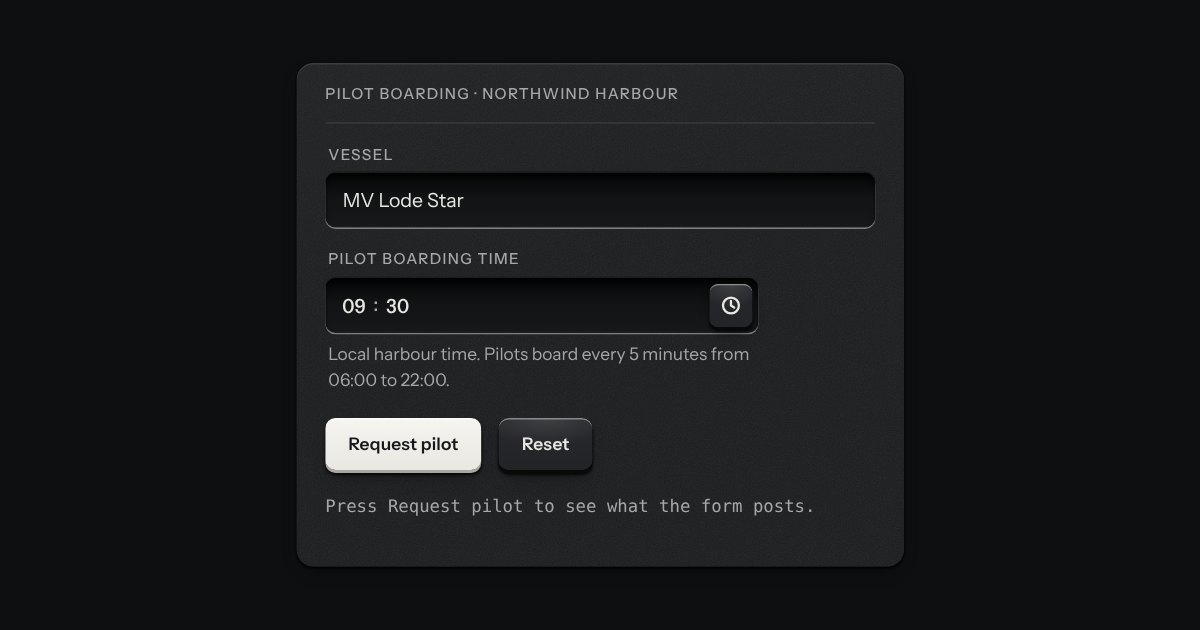
A time of day in the field’s well: hours, minutes and, on a 12 hour clock, AM or PM, each a segment you can type into or step with the arrow keys. A key at the right opens a plain list of times, every few minutes between the earliest and the latest you allow, with the current one in the middle. It posts “HH:MM” on the 24 hour clock whichever clock it shows, says what is wrong in words (empty, half typed, too early, too late, off the step), and works in a native form, with a label, help text, an error, a disabled state and a reset.
A face plate that groups what belongs together: a head, a rule, then the parts. Screws only on device-like panels.
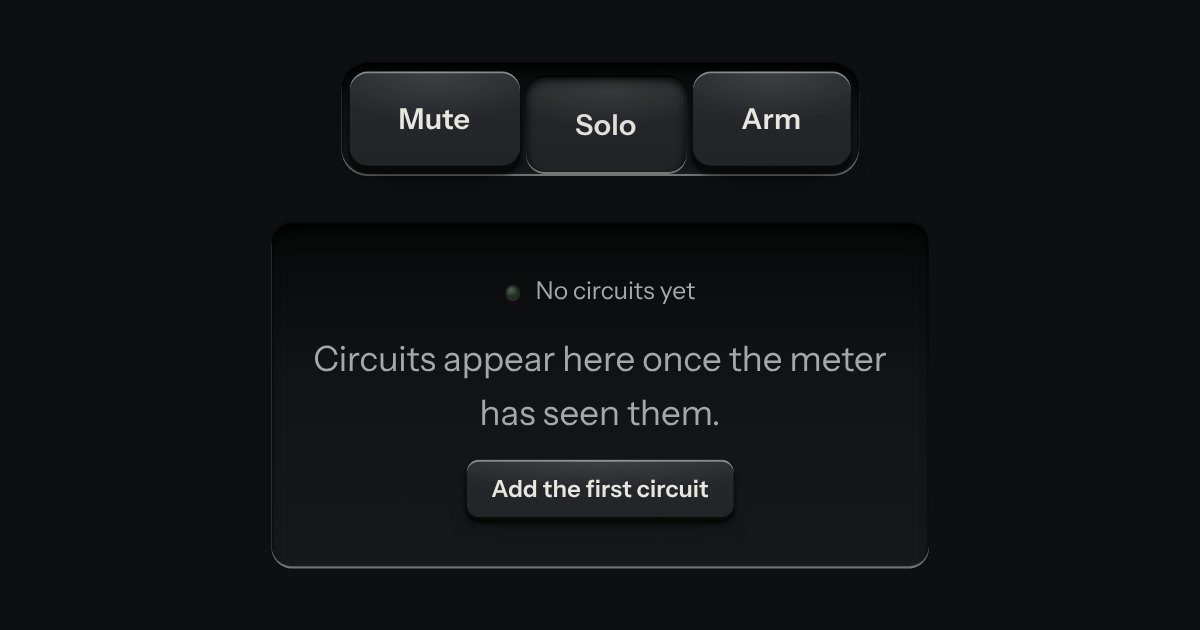
A recess cut into the plate that holds other parts: keys, a selector, an empty state waiting for its first thing.
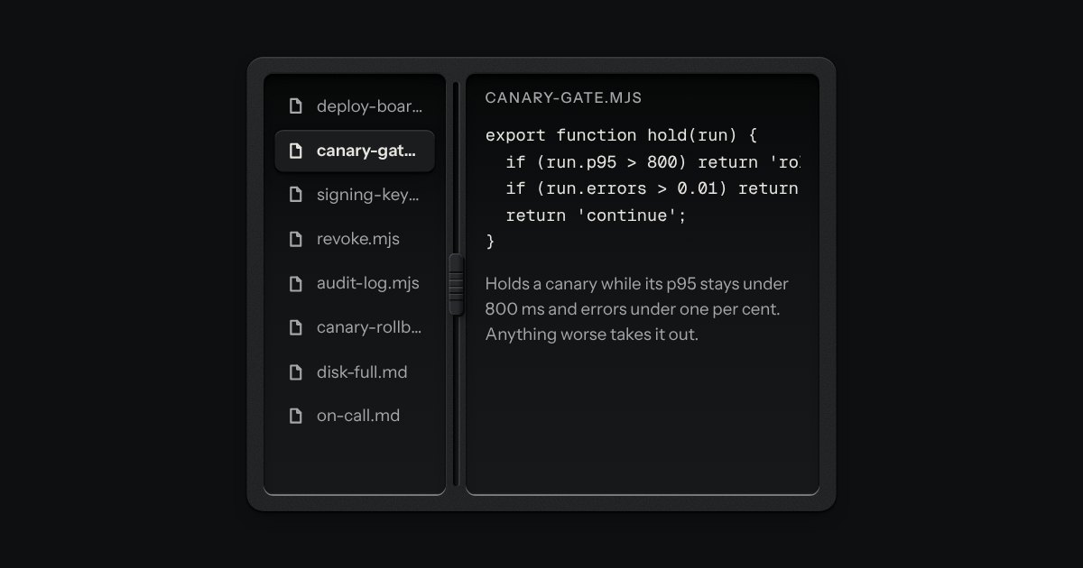
Two panes and a groove cut across the plate between them, with a knurled grip set in the groove. Drag the grip with a mouse, a pen or a finger, or give it focus and use the keys; Enter folds the first pane away and brings it back. Side by side or one over the other, each pane keeps the least room you give it.
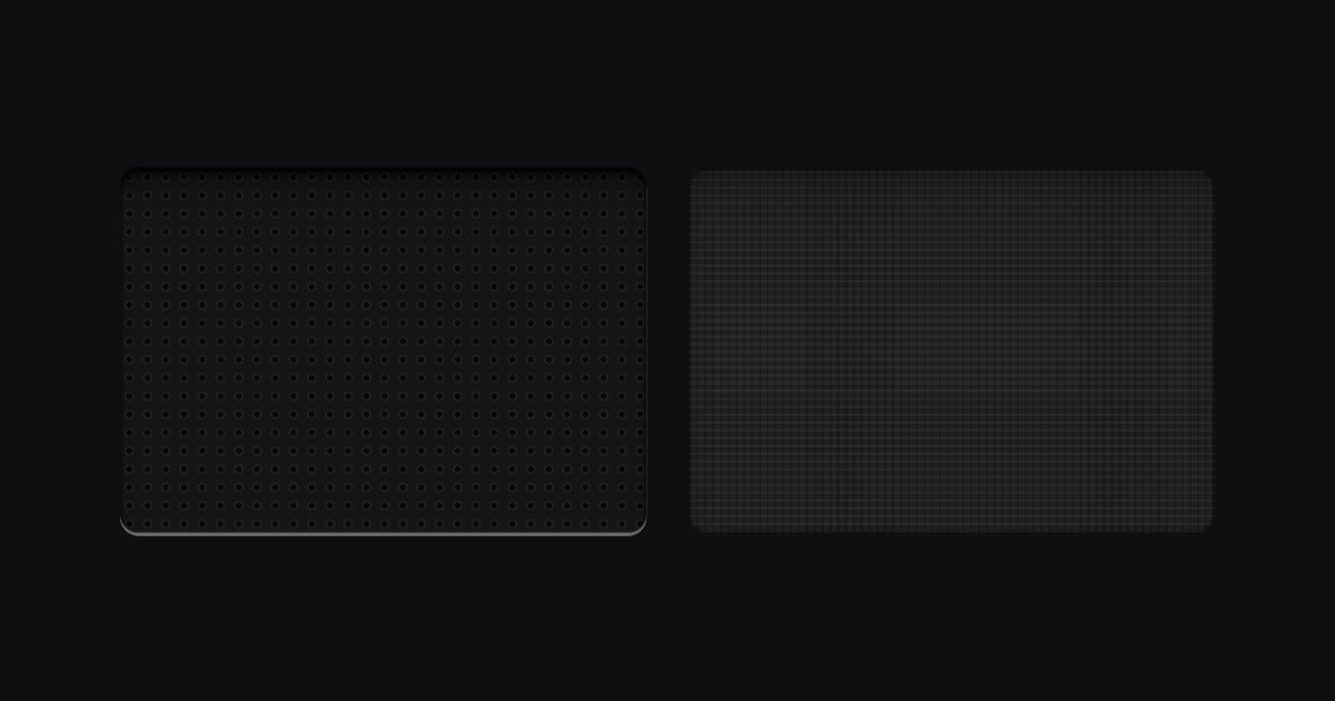
Perforated metal and speaker cloth, for the place where a real device would breathe or sound.
A person’s ID plate: their coin set in a countersunk socket, name and role, a rating plate of facts engraved in tabular figures, and one key to act. Compact for one line.
A staff badge for a person. An engraved metal plate with a clip slot cut through its top edge, a photo well and the name, role and serial engraved beneath. With no photo, the initials are debossed into the well. A lamp shows whether they are online, away or offline, and the word is always printed beside it. A compact plate does the same in one line, for lists.
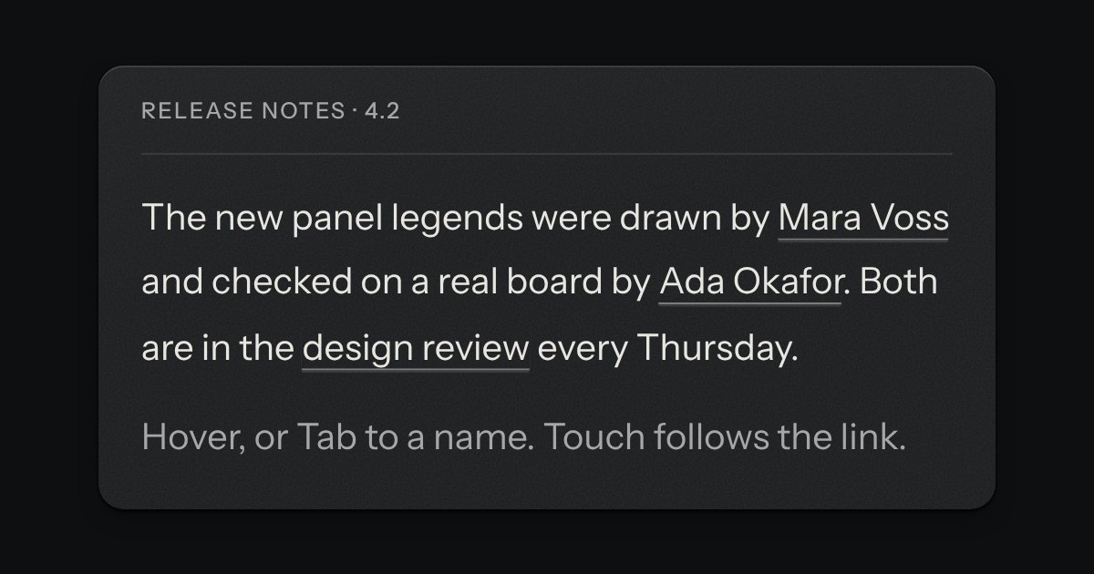
A preview that hangs from a link when the pointer rests on it or the keyboard reaches it. The popover’s card and leader, opened by a short delay and put away by leaving.
A radio or a check set as a large plate carrying a name, a sentence and a price. The plate is a big key on a skirt with a small check key in its corner; the chosen one goes down below the panel and its corner key latches. Under it is the real radio or checkbox, so a group is a native radio group and posts with the form.
An engraved rule: a fine groove cut into the plate, a hairline with a catch of light on its lower wall, or on its right wall when it stands upright. It divides without shouting, with no colour, no weight and nothing to read. Quiet keeps only the hairline. A real hr is a separator to a screen reader; one that only spaces things out says nothing.
A rule with a word set into it. The same engraved groove as the separator runs out to both sides of a printed word, broken where the word sits: “or” between two ways in, a date between two days of messages, the name of the section below. The word is real text in reading order; only the two grooves are drawn.
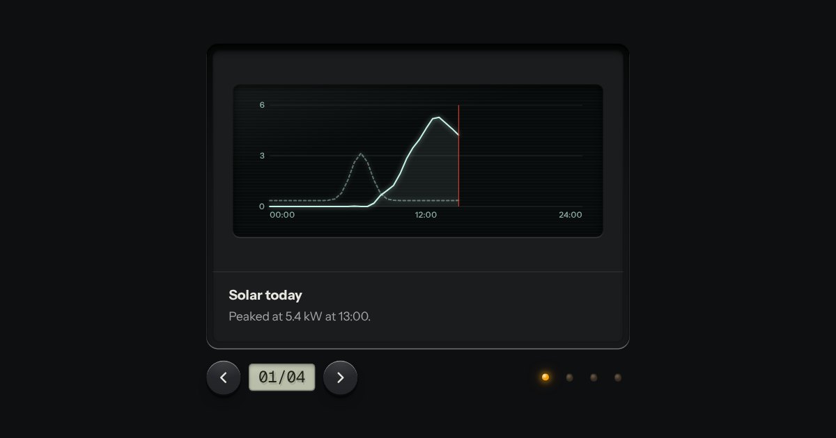
Slides seen one at a time through a viewer’s gate: transport keys either side of a frame counter on an LCD, lamp keys to jump, swipe on touch. Nothing moves on its own unless you ask it to.
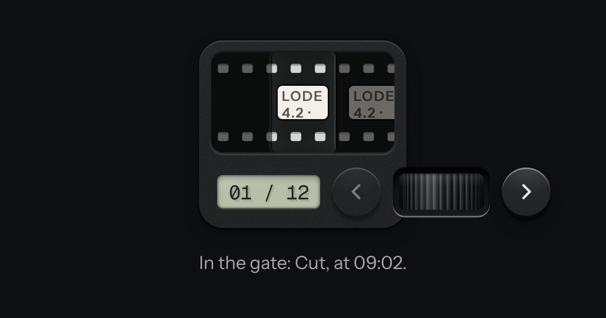
A carousel as a strip of film in a machined viewer. The frames run behind a gate lit from behind, with sprocket holes along both edges, and the frames either side wait under a smoked cover. It moves a frame at a time and settles as each one registers. Turn the thumbwheel, press the keys or swipe the film itself: underneath it is a native scroller with a snap point at every frame.
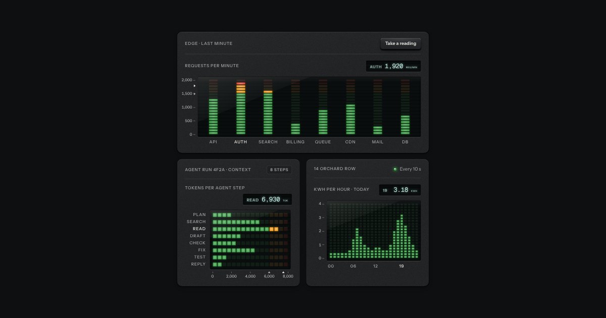
A bar chart built like a studio meter bridge: columns of LED segments behind a smoked window, green then amber then red, with a peak segment that lingers and a lit readout for the exact value.
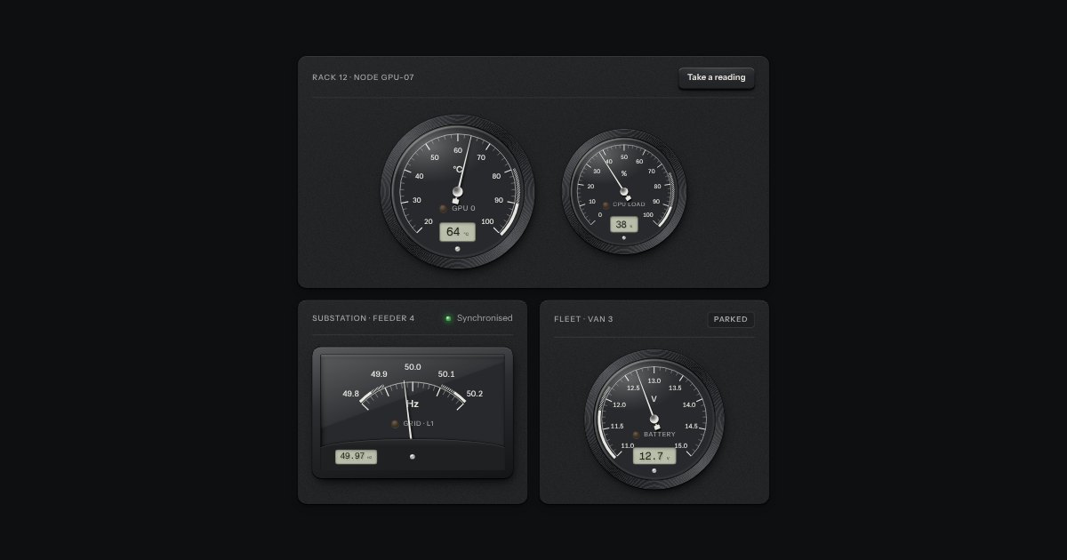
A moving-coil panel meter: a printed scale under glass, a thin needle that swings past the mark and settles, a lamp for the bands and a small LCD for the exact reading.
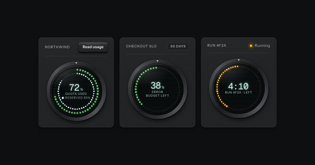
The kit’s donut chart as an instrument: a ring of lamps behind dark glass in a spun bezel, lit clockwise from twelve like a studio clock’s seconds, with the value in lit digits in the middle.
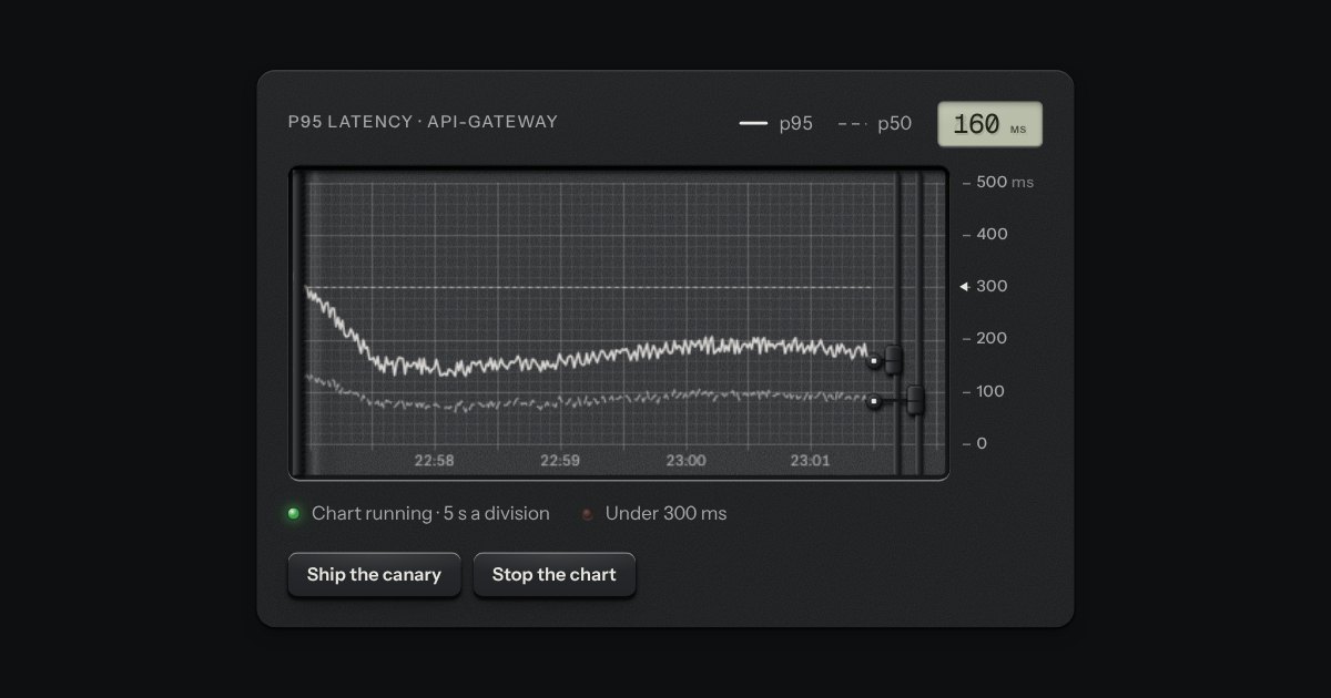
A strip-chart recorder: gridded paper advancing under a pen that rides a rail, drawing the live value as the paper moves and printing the time in the margin. For p95 latency, tokens per second, grid frequency, a cold room’s log.
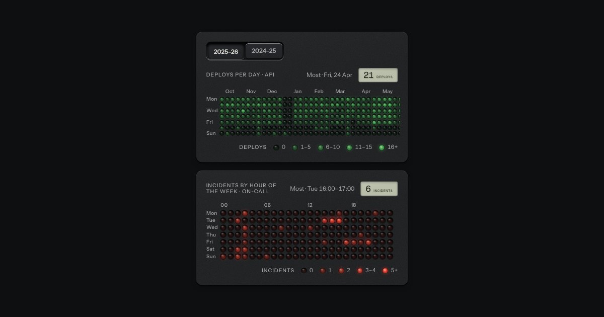
A heatmap as a matrix of small panel lamps set into the plate: each lamp’s brightness is the value, off to full in four steps, with a printed legend. Deploys per day over a year, incidents by hour of the week, energy by the hour.
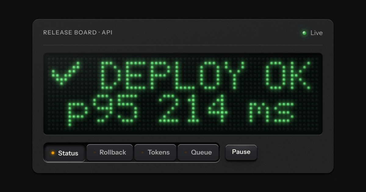
A dot-matrix display of round LEDs behind smoked acrylic, each with its own bloom and a short warm-up and fade.
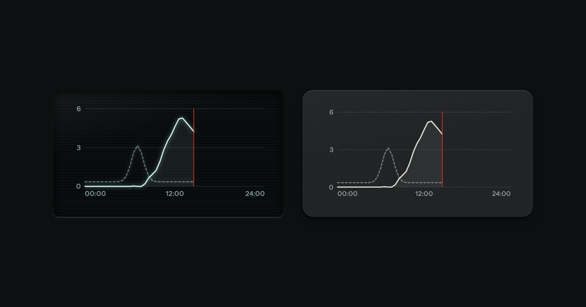
Line charts drawn as light on glass, or as ink on a panel: gridlines faint, two traces at most, a red line for now.
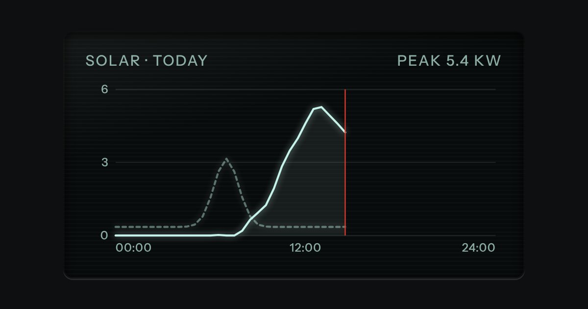
Dark display glass for plots and live readouts, whatever the finish around it. Everything printed inside it is lit.
A word-sized line for the margin of a table or beside a readout. It is an SVG that takes the size of the type around it and the ink of the place it sits in, so on a panel it is ink and on display glass it is the display’s light. The last value is marked with a dot seated in a faint ring, and a lamp lights the dot when the reading matters. The trend and the last value are said in words on the image’s label, so the line is a second sign and never the only one.
Printed bars on the panel, one value each. The bars are ink laid flat on the plate, never a colour and never glass; the axis is engraved into it, a groove along the zero line with the light on its lower lip and a faint rule at each tick. The values are a real list, one item a bar, so a screen reader reads “Thu, 73” and the picture is drawn over it. Columns by default, rows when the labels are long, and on display glass the ink is the display’s light.
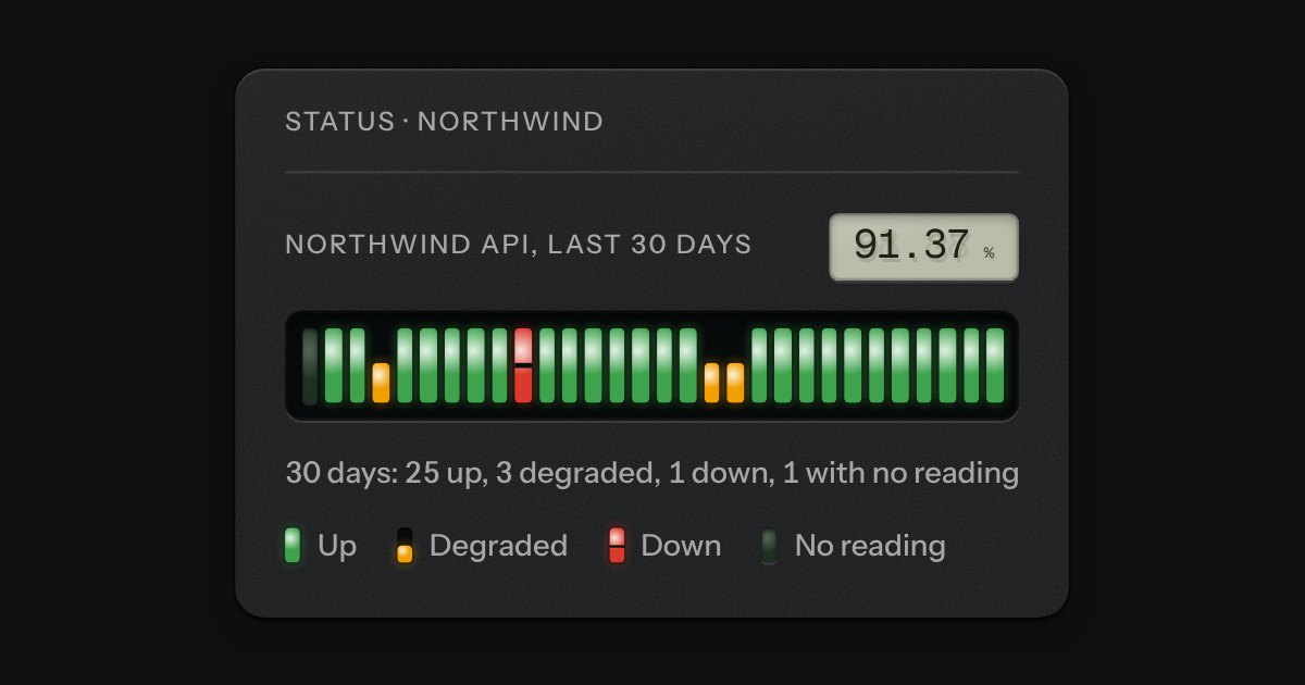
A row of ticks, one for each day or hour, on a strip of dark glass, each tick a lamp in its own slot, with the percentage on an LCD above. A lit green lamp is a period that was up; amber lit in the lower half only is one that was degraded; red lit across but cut by a slit is one that was down; a lamp that is out is a period with no reading. Move across the strip, or use the arrow keys, and the tick you are on is read out in words under it. A key below spells the four lamps.
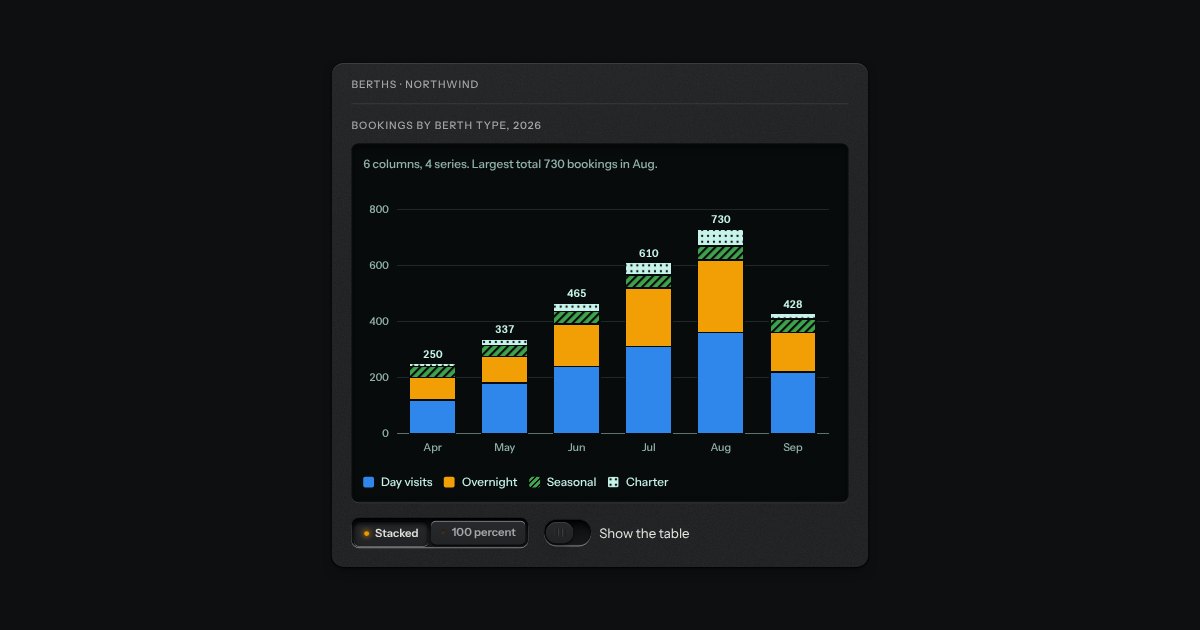
Columns split by series on a display well. Stacked mode reads totals from zero, with each total printed above its column. The series are the lamps (blue, amber, green) and the display’s own light, and from the third on they have a pattern too, so no series is only a colour. Move the pointer across the columns, or use the arrow keys, and the readout says the series, its value, its share and the total. The legend keys turn a series off and on, and the scale follows.
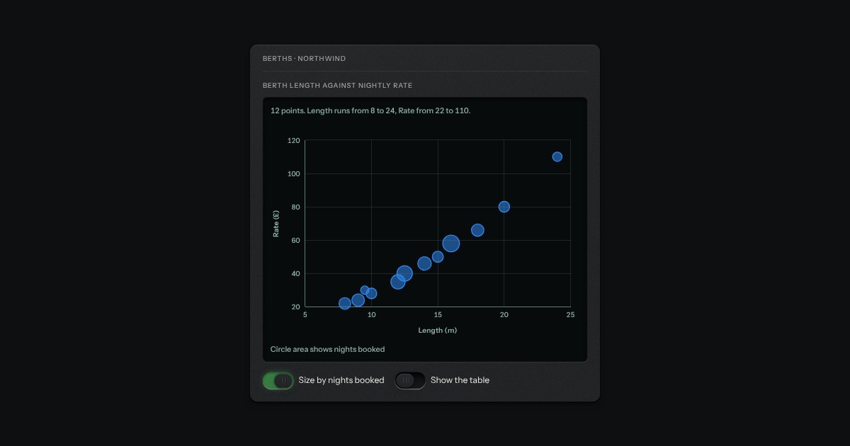
Points on two labelled scales, with a crosshair that reads the nearest point wherever the pointer is. Neither axis is forced to start at zero. Give each point a size and the circles take an area in proportion to it. With more than one series the series differ in shape as well as lamp: circle, square, triangle. Left and Right step through the points from the lowest on the horizontal axis to the highest, and the readout names each point with both values.
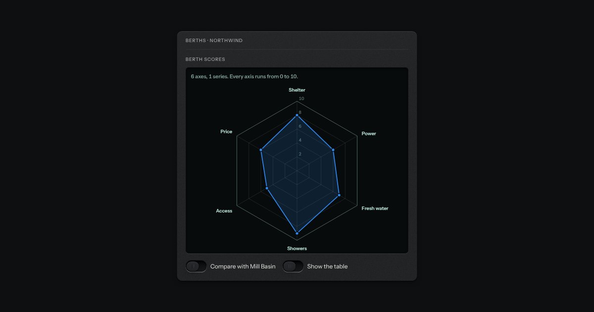
One value on each of several spokes, joined into a shape on straight-sided rings of one shared scale that starts at zero in the middle. The ring values are printed along the first spoke so a value can be read, not only compared. One or two series, lightly filled; the second has a dashed edge and square markers. Left and Right step round the spokes, Up and Down switch series. There is nothing sweeping or turning.
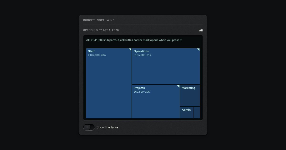
Shares of a whole as nested rectangles, each sized by its value, one level at a time. A cell that holds more has a dog-ear in its corner; click it or press Enter to open it, and the crumb above, Escape or Backspace takes you back up. A label is printed only where the cell can hold it, so a small cell stays blank rather than being cut mid-word, and every cell is still read in the readout, by the keyboard and in the table, which lists the whole tree.
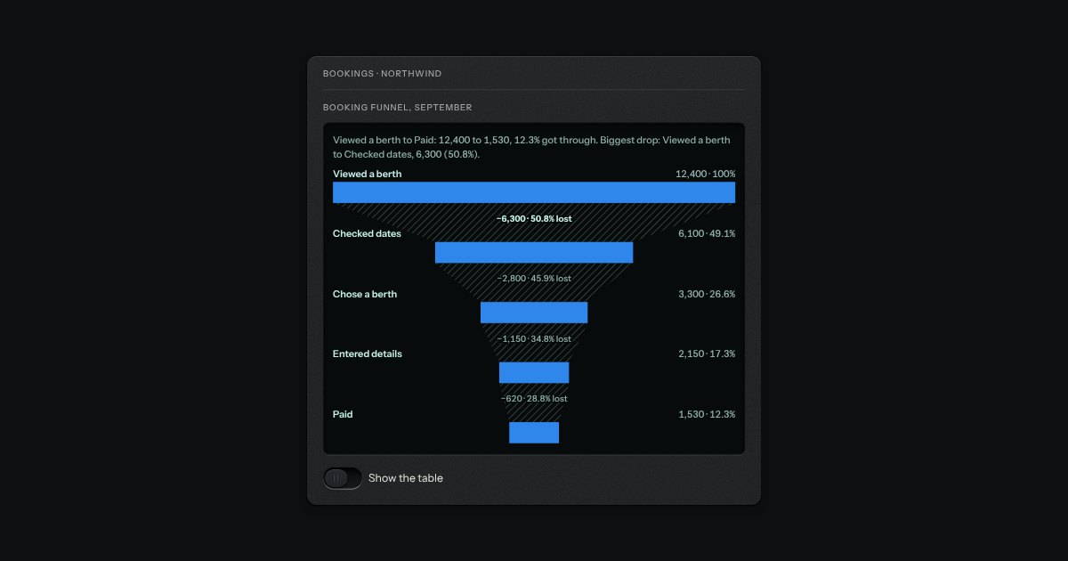
The stages of a process in order, each as wide as how many got that far, centred and to scale, with the drop-off written between each pair: the number lost and its share of the stage before. Every stage prints its count and its share of the first. The biggest drop is set in bold. A later stage larger than the one before is drawn to scale and said to be a gain, never hidden.
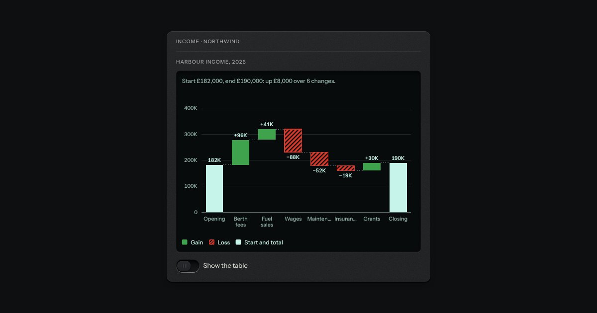
Gains and losses stepping from a start to a total. Each change floats from where the running figure was to where it lands, and a total stands on the zero line. A gain is a solid green bar with its figure above it and a plus; a loss is a hatched red bar with its figure below it and a minus, so direction reads with the colour taken away. Thin dashed steps join the bars at the running figure, and the scale takes in zero and every running figure, so a run that dips below zero is drawn below the line.
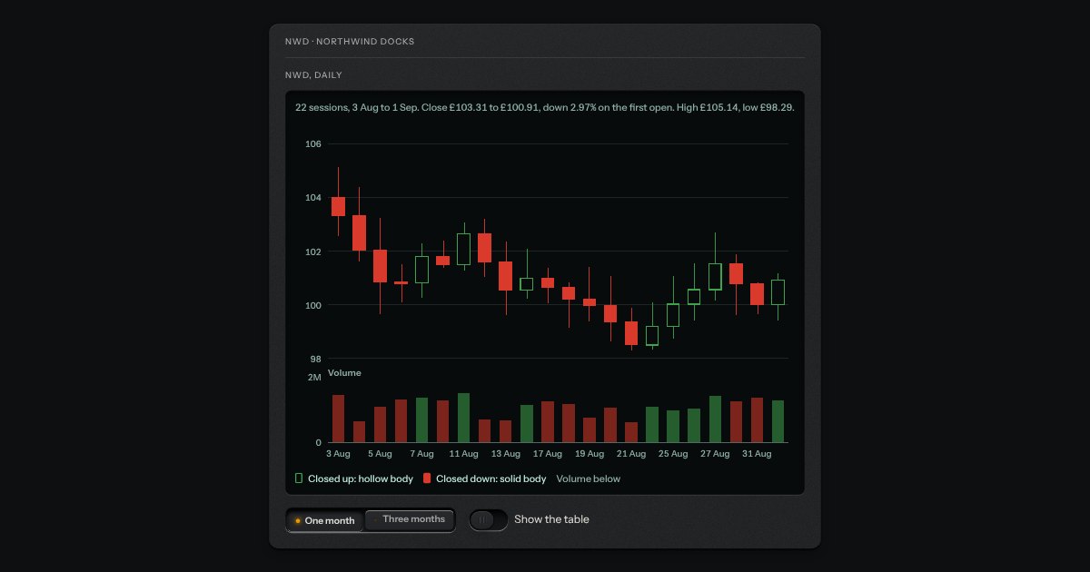
Open, high, low and close for each session, with the volume traded under it, for market data. The body runs from open to close and the wick from low to high. A session that closed up has a hollow body and one that closed down a solid body, so direction does not rest on green and red alone. The price axis runs on whole steps from just under the lowest low to just over the highest high and does not start at zero; the volume strip has its own scale from zero. A crosshair reads the close and the session.
An option in a form: a small square key that presses below the plate when chosen, with a tick printed on it.
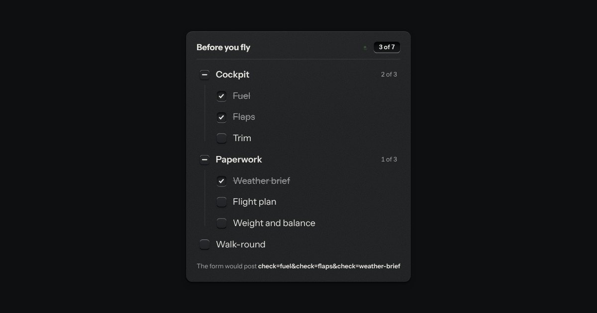
The kit’s check keys in nested groups. A group’s key is the sum of its items: all done, none, or some, and some is a key sunk halfway with a bar across it. The head counts the items, “3 of 7”, and its lamp lights when they are all done.
A radio or a check set as a large plate carrying a name, a sentence and a price. The plate is a big key on a skirt with a small check key in its corner; the chosen one goes down below the panel and its corner key latches. Under it is the real radio or checkbox, so a group is a native radio group and posts with the form.
const berth = 'A1';
const open = true;
return { berth, open };
Code on display glass. A bar along the top holds the file name on a tab, with a lit edge under it, and the copy key at the far end. Under it the lines run, each with its number engraved in a gutter that stays where it is when a long line scrolls sideways. The numbers are drawn by the stylesheet, so they are never selected, never copied and never read aloud. Highlighting is optional and small: a few strengths of the display’s own light, told apart by weight and italic, never a colour of its own.
pnpm add @northwind/cliOne command, four package managers. A row of selector keys (npm, pnpm, yarn and bun) sits over a line of display glass with the command on it and the copy key at the end. Press another key and the command is rewritten; the choice is remembered, and every other install snippet on the page follows it, so someone who uses pnpm reads pnpm all the way down the guide. It is the kit’s selector and copy key with one small script between them.
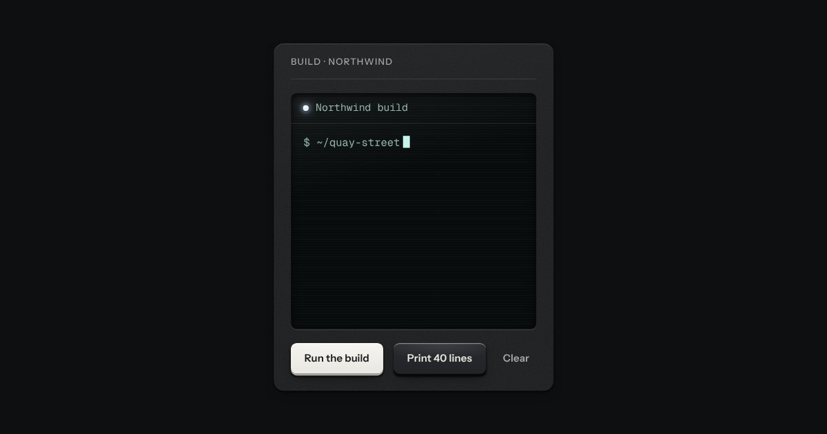
A command prompt on dark glass. It is a display, not a shell: it prints what the page gives it, line by line, and keeps a scrollback to read back through. A bar along the top names it and carries one lamp, white while it waits and amber while lines are still arriving. Each line has a mark in its margin that says what it is (a command, a success, a warning or a failure), so a kind is never only a colour, and at the foot a block cursor waits at a prompt that does nothing. Under reduced motion every line arrives whole.
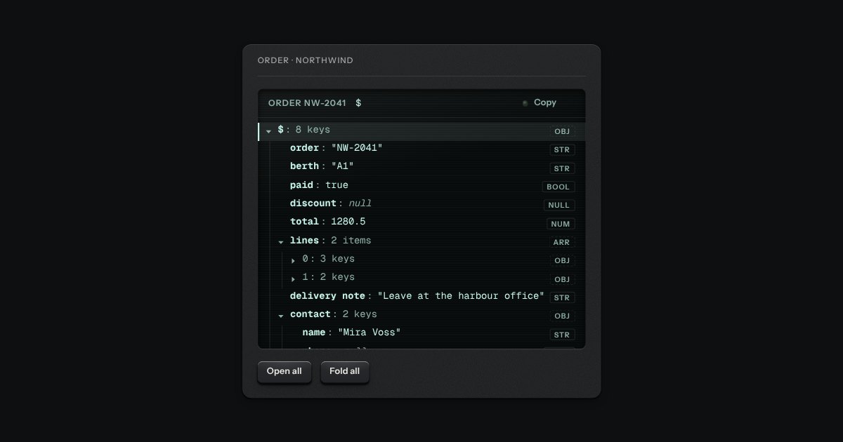
A tree of keys and values on display glass. A bar along the top names it, prints the path of the row you are on ($.lines[0].sku) and carries the copy key, so the path to any value is one press from the clipboard. Under it the tree folds and unfolds, one tab stop with the arrow keys inside it. Every value is the display’s one light: what kind of value it is (a string, a number, true or false, null, an object or an array) is printed as a small legend at the end of the row and said in words to a screen reader, never left to a colour.
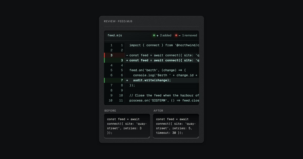
Two versions of a file on display glass, side by side or stacked. A bar along the top names the file, shows a legend (a lit green lamp and a plus for the lines added, a lit red lamp and a minus for the lines removed) and, where there is room, a selector for the layout. A changed line lights its gutter along the edge and takes a sign: added lines a plus on a solid ground, removed lines a minus on a hatched one. The line numbers are drawn by the stylesheet, so they are never selected, never copied and never read aloud, and long unchanged runs fold into one row that says how many lines were left out.
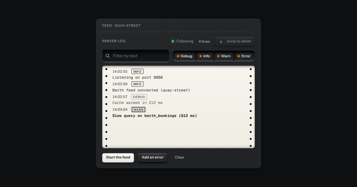
A live log printed on a strip of paper tape. Each line is a time, a printed legend for its level (debug, info, warn, error) and its words, set between the sprocket holes of the tape. A lamp in the head says whether the tape is following the newest line (green, Following) or has been left where you are reading (amber, Paused, and how many lines have come since); a key jumps back to the latest. Over the tape sits a filter well: a search field and the four levels as chips. It is a display: it prints what the page gives it, keeps the last thousand lines and runs nothing.
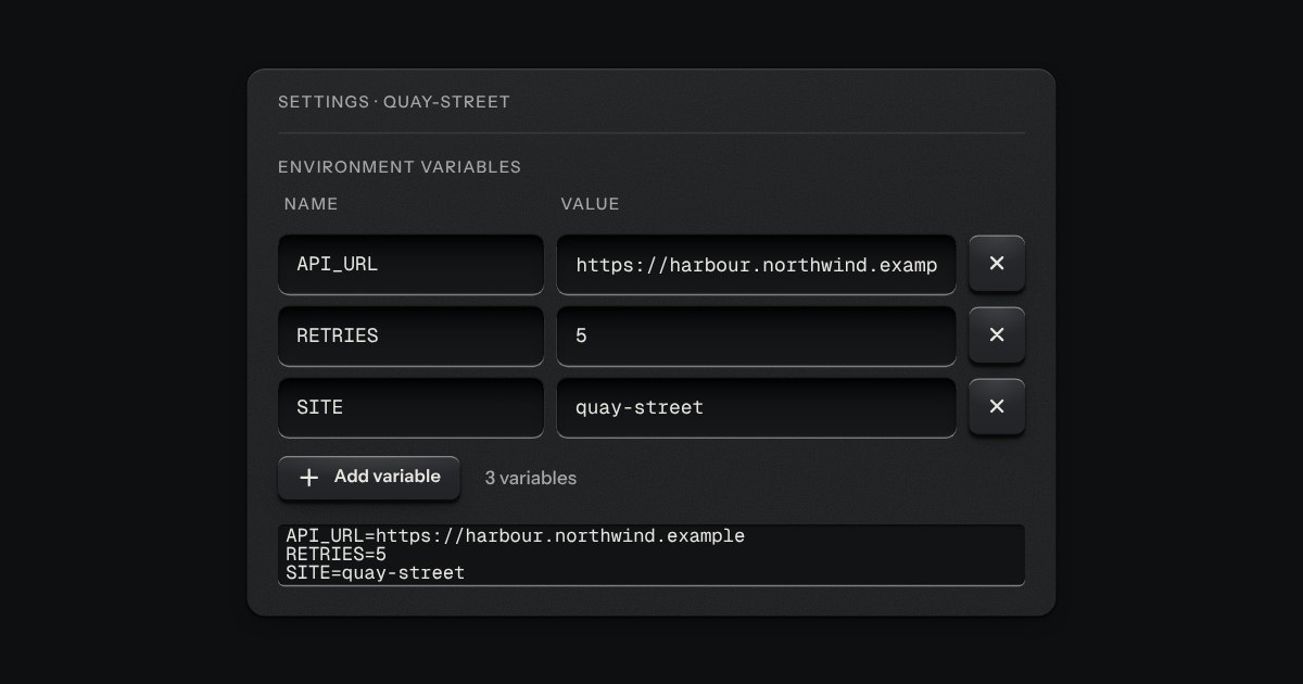
Rows of a name and a value, each its own recess, with a remove key at the end of the row and an add key under the last: for environment variables, request headers, tags and the like. It is the kit’s field, key and icon key set in a grid, so it posts with a form like any other fields. A new row takes the caret in its name, a removed row says what went, and a name used twice is marked on its recess and said in words under the row. Narrow, the name sits over the value and each says which it is.
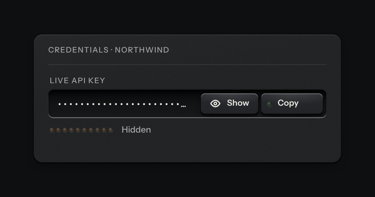
A masked value for an API key or a token, in the field’s well, with a reveal key and the kit’s copy key on its floor. Under it a ladder of ten lamps says how long the value will stay shown: lit end to end the moment it is revealed, putting its lamps out one by one with the seconds beside it, and dark and marked Hidden when the value is masked. It masks itself again when the time is up, when focus leaves the field, when a press lands outside it and when the page is put away. It is the password field’s peek key with a clock.
A decision that must be made now: a native dialog with a question, one sentence of consequence, a way back and the act.
Every action and page behind one key: a modal plate whose entry line is a lit display, with the results printed below and the chosen one pressed in.
A panel that slides in from any edge of the window, on the native dialog. A face plate bolted to the frame, with a machined grip let into its inner edge to pull it shut by.
The dialog plate for a question that must be answered before an act that matters. A caution strip is set across its head with one lamp in it, red when the act cannot be undone and amber when it can. The question is the title, one sentence says what will happen, and a grave act can ask for its name to be typed first.
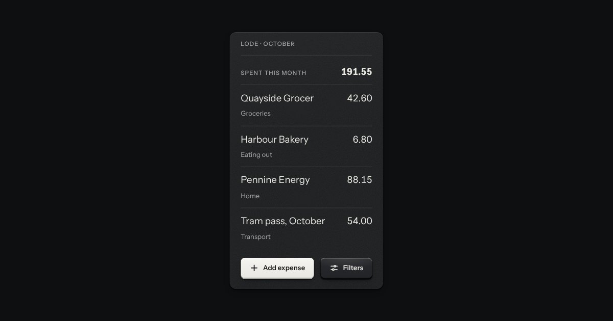
A panel that rises from the bottom edge of the window, on the native dialog, for a short task that should not leave the page: add an expense, set some filters, pick an action. It stops at two heights, half and full. A grip in its top edge drags it, or steps it between the heights from the keyboard; dragged down from half it goes away. The key that saves stays in sight at half, and the content scrolls only when the sheet is full. On a phone it is the whole width; on a wide screen it is a card, centred, standing on the bottom edge.
A card of actions and options that slides out from under its key. The key stays down while the card is out; an option that is on lights its lamp.
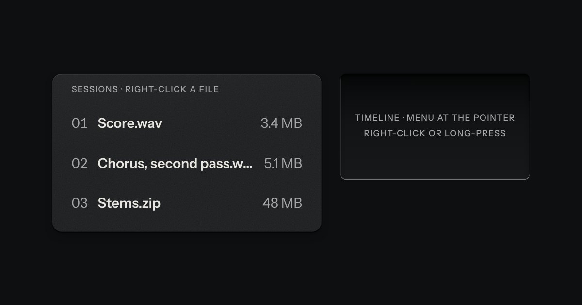
The menu’s own card, opened where you pointed: by right-click, by a long press on a touch screen, or from the keyboard with Shift F10 or the Menu key. The thing it opened on stays sunk while it is out.
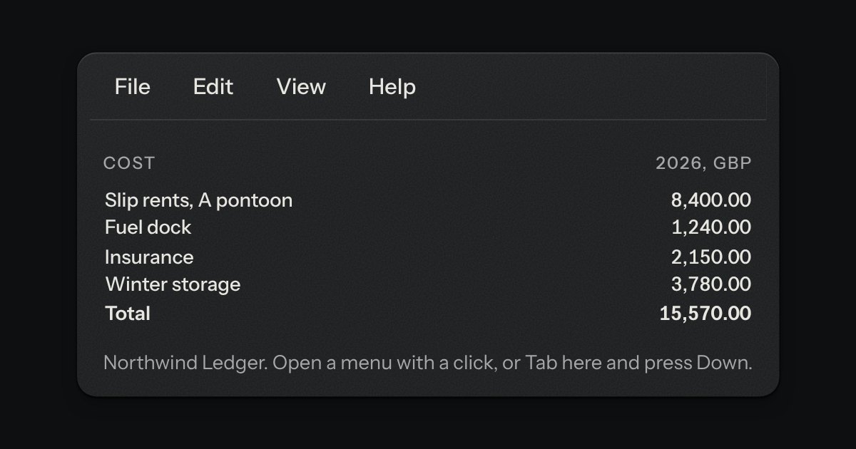
The row of menu names along the top of a window: File, Edit, View, Help. The names are plain printing on the page, with no caps; under the pointer one is tinted, and while its card is out it is pressed into the surface. The cards are the menu part’s own, with their lamps, shortcuts and submenus. Once one is out, Left and Right (or resting the pointer on the next name) hand over to the neighbouring card, as a desktop app does.
What a view shows before it has anything: an empty tray with the outline of what goes in it printed on its floor, one sentence and one key.
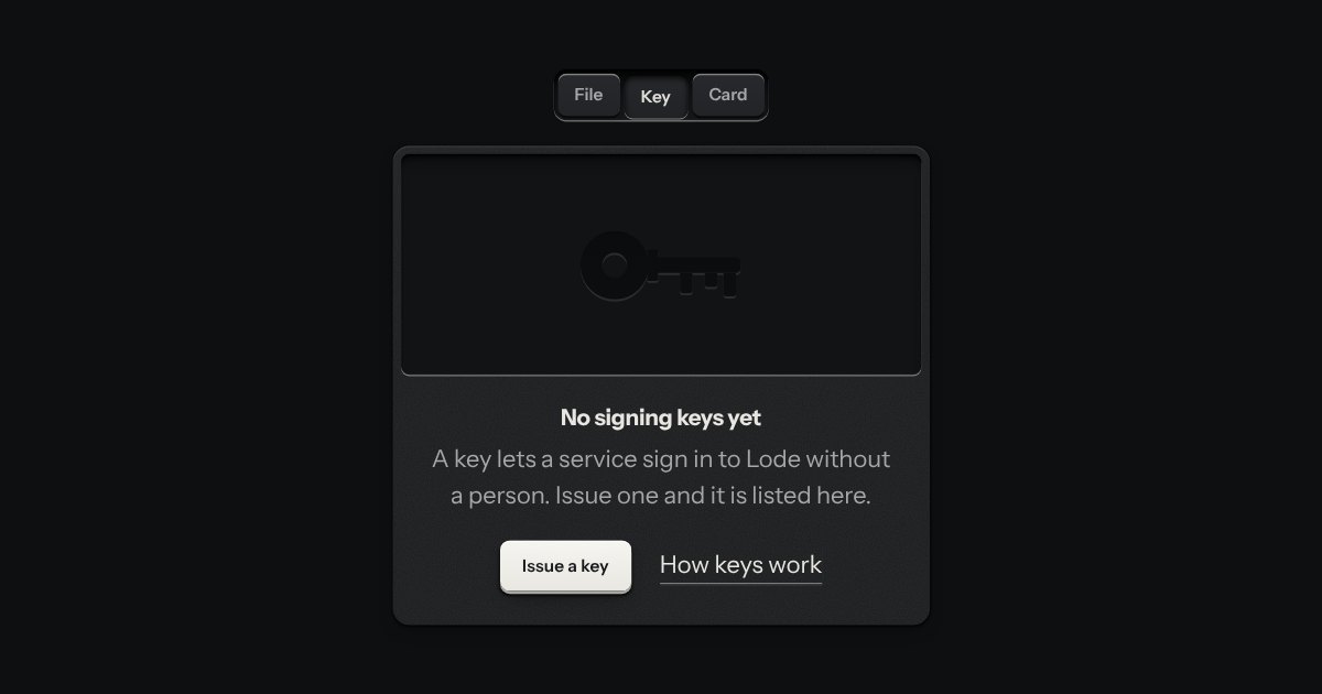
An empty state drawn as an empty machined tray. The shape of what goes in it, a file, a key or a card, is cut into its floor the way a case is cut for the thing it carries. Under it: what is missing, one line on why, a key that fills it and, if you like, a link to read more. It is markup and nothing else.
What a view shows when loading failed. It is the empty state’s sibling: the same tray, with the outline of what should be there printed on its floor, but the lamp in its title is lit red, the words say in plain language what happened and whether anything was lost, and the first key is Retry, with a way round it beside it if there is one. Pressing Retry holds the key, turns the lamp amber and has a screen reader say so.
The end of a task as one plate: a lens sunk into it with one lamp lit, a verdict, one sentence and what to do next. Green when it worked, amber when it worked with something to check, red when it did not. The verdict is a sentence that says which, so the lamp is only a second sign. When a result appears, focus moves to its verdict, so a keyboard user is where the news is and a screen reader says it.
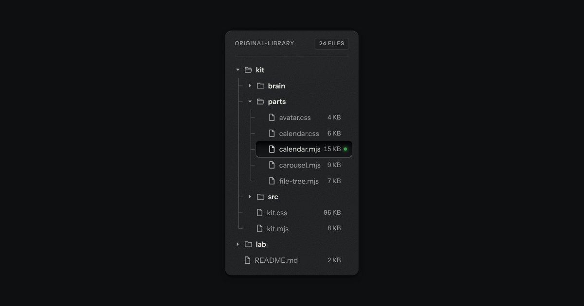
Folders and files as a real tree, printed like a wiring diagram: traces with an elbow into every item, chevrons that turn, and the chosen file set in a recess with its lamp lit. Written as a plain nested list.
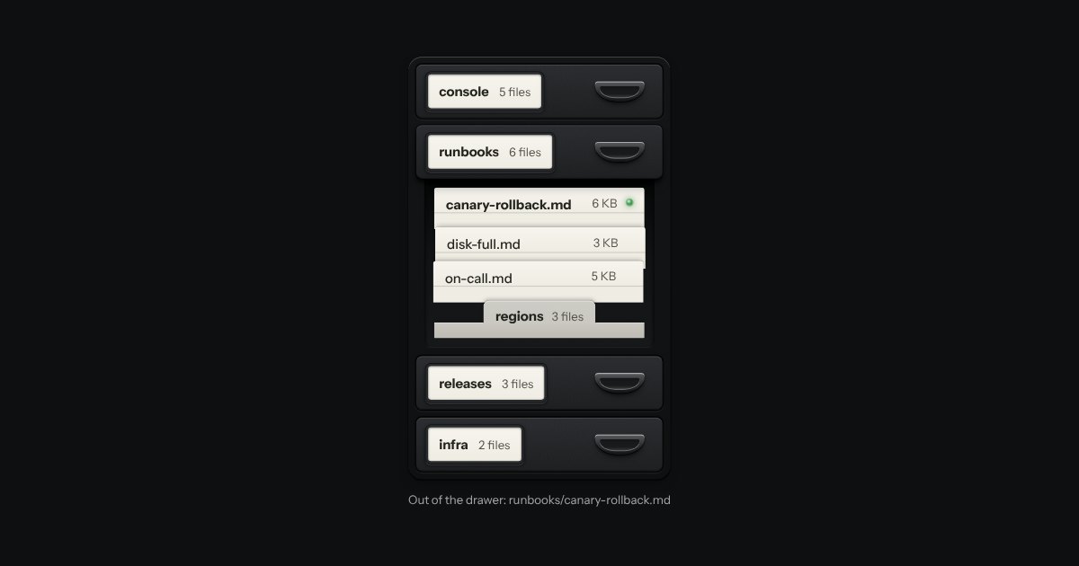
A file tree as a card-index cabinet. Folders are drawers, each with a label holder and a cup pull; open one and it slides out with its files standing in it as index cards, each showing its top edge over the card behind. A folder inside a drawer is a divider with a tab. It is a real tree for the keyboard and for a screen reader, drawn from data by one function.
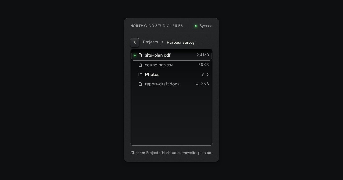
Folders as columns, side by side, the way a file manager’s column view browses them. Choose a folder and its contents open in the next column; choose a file and its details stand in the last one, with an Open key. A path along the top says where you are and takes you back a level at a time. Long lists scroll in their own column, a folder can be loaded only when it is opened, and on a narrow box it shows one column at a time with a Back key, the way a phone browses folders. It is the file tree’s other half: the tree shows a hierarchy at once, the columns walk it.
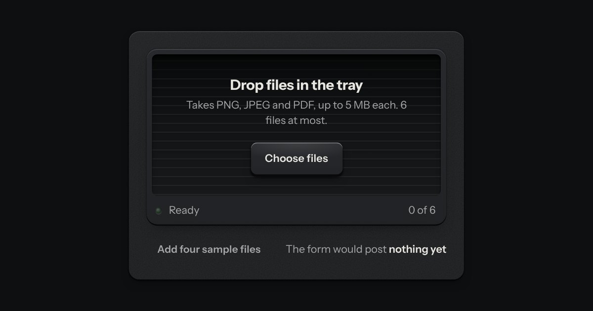
An in-tray for files. A machined lip stands round a ribbed floor; the floor rises a little when a file is dragged over it, and a lamp on the lip lights. What goes in lands in the tray as a sheet of paper and is listed as printed rows, a refusal says why, and the key inside the tray is a real file input.
The browser’s own file input, dressed as a key and a printed file name in a well. The input itself is the control, so it takes the focus, opens the chooser from the keyboard, accepts a file dropped on it and posts with its form, with or without a script. With a script, a chosen set can be listed under it, one ruled row to a file with its size and a key to take it out.
Text entry in a recess, the label printed above it, and a hint that says how to fix an error.
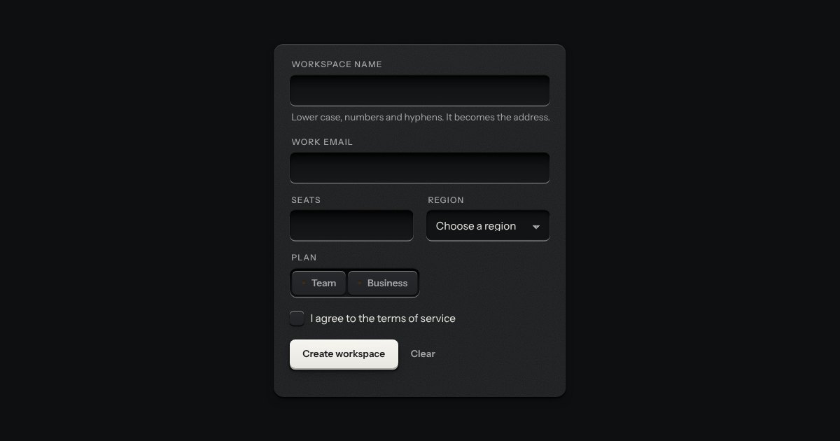
A form that says what is wrong, on the browser’s own checks. Press submit with something missing and each field in error gets a line under it with a red lamp lit and words that say how to put it right, its well ringed red; at the top of the form an annunciator lights over a count and a list that links to each field, and takes the focus. From then on each field is checked again as it changes.
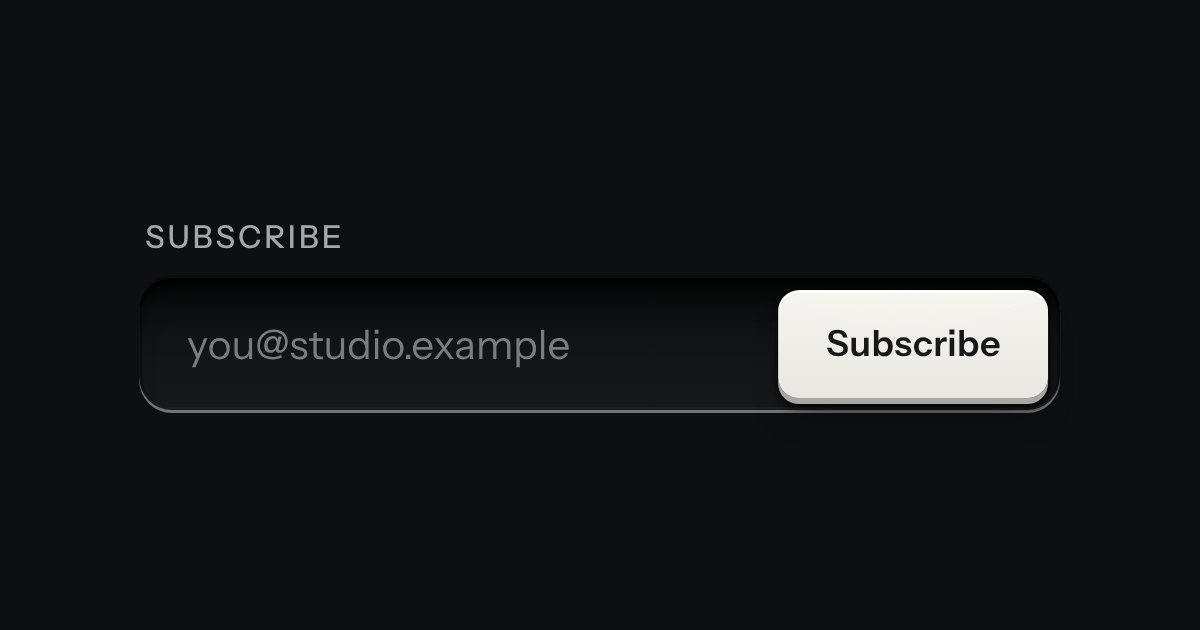
One field with its one action in a shared well: subscribe, search, add.
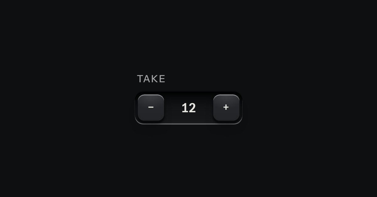
A small integer with − and + keys either side, in one well.
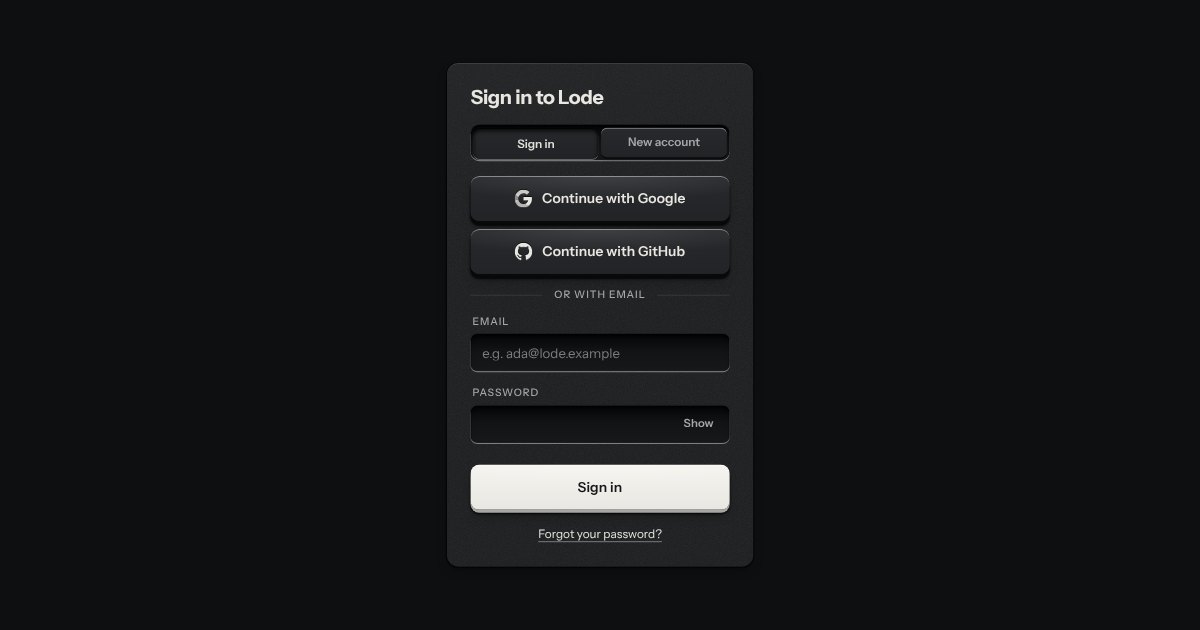
Sign in and sign up on one plate: Google and GitHub keys with their marks stamped in monochrome, an email route underneath, a two-way selector that re-prints the plate, and errors that say how to fix them.
A number you can type or drag, the way a pro tool’s value field works: an engraved ruler under the numerals slides beneath a fixed index as the value moves.
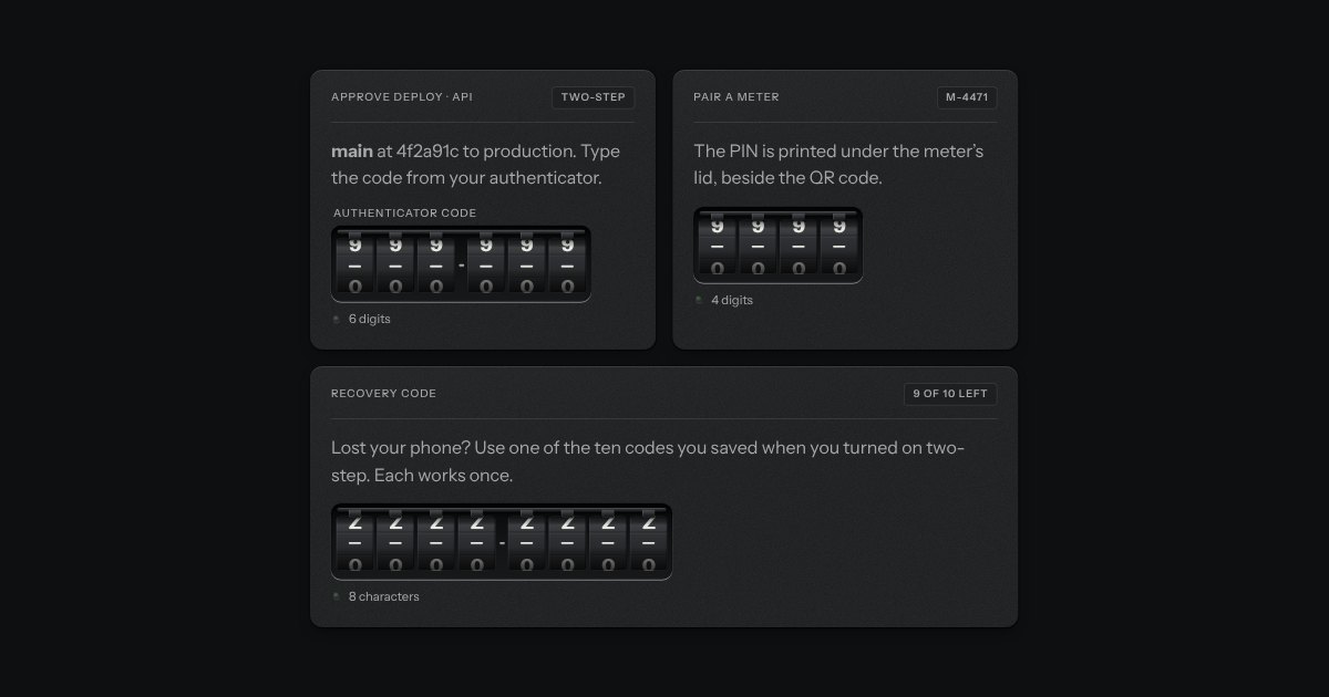
A PIN or one-time code dialled into a combination lock: number wheels behind a slot in the plate, turning on detents. Right, a locking bar drops into their notches; wrong, they spin back to blank.
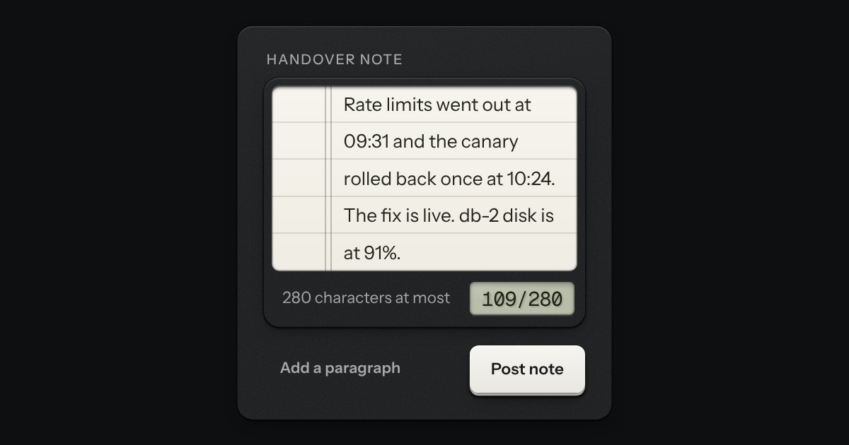
A writing pad that is still a real textarea. A sheet of ruled paper is set into a machined frame, and the rules move with the words. A small LCD in the foot counts characters or words: it lights amber near the limit and red over it, and the limit is said once, in words, when it is crossed. The pad grows with the text up to a height you choose.
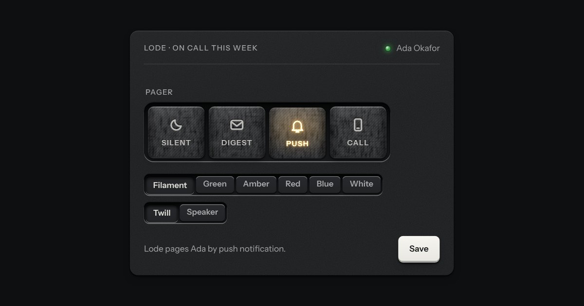
A mode switch made of cloth. A row of tiles covered in stretched fabric stands in a machined tray, each with an icon and a word pressed into it. The chosen tile sits a touch lower and a lamp behind it lights its icon and word through the weave. Choose another and the first lamp fades down as the next comes up. Underneath it is a group of native radios, so it posts one value without any script.
The field’s well with a louvred shutter drawn across its characters and a peek key at the end. Press the key and the shutter slides off to the right, the characters stand open, and the key stays down; press it again and the shutter closes. The key says Show or Hide, and the caret never leaves where it was.
Related fields under one engraved legend, with one hint and one error line for the group. It is the browser’s own fieldset and legend, so the group has a name for a screen reader and a disabled fieldset disables every field inside. The legend runs on into a groove cut in the plate; the error waits at the foot, not drawn, until it has something to say.
What a settings page is made of: a label, one sentence under it and the control at the end, ruled like the list with a hairline between rows and nothing else drawn. A row with a switch or a check is one label, so pressing anywhere on it turns the control; a row with a key, a select or a value is a plain box, so a press means what the key says.
The browser’s own file input, dressed as a key and a printed file name in a well. The input itself is the control, so it takes the focus, opens the chooser from the keyboard, accepts a file dropped on it and posts with its form, with or without a script. With a script, a chosen set can be listed under it, one ruled row to a file with its size and a key to take it out.
A date typed in three segments, day, month and year, in the field’s own well. Each segment is a small number you can step with the arrow keys or type over, and typing moves you on by itself once a number is complete. The order and the separator are the reader’s. A calendar key at the right of the well opens the kit’s calendar for anyone who would rather point. The form gets an ISO date, yyyy-mm-dd, or nothing while the date is not complete, and a wrong date says what is wrong in a sentence: February has 28 days in 2026.
A time of day in the field’s well: hours, minutes and, on a 12 hour clock, AM or PM, each a segment you can type into or step with the arrow keys. A key at the right opens a plain list of times, every few minutes between the earliest and the latest you allow, with the current one in the middle. It posts “HH:MM” on the 24 hour clock whichever clock it shows, says what is wrong in words (empty, half typed, too early, too late, off the step), and works in a native form, with a label, help text, an error, a disabled state and a reset.
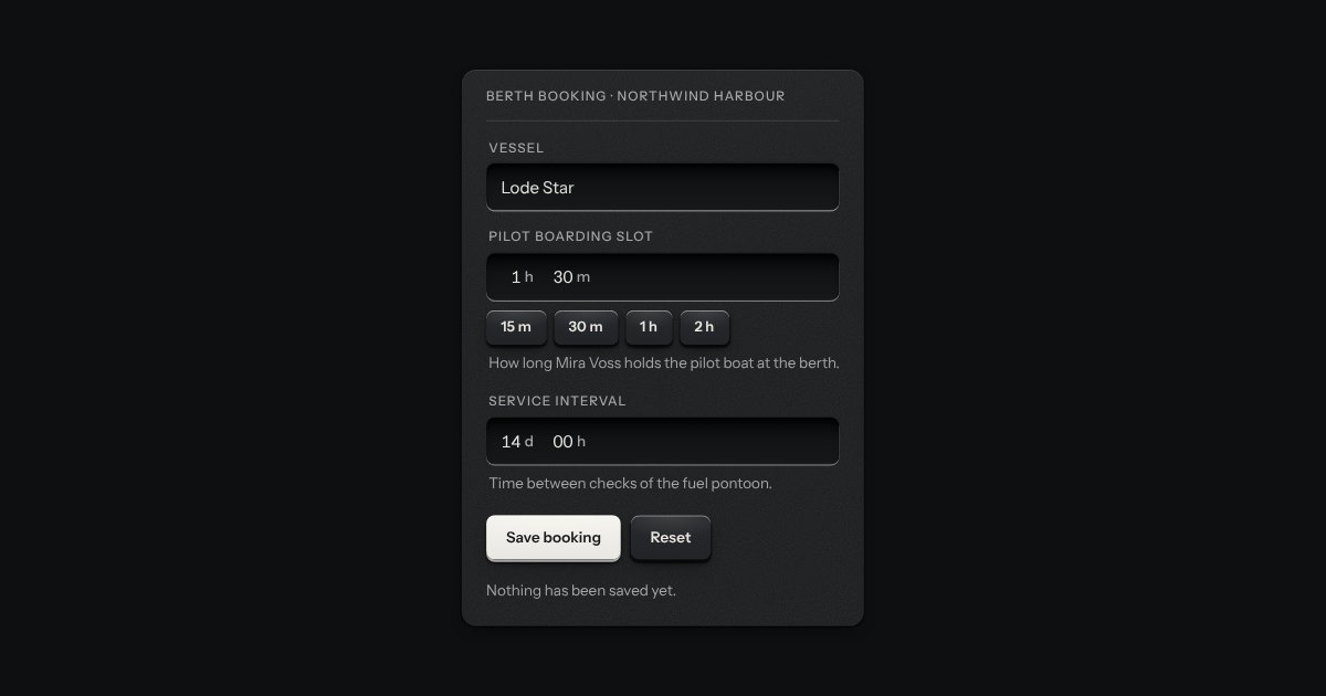
Each segment is a spin button with its unit printed beside it as a small suffix. Type digits and it moves on after two, press Up and Down to step, and it carries the way a clock does. Quick picks can sit under the well as plain keys.
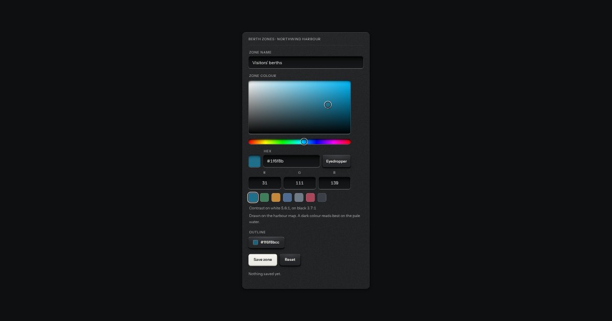
A form field for choosing a colour. A plane sets saturation across and brightness up, a strip sets hue and, if you ask for it, a second strip sets opacity. Under them are a hex field that takes #rgb, #rrggbb and #rrggbbaa with or without the #, red, green and blue number fields, a row of swatches and a preview of the colour you have. The plane and the strips are drawn with gradients and only their thumbs move. The colour being chosen shows in the plane, the strips, the swatches and the preview and nowhere else: the thumbs, the fields and the rings are the kit’s own. It posts a lowercase hex under its name, resets with its form, fails validation when it is required and empty, and works inline in a form or inside a native popover opened by a swatch key.
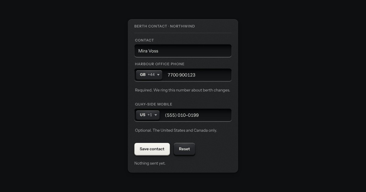
A country key and a number in one well, for a contact number. It opens a card with a search box and a list of countries; the number beside it is a plain telephone input that sets itself out in the country’s own grouping as you type, and keeps the caret where it was. Paste an international number and the country follows it. It checks length and shape, not whether a line exists.
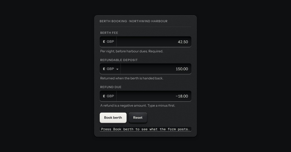
An amount of money in the field’s well, with its currency printed on the floor at the left (the symbol and the code, or a native select when several are offered).
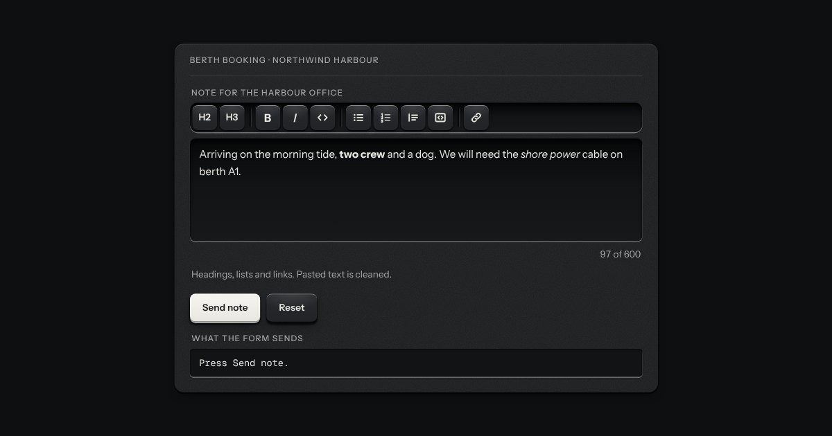
A plain rich-text field with no dependency. A toolbar of keys sits over an editing surface in the field's well: two heading levels, bold, italic, code, bulleted and numbered lists, a quote, a code block and a link. The keys stay down while the text under the caret has that format. What comes out is always the same small set of clean HTML (p, h2, h3, strong, em, code, pre, blockquote, ul, ol, li and a with an address), whatever was pasted in, because everything that goes in, by typing, pasting, dropping or setting the value, is cleaned by a strict allow-list. It is a real form field: it submits, resets, validates, counts and goes off like any other.
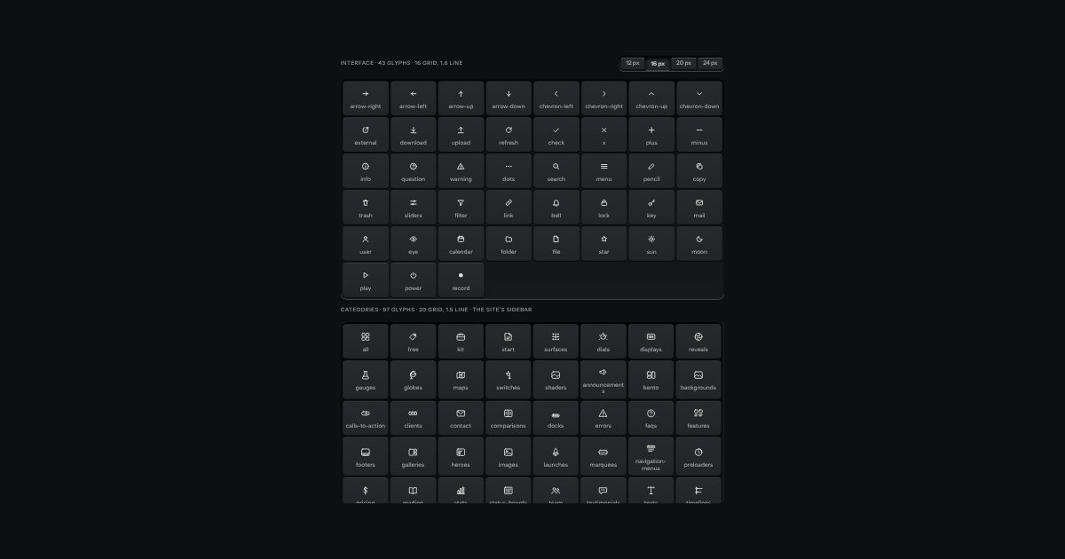
The kit’s glyphs as one set.
A key with an icon and no words, square or round: transport, power, the small tools. Its aria-label names it; a tip shows the name.
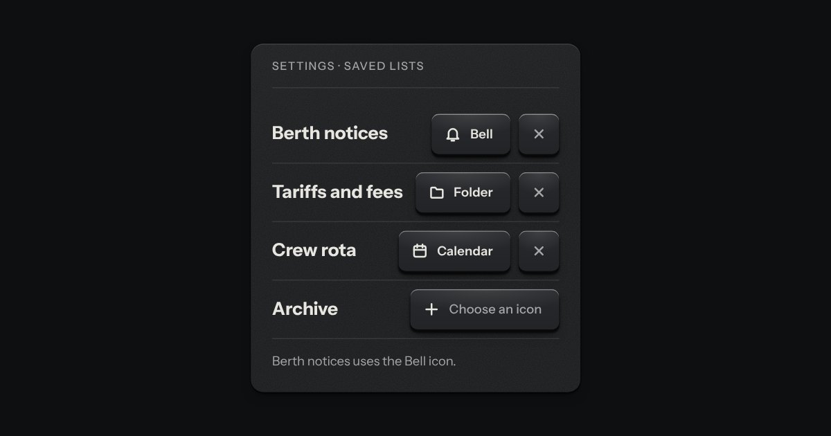
A key that shows the icon it holds, with a clear key beside it, and that opens a card of the kit’s own icons to change it. The card hangs from the key on the popover’s printed leader, with the search field above a grid of icons in a few groups (Moving, Marking, Doing, Things and Transport). The search answers to the words an icon goes by as well as its name: “delete” finds the trash. The arrow keys walk the grid across the group headings, the one under the arrows is named in the card’s foot, and the one picked is pressed down with its lamp lit. Nothing from outside the kit’s icon set can be picked.
Text entry in a recess, the label printed above it, and a hint that says how to fix an error.
One field with its one action in a shared well: subscribe, search, add.
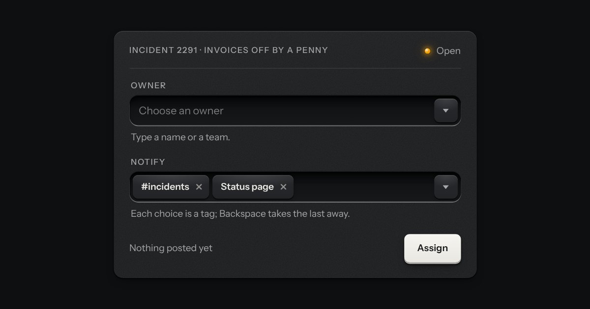
A field that filters a long list as you type. It starts as a plain select, so it posts with the form and works without a script; then the options card slides out of a slot under the well, the letters that match print heavier and the chosen option’s lamp is lit. Several choices sit in the well as tags.
A date field with its calendar card in a slot underneath: type a date in any common form for your locale, or press the key and the card slides out. Single dates and ranges; shown the Intl way, posted as ISO.
A number you can type or drag, the way a pro tool’s value field works: an engraved ruler under the numerals slides beneath a fixed index as the value moves.
A PIN or one-time code dialled into a combination lock: number wheels behind a slot in the plate, turning on detents. Right, a locking bar drops into their notches; wrong, they spin back to blank.
A text input that turns what you type into printed tags. Enter or a comma sets one down in the well; each tag is a key that takes itself away, and every change is spoken.
An in-tray for files. A machined lip stands round a ribbed floor; the floor rises a little when a file is dragged over it, and a lamp on the lip lights. What goes in lands in the tray as a sheet of paper and is listed as printed rows, a refusal says why, and the key inside the tray is a real file input.
A writing pad that is still a real textarea. A sheet of ruled paper is set into a machined frame, and the rules move with the words. A small LCD in the foot counts characters or words: it lights amber near the limit and red over it, and the limit is said once, in words, when it is crossed. The pad grows with the text up to a height you choose.
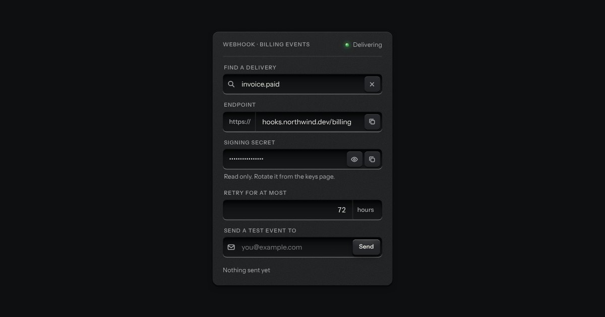
One recess that holds a field and everything that belongs to it. Words that are part of the value but are not typed, such as https:// or a currency, are printed on the floor of the well behind an engraved line; a glyph sits at the start; small keys sit at the end to clear the text, copy it, or show a password.
The field’s well with a louvred shutter drawn across its characters and a peek key at the end. Press the key and the shutter slides off to the right, the characters stand open, and the key stays down; press it again and the shutter closes. The key says Show or Hide, and the caret never leaves where it was.
A recess for a question. A glass is printed on its floor at the start, the words run on, an optional count is printed behind an engraved line, and a clear key sits in the far corner while there is something to clear. Escape empties it.
A printed label that becomes a field when you press it. At rest it is plain printing, so a page of them reads as text; under the pointer an outline and a pencil say it can be changed. Pressed, it is let into the plate as the field, in the same type, so the words stay where they were. Enter prints the new words back and Escape puts the old ones back.
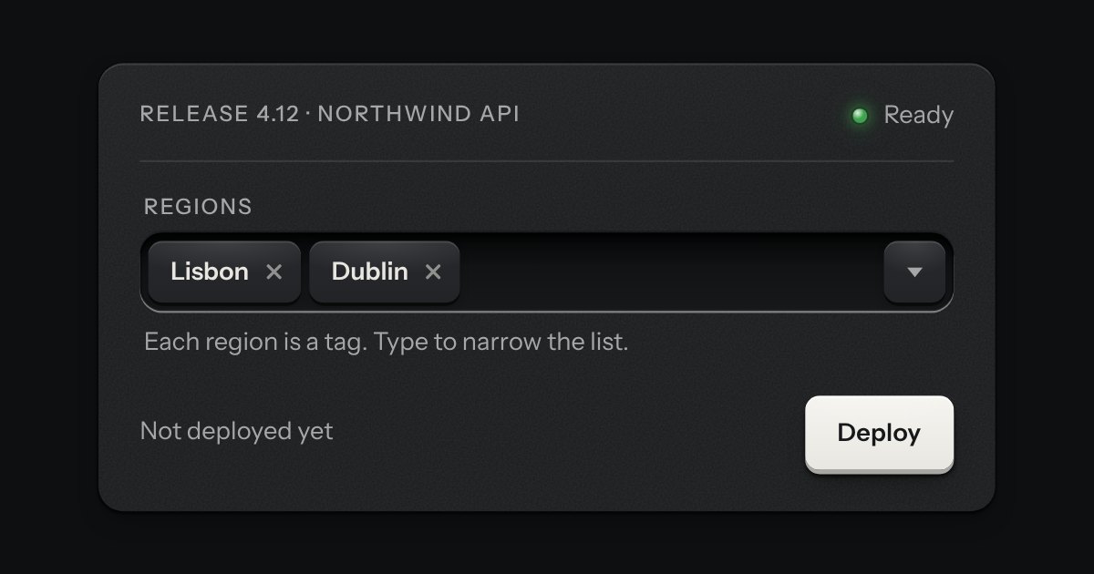
A combobox that takes several. Each choice is set down in the well as a tag, the card of options stays out while you choose the next, and the foot of the card counts what is chosen and lets it all go. It starts as a native select with the multiple attribute, so it posts with the form and works without a script.
The browser’s own file input, dressed as a key and a printed file name in a well. The input itself is the control, so it takes the focus, opens the chooser from the keyboard, accepts a file dropped on it and posts with its form, with or without a script. With a script, a chosen set can be listed under it, one ruled row to a file with its size and a key to take it out.
A date typed in three segments, day, month and year, in the field’s own well. Each segment is a small number you can step with the arrow keys or type over, and typing moves you on by itself once a number is complete. The order and the separator are the reader’s. A calendar key at the right of the well opens the kit’s calendar for anyone who would rather point. The form gets an ISO date, yyyy-mm-dd, or nothing while the date is not complete, and a wrong date says what is wrong in a sentence: February has 28 days in 2026.
A time of day in the field’s well: hours, minutes and, on a 12 hour clock, AM or PM, each a segment you can type into or step with the arrow keys. A key at the right opens a plain list of times, every few minutes between the earliest and the latest you allow, with the current one in the middle. It posts “HH:MM” on the 24 hour clock whichever clock it shows, says what is wrong in words (empty, half typed, too early, too late, off the step), and works in a native form, with a label, help text, an error, a disabled state and a reset.
Each segment is a spin button with its unit printed beside it as a small suffix. Type digits and it moves on after two, press Up and Down to step, and it carries the way a clock does. Quick picks can sit under the well as plain keys.
A form field for choosing a colour. A plane sets saturation across and brightness up, a strip sets hue and, if you ask for it, a second strip sets opacity. Under them are a hex field that takes #rgb, #rrggbb and #rrggbbaa with or without the #, red, green and blue number fields, a row of swatches and a preview of the colour you have. The plane and the strips are drawn with gradients and only their thumbs move. The colour being chosen shows in the plane, the strips, the swatches and the preview and nowhere else: the thumbs, the fields and the rings are the kit’s own. It posts a lowercase hex under its name, resets with its form, fails validation when it is required and empty, and works inline in a form or inside a native popover opened by a swatch key.
A country key and a number in one well, for a contact number. It opens a card with a search box and a list of countries; the number beside it is a plain telephone input that sets itself out in the country’s own grouping as you type, and keeps the caret where it was. Paste an international number and the country follows it. It checks length and shape, not whether a line exists.
An amount of money in the field’s well, with its currency printed on the floor at the left (the symbol and the code, or a native select when several are offered).
A plain rich-text field with no dependency. A toolbar of keys sits over an editing surface in the field's well: two heading levels, bold, italic, code, bulleted and numbered lists, a quote, a code block and a link. The keys stay down while the text under the caret has that format. What comes out is always the same small set of clean HTML (p, h2, h3, strong, em, code, pre, blockquote, ul, ol, li and a with an address), whatever was pasted in, because everything that goes in, by typing, pasting, dropping or setting the value, is cleaned by a strict allow-list. It is a real form field: it submits, resets, validates, counts and goes off like any other.
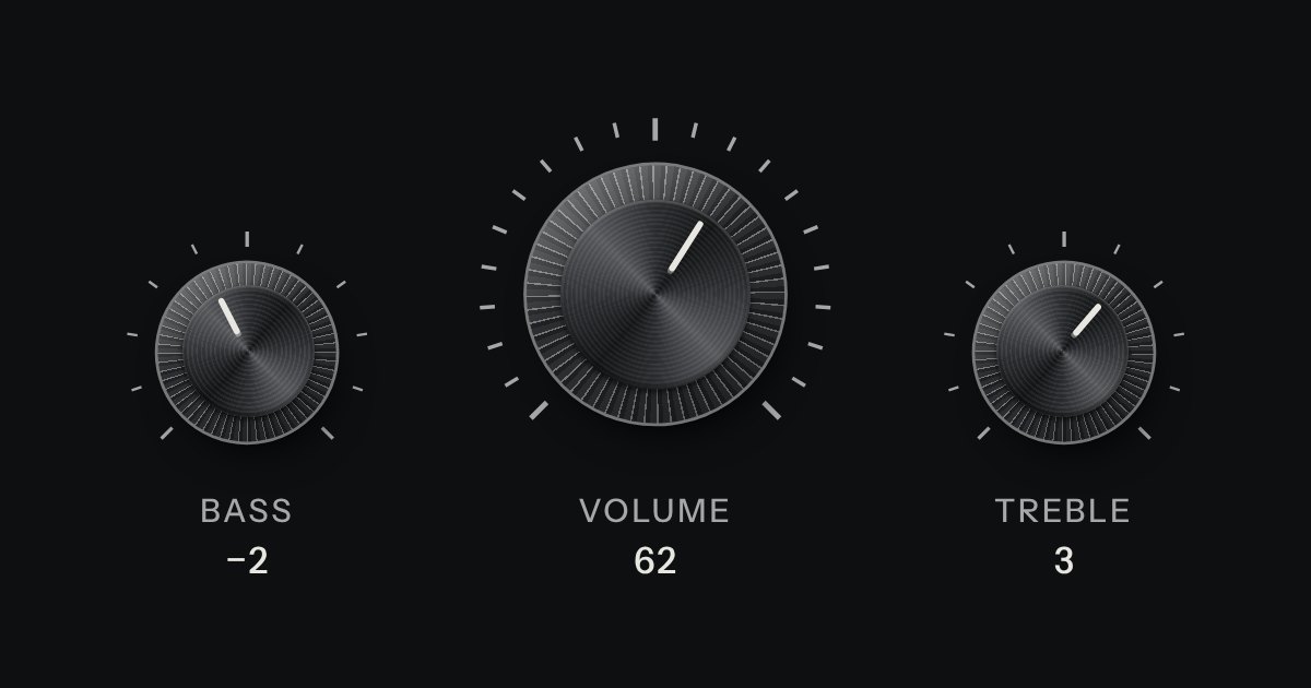
A rotary control for continuous or stepped values where space is square. Its knurl and pointer turn; its light does not.
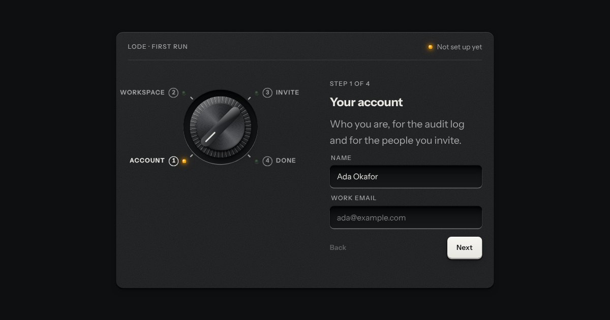
Onboarding as the program dial of an appliance on its first run. Each step is a detent on a rotary dial, its number and name engraved round it, and the panel beside it shows that step’s few fields. A step that is done lights a green lamp by its mark, and the one you are on an amber one. The dial turns back freely, and forward only as far as the first step not yet done.
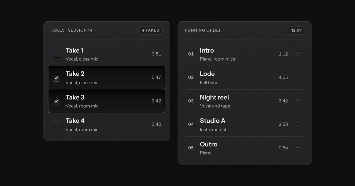
Rows in a rack: a mark, a title, a second line and a fact or a key at the end. Chosen rows sink into a recess with their check key latched; in a running order, a row lifts out of the rack on its skirt and slides past the others, from the keyboard or by its grip.
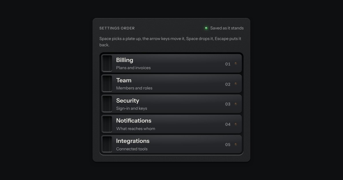
Plates in a rack that you reorder. Each has a knurled handle: drag it and the plate lifts off the rack on a shadow while the others slide aside, or pick it up from the keyboard and walk it up and down. Every step is spoken.
A staff badge for a person. An engraved metal plate with a clip slot cut through its top edge, a photo well and the name, role and serial engraved beneath. With no photo, the initials are debossed into the well. A lamp shows whether they are online, away or offline, and the word is always printed beside it. A compact plate does the same in one line, for lists.
An always-open list let into the plate as a recess. The rows are printed on its floor and a chosen row is a cap let down into it with its lamp lit. One row may be chosen, or several; typing a few letters finds the next row that starts with them. It starts as a native select with a size, so it posts with the form and works without a script.
What a settings page is made of: a label, one sentence under it and the control at the end, ruled like the list with a hairline between rows and nothing else drawn. A row with a switch or a check is one label, so pressing anywhere on it turns the control; a row with a key, a select or a value is a plain box, so a press means what the key says.
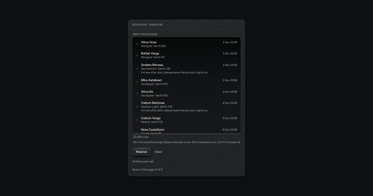
A list for thousands of rows that stays quick because it only ever draws the ones you can see, and a few either side. It sits in the listbox’s recess with the same lamps and the same sunk row for what is chosen, scrolls with the browser’s own scrollbar, and holds ten thousand rows in about twenty elements. Rows may all be one height, or differ: each is measured once it is drawn, and the scroll position is corrected so nothing on screen jumps when a row above it turns out taller than guessed. It is a listbox: Up, Down, PageUp, PageDown, Home, End, type-ahead, Space and Shift to choose, Ctrl+A for all. Choose a name and the chosen ids are submitted with the form.
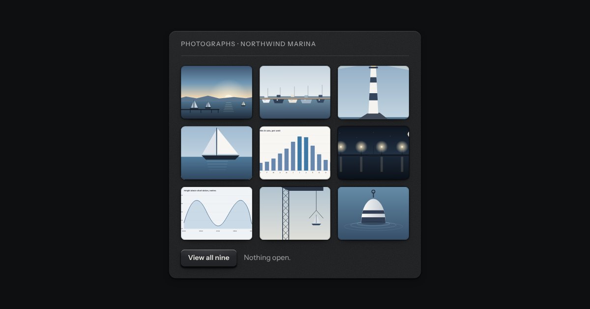
A grid of thumbnails that opens one picture large. Each thumbnail is a plate with the picture set in it, and a real link to the full picture, so the grid works without any script. Press one and the page goes behind a near-black scrim. Left and Right turn the page, Home and End go to the first and the last, Escape puts it away, and on a touch screen a swipe does the same. It is dark in every finish, because a picture is looked at best in a dark room.
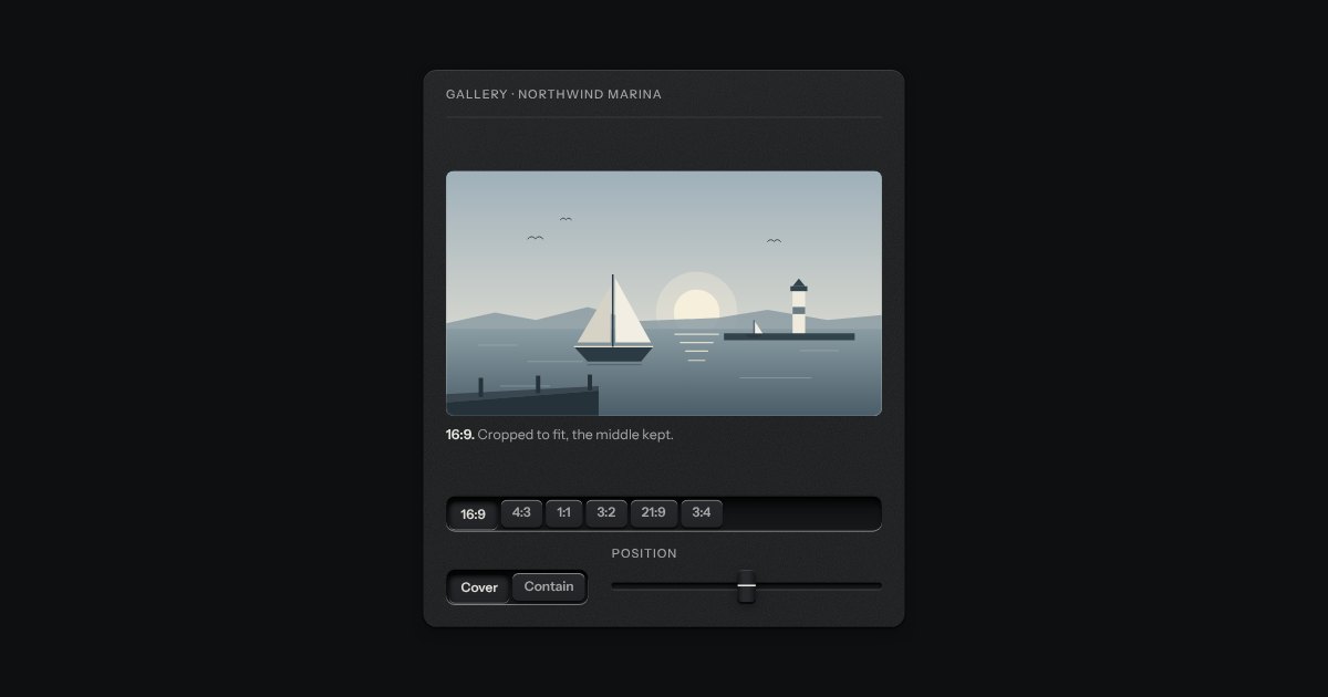
A frame that holds one shape, whatever is put in it. Say the shape (16:9, 4:3, 1:1, 3:2, 21:9, 3:4) and the frame takes its height from its width; a picture, a video or a map inside it is cropped to fit, keeping the middle unless you say which part to keep. Until a picture arrives the frame is a recess, so the page does not jump. An optional hairline round the edge keeps a pale picture from dissolving into a pale page. Plain CSS, with no script.
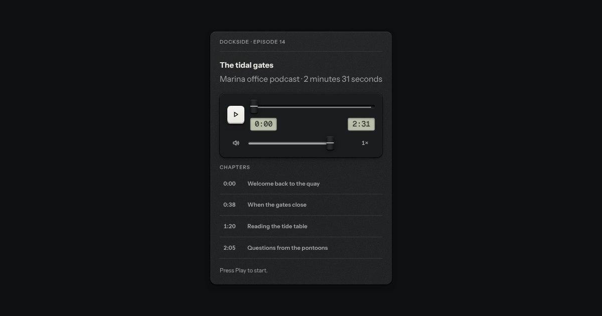
The control bar for an audio or video element. It plays nothing itself: it drives a real media element, so that element’s own events, buffering and errors stay the truth. A primary play key that swaps to pause, the time elapsed and the length on two small LCDs in the mono figures, a scrubber that is the kit’s fader with the loaded length printed as a rule on its floor and the played length filled in, a mute key with a volume fader and an optional speed key. The keys are Space, the arrows and M. For a screen reader the position is a sentence on the scrubber, and a polite status says what happened, no more than once a second.
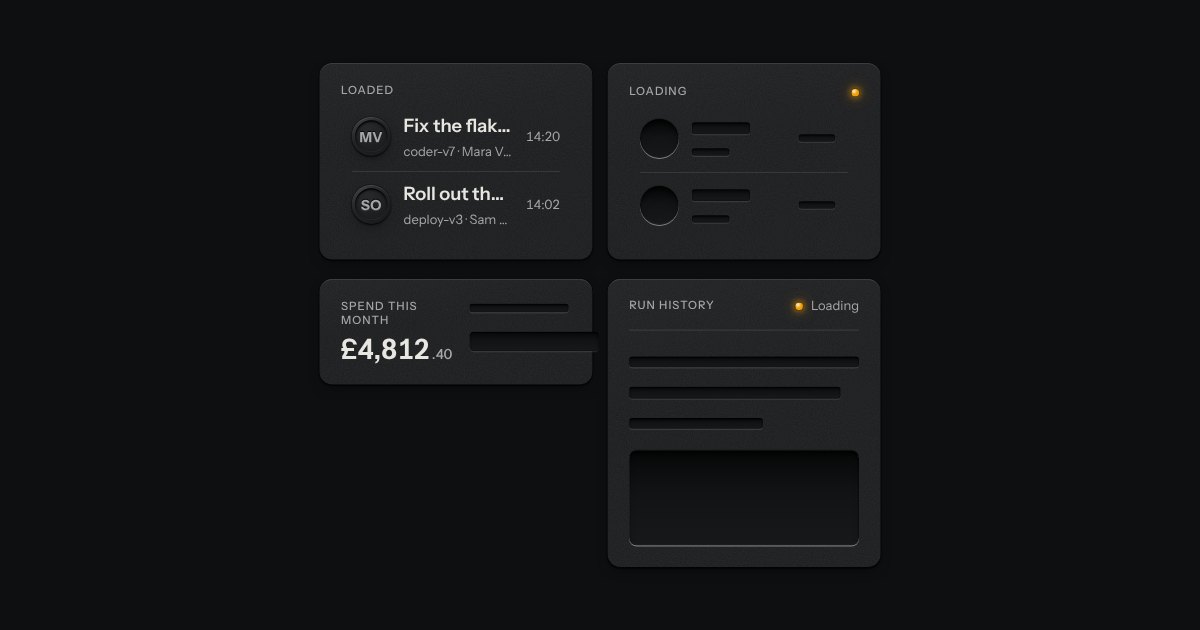
The shape of a page before its data arrives, drawn as the unprinted plate: blank engraved bars where the words will print. Nothing on it moves. One amber lamp beside “Loading” is the only sign of work.
The only colour in the kit: a lamp that is on. Green is on, amber is waiting, red is recording or failing, blue is linked, white is standing by. Always next to words.
A key for work that takes time and must not run twice. It latches below the plate while the work runs, an LED matrix in its face scanning amber, and says how it ended.
A ring of eight lamps lit in turn, a chase round a dial: each lamp is a dim cap with its light laid over it, and the light fades as the chase passes on, leaving a short tail. Only the light’s opacity moves. Amber, the lamp for work in hand. Under reduced motion it holds still on one lit lamp at the top, and the words still say it is busy.
A pane of smoked glass laid over a panel while it works. The panel underneath keeps every pixel of its place, dimmed and a little out of focus, with one plate in the middle carrying a spinner and a line of words. Set aria-busy on the panel to lower the glass; what is underneath goes inert, so nothing in it can be pressed or tabbed to until the glass lifts.
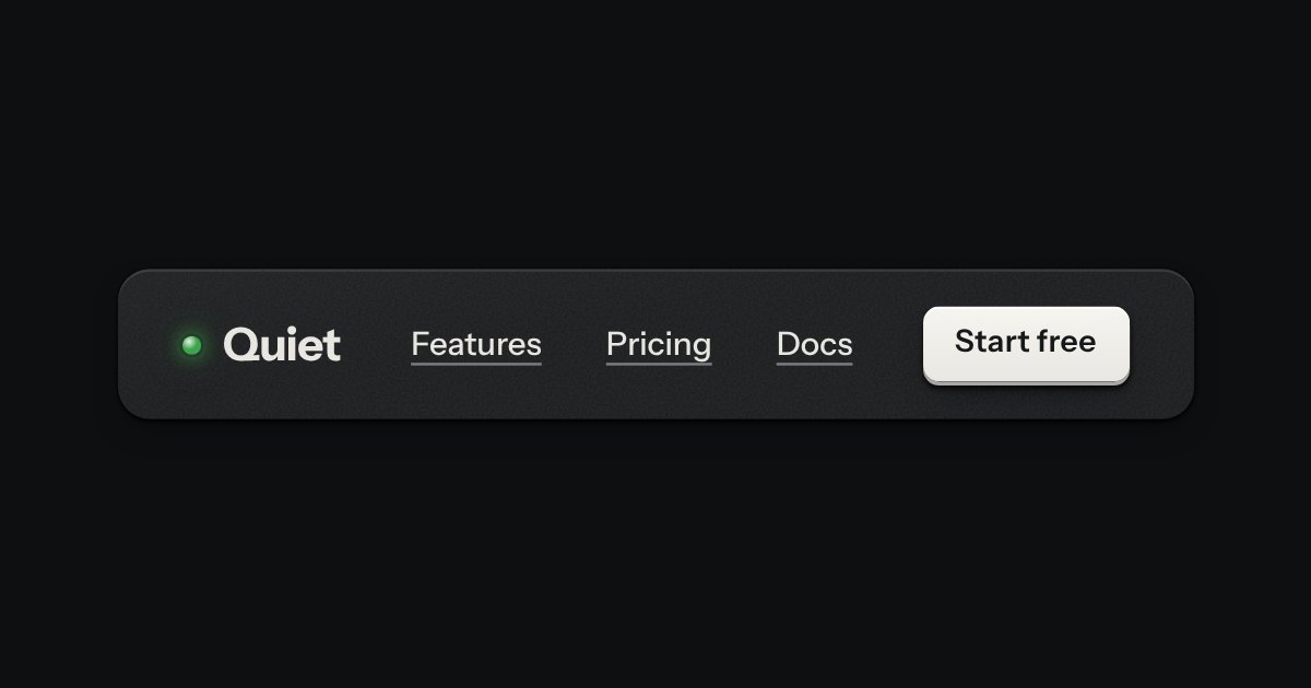
The top of a page: a wordmark with a lamp, printed links, and one contrast key at most.
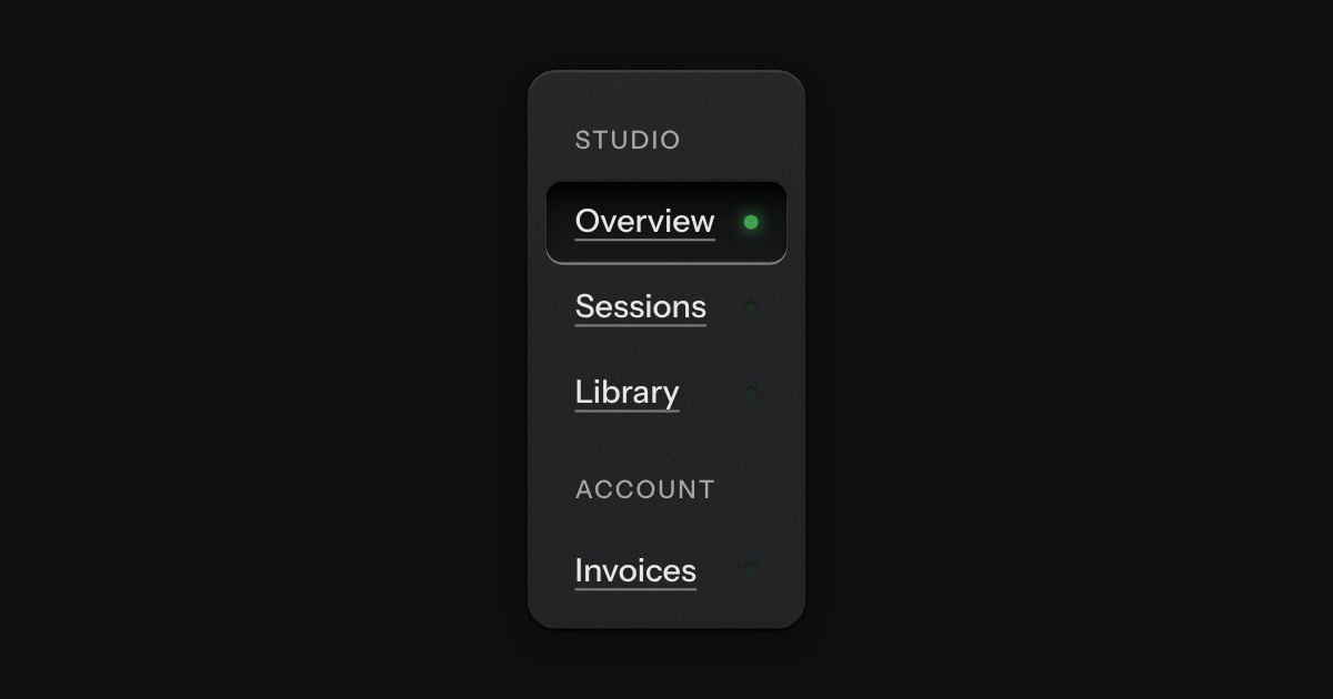
App navigation in a panel: the current page is a recess with its lamp lit, links grouped under printed labels.
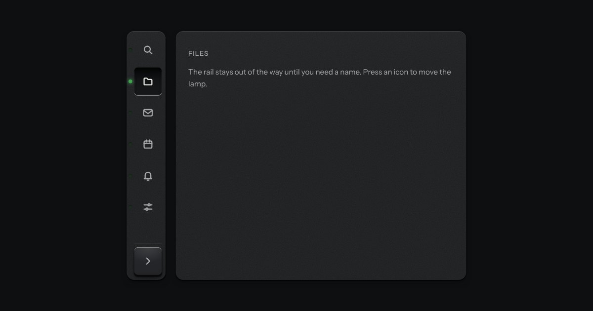
A narrow sidebar of icon keys, using the kit’s own icons. A lamp beside the current one is lit, a label shows as a tooltip on hover and on focus, and a key at the foot opens the rail out so every label is printed beside its icon. It remembers which way you left it.
Views of the same thing, switched in place: keys in a tray, the chosen view a raised cap.
Pages for tables and lists: numbered keys in a tray with the current page latched down, seven slots so the row never changes width. Compact, it is a transport with a track counter.
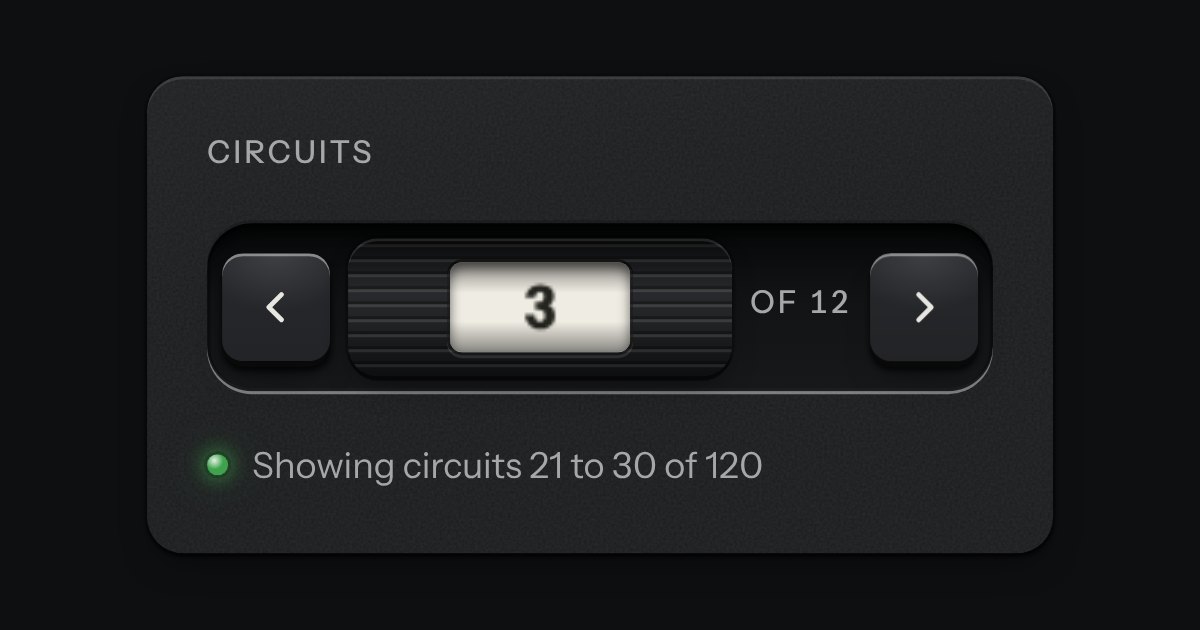
Pagination as a thumbwheel. A knurled wheel stands in a recess with a window in its face, and the page number rolls past it on a paper tape. A key either side steps by one. The keys are plain links, so it pages without any script; the wheel is what a script adds.
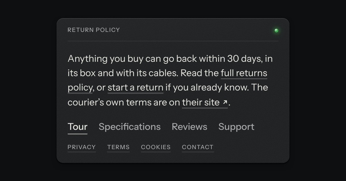
Printed type that goes somewhere. The words stay in ink and the rule under them is engraved into the plate: cut darker when you hover, deeper when you press.
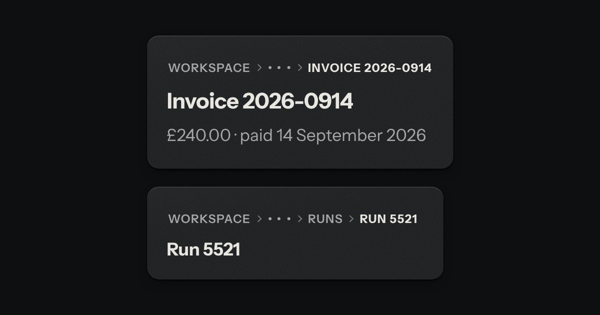
The trail of levels above this page, printed across the top like the path an instrument shows over its menu screen: SETTINGS › BILLING › INVOICES. The levels above are in the second ink, the one you are on in full ink, with small engraved chevrons between. When the line is too short, the middle folds into a … key that opens a menu.
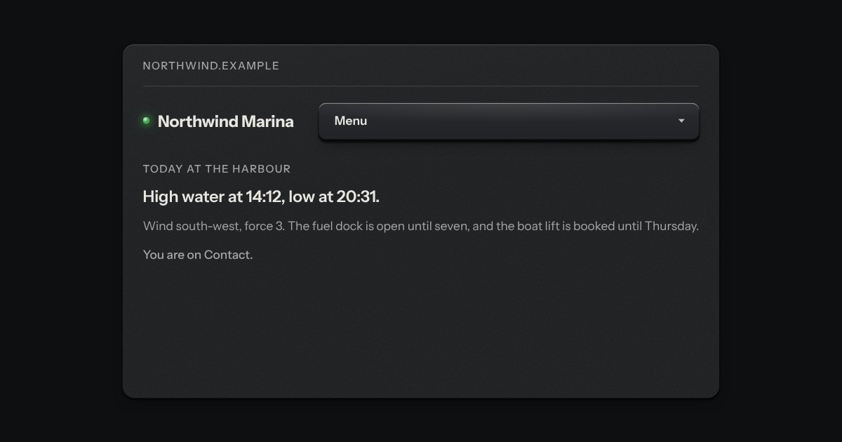
The links at the top of a site. A row that is flat on the page: plain links, and keys that open a panel of links beneath the bar. Each panel link has a name and one line on where it goes, and a panel may lead with a featured link. The key that is open is pressed into the bar, and the page you are on is pressed in too, with a lit lamp as in the side rail. Rest on a key and its panel opens; move to the next key and the panel changes at once.
A key with a counter window in its cap, and a card of messages hung from it. Each unread message has its lamp lit; reading it puts the lamp out and the counter steps down.
Disk 82% full.
A message let into the surface, with an annunciator: a small lit legend (Note, Done, Check, Fault) beside the words that say what happened.
A strip the width of the page, above everything, for one announcement: a lamp, one line, an optional key that goes somewhere and a dismiss key. It is a raised plate, not a recess, so it reads as part of the frame and not as a message in the page. It is a labelled region, there on load, and says its thing once. When it goes it closes like a drawer, so the page glides up by its height instead of jumping.
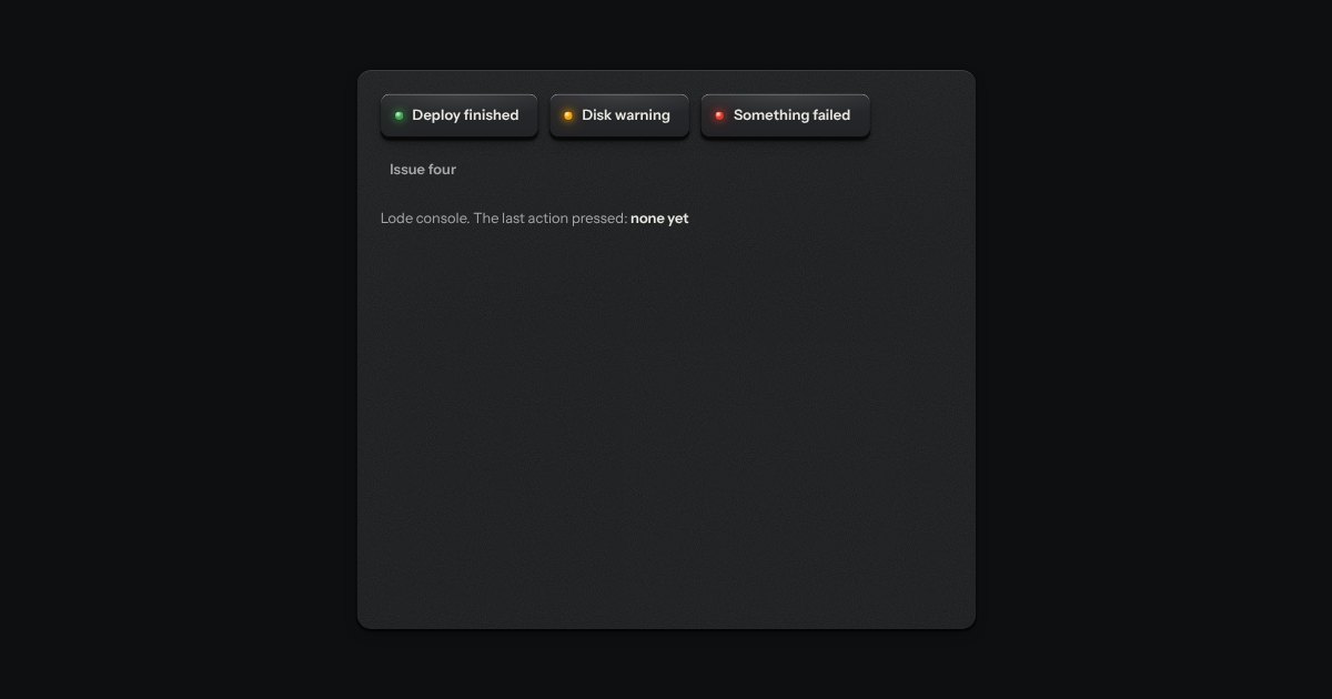
A toast issued like a numbered ticket from a dispenser. A short slip of thermal paper with a number, a line of words and, if it needs one, an action key slides out of a slot at the edge of the screen. Several fan a little. Tear one off with a swipe or its close key, or leave it and it retracts by itself, on a timer that stops while you are reading it.
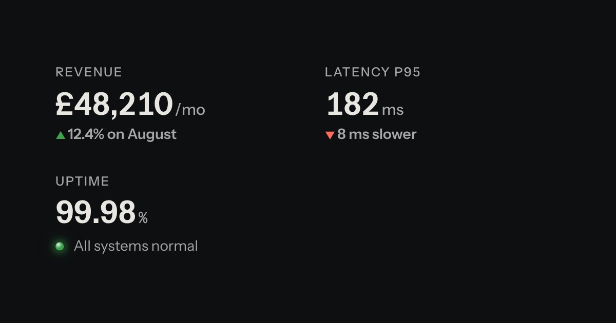
A printed label over a value: key figures, with the unit small and the change in words.
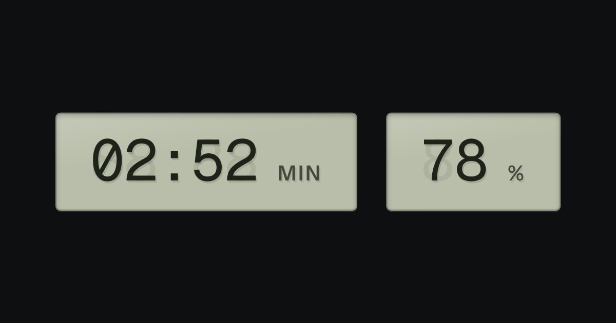
A value that changes, on grey-green liquid crystal, with a ghost of the unlit segments behind it: clocks, battery, counters.
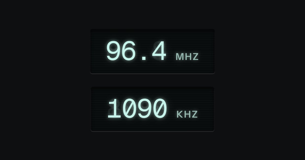
A vacuum-fluorescent display: cyan-white light on near-black glass, with a glow and a ghost. Frequencies, levels, status screens.
A number you can type or drag, the way a pro tool’s value field works: an engraved ruler under the numerals slides beneath a fixed index as the value moves.
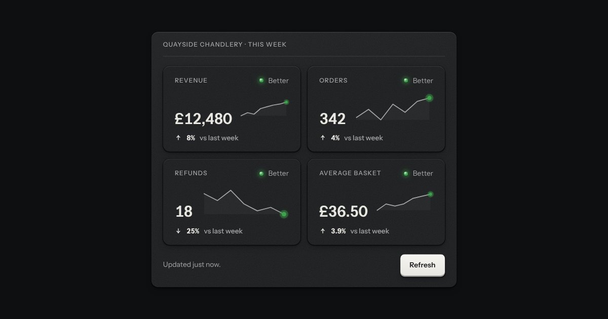
One headline number with its label, how it moved against another period and, if you give it readings, the small line of the run behind it. The label and the figure are the readout, set on a plate; the figure is formatted with the money field’s own helpers, so pounds, dollars and plain counts group the way the locale does. Say which way is better and a kit lamp and the word Better or Worse join it, so a fall in refunds can be good news; leave it out and nothing is judged. A tile can be loading (the skeleton with its amber lamp) or empty, and a screen reader hears one sentence for the whole tile.
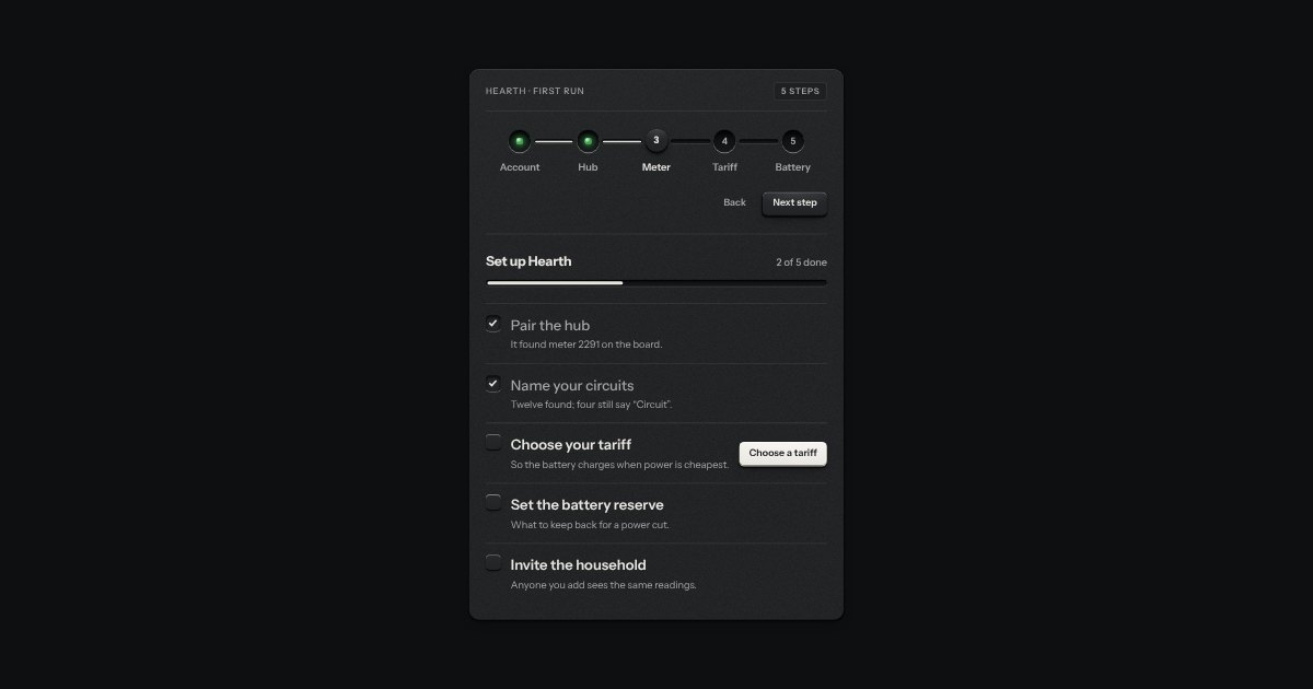
Setting something up: stations along a groove (done ones with their lamp lit, the current one a raised cap) and a checklist of check keys with a progress slot.
Onboarding as the program dial of an appliance on its first run. Each step is a detent on a rotary dial, its number and name engraved round it, and the panel beside it shows that step’s few fields. A step that is done lights a green lamp by its mark, and the one you are on an amber one. The dial turns back freely, and forward only as far as the first step not yet done.
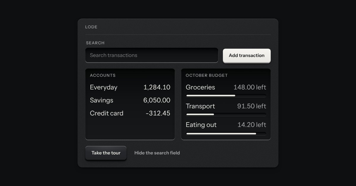
A product tour. The page is dimmed, one element is left as bright as it was, and a small card sits beside it with a title, a few words, “2 of 4”, Back, Next and Skip. Next becomes Done on the last step. It is one native modal dialog, so the page behind is inert, Tab stays in the card and Escape ends the tour. The lit area follows its target as the page scrolls or resizes, a step whose target is not on the screen is skipped and the card says so, and on a phone the card docks along the bottom edge.
Pages for tables and lists: numbered keys in a tray with the current page latched down, seven slots so the row never changes width. Compact, it is a transport with a track counter.
Pagination as a thumbwheel. A knurled wheel stands in a recess with a window in its face, and the page number rolls past it on a paper tape. A key either side steps by one. The keys are plain links, so it pages without any script; the wheel is what a script adds.
A card hung from the key that opened it, with a printed leader running back to the key. Not modal: the page stays live around it.
A card of actions and options that slides out from under its key. The key stays down while the card is out; an option that is on lights its lamp.
A preview that hangs from a link when the pointer rests on it or the keyboard reaches it. The popover’s card and leader, opened by a short delay and put away by leaving.
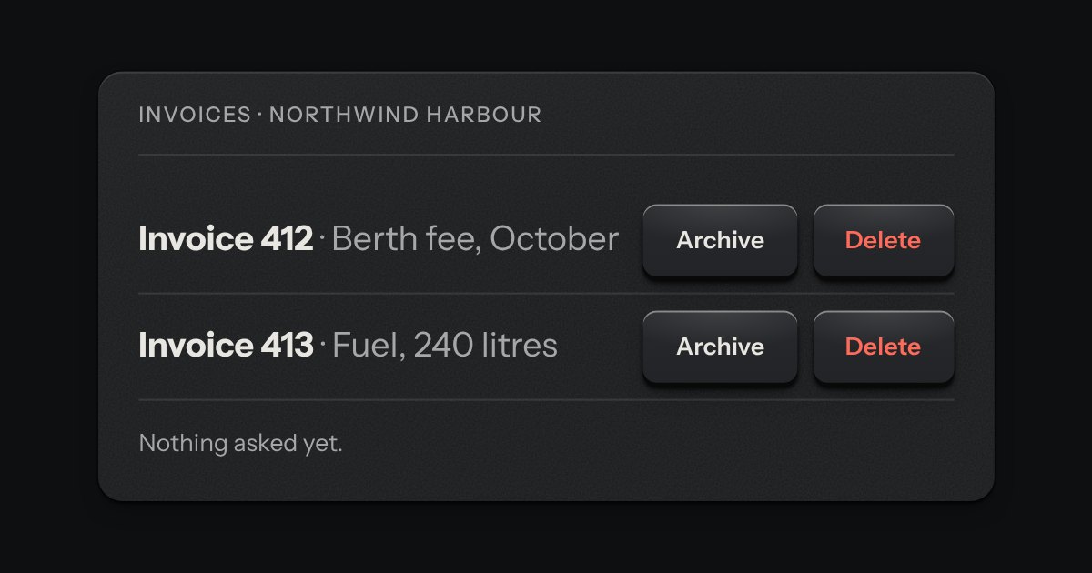
A small card that asks before a click does its work, hung from the key that opened it. It is the popover, placed by the popover’s own rules and tied to its key by the same printed leader, holding a short question, an optional second line, and Cancel and Confirm keys. Escape and a click outside both cancel it, and the focus goes back to the key. For a destructive act it takes the danger tone: the kit’s red lamp before the question and a danger Confirm key, with no new colour. It is the guard on a delete in a table row, where a dialog is too heavy.
A person’s ID plate: their coin set in a countersunk socket, name and role, a rating plate of facts engraved in tabular figures, and one key to act. Compact for one line.
A staff badge for a person. An engraved metal plate with a clip slot cut through its top edge, a photo well and the name, role and serial engraved beneath. With no photo, the initials are debossed into the well. A lamp shows whether they are online, away or offline, and the word is always printed beside it. A compact plate does the same in one line, for lists.
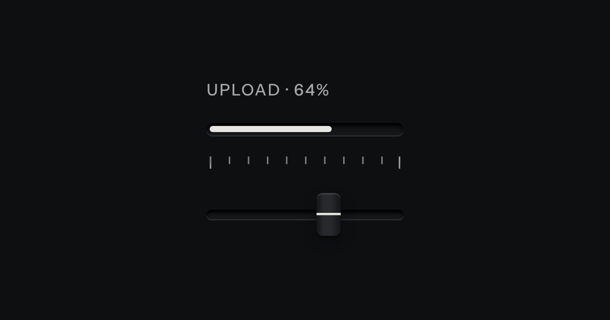
Progress through a task: ink filling a groove, never a coloured bar.
The kit’s donut chart as an instrument: a ring of lamps behind dark glass in a spun bezel, lit clockwise from twelve like a studio clock’s seconds, with the value in lit digits in the middle.
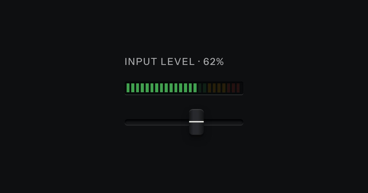
An LED ladder for levels and load: green, then amber, then red, the way a recording level has always been read.
A value inside a known range, read off an LED strip. The strip is a native meter element, so low, high and optimum are the browser’s own: the whole lit length takes the colour of where the value stands (green in the good region, amber next to it, red beyond), not the colour of the segment it has reached. The marks under the strip print where the regions begin, and cut lines across it show the same two places. Words say the state too.
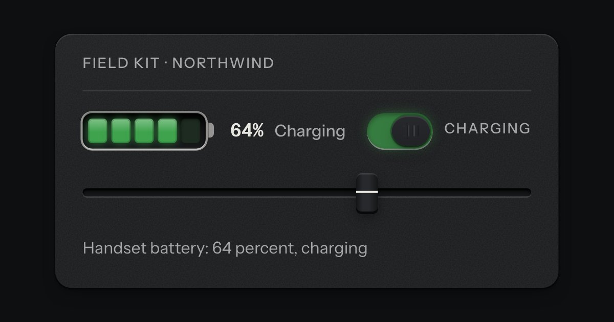
A cell outline with a terminal at one end, filled with lamp segments set into a recess, lit from the empty end. The lit segments are one lamp colour for the whole cell: green, amber below two fifths, red below a fifth. While it charges, the top lit segment breathes. The level is said in words too, so neither the colour nor the breathing is the only sign.
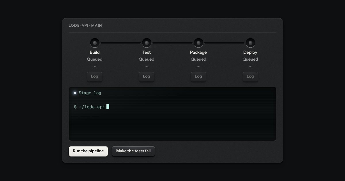
The stages of a build and a deploy as stations along a groove, like the program track of a machine. Each station is a socket with a lamp in it (green for a stage that passed, red for one that failed, amber and breathing for the one running, an empty socket for one that is waiting or was skipped) and under it the stage’s name, its state in words, how long it took and a Log key. Ink runs along the groove as far as the run has got. Wide, the stages stand in a row; narrow, they stand in a column with the groove down the side.
One choice from a short list in a form: small round keys in a fieldset, the chosen one pressed with a printed dot.
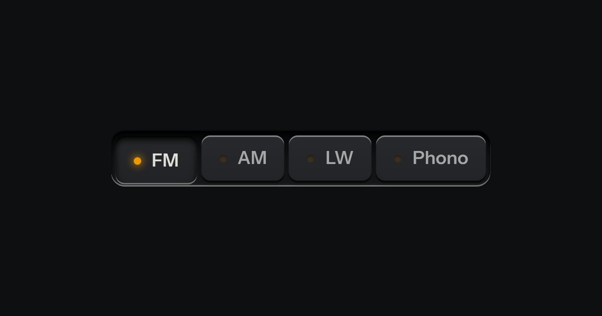
One mode of two to five: latching keys in a tray, one down at a time, each with a lamp that lights when chosen.
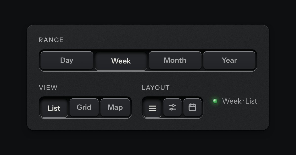
A row of keys in a tray with one pressed down: pick a view, a range or a mode and it applies at once. It is the kit’s selector without the lamps, with sizes, a full-width row and icon segments.
A mode switch made of cloth. A row of tiles covered in stretched fabric stands in a machined tray, each with an icon and a word pressed into it. The chosen tile sits a touch lower and a lamp behind it lights its icon and word through the weave. Choose another and the first lamp fades down as the next comes up. Underneath it is a group of native radios, so it posts one value without any script.
A row of indicator lamps, each in its own round recess, lit up to your score. It is a native radio group underneath, so arrows, Space, the label and the form all work with no script; a number is printed under each lamp, so the score is never told by colour alone. A read-only row shows a score someone else gave.
A radio or a check set as a large plate carrying a name, a sentence and a price. The plate is a big key on a skirt with a small check key in its corner; the chosen one goes down below the panel and its corner key latches. Under it is the real radio or checkbox, so a group is a native radio group and posts with the form.
A toast issued like a numbered ticket from a dispenser. A short slip of thermal paper with a number, a line of words and, if it needs one, an action key slides out of a slot at the edge of the screen. Several fan a little. Tear one off with a swipe or its close key, or leave it and it retracts by itself, on a timer that stops while you are reading it.
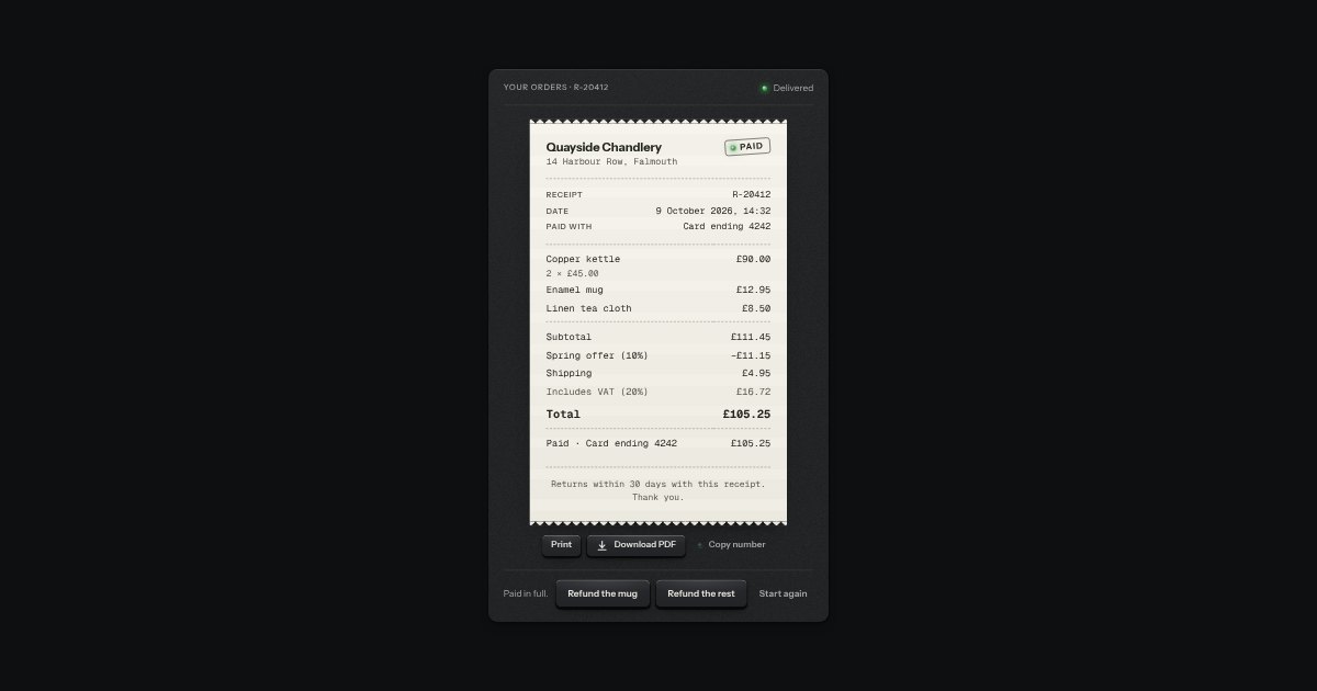
The record of a payment, printed on a slip of thermal paper: who was paid, the receipt number, when and with what, the lines and the sums, any refunds, and a rubber stamp that says where it stands, Paid, Part refunded, Refunded, Due or Void, with a lamp beside the word. It is what an order page, a billing history or the screen after checkout keeps; the order summary prices an order before it is paid. Under the slip are Print (only the slip goes to the printer), Download when there is a file, and Copy number. The sums are the order summary’s own, in whole minor units, never floating point.
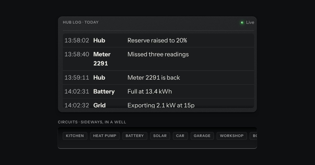
A region that scrolls, with its scrollbar made as a machined rail: a groove cut into the plate and a thumb like a fader cap riding in it. Scrolling itself is the browser’s own.
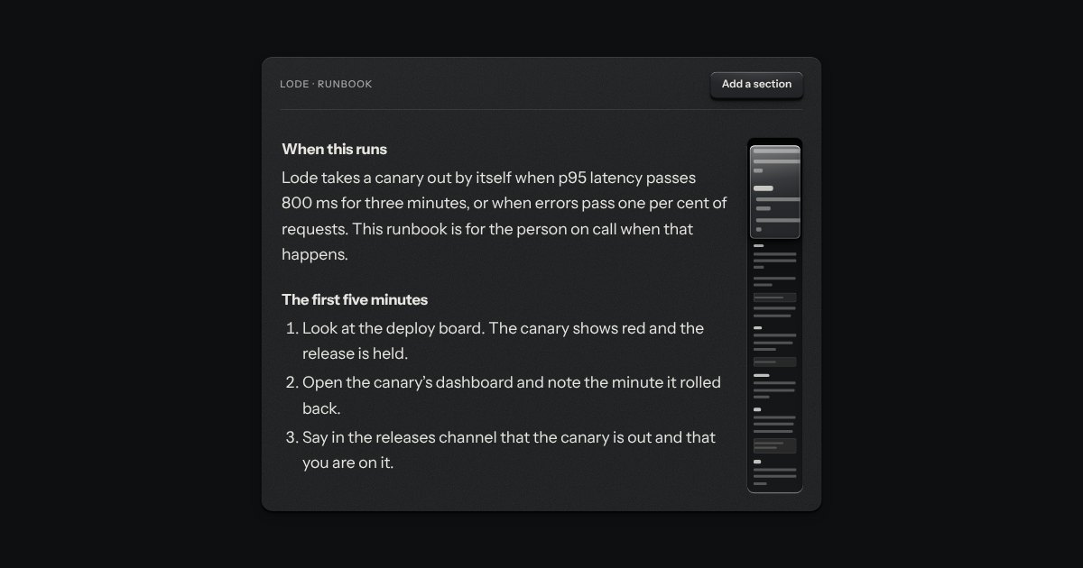
A scroll area whose scrollbar is a map of what it holds. A narrow machined rail runs beside the text with every line drawn small on its floor, headings darker and code as a box. A glass loupe rides over the part in view and shows it a little magnified. Drag the loupe to scroll, or press the rail to jump there; underneath it is a native scroll container.
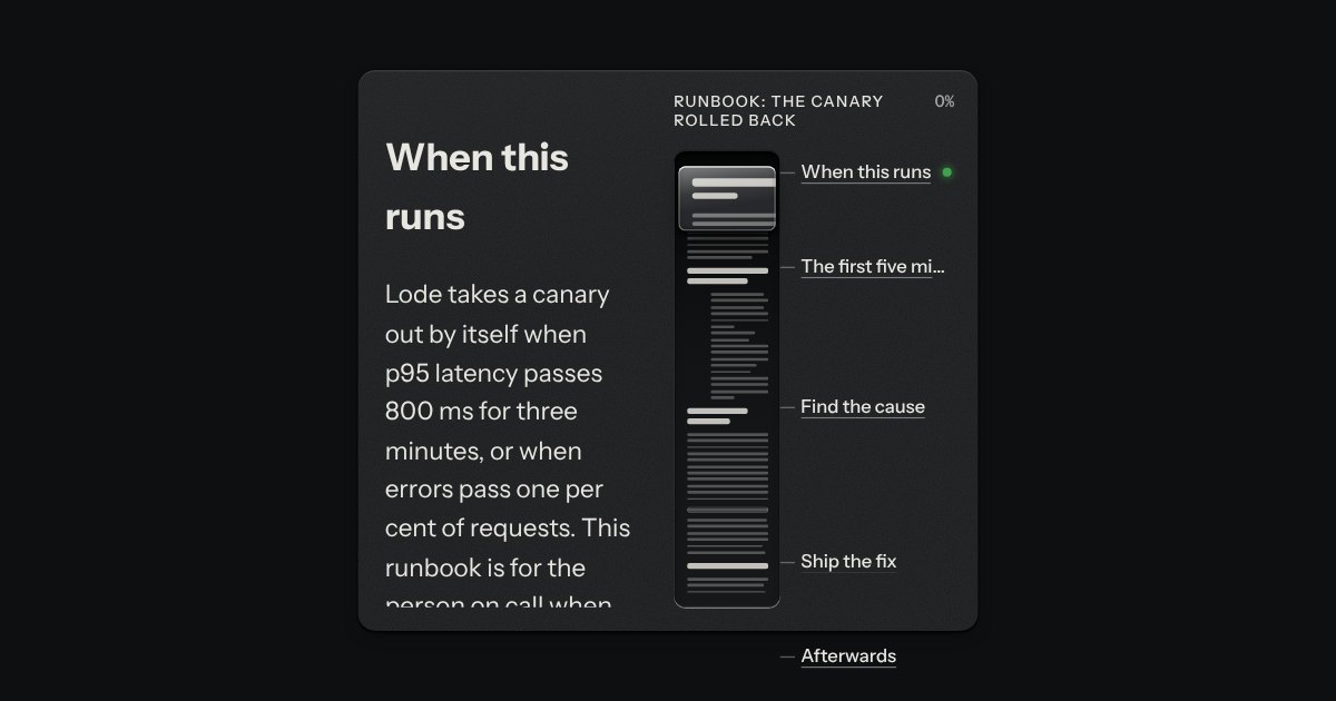
A map of the whole page, for the corner beside it. A machined groove holds the page drawn small, a glass loupe rides over the part in the window, and the page’s section headings are printed beside the groove at their own height, the one you are reading lit. Drag the loupe or press the groove to move; the headings are links.
One field with its one action in a shared well: subscribe, search, add.
A field that filters a long list as you type. It starts as a plain select, so it posts with the form and works without a script; then the options card slides out of a slot under the well, the letters that match print heavier and the chosen option’s lamp is lit. Several choices sit in the well as tags.
Every action and page behind one key: a modal plate whose entry line is a lit display, with the results printed below and the chosen one pressed in.
One recess that holds a field and everything that belongs to it. Words that are part of the value but are not typed, such as https:// or a currency, are printed on the floor of the well behind an engraved line; a glyph sits at the start; small keys sit at the end to clear the text, copy it, or show a password.
A recess for a question. A glass is printed on its floor at the start, the words run on, an optional count is printed behind an engraved line, and a clear key sits in the far corner while there is something to clear. Escape empties it.
A choice from a longer list, in the same recess as a field, with a printed chevron. The browser’s own menu opens it.
One field with its one action in a shared well: subscribe, search, add.
A field that filters a long list as you type. It starts as a plain select, so it posts with the form and works without a script; then the options card slides out of a slot under the well, the letters that match print heavier and the chosen option’s lamp is lit. Several choices sit in the well as tags.
A combobox that takes several. Each choice is set down in the well as a tag, the card of options stays out while you choose the next, and the foot of the card counts what is chosen and lets it all go. It starts as a native select with the multiple attribute, so it posts with the form and works without a script.
An always-open list let into the plate as a recess. The rows are printed on its floor and a chosen row is a cap let down into it with its lamp lit. One row may be chosen, or several; typing a few letters finds the next row that starts with them. It starts as a native select with a size, so it posts with the form and works without a script.
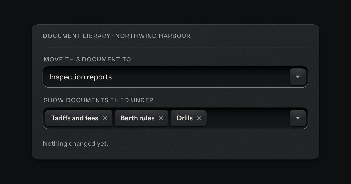
A select whose list is a tree, for a folder, a category or a team that sits inside others. Folders open and close with a turning chevron; a pick is one leaf, or in multiple mode any number of them, with a box on every row. A folder’s box picks all it holds and sinks half way, with a bar across it and a count (“2 of 3”), when only some of it is picked. Typing jumps to the next name that starts with the letters, opening folders on the way. In the closed field the picks sit as tokens, and a folder with everything picked is one token, not many. It is a proper ARIA combobox with a tree in its popup.
App navigation in a panel: the current page is a recess with its lamp lit, links grouped under printed labels.
A narrow sidebar of icon keys, using the kit’s own icons. A lamp beside the current one is lit, a label shows as a tooltip on hover and on focus, and a key at the foot opens the rail out so every label is printed beside its icon. It remembers which way you left it.
Two panes and a groove cut across the plate between them, with a knurled grip set in the groove. Drag the grip with a mouse, a pen or a finger, or give it focus and use the keys; Enter folds the first pane away and brings it back. Side by side or one over the other, each pane keeps the least room you give it.
Sign in and sign up on one plate: Google and GitHub keys with their marks stamped in monochrome, an email route underneath, a two-way selector that re-prints the plate, and errors that say how to fix them.
A PIN or one-time code dialled into a combination lock: number wheels behind a slot in the plate, turning on detents. Right, a locking bar drops into their notches; wrong, they spin back to blank.
A rule with a word set into it. The same engraved groove as the separator runs out to both sides of a printed word, broken where the word sits: “or” between two ways in, a date between two days of messages, the name of the section below. The word is real text in reading order; only the two grooves are drawn.
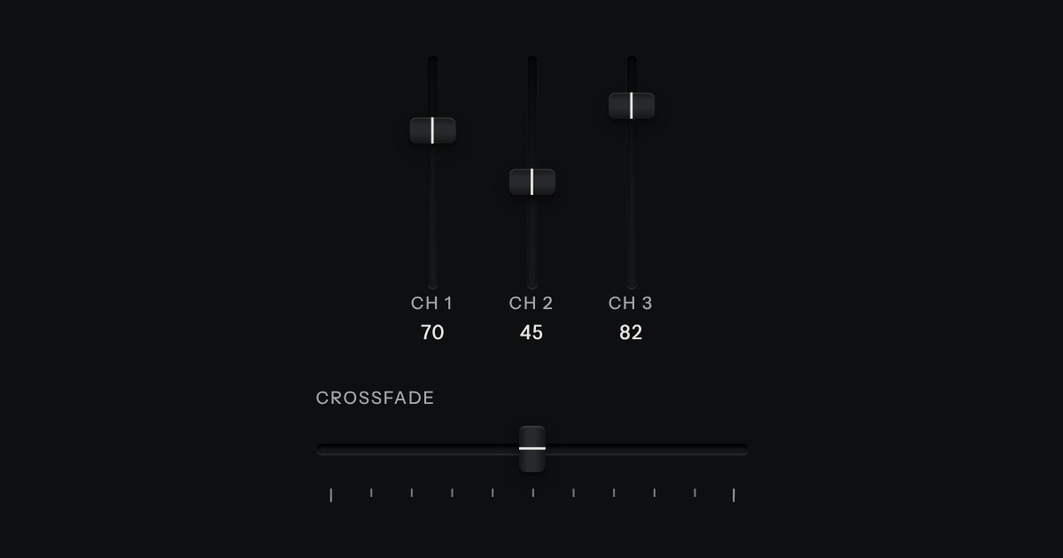
A continuous value along a line: a native range whose cap rides in a slot cut into the plate, with a printed scale.
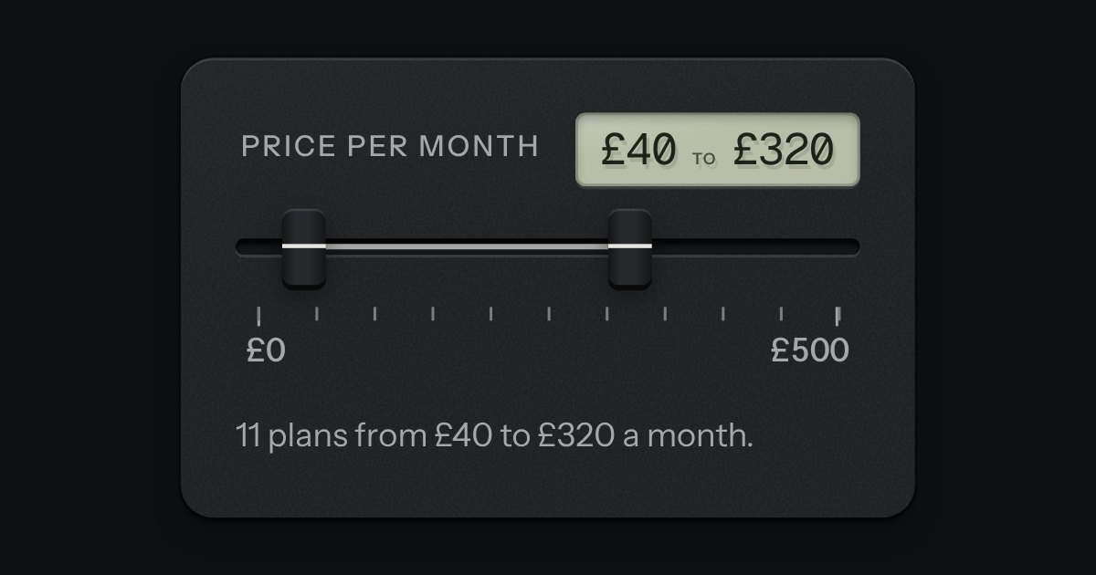
Two fader caps in one slot, for a span between a low value and a high one: a price band, quiet hours, a frequency band. The span between the caps is printed on the slot’s floor and both values read on a small LCD. The caps meet but never pass each other. Underneath are two native range inputs, which post with the form and are what shows without the script.
A number you can type or drag, the way a pro tool’s value field works: an engraved ruler under the numerals slides beneath a fixed index as the value moves.
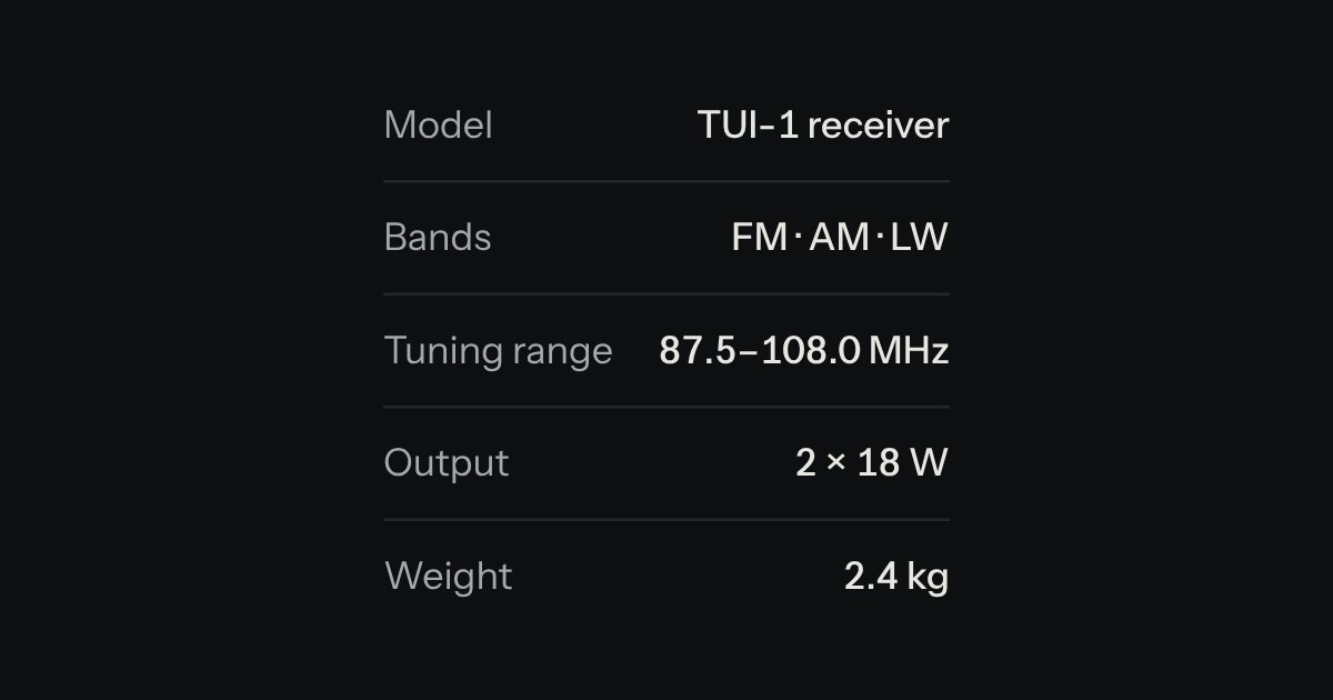
Key and value facts, printed like the plate on the back of a device.
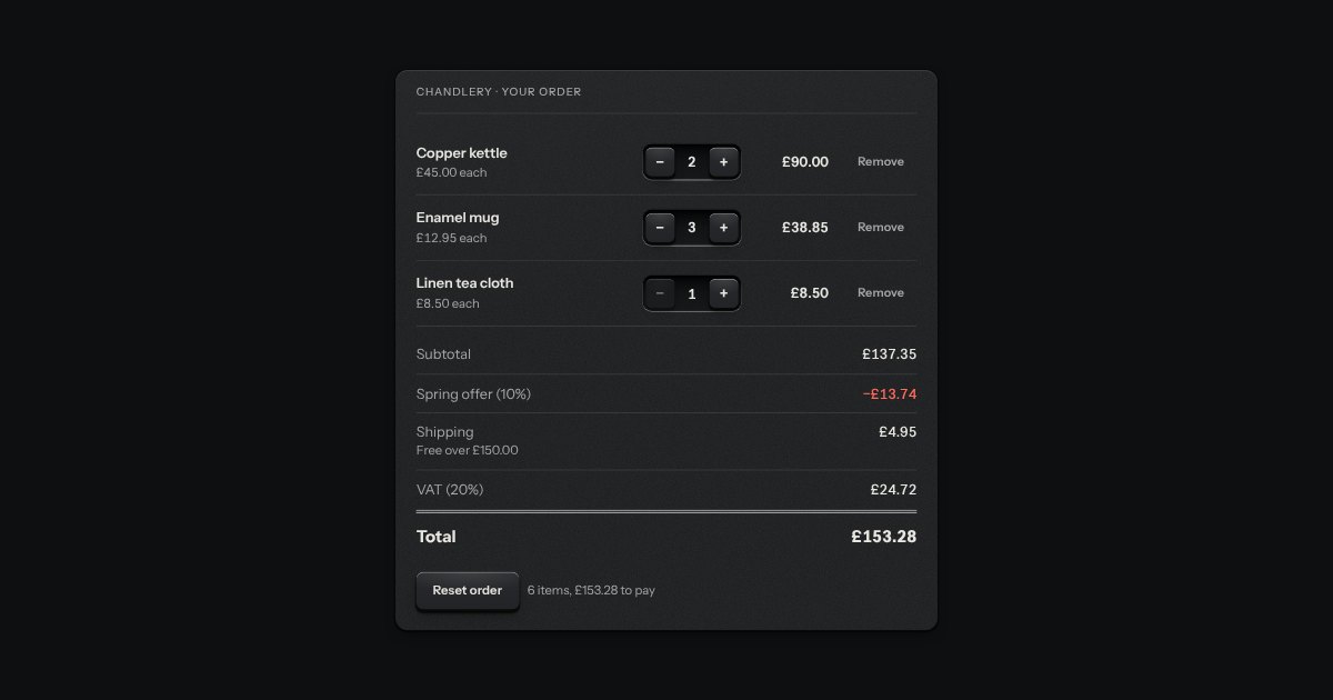
The priced lines of an order, printed like a till slip: a name, a unit price, a quantity and a line total on each, then a ruled block of totals in the spec list’s hand with the subtotal, any discounts as cuts, shipping, tax and a total set heavier under a double rule. Where the lines are editable each carries a quantity stepper and a Remove key, and every figure below is worked out again as one changes. Money is whole minor units and BigInt, never a float, and is shown by the money field’s own formatter, so pounds have two decimals, yen none and dinars three.
A small integer with − and + keys either side, in one well.
Setting something up: stations along a groove (done ones with their lamp lit, the current one a raised cap) and a checklist of check keys with a progress slot.
Onboarding as the program dial of an appliance on its first run. Each step is a detent on a rotary dial, its number and name engraved round it, and the panel beside it shows that step’s few fields. A step that is done lights a green lamp by its mark, and the one you are on an amber one. The dial turns back freely, and forward only as far as the first step not yet done.
| Reel 3 | 42:10 |
| Mixed | 0:30 |
Rows of data with printed column labels, figures right-aligned in columns, and status in lamps with words.
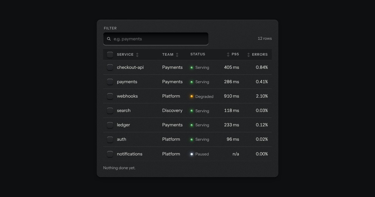
The kit’s table with the tools a working one needs: headers that sort, a filter well, a check key on every row with one in the header that selects them all and sinks half way when only some are chosen, and a header that stays at the top while the rows scroll under it. While rows are chosen a plate slides out of a slot under the tools, its lamp lit, carrying what can be done to them. Without the script it is the plain table.
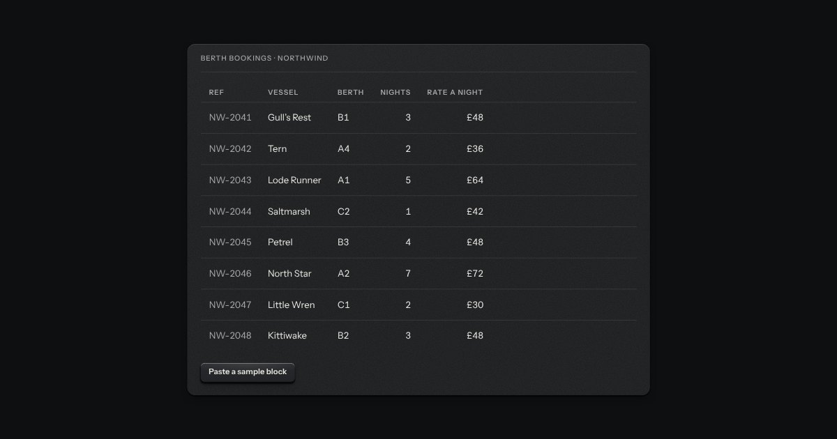
A table you edit in place, the way a spreadsheet is edited. One cell is in focus at a time and the arrow keys move between them; Enter or F2 opens a cell for editing, Escape puts it back, and Tab keeps the edit and moves on. Paste a block of cells from a spreadsheet and it fills a block of the grid. Nothing is saved by typing: a row with changes keeps them as a draft, marks the cells that changed, lights a lamp, says “Edited” and carries its own Save and Discard keys.
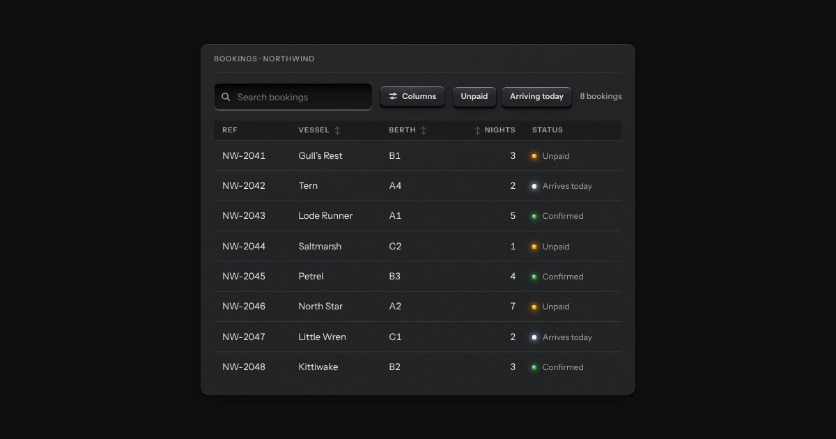
The strip over a table: a search well, filter keys that latch, a menu to choose which columns show, and the count of rows in view (“8 of 8 bookings”). It drives a data table or a data grid through the methods and events they share, so the table and its toolbar stay two parts. It tells the page about every change too, for a table that asks a server.
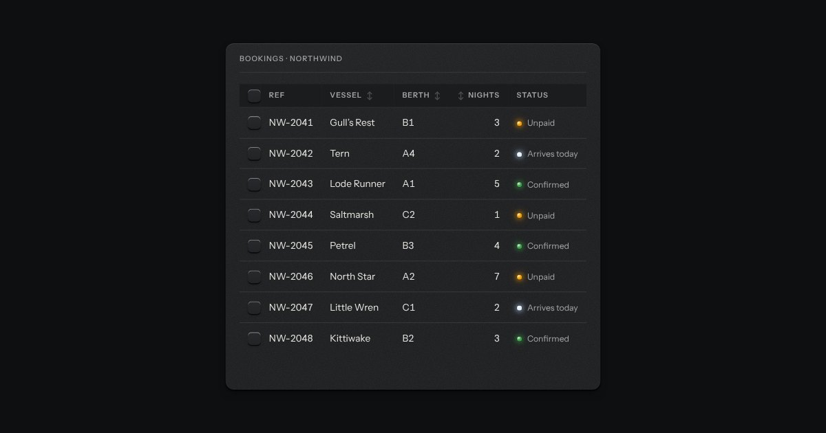
The bar that slides up when rows are checked. It says how many are chosen, offers the actions that apply to all of them (Archive, Assign, Delete) and a Clear key, and goes away again when none are. It follows a data table through the table’s own selection event, so the two share nothing but an id. The slide is a transform and nothing else, and under reduced motion the bar simply appears.
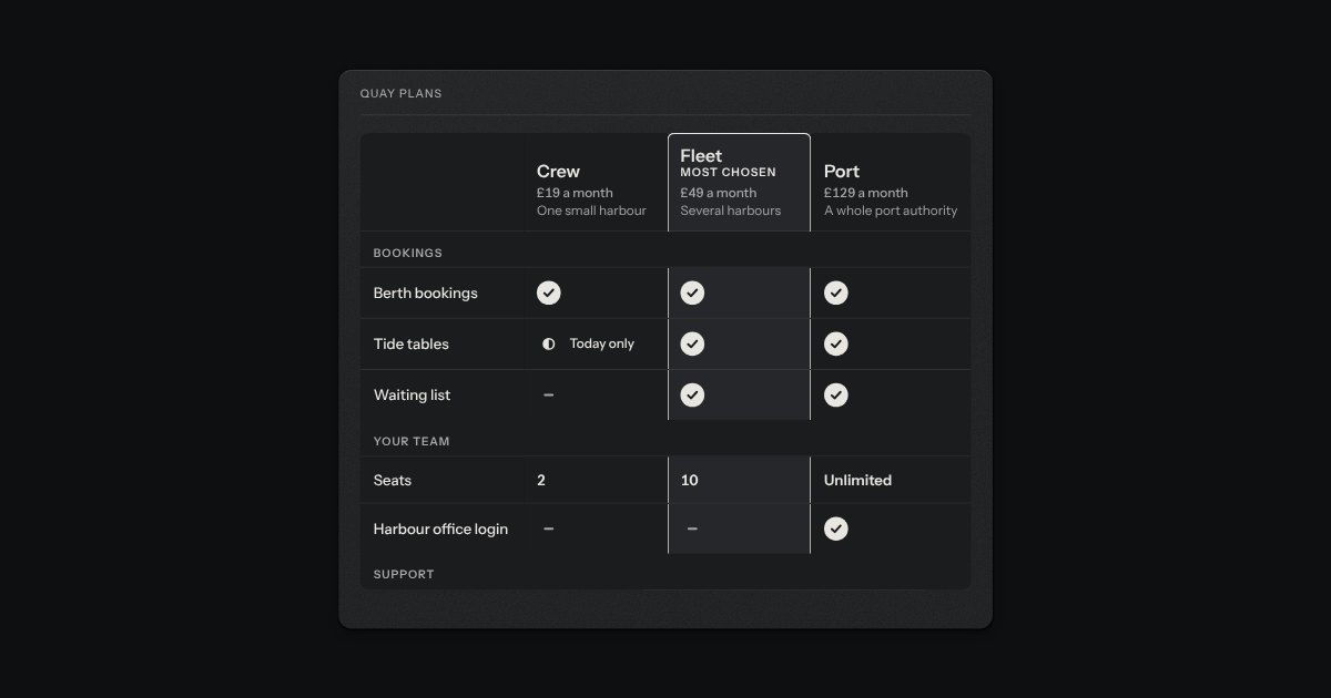
Plans or products as columns, features as rows, for the decision that is made by lining things up. The header stays at the top of its box and the feature names at its left. Every cell is a mark that differs in shape as well as in word (a disc with a tick, a dash, a half disc), so it reads without colour, and a partial one says what is meant (“Office hours”). One column can be lifted and ringed as the one to look at. On a phone the table scrolls inside its own box.
Longer text in a deeper recess: notes, messages, descriptions. It grows by its corner handle.
A writing pad that is still a real textarea. A sheet of ruled paper is set into a machined frame, and the rules move with the words. A small LCD in the foot counts characters or words: it lights amber near the limit and red over it, and the limit is said once, in words, when it is crossed. The pad grows with the text up to a height you choose.
The prompt box. One deep recess holds the text and the keys sit on its floor: attach at one end; at the other a small LCD that counts tokens, amber near the limit and red over it, and the send key, which becomes a stop key while a reply runs. It is a real form with a labelled text area. Enter sends and Shift and Enter make a new line, and the send key is disabled while there is nothing to send. The text grows as you type, up to a height, then scrolls.
A plain rich-text field with no dependency. A toolbar of keys sits over an editing surface in the field's well: two heading levels, bold, italic, code, bulleted and numbered lists, a quote, a code block and a link. The keys stay down while the text under the caret has that format. What comes out is always the same small set of clean HTML (p, h2, h3, strong, em, code, pre, blockquote, ul, ol, li and a with an address), whatever was pasted in, because everything that goes in, by typing, pasting, dropping or setting the value, is cleaned by a strict allow-list. It is a real form field: it submits, resets, validates, counts and goes off like any other.
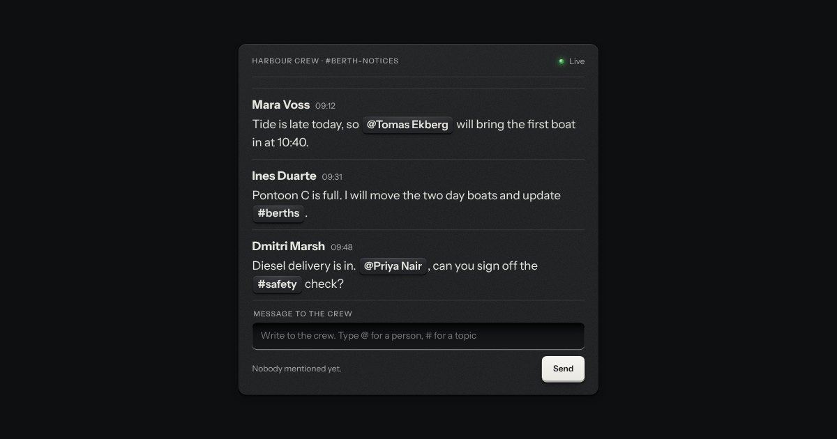
A text field for comments, notes and chat where typing @ opens a short list of people, and # a list of topics, hung under the caret. The arrow keys and Enter pick, and the pick is set into the text as a small raised token that Backspace takes away as one piece. It is the kit’s text well with the combobox’s card and options: a proper ARIA combobox, with the active option named by aria-activedescendant and the count of the list spoken as it narrows. What it holds reads as plain text with each pick written @[id], so a server can store it and a page can draw it again.
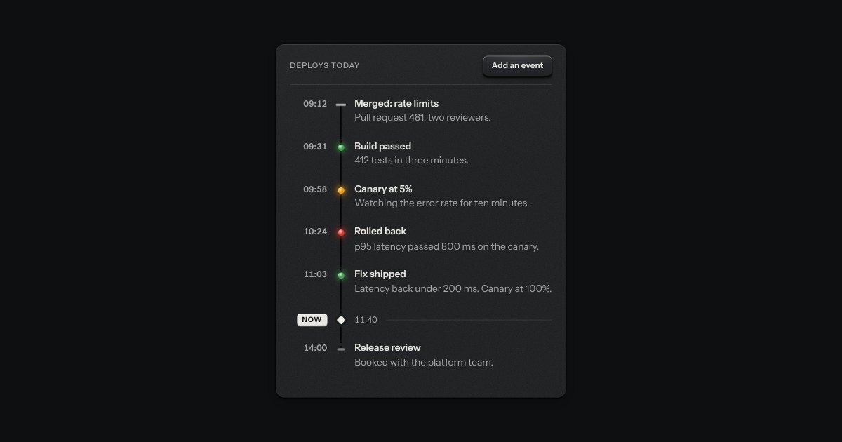
An event log like the roll of a chart recorder. The rail is engraved down the plate and each event is a tick stamped across it, with its time in tabular figures and its words beside it. A lamp on the rail is the only colour, and a marker for the present separates what has happened from what is still to come.
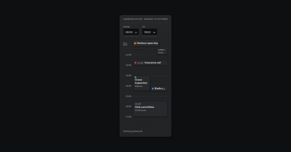
One day in hour rows, like a page of a desk diary. Each timed event stands on the rows by when it starts and how long it runs; events that overlap stand side by side and share the width. All-day events sit in a strip above the rows, and a Now line crosses at the time on the clock and moves with it. The first and last hour are options. Every event is a real key named with its time, so the day can be driven from the keyboard and read aloud.
A confirmation after an action: a small plate with a lamp and one factual sentence, read out politely, gone in 3.6 seconds.
A toast issued like a numbered ticket from a dispenser. A short slip of thermal paper with a number, a line of words and, if it needs one, an action key slides out of a slot at the edge of the screen. Several fan a little. Tear one off with a swipe or its close key, or leave it and it retracts by itself, on a timer that stops while you are reading it.
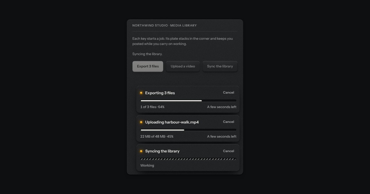
A toast that carries a job running in the background, an export, an import or a sync, from its start to its end. The toast’s plate holds a lamp, the job in words, the progress groove filling with ink, the count, the percent and the time left, and a Cancel key. When the job ends the same plate says how it went: done, with an action key such as Open, and gone after six seconds; failed, with Retry, staying until it is closed; or cancelled. A job of unknown size runs a short length of ink to and fro. Nothing takes focus, and only the start and the end are said aloud.
On or off, applied the moment it moves. A native checkbox with a ridged thumb in a slot that lights green when on.
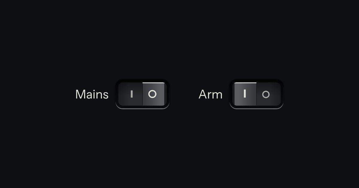
A heavier on/off for power, mains and arming: a cap that pivots in a black bezel, printed | and O.
A row of keys in a tray with one pressed down: pick a view, a range or a mode and it applies at once. It is the kit’s selector without the lamps, with sizes, a full-width row and icon segments.
A mode switch made of cloth. A row of tiles covered in stretched fabric stands in a machined tray, each with an icon and a word pressed into it. The chosen tile sits a touch lower and a lamp behind it lights its icon and word through the weave. Choose another and the first lamp fades down as the next comes up. Underneath it is a group of native radios, so it posts one value without any script.
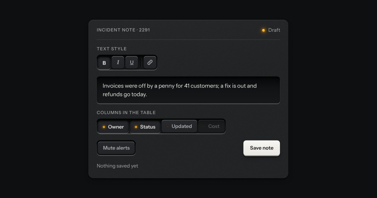
The segmented control’s keys, each latching on its own, so any number can be down at once: bold and italic, the columns a table shows, the filters on a log. Every key is a checkbox and posts with the form. A lone toggle is a group of one, and a parting line splits clusters of keys in one slot.
One key that latches below the plate and stays there. It is the kit’s own key with one state to keep, down or up, so it is the way to say mute, pin, bold or armed without the weight of a switch. A lamp in the cap may light while it is down.
Small plates you press on and off, laid in a tray that wraps: the filters over a table, the topics on a form, the sizes on a product. Each chip is a native checkbox, or a radio when only one may be down, drawn as a small cap that sinks below the tray with its lamp lit. A limit may be set on how many go down at once.
A few words on a small label plate, the kind riveted beside a control on a rack: printed in the contrast colours with a rule just inside its edge and a short tab aimed at its key. It comes up when a pointer rests on the key or the keyboard reaches it, is read by a screen reader, and goes on Escape.
A preview that hangs from a link when the pointer rests on it or the keyboard reaches it. The popover’s card and leader, opened by a short delay and put away by leaving.
A small round key beside a label that, when pressed, hangs a sentence or two about it on a label plate and says them aloud. The tooltip names a key on hover and never opens on touch; a toggletip is for words a person may need to read before they choose, so it opens on a press, on a phone as on a desk, and stays until it is pressed again, Escape is pressed, a press lands outside it or focus moves on. The note is written into a polite status line as it opens, so a screen reader hears it once. Without the script the note is printed in place after the label.