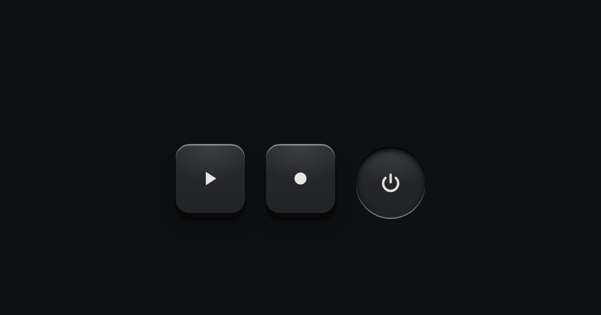
Icon key
A key with an icon and no words, square or round: transport, power, the small tools. Its aria-label names it; a tip shows the name.
Kit parts
The kit’s glyphs as one set.
Seats open in 11 days. Want one email that morning?
The set is data, not sprites.
| Name | Kind | Description |
|---|---|---|
| ICONS · ICON_NAMES | object · array | |
| data-size | attribute | On a grid: scales every glyph in it. |
Press a glyph to copy its markup. The size switch scales the whole grid; the line stays a tenth of the box.
A key with an icon and no words, square or round: transport, power, the small tools. Its aria-label names it; a tip shows the name.
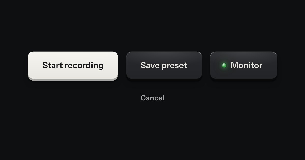
Every button, and every link that acts like one: a cap on a skirt that drops below the plate when pressed.
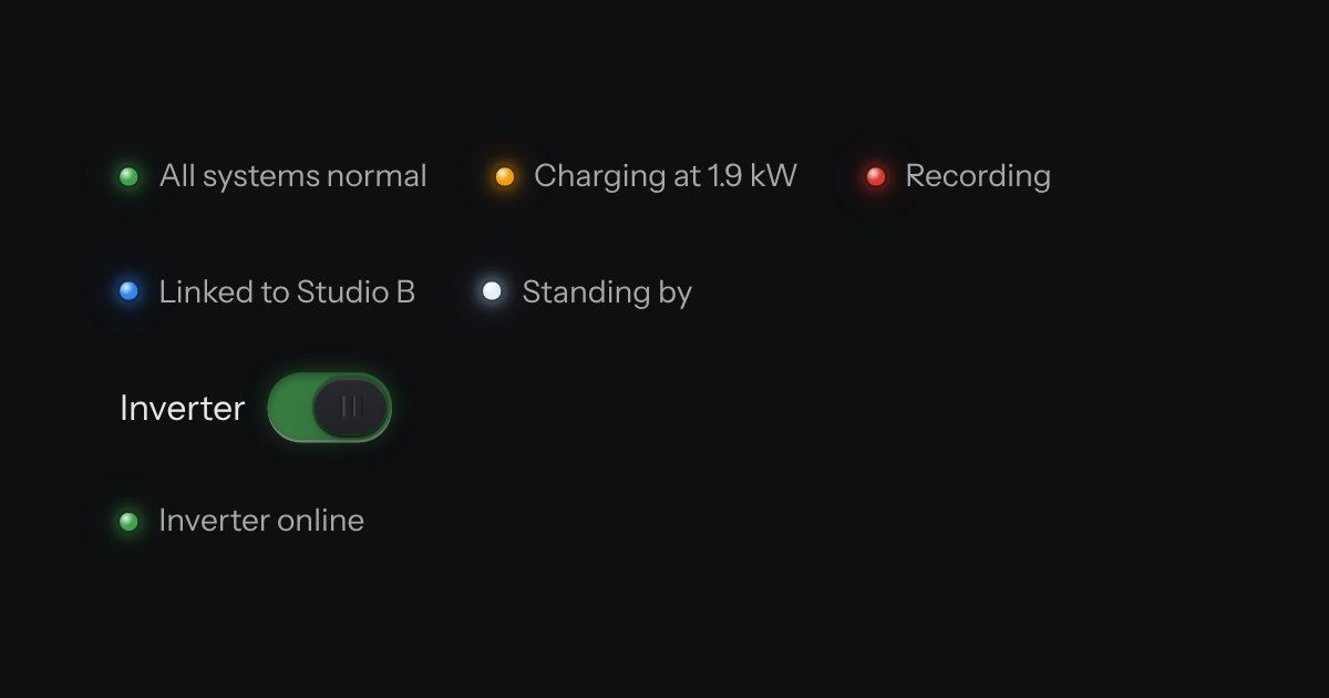
The only colour in the kit: a lamp that is on. Green is on, amber is waiting, red is recording or failing, blue is linked, white is standing by. Always next to words.