Side rail
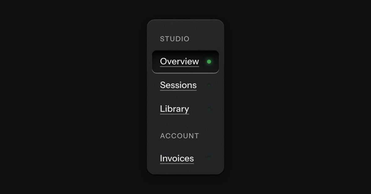
App navigation in a panel: the current page is a recess with its lamp lit, links grouped under printed labels.
Kit parts
Folders and files as a real tree, printed like a wiring diagram: traces with an elbow into every item, chevrons that turn, and the chosen file set in a recess with its lamp lit. Written as a plain nested list.
Seats open in 11 days. Want one email that morning?
How it is built, line by line, comes with its code and styling.
| Name | Kind | Description |
|---|---|---|
| label | attribute | |
| data-open | attribute | Starts open. Folders on the path to the chosen item open anyway. |
| data-meta | attribute | A short fact at the row’s end: a size, a count. |
| value | property | The chosen item’s path, names joined by “/”. |
| change | event | A different item was chosen. |
| ArrowDown · ArrowUp | keyboard | Next and previous visible item. |
| ArrowRight · ArrowLeft | keyboard | Open a folder, then step into it; close it, then step out to its parent. |
| Home · End | keyboard | First and last visible item. |
| Enter · Space | keyboard | Choose the item; on a folder, also open or close it. |
| * | keyboard | Open every folder beside the focused one. |
| Letters | keyboard | Jump to the next item whose name starts with what you typed. |
Click, or Tab in and use the arrows: Right opens, Left closes, Home/End, and type a name to jump. Enter chooses.
App navigation in a panel: the current page is a recess with its lamp lit, links grouped under printed labels.
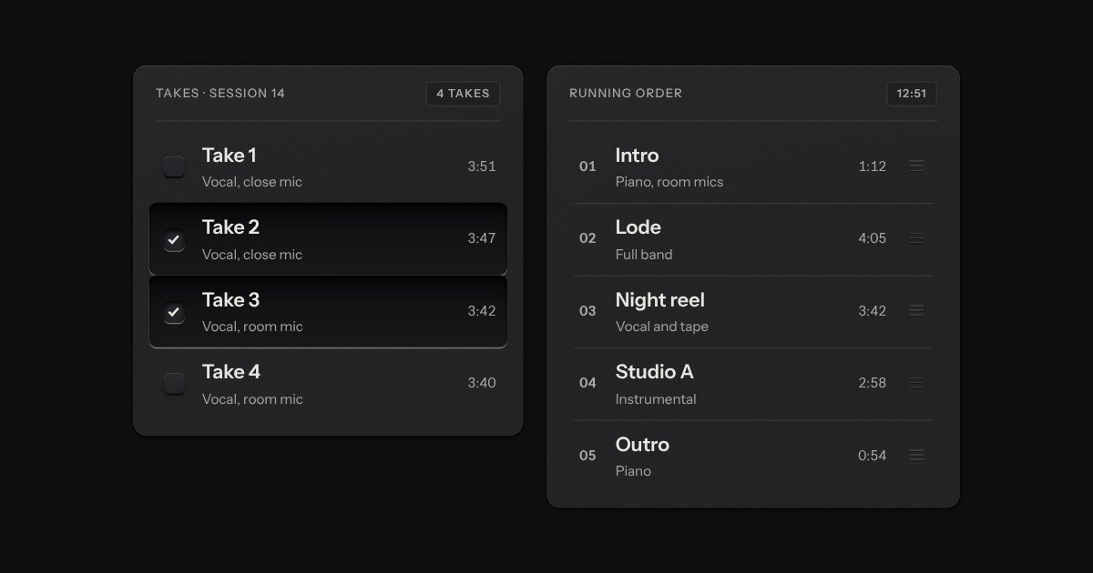
Rows in a rack: a mark, a title, a second line and a fact or a key at the end. Chosen rows sink into a recess with their check key latched; in a running order, a row lifts out of the rack on its skirt and slides past the others, from the keyboard or by its grip.
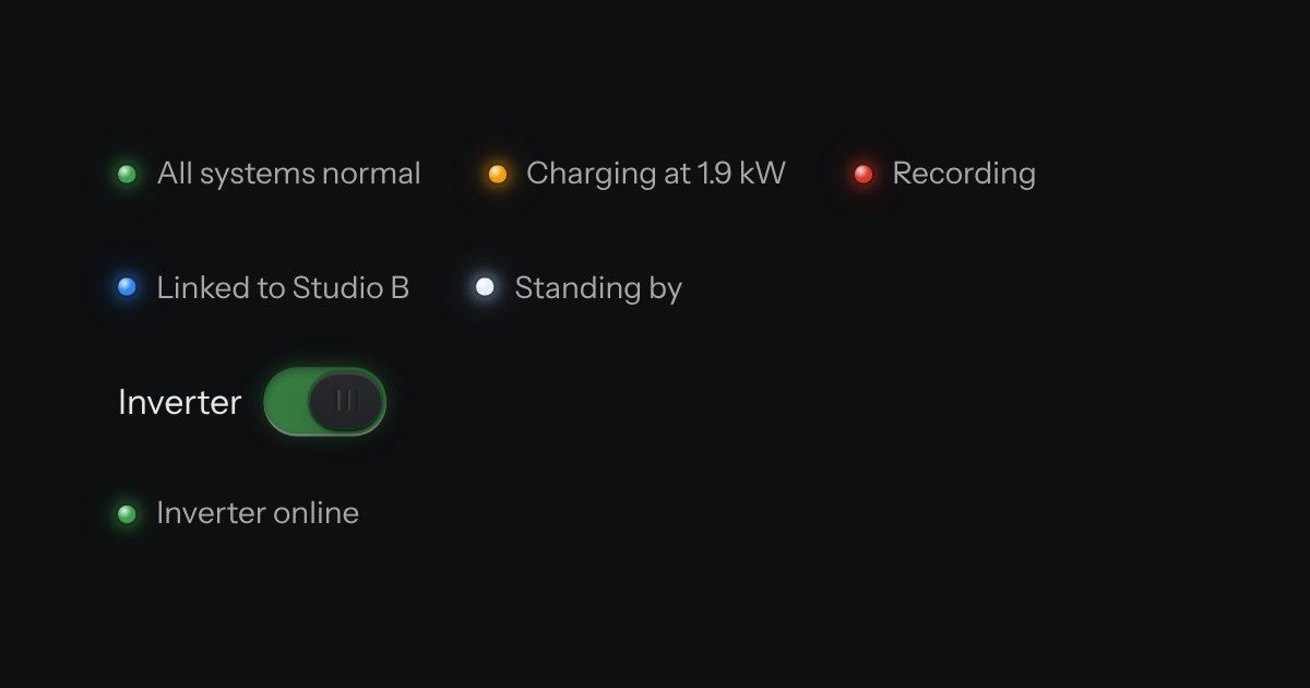
The only colour in the kit: a lamp that is on. Green is on, amber is waiting, red is recording or failing, blue is linked, white is standing by. Always next to words.