Selector
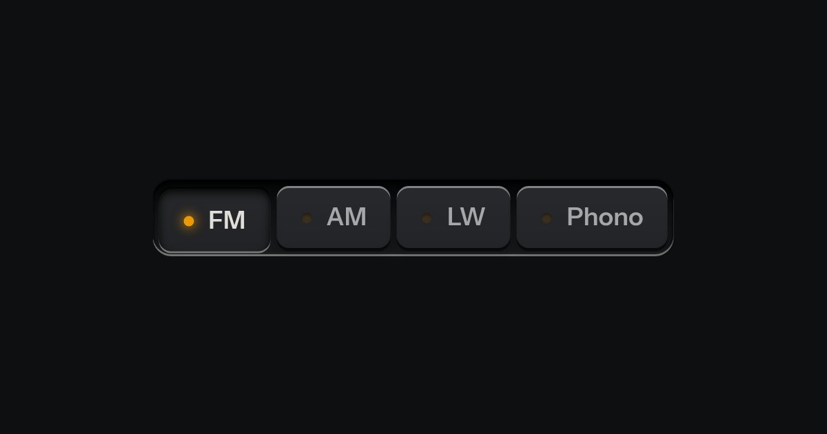
One mode of two to five: latching keys in a tray, one down at a time, each with a lamp that lights when chosen.
Kit parts
A mode switch made of cloth. A row of tiles covered in stretched fabric stands in a machined tray, each with an icon and a word pressed into it. The chosen tile sits a touch lower and a lamp behind it lights its icon and word through the weave. Choose another and the first lamp fades down as the next comes up. Underneath it is a group of native radios, so it posts one value without any script.
Seats open in 11 days. Want one email that morning?
Unlit, the icon and word are pressed in: a darker shade of the cloth on aluminium and a paler one on graphite, with a shaded upper wall and a lit lower lip. Corners are concentric. An aurora lamp is the kit’s shared field in the glow: three to five soft blobs, each a radial gradient on its own layer, drifting on the compositor, shaped by the glow’s own falloff. On graphite it is added as light. The icon and word are lit near white, tinted by the field’s white point.
| Name | Kind | Description |
|---|---|---|
| data-lamp | attribute | The lamp behind the cloth. Filament, a warm white, by default. |
| paused | attribute | Holds the aurora where it is. Toggle it from a Pause key of your own, a real button with aria-pressed (the recipe is under Markup): an aurora drifts for longer than five seconds, so a way to stop it is part of using one. No key is built in. |
| data-weave | attribute | The cloth. A fine diagonal twill by default, felt more than seen; speaker cloth is a coarser weave that shows the light as pinholes. |
| Home · End | keyboard | The first or last mode that can be chosen. Needs kit.mjs; the arrow keys are the browser’s own. |
| clothSelectorHTML · clothLamp · clothWeave · clothSelectorEdge | function | The markup, written for you, and the rules under it, pure: which lamp a value means, which weave, and where Home and End go. |
Click a tile, or tab in and use the arrow keys, Home and End. The lamp fades from one tile to the next. Try the other lamps and the speaker cloth, then Save.
One mode of two to five: latching keys in a tray, one down at a time, each with a lamp that lights when chosen.
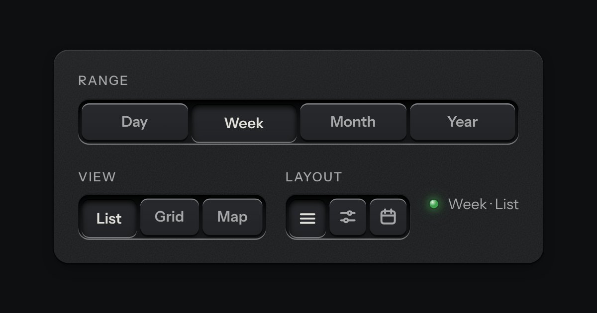
A row of keys in a tray with one pressed down: pick a view, a range or a mode and it applies at once. It is the kit’s selector without the lamps, with sizes, a full-width row and icon segments.
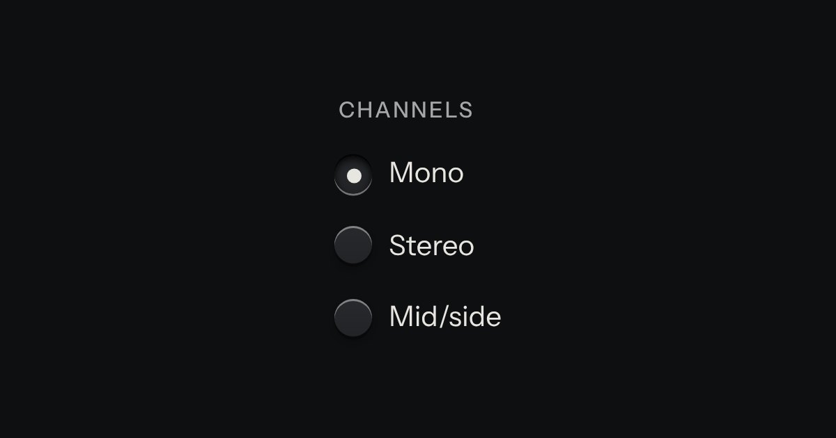
One choice from a short list in a form: small round keys in a fieldset, the chosen one pressed with a printed dot.