Table
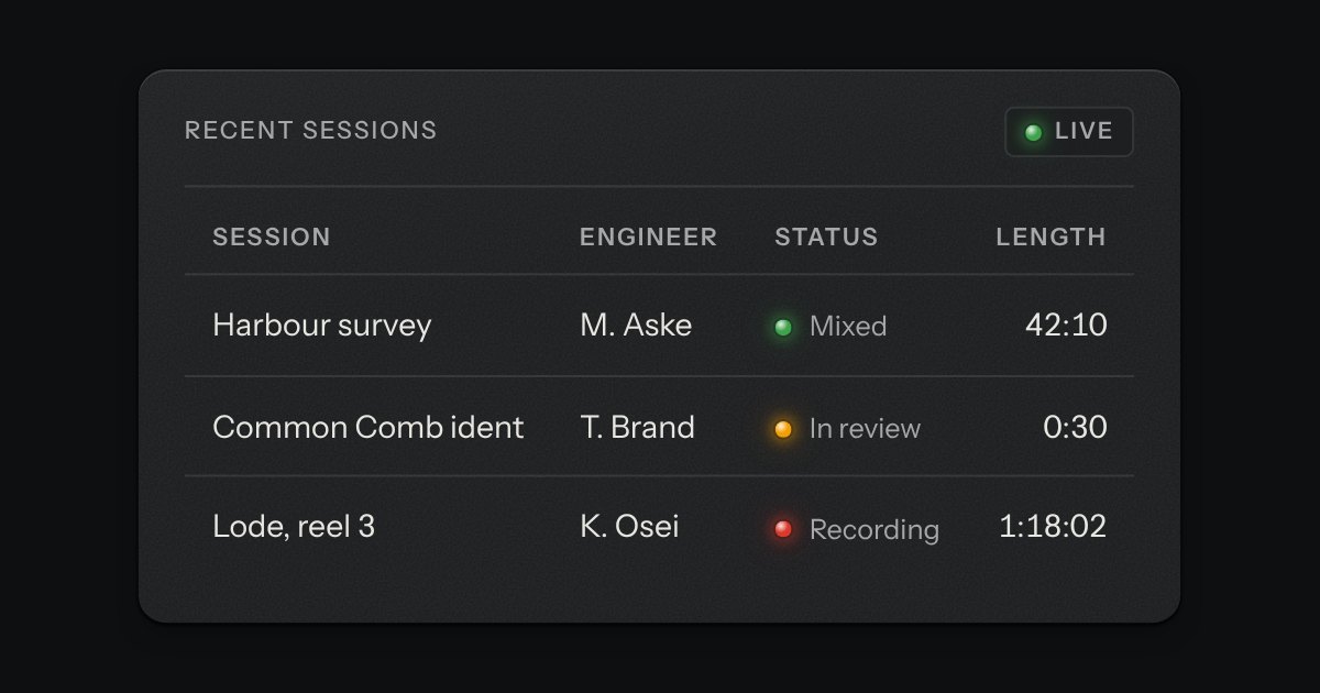
Rows of data with printed column labels, figures right-aligned in columns, and status in lamps with words.
Kit parts
The kit’s table with the tools a working one needs: headers that sort, a filter well, a check key on every row with one in the header that selects them all and sinks half way when only some are chosen, and a header that stays at the top while the rows scroll under it. While rows are chosen a plate slides out of a slot under the tools, its lamp lit, carrying what can be done to them. Without the script it is the plain table.
Seats open in 11 days. Want one email that morning?
It takes the table it is given and adds to it. A first column of native checkboxes goes into the head and every row. Sorting is the kit table’s own, done here so it moves only rows the filter leaves.
| Name | Kind | Description |
|---|---|---|
| select · filter | attribute | A check key on every row and one in the header; a filter well over the table. Leave either out for a table without it. |
| label · noun · placeholder | attribute | What the rows are, for the filter’s name (“Filter services”); the word for one row and for many in the count (“service, services”); an example for the well. |
| tr[data-key] | attribute | Its index when there is none. |
| th[data-sort] · td[data-value] | attribute | The table’s own sorting, kept to the rows the filter leaves. aria-sort says which way. |
| Shift with a click | pointer | Chooses or clears the run of rows in view from the last one pressed. |
| dataTableKey · dataTableOrder · dataTableMatch · dataTableAllState · dataTableSay | function | The rules, pure: a cell’s sort key, the order of the rows, whether a row matches, the select-all key’s state and the words in the count and the bar. |
Type in the filter: “payments”, “degraded”, “media fail”. Press a header to sort by it, again to turn it round. Tick rows, or Shift-click to tick a run of them; the key in the header selects every row in view. Pause or Restart what you chose.
Rows of data with printed column labels, figures right-aligned in columns, and status in lamps with words.
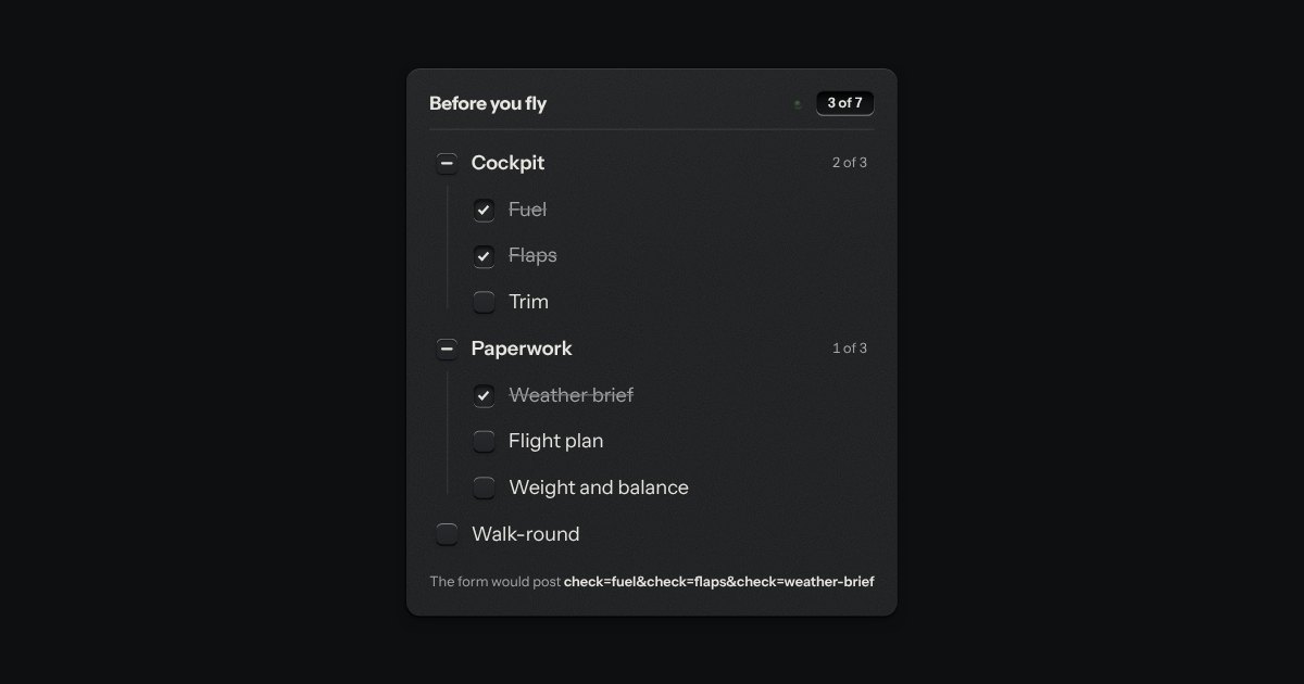
The kit’s check keys in nested groups. A group’s key is the sum of its items: all done, none, or some, and some is a key sunk halfway with a bar across it. The head counts the items, “3 of 7”, and its lamp lights when they are all done.
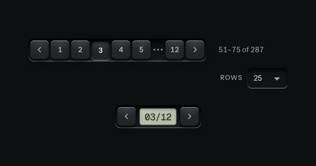
Pages for tables and lists: numbered keys in a tray with the current page latched down, seven slots so the row never changes width. Compact, it is a transport with a track counter.