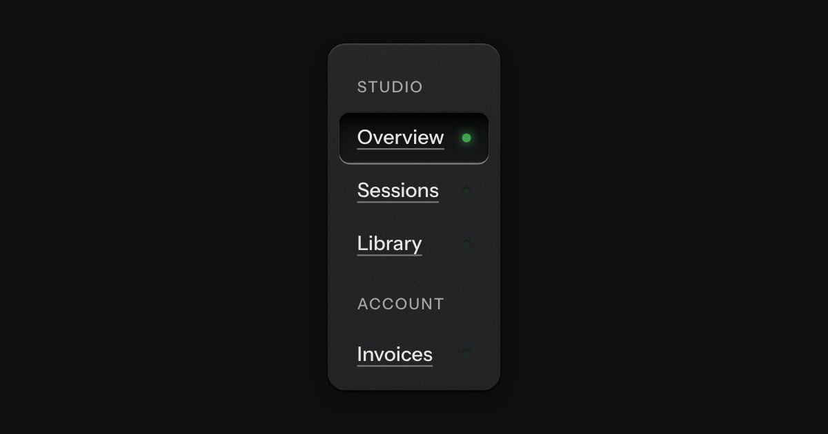
Side rail
App navigation in a panel: the current page is a recess with its lamp lit, links grouped under printed labels.
Kit parts
A narrow sidebar of icon keys, using the kit’s own icons. A lamp beside the current one is lit, a label shows as a tooltip on hover and on focus, and a key at the foot opens the rail out so every label is printed beside its icon. It remembers which way you left it.
Seats open in 11 days. Want one email that morning?
Closed, the label is a small contrast plate set to the right and made visible on hover and focus; it is never removed from the page, only made transparent, which is why the icon key still has a name. Opened, the same label loses its plate and sits in the row, and the icon does not move: the item’s padding is the half of the closed width the icon was centred in. The width eases; everything else follows from an attribute, and the foot key is the one control that needs a script.
| Name | Kind | Description |
|---|---|---|
| expanded | property | Read or set whether the labels are printed. Setting it stores the choice. |
| ↑ ↓ · Home · End | keyboard | Move between the icon keys and the foot key. Tab visits each one as well. |
Hover or Tab to an icon for its label. Press the key at the foot to print every label; reload and it stays as you left it.
App navigation in a panel: the current page is a recess with its lamp lit, links grouped under printed labels.
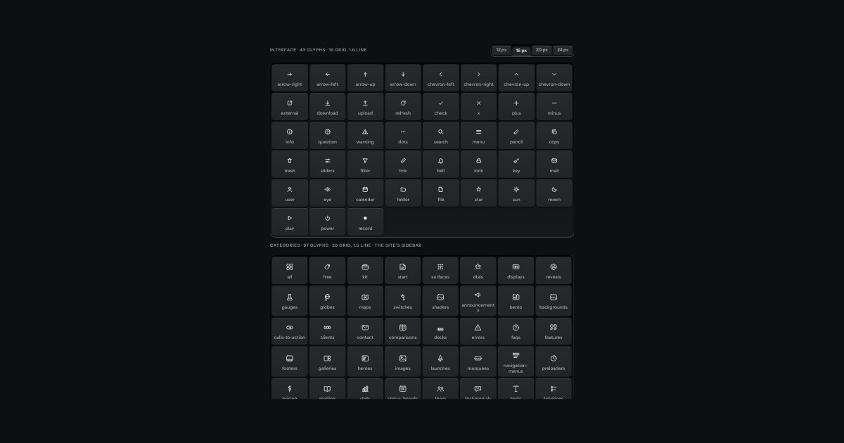
The kit’s glyphs as one set.
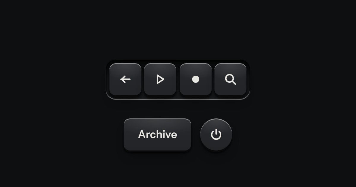
A few words on a small label plate, the kind riveted beside a control on a rack: printed in the contrast colours with a rule just inside its edge and a short tab aimed at its key. It comes up when a pointer rests on the key or the keyboard reaches it, is read by a screen reader, and goes on Escape.