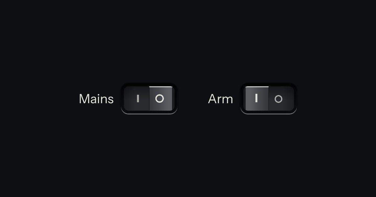
Rocker
A heavier on/off for power, mains and arming: a cap that pivots in a black bezel, printed | and O.
Kit part · Toggles & switches
On or off, applied the moment it moves. A native checkbox with a ridged thumb in a slot that lights green when on.
Seats open in 11 days. Want one email that morning?
| Heat pump |
Both finishes, side by side. Hover, pressed and focus are forced with .is-hover, .is-down and .is-focus; checked and disabled are real.
Aluminium
| Part | Off | On | Focus | Disabled off | Disabled on |
|---|---|---|---|---|---|
| Switch |
Graphite
| Part | Off | On | Focus | Disabled off | Disabled on |
|---|---|---|---|---|---|
| Switch |
| Name | Kind | Values | What it does |
|---|---|---|---|
| .tui-switch | class | on <input type="checkbox"> | A 48 × 26 slot with a ridged thumb that slides 16px. |
| checked | attribute | On: the thumb slides right and the slot lights green. | |
| data-material | attribute | aluminium · graphite · porcelain · black-anodised · titanium · bakelite · anodised-blue · anodised-green | What the thumb is made of, apart from the page’s finish. The slot is cut in the plate: it keeps the finish and still lights green. On the switch or on its device. Anodised blue and green go on a whole device only. |
| disabled | attribute | 45% opacity, no pointer. | |
| name · value | attribute | Posts with a form like any checkbox. | |
| change | event | Native. Apply the setting here, at once. | |
| .is-focus | class | Forced focus ring, for specimens. | |
| Space | keyboard | Toggles, as any checkbox. |
<label class="tui-choice">
  Phantom power
  <input type="checkbox" class="tui-switch" checked>
</label>
Needs kit.css only, no script. How to install the kit.
<label class="tui-choice"> so the text names it and the whole row is clickable.aria-label that names the thing it powers: “Heat pump power”.An appearance: none checkbox. The slot is the kit’s recess; the thumb is an ::after with a raised light and a ridged grip drawn by one repeating gradient. Checked, the thumb translates 16px over 180ms and the slot fills with a mix of --tui-green and the well. No script, no images.
If the change needs a Save, it is not a switch: use a check key.
5 rules in this file, with the foundations they rest on and the anti-patterns that break them. Full rules ship in the brain with the Pass.
A heavier on/off for power, mains and arming: a cap that pivots in a black bezel, printed | and O.
An option in a form: a small square key that presses below the plate when chosen, with a tick printed on it.
| Reel 3 | 42:10 |
| Mixed | 0:30 |
Rows of data with printed column labels, figures right-aligned in columns, and status in lamps with words.