Popover
A card hung from the key that opened it, with a printed leader running back to the key. Not modal: the page stays live around it.
Kit parts
A preview that hangs from a link when the pointer rests on it or the keyboard reaches it. The popover’s card and leader, opened by a short delay and put away by leaving.
Seats open in 11 days. Want one email that morning?
One card is out at a time.
| Name | Kind | Description |
|---|---|---|
| data-hover-card | attribute | On the trigger (a link or a key): the card that hangs from it. The card is a block, so put it beside the trigger, never inside a paragraph. |
| aria-describedby | attribute | On the trigger, so the card is read as its description when it gains focus. |
| data-side · data-align | attribute | On the card: where it prefers to hang, and along which edge. It flips when the page runs out. |
| data-open-delay · data-close-delay | attribute | On the trigger. |
| showHoverCard(trigger) · hideHoverCard() | function | Open one now, and put the open one away. |
| HOVER_OPEN_MS · HOVER_FOCUS_MS · HOVER_CLOSE_MS | constant | The timings. |
| Focus · Escape | keyboard | A keyboard-visible focus opens it; Escape closes it and focus stays on the trigger. |
| Tab | keyboard | From the trigger goes into the card, which follows it in the source, if it has anything focusable. |
Rest the pointer on a name for half a second, or Tab to it. Move onto the card to read it; Escape puts it away.
A card hung from the key that opened it, with a printed leader running back to the key. Not modal: the page stays live around it.
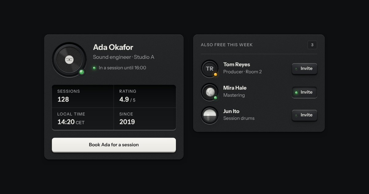
A person’s ID plate: their coin set in a countersunk socket, name and role, a rating plate of facts engraved in tabular figures, and one key to act. Compact for one line.
A few words on a small label plate, the kind riveted beside a control on a rack: printed in the contrast colours with a rule just inside its edge and a short tab aimed at its key. It comes up when a pointer rests on the key or the keyboard reaches it, is read by a screen reader, and goes on Escape.