Field
Text entry in a recess, the label printed above it, and a hint that says how to fix an error.
Kit part · Forms
Related fields under one engraved legend, with one hint and one error line for the group. It is the browser’s own fieldset and legend, so the group has a name for a screen reader and a disabled fieldset disables every field inside. The legend runs on into a groove cut in the plate; the error waits at the foot, not drawn, until it has something to say.
Seats open in 11 days. Want one email that morning?
Both finishes, side by side. Hover, pressed and focus are forced with .is-hover, .is-down and .is-focus; checked and disabled are real.
Aluminium
| Part | Rest | With a hint | Error | Disabled |
|---|---|---|---|---|
| Group |
Graphite
| Part | Rest | With a hint | Error | Disabled |
|---|---|---|---|---|
| Group |
| Name | Kind | Values | What it does |
|---|---|---|---|
| <fieldset class="tui-fieldset"> | element | with aria-describedby | The group. List the ids of the hint and then the error in aria-describedby, and both are read as the focus enters. |
| <legend class="tui-fieldset__legend"> | element | first child | The group’s name, printed small with the engraved rule running on from it. Keep it a few words. |
| .tui-fieldset__hint · .tui-fieldset__error | class | paragraphs with ids | How to fill the group in, and what is wrong with it. The error is empty until it has words and has role="alert", so it is read out when it appears. |
| .tui-fieldset__fields | class | around the fields | A grid with a gap. Add --row to the fieldset to set fields side by side, --choices for a tighter column of checks or radios, --well to set the group on a tray. |
| data-min · data-max | attribute | on the fieldset, numbers | How many checkboxes must be down. The form is stopped on submit if the count is out of range; the next change re-checks it. |
| data-error | attribute | set by the script | Marks the group as wrong: the legend’s rule turns red. Add it yourself when you set the error with your own code. |
| fieldsetError(fieldset, words) | function | a fieldset, a string or empty | Puts words in the error line, or takes them away, and marks the fieldset. |
| fieldsetValidate(fieldset) · fieldsetCheck(count, { min, max }) | function | kit.mjs | Checks a fieldset that has a count and returns whether it is right; the words for a count, pure. |
<fieldset class="tui-fieldset tui-fieldset--choices" aria-describedby="alerts-hint alerts-error" data-min="1">
  <legend class="tui-fieldset__legend">Send me alerts for</legend>
  <p class="tui-fieldset__hint" id="alerts-hint">Pick the events that should send an email.</p>
  <div class="tui-fieldset__fields">
    <label class="tui-choice"><input class="tui-check" type="checkbox" name="alert" value="failed"> Failed payments</label>
    <label class="tui-choice"><input class="tui-check" type="checkbox" name="alert" value="refunds"> Refunds</label>
  </div>
  <p class="tui-fieldset__error" id="alerts-error" role="alert"></p>
</fieldset>

<!-- Fields in a row, on their own tray -->
<fieldset class="tui-fieldset tui-fieldset--row tui-fieldset--well">
  <legend class="tui-fieldset__legend">Billing contact</legend>
  <div class="tui-fieldset__fields"> <div class="tui-field">…</div> <div class="tui-field">…</div> </div>
</fieldset>
import { fieldsetError, fieldsetValidate, fieldsetCheck } from '/kit/kit.mjs';
// data-min and data-max on the fieldset are checked on submit and on change. Or say it yourself:
fieldsetError(document.querySelector('#alerts'), 'Choose at least one.');
fieldsetError(document.querySelector('#alerts'), ''); // take it away
fieldsetValidate(fieldset); // true when the count is right
fieldsetCheck(0, { min: 1 }); // 'Choose at least one.'Needs kit.css and kit.mjs. How to install the kit.
aria-describedby on the fieldset has the hint and the error read after the legend. The error line is a role="alert", empty until needed, so it is spoken the moment it is given words.disabled fieldset disables every field in it, which the browser already does; the legend and hint go quieter and the group stays readable.There is one native element and four lines of drawing. The legend is floated so that it stops being the border’s special case and can hold a rule: a flex row with the words and a 2px groove after them, dark with the light on its lower lip, the cut the toolbar and the toggle group already use between clusters. The error is the kit’s red lamp and a line of words. The count check is the only script, and it runs on the form’s own submit and the field’s own change.
Name a group of fields once, say how to fill it in once, and say what is wrong with it once, in a place a screen reader will read.
6 rules in this file, with the foundations they rest on and the anti-patterns that break them. Full rules ship in the brain with the Pass.
Text entry in a recess, the label printed above it, and a hint that says how to fix an error.
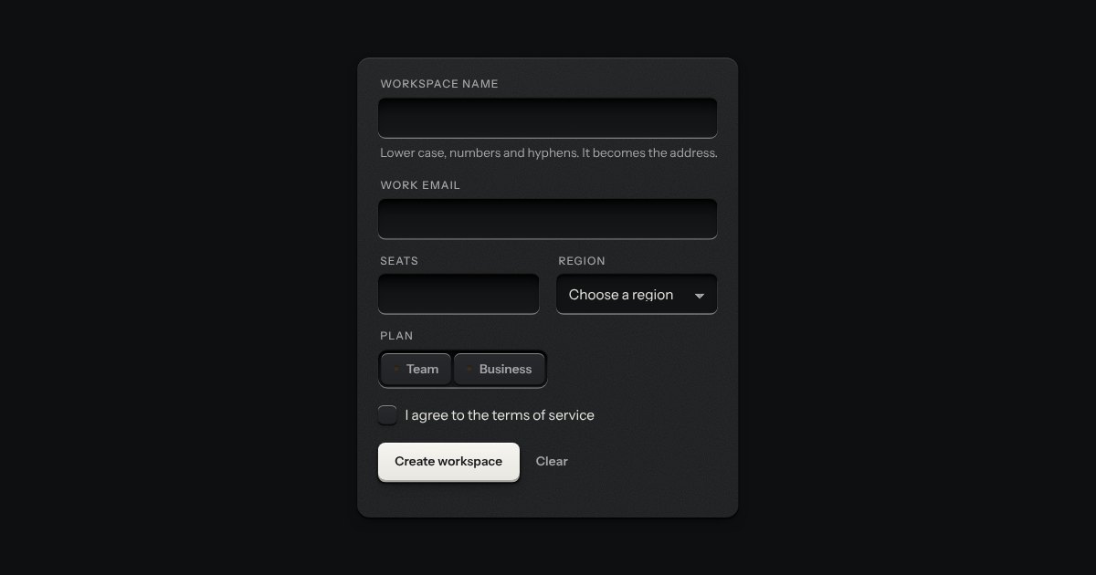
A form that says what is wrong, on the browser’s own checks. Press submit with something missing and each field in error gets a line under it with a red lamp lit and words that say how to put it right, its well ringed red; at the top of the form an annunciator lights over a count and a list that links to each field, and takes the focus. From then on each field is checked again as it changes.
An option in a form: a small square key that presses below the plate when chosen, with a tick printed on it.
One choice from a short list in a form: small round keys in a fieldset, the chosen one pressed with a printed dot.