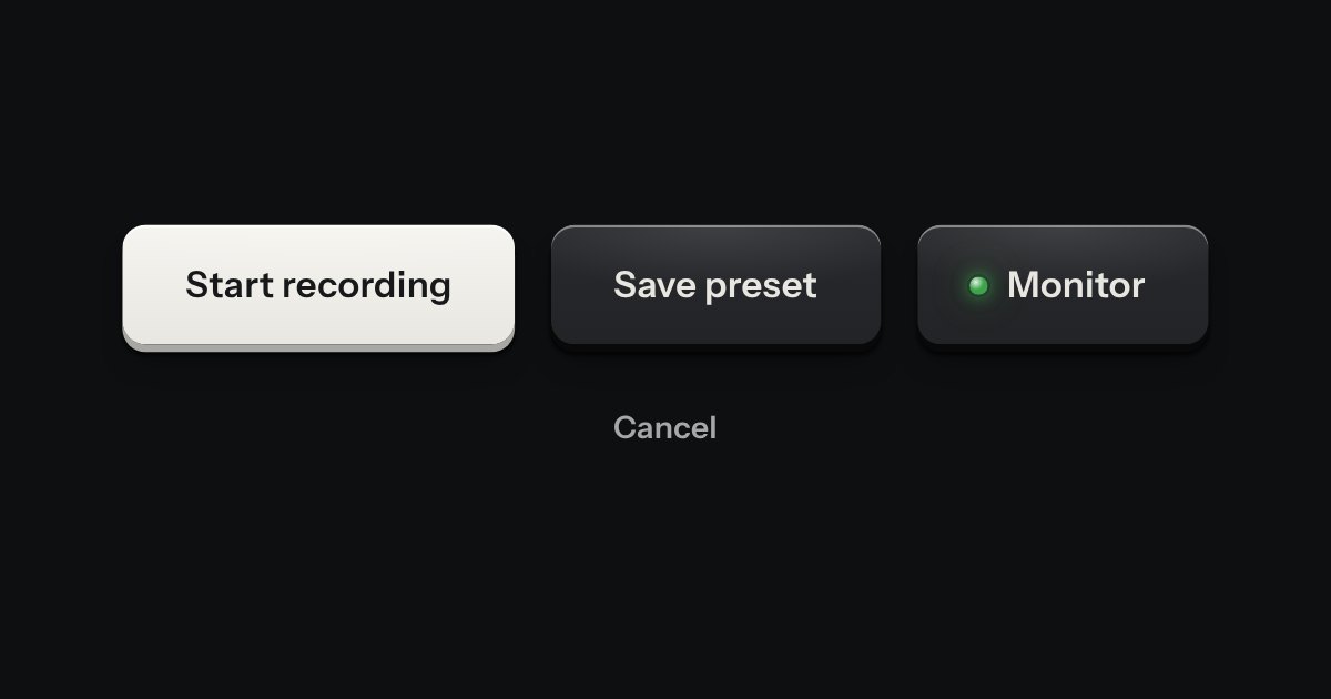
Key
Every button, and every link that acts like one: a cap on a skirt that drops below the plate when pressed.
Kit parts
Printed type that goes somewhere. The words stay in ink and the rule under them is engraved into the plate: cut darker when you hover, deeper when you press.
Seats open in 11 days. Want one email that morning?
It is not a text-decoration because a visited link may change colours and nothing else, and this way the rule can change colour alone.
| Name | Kind | Description |
|---|---|---|
| aria-current | attribute | On the navigation link for where you are: full ink and a full rule. |
| no href | attribute | A link that goes nowhere yet. |
Hover a link, press and hold it, Tab to it. The arrow marks the one that leaves the site; a visited link is one step quieter.
Every button, and every link that acts like one: a cap on a skirt that drops below the plate when pressed.
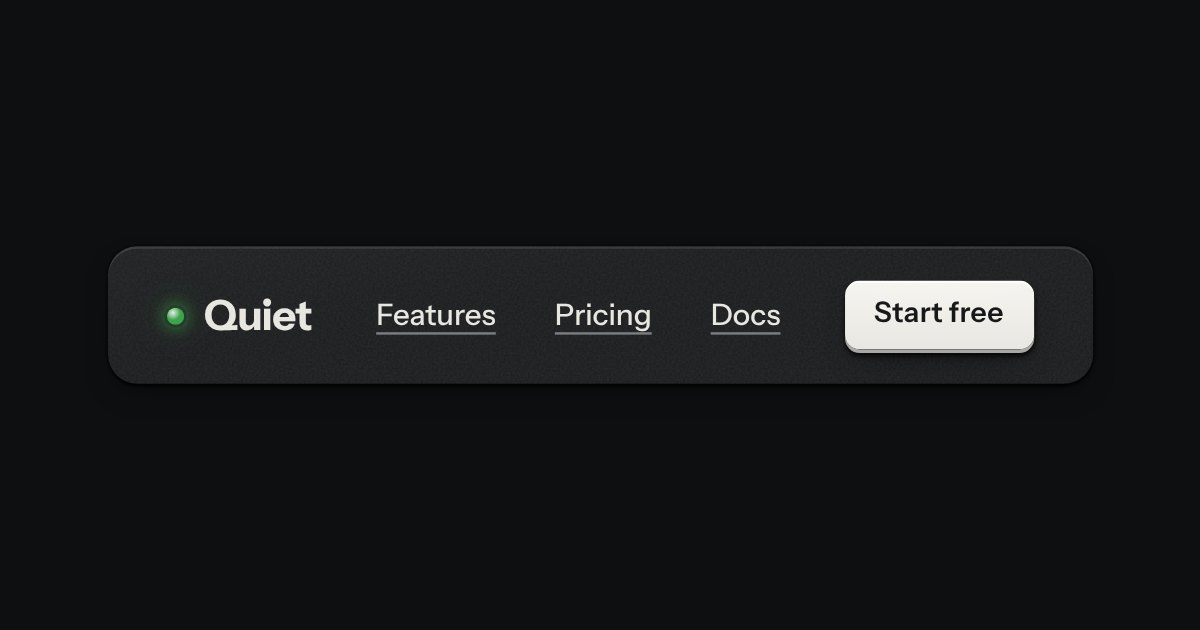
The top of a page: a wordmark with a lamp, printed links, and one contrast key at most.
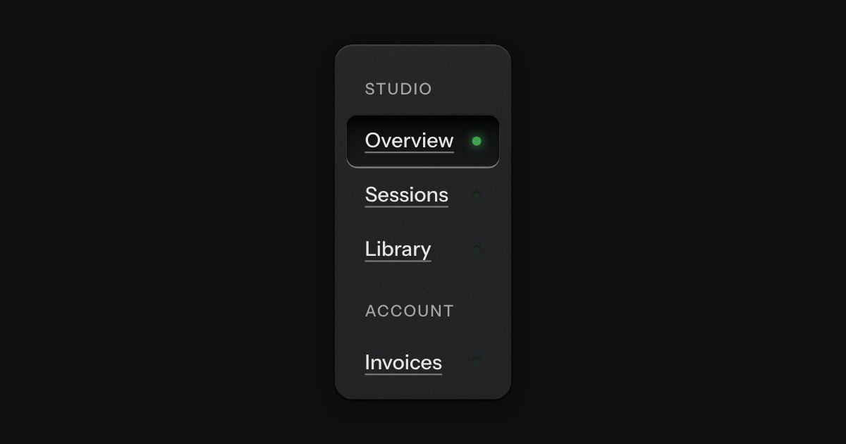
App navigation in a panel: the current page is a recess with its lamp lit, links grouped under printed labels.