Select
A choice from a longer list, in the same recess as a field, with a printed chevron. The browser’s own menu opens it.
An always-open list let into the plate as a recess. The rows are printed on its floor and a chosen row is a cap let down into it with its lamp lit. One row may be chosen, or several; typing a few letters finds the next row that starts with them. It starts as a native select with a size, so it posts with the form and works without a script.
Seats open in 11 days. Want one email that morning?
Both finishes, side by side. Hover, pressed and focus are forced with .is-hover, .is-down and .is-focus; checked and disabled are real.
Aluminium
| Part | Rest | Hover | Active | Chosen | Disabled |
|---|---|---|---|---|---|
| Row | Ireland | Ireland | Ireland | Ireland | Ireland |
Graphite
| Part | Rest | Hover | Active | Chosen | Disabled |
|---|---|---|---|---|---|
| Row | Ireland | Ireland | Ireland | Ireland | Ireland |
| Name | Kind | Values | What it does |
|---|---|---|---|
| <tui-listbox> | element | around one <select size> | Hides the select, keeps it as the form’s value and draws the options as rows in the recess. Without the script the select is what shows. |
| <select multiple size="6"> | attribute | on the select | Several rows may be chosen, with green lamps; size is how many rows show before the list scrolls. |
| data-hint · <optgroup label> | attribute | on options and groups | A second word printed at the right of a row; a printed heading over a group. |
| value · values · select | property | string · string[] · <select> | What is chosen, and the select itself (listen for change on it). |
| tui-listbox-change | event | detail { values } | Bubbles from the element after the choice changes. The select’s own change fires as ever. |
| ↑ ↓ · Home · End · PageUp · PageDown | key | on the list | Move the active row. In a single list the choice follows it. |
| Space · Shift+↑ ↓ · Ctrl+A | key | in a multiple list | Choose or let go of the active row; choose the run from where you started; choose every row. |
| A letter | key | type-ahead | Typing finds the next row that starts with what you typed; the same letter again steps on to the next that starts with it. |
| typeaheadFind(labels, from, typed) · listboxRange(a, b) · listboxMove(index, key, n) | function | pure | Which row a typed word finds, the rows between two, and where a key moves the active row. |
<div class="tui-field">
  <label class="tui-label" for="region">Region</label>
  <tui-listbox>
    <select class="tui-select" id="region" name="region" size="5">
      <optgroup label="Europe">
        <option value="pt" data-hint="eu-south" selected>Portugal</option>
        <option value="ie" data-hint="eu-west">Ireland</option>
      </optgroup>
      …
    </select>
  </tui-listbox>
</div>

<!-- Several: a multiple select; plain presses choose and let go -->
<tui-listbox><select class="tui-select" id="targets" name="targets" size="6" multiple>…</select></tui-listbox>
import { typeaheadFind, listboxRange } from '/kit/kit.mjs';
const list = document.querySelector('tui-listbox');
list.addEventListener('tui-listbox-change', (e) => {
console.log(e.detail.values); // ['pt']
});
list.values; // the values chosen
typeaheadFind(['Brazil', 'Germany'], -1, 'g'); // 1
listboxRange(1, 3); // [1, 2, 3]Needs kit.css and kit.mjs. How to install the kit.
aria-activedescendant: the list is one tab stop and keeps the focus while the active row moves, and each row has aria-selected; a list that takes several is aria-multiselectable.The recess is the kit’s well and the rows are the combobox’s lines: a lamp, the words, a hint. A chosen row is drawn as a key let down into the recess, the same pressed shadow a latched key has, so it follows every finish and both volumes. The select stays in the page, hidden, and is written to with a real change event, so a form, a framework or a test reads it as ever. Type-ahead keeps a buffer for 700ms and treats one letter repeated as a request for the next row.
Show every option at once instead of hiding it behind a key: arrows, type-ahead, ranges with Shift, and the same select underneath for the form.
6 rules in this file, with the foundations they rest on and the anti-patterns that break them. Full rules ship in the brain with the Pass.
A choice from a longer list, in the same recess as a field, with a printed chevron. The browser’s own menu opens it.
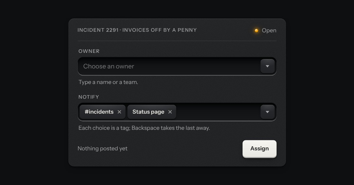
A field that filters a long list as you type. It starts as a plain select, so it posts with the form and works without a script; then the options card slides out of a slot under the well, the letters that match print heavier and the chosen option’s lamp is lit. Several choices sit in the well as tags.
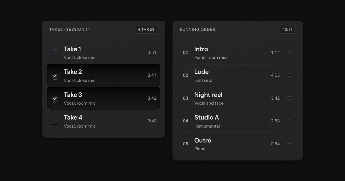
Rows in a rack: a mark, a title, a second line and a fact or a key at the end. Chosen rows sink into a recess with their check key latched; in a running order, a row lifts out of the rack on its skirt and slides past the others, from the keyboard or by its grip.
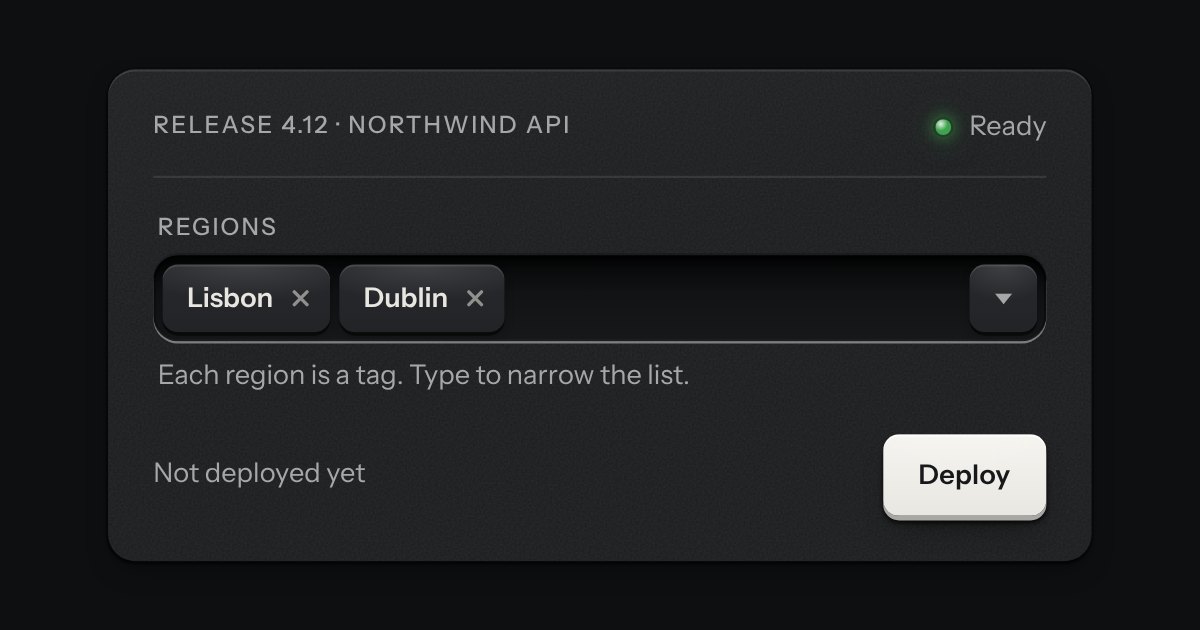
A combobox that takes several. Each choice is set down in the well as a tag, the card of options stays out while you choose the next, and the foot of the card counts what is chosen and lets it all go. It starts as a native select with the multiple attribute, so it posts with the form and works without a script.