Popover
A card hung from the key that opened it, with a printed leader running back to the key. Not modal: the page stays live around it.
Kit parts
A card of actions and options that slides out from under its key. The key stays down while the card is out; an option that is on lights its lamp.
Seats open in 11 days. Want one email that morning?
The browser’s own popover does the opening, the top layer and light dismiss, so the card is never clipped by a panel. The line under the finger is the kit’s recess.
| Name | Kind | Description |
|---|---|---|
| popovertarget | attribute | Native opening and light dismiss; the part adds the keyboard and sets aria-expanded. |
| aria-checked | attribute | An option with a green lamp. Toggles and the card stays. |
| aria-checked | attribute | One of a set, with an amber lamp. Choosing it clears the others in its group. |
| kbd | element | The shortcut, printed at the right in the second ink. |
| svg | element | Optional. |
| data-menu-context | attribute | On any element: right-click, Shift+F10 or the Menu key opens that card there. |
| closeMenu(menu) | function | |
| Enter · Space · ↓ · ↑ | keyboard | Open and go to the first line; ↑ goes to the last. |
| ↑ ↓ · Home · End · Page Up · Page Down · a letter | keyboard | Move, wrapping at the ends. Home and Page Up go to the first line, End and Page Down to the last; a letter jumps to the next line starting with it. |
| → · ← | keyboard | Open a submenu and go into it; close it and go back to its line. |
| Escape · Tab | keyboard | Escape closes one card and focus returns; Tab closes them all and moves on from the key. |
Open Reel 4 by click, Enter or ↓. Move with the arrows or a letter; → opens Export as. Right-click the take, or focus it and press Shift F10.
A card hung from the key that opened it, with a printed leader running back to the key. Not modal: the page stays live around it.
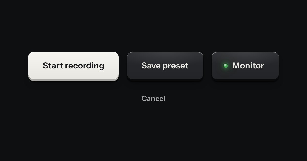
Every button, and every link that acts like one: a cap on a skirt that drops below the plate when pressed.
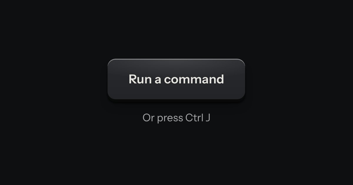
Every action and page behind one key: a modal plate whose entry line is a lit display, with the results printed below and the chosen one pressed in.