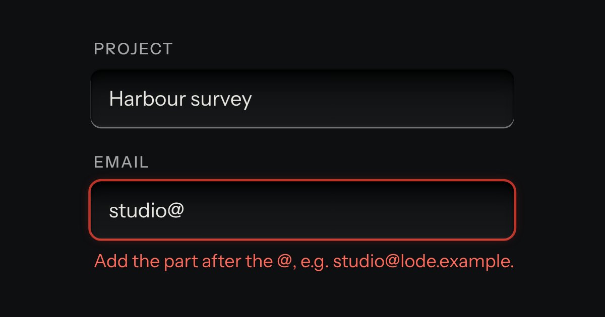
Field
Text entry in a recess, the label printed above it, and a hint that says how to fix an error.
Kit parts
A plain rich-text field with no dependency. A toolbar of keys sits over an editing surface in the field's well: two heading levels, bold, italic, code, bulleted and numbered lists, a quote, a code block and a link. The keys stay down while the text under the caret has that format. What comes out is always the same small set of clean HTML (p, h2, h3, strong, em, code, pre, blockquote, ul, ol, li and a with an address), whatever was pasted in, because everything that goes in, by typing, pasting, dropping or setting the value, is cleaned by a strict allow-list. It is a real form field: it submits, resets, validates, counts and goes off like any other.
Seats open in 11 days. Want one email that morning?
The field's well with the kit's toolbar and toggle keys above it. The command layer uses the browser's own editing commands for inline marks, lists and blocks, so undo, redo and the spell checker keep working; everything the editor reports, submits or copies goes through the sanitiser, which has its own small tokenizer and an allow-list and never gives an untrusted string to innerHTML. The sanitiser is the same code in the browser and in Node, so it is tested without a DOM.
| Name | Kind | Description |
|---|---|---|
| required · minlength · maxlength | attribute | Required is met when there is text. The lengths count characters of text, not tags. The limit is soft: the count turns to a warning, the form will not submit, and typing is never cut off. |
| disabled · readonly | attribute | Both turn the toolbar off. Disabled leaves the tab order; read only keeps the text focusable and selectable but not editable. |
| data-placeholder · placeholder | attribute | Shown while the editor is empty. It is drawn with CSS, so it is never part of the value. |
| aria-describedby | attribute | Marks and announces the error state. The page writes the message and points aria-describedby at it, as for any field. The field also draws its own validity message after a first blur or a submit. |
| value | property | The clean HTML. Setting it cleans what is given. An editor with no text reads as "". |
| plainText · length | property | The text, and the number of characters counted against the limits. |
| input · change | event | input on every edit; change when focus leaves the editor and the value is not what it was. |
| sanitizeHTML() · htmlToText() · plainToHTML() · richSummary() · pasteHTML() | function | Clean any HTML to the allow-list, read it as text, turn plain text into paragraphs, and everything in one pass. They run in Node with no DOM. |
| safeHref() · linkHref() · lineStartShortcut() · shortcutAction() · formatState() · richSays() · countText() · countState() · richValidity() | function | Which addresses are kept (http, https, mailto, tel), what the link row makes of what is typed, the line-start and key shortcuts, which keys are down for a caret, what is said aloud, and the count and its validity. |
Select a few words and press B: the key stays down and the words are bold. Move the caret into them and the key is down; move out and it comes up. Type "- " at the start of a line for a bullet, "## " for a heading. Press Ctrl+K (Command+K on a Mac) for a link. Paste something from a web page or a document: it comes in clean. The value under the editor is what the form would send.
Text entry in a recess, the label printed above it, and a hint that says how to fix an error.
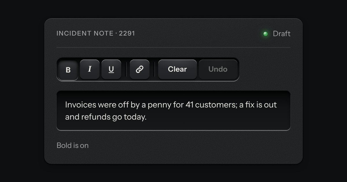
A rack of keys in one slot cut into the plate, under one tab stop. Keys, toggle keys, a copy key and a menu key sit side by side, parted into clusters by engraved lines, and the arrow keys move along it so a keyboard user passes the whole rack with one Tab.
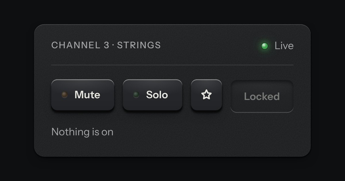
One key that latches below the plate and stays there. It is the kit’s own key with one state to keep, down or up, so it is the way to say mute, pin, bold or armed without the weight of a switch. A lamp in the cap may light while it is down.
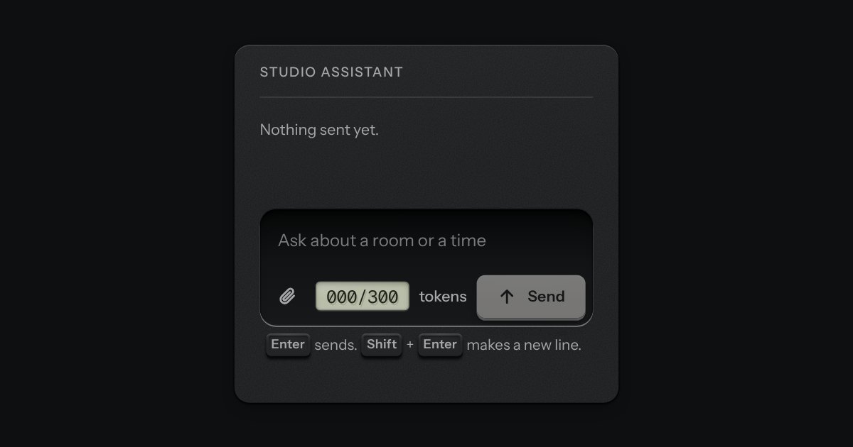
The prompt box. One deep recess holds the text and the keys sit on its floor: attach at one end; at the other a small LCD that counts tokens, amber near the limit and red over it, and the send key, which becomes a stop key while a reply runs. It is a real form with a labelled text area. Enter sends and Shift and Enter make a new line, and the send key is disabled while there is nothing to send. The text grows as you type, up to a height, then scrolls.
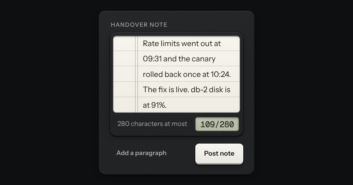
A writing pad that is still a real textarea. A sheet of ruled paper is set into a machined frame, and the rules move with the words. A small LCD in the foot counts characters or words: it lights amber near the limit and red over it, and the limit is said once, in words, when it is crossed. The pad grows with the text up to a height you choose.