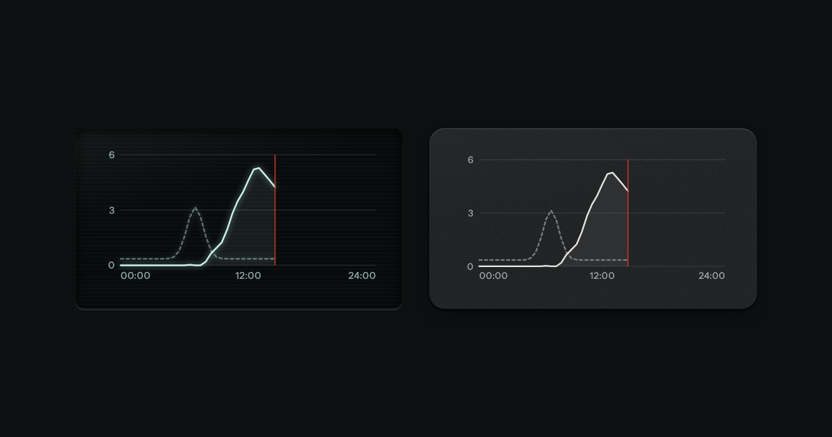
Plot
Line charts drawn as light on glass, or as ink on a panel: gridlines faint, two traces at most, a red line for now.
Kit part · Charts
A word-sized line for the margin of a table or beside a readout. It is an SVG that takes the size of the type around it and the ink of the place it sits in, so on a panel it is ink and on display glass it is the display’s light. The last value is marked with a dot seated in a faint ring, and a lamp lights the dot when the reading matters. The trend and the last value are said in words on the image’s label, so the line is a second sign and never the only one.
Seats open in 11 days. Want one email that morning?
| Service | Last 8 hours | p95 |
|---|---|---|
| Berth bookings | 76 ms | |
| Tide tables | 38 ms | |
| Pilot dispatch | 50 ms |
Both finishes, side by side. Hover, pressed and focus are forced with .is-hover, .is-down and .is-focus; checked and disabled are real.
Aluminium
| Part | Rising | Falling | Steady | Lit red |
|---|---|---|---|---|
| On the panel | ||||
| On glass |
Graphite
| Part | Rising | Falling | Steady | Lit red |
|---|---|---|---|---|
| On the panel | ||||
| On glass |
| Name | Kind | Values | What it does |
|---|---|---|---|
| svg.tui-sparkline[role="img"][aria-label] | element | named | The line. It is an image, so give it a name that says the trend and the last value, as sparklineSVG() does. |
| viewBox | attribute | "-4 -4 88 32" | The 80 by 24 box with a margin of 4 for the dot and the stroke. The size is the type’s: 5.5em wide. |
| .area · .line · .seat · .last | class | on the paths and circles | The shade under the line, the line, the faint ring and the dot at the last value. |
| [data-lamp] | attribute | green · amber · red · blue | Lights the dot in a lamp colour. Without it the dot is ink. The words on the label still say the news. |
| --sm · --lg | modifier | tui-sparkline--sm · --lg | Smaller beside body text in a dense table; larger beside a readout. |
| sparklineSVG(values, options) | function | pure | The whole SVG. Options: noun, unit, period, lamp, area, label (your own words instead of the ones it writes), class. |
| sparklineWords(values, options) | function | pure | The sentence: “p95 latency: rising over 8 readings, last 76 ms”. |
| sparklineTrend(values) · sparklinePoints(values) | function | pure | Rising, falling, steady (within a tenth of the range) or flat; and the points in the box. |
<!-- An image with a name that says the trend and the last value. The picture is a second sign. -->
<svg class="tui-sparkline" viewBox="-4 -4 88 32" role="img"
     aria-label="p95 latency: rising over 8 readings, last 76 ms" data-lamp="amber">
  <path class="area" d="M0 17 L11.4 14.4 … L80 0 L80 24 L0 24 Z"/>
  <path class="line" d="M0 17 L11.4 14.4 … L80 0"/>
  <circle class="seat" cx="80" cy="0" r="3.4"/><circle class="last" cx="80" cy="0" r="2.3"/>
</svg>

<!-- In a table cell, beside the figure it summarises: -->
<td>…svg…</td><td class="is-num">76 ms</td>
import { sparklineSVG } from '/kit/kit.mjs';
cell.innerHTML = sparklineSVG([41, 44, 43, 52, 58, 61, 70, 76], {
noun: 'p95 latency', // what is measured, said first
unit: 'ms', // printed after the last value
lamp: 'amber', // optional: lights the dot
});
// aria-label: "p95 latency: rising over 8 readings, last 76 ms"Needs kit.css only, no script. How to install the kit.
role="img" with an aria-label that says the trend and the last value in words: “p95 latency: rising over 8 readings, last 76 ms”. A screen reader user gets the news the picture carries.Plain SVG, drawn by one short function that scales the readings into an 80 by 24 box and writes a path, a shade, a ring and a dot. The size is in em, so it grows with the type it is set beside, and the ink is --tui-ink, so on display glass it is the display’s light without a rule of its own. There is no script to load: the markup is the part.
Put the shape of the last few readings in the margin of a table, with the last one marked and the news said in words.
6 rules in this file, with the foundations they rest on and the anti-patterns that break them. Full rules ship in the brain with the Pass.
Line charts drawn as light on glass, or as ink on a panel: gridlines faint, two traces at most, a red line for now.
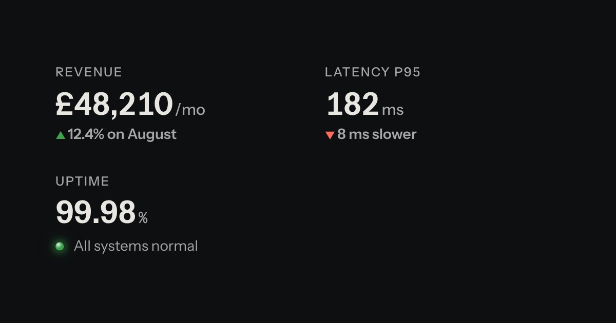
A printed label over a value: key figures, with the unit small and the change in words.
| Reel 3 | 42:10 |
| Mixed | 0:30 |
Rows of data with printed column labels, figures right-aligned in columns, and status in lamps with words.