The browser’s own file input, dressed as a key and a printed file name in a well. The input itself is the control, so it takes the focus, opens the chooser from the keyboard, accepts a file dropped on it and posts with its form, with or without a script. With a script, a chosen set can be listed under it, one ruled row to a file with its size and a key to take it out.
Element
<input class="tui-file-field__input" type="file">
Needs
kit.css + kit.mjs
Rules
file-field.rules.md · 5
Finishes
Aluminium · Graphite · Oak · Walnut · Porcelain · Black · Daylight · Night · Paper · Phosphor · E-paper · AMOLED
Seats open in 11 days. Want one email that morning?
Variants
At rest · nothing chosen
Focus
The key pressed
Any number of images or PDFs.
Several · multiple
Receipts
taxi-0412.pdf84 KB
lunch.jpg1.2 MB
Listed · data-file-list
Choose the invoice to send.
Error
Disabled
Every state, at once
Both finishes, side by side. Hover, pressed and focus are forced with .is-hover, .is-down and .is-focus; checked and disabled are real.
Aluminium
Part
Rest
Hover
Pressing
Focus
Field
Graphite
Part
Rest
Hover
Pressing
Focus
Field
API
Name
Kind
Values
What it does
input.tui-file-field__input
element
type="file", with a name and an id
The real input, drawn as the well with the browser’s own button as the key. Set accept, multiple, required and disabled on it as on any file input.
.tui-file-field
class
around the input
The wrapper. Needed only to list the chosen files; a lone input works without it.
data-file-list
attribute
on the wrapper
List the chosen files under the well, one ruled row to a file, with its size and a key that takes it out. The input’s files are rebuilt to match.
.tui-file-field__list · __name · __size
class
made by the script
The list, a name and a size. The list is empty, and not drawn, until a file is chosen.
tui-file-field-change
event
detail { files }
Bubbles from the wrapper after a file is taken out of the list. The input’s own change fires when files are chosen.
fileSize(bytes) · fileSummary(names)
function
pure
A size in the units people read (“84 KB”), and what was chosen in words (“No file chosen”, “3 files”).
Space · Enter
key
on the input
Open the browser’s file chooser.
Markup
<div class="tui-field">
  <label class="tui-label" for="invoice">Invoice</label>
  <div class="tui-file-field">
    <input class="tui-file-field__input" id="invoice" name="invoice" type="file" accept=".pdf">
  </div>
  <span class="tui-hint">A PDF, up to 5 MB.</span>
</div>

<!-- Several, listed with their sizes -->
<div class="tui-file-field" data-file-list>
  <input class="tui-file-field__input" id="receipts" name="receipts" type="file" multiple>
</div>
import { fileSize, fileSummary } from '/kit/kit.mjs';

document.querySelector('.tui-file-field').addEventListener('tui-file-field-change', (e) => {
  upload.queue = e.detail.files;              // after a file is taken out of the list
});

fileSize(84200);                              // '84 KB'
fileSummary(['a.pdf', 'b.pdf']);              // '2 files'
It is the browser’s own file input, so the browser says what a screen reader says for it, “Invoice, button, no file chosen”, in the visitor’s language, and the label’s for names it.
The focus is the input’s, a 2px ring round the whole well; nothing is laid over it, so a pointer, a keyboard, a switch device and a file dragged from the desktop all reach it.
What was chosen is the browser’s printed name, and the list under it says the same in rows. A polite line says “Chosen: 3 files” and, after a removal, “Removed lunch.jpg. taxi-0412.pdf.”
Each Remove key is named for its file, “Remove lunch.jpg”, and the focus lands on the next key (or the input) after one is pressed, never nowhere.
On a phone the well is 48px tall, the key is 42px inside it and every Remove key is 44px square; the text is 16px so the page is not zoomed.
How it’s built
The browser lets a page restyle exactly one part of a file input, the button, with ::file-selector-button, and everything else about the input is its own. So the well is the kit’s field on the input itself and the key is that button drawn as a key: the same cap, skirt and pressed shadow, taking its press from :active. The list is the one thing the browser cannot do, and the removal is done by building a new set of files with a DataTransfer and handing it back to the input, so the form posts what is shown.
Rules
file-field.rules.mdIn the brain
A file input that looks like the rest of the form and still is the browser’s: real focus, real posting, real drag and drop, and a list of what you chose.
5 rules in this file, with the foundations they rest on and the anti-patterns that break them. Full rules ship in the brain with the Pass.
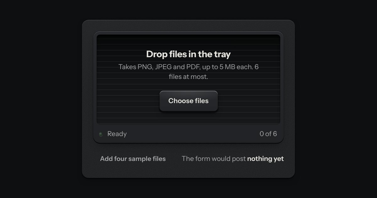
An in-tray for files. A machined lip stands round a ribbed floor; the floor rises a little when a file is dragged over it, and a lamp on the lip lights. What goes in lands in the tray as a sheet of paper and is listed as printed rows, a refusal says why, and the key inside the tray is a real file input.
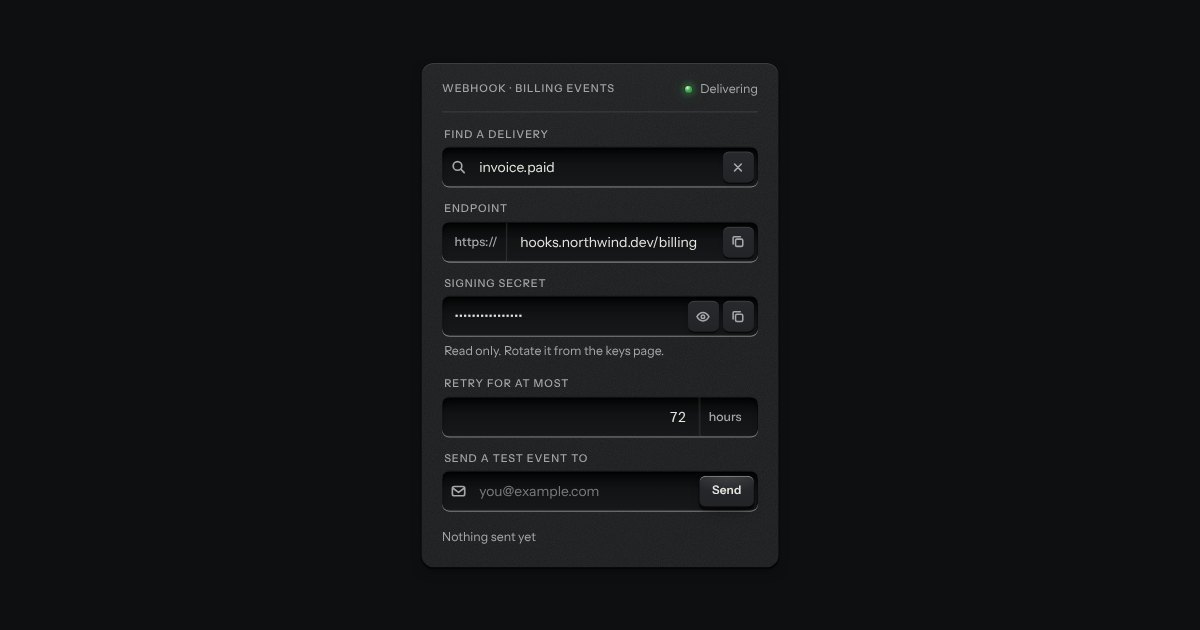
One recess that holds a field and everything that belongs to it. Words that are part of the value but are not typed, such as https:// or a currency, are printed on the floor of the well behind an engraved line; a glyph sits at the start; small keys sit at the end to clear the text, copy it, or show a password.